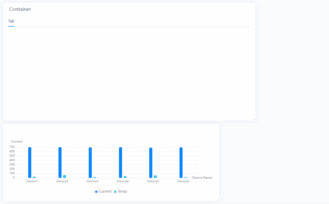
Grouping Widgets Using Containers
Containers enable you to group widgets and organize widgets into tabs. Using containers is a great way to keep the dashboard clean and easy to use. You can use containers when:
You want to keep widgets that display related information together
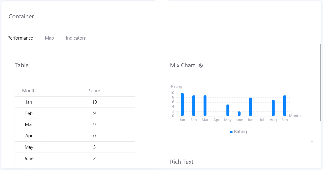
You want to display different types of the widget in the same page area by using tabs
You want to have a structured page layout
Adding a Container
Add a container by following these steps:
In the Page Editor, hover your cursor over Add and select Container. You can also add a container by clicking on Widget (From Template) and selecting an existing container template.
Configure the settings in Basic Options as necessary.
Title: specify the title of the container.
CageCode: specify the CageCode of the array container. When events are dispatched externally via the DTV SDK, you can use an identification code to specify the container.
Hide Title: check this to hide the title.
Title Font: configure the font of the title.
Title Link: configure the name, method and URL of the container title’s link. Application users can select the title of the container to redirect to the specified URL address.
Description: briefly describe your container.
Configure the settings in Container Style as necessary.
Hide Tabs: check this to hide the container tabs.
Tabs: select +Add to add new tabs, or you can specify the name of a tab.
Tab Style: configure how and where the tabs are displayed. When the tab style is button or card, the size, color and font style of the tab can be configured.
Tab Font: configure the font of the tab names.
Hide Child Widget Title: select this to hide the title of all widgets in the container.
Child Widget Spacing: specify the amount of space between each child widget.
Configure the settings in Other Options as necessary.
Allow Maximize: check this to allow the container to be maximized in the preview or published page. For more information, see Maximizing Widgets.
Rendering Type: select how to render tabs in the container, supporting
Direct Rendering(rendering all tabs at the same time),Rendering with Delay(rendering tabs sequentially with a certain time interval), andRendering on Click(rendering a tab only when you open the tab).Chart Padding: specify the amount of space between each boundary of the container and the content.
Grid Amount: specify the amount of grid in a container.
Widget Spacing: specify the vertical and horizontal spacing between widgets.
Grid Height:specify the height of container grids.
Background Color: select the background color of the container.
Background Image: upload an image to be displayed as the container background. It adaptively fills the container according to its size of the container.
Title Decoration: select how you want to decorate the title.
Top Decorative Line: add a decorative line for the top boundary of the container.
Bottom Decorative Line: add a decorative line for the bottom boundary of the container.
Configure the settings in Filter Settings as necessary. For more information, see Adding Container Filters.
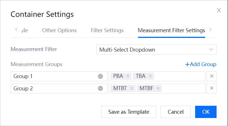
Configure the settings in Measurement Filter Settings as necessary. For more information, see Adding Container Filters.
Adding Widgets into a Container
After you have added a container to the page, you can start organizing your widgets by adding them to the container.
Add a widget to a container by following these steps:
Locate the widget you wish to include and select
 found on the top right of a widget.
Select the container and tab you want to place the widget in.
Moving Widgets out of a Container
If you decide to display some critical widgets directly on the page, you can move them out of their containers. Similar to adding a widget, locate the widget you wish to remove and select .