Start Building a Single-Page Application
This case-based tutorial walks you through building a DTV Single-Page Application from the ground up. The animation below shows the target application page to be created by the end of this tutorial.

Your Objectives
To understand the workflow of DTV, including preparation, configuration, and publication.
To grasp how to configure Static Data Source.
To be able to build a double-layer Single-Page Application page.
To learn about widget configuration.
Prerequisites
Before you start, make sure that:
You have updated to at least version R2506, if you are developing and using the web app in the same environment.
You have an EnOS Application Portal account and permission to create web applications using DTV. Contact your OU administrator if otherwise.
You have grasped DTV Key Concepts.
Preparation
Step 1: Analyzing and Planing
Before you start building the page, you need to have a clear idea of its structure and data source.
Page Structure Planning
The target application page has two layers. Users will switch between layers via the navigators. The layout of each layer is identical—static pictures on the left and dynamic data charts on the right. Chart data changes according to their related navigators. Here we break down the page into the following components:
Page Structure: two canvases, with each canvas consisting of a background picture and a layer.
Layer Structure: Each canvas has one layer, making two layers in total. Each layer has multiple widgets that entail data changes.
Data Type: Static data. Make sure you select Enable Static Data Entry at Basic Configuration to allow users to modify displayed data for presentation or promotional purposes.
Interactive Elements: A Dropdown filter to enable canvas and data switch.
Widget Lists: Widgets on the two canvases are identical, hence reusing configured widgets from Canvas 1 to Canvas 2 will make configuration more efficient. Widgets used on the page include:
5 Containers
9 Metric Cards
1 Table
4 Meter Gauges
Linkage Involved: Canvas switches as the filter’s selected object changes.
Data Planning
Data Source: static data from CSV files.
Datasets Samples:
Datasets 1: An annual overview of carbon emissions data for two products, presented in Multi-Metric Cards No.1-4.
Datasets 2: Organized detailed carbon emissions data for the two products to enable direct comparison, presented in Meter Gauges No.1-4.
Datasets 3: Carbon emission source information at each stage, presented in Multi-Metric Cards No. 6-9 and Meter Gauges No.1-4.
Datasets 4: The names of the two products displayed in the dropdown menu of the filter.
Step 2: Preparing Data Resources
Prepare the following data and ensure data completeness.
Creating Static Data Source
Visit Data Sources from DTV Center > Commonly Used.
On the External Data Sources tab, create a New Data Source of Static Data type and name it
Bentley Continental Gt3.
Defining Datasets
Create four datasets under the “Bentley Continental Gt3” data source with the following CSV files respectively:
Use the default setting (i.e. Default Structure) in the Configure Return Field section.
Step 3: Getting Media Elements Ready
Prepare the media elements to be used in the page.
Identifying the elements:
2 images as the background of the page
4 icons for Metric Cards No.5-9
Sizing the elements. Considering large-size screen resolution (1920 x 1080), it is recommended to size the images accordingly. For this case-based practice, you can download the compressed folder
Mediato obtain all components used in the target page.
Configuration
Step 1: Creating the Page
Now that all resources are ready, you can enter the DTV Center to start building the page.
At the Single-Page Apps tab of the DTV Center, select +New.
On the Basic Configuration tab, fill in the following items:
Page Name: Enter
Single-Page Application.Belonged Group: Select a group in which you have permission to create app pages. You can control access to this page by assigning a group.
Folder: Select a folder in which you have permission to create app pages or create a new folder if needed. Folders are used to manage multiple DTV pages.
Responsive Mode: Select Web.
Enable Animation: Select the checkbox to enable data updating animation.
Enable Static Data Entry: Check the checkbox, and then select Use Real Data. If you enable Static Data Entry, a static data entry URL will be generated when this app page is published. Users will be able to upload specific data to be presented on the page.
Enable PDF Export: Select the checkbox to allow users to export the app page in PDF format.
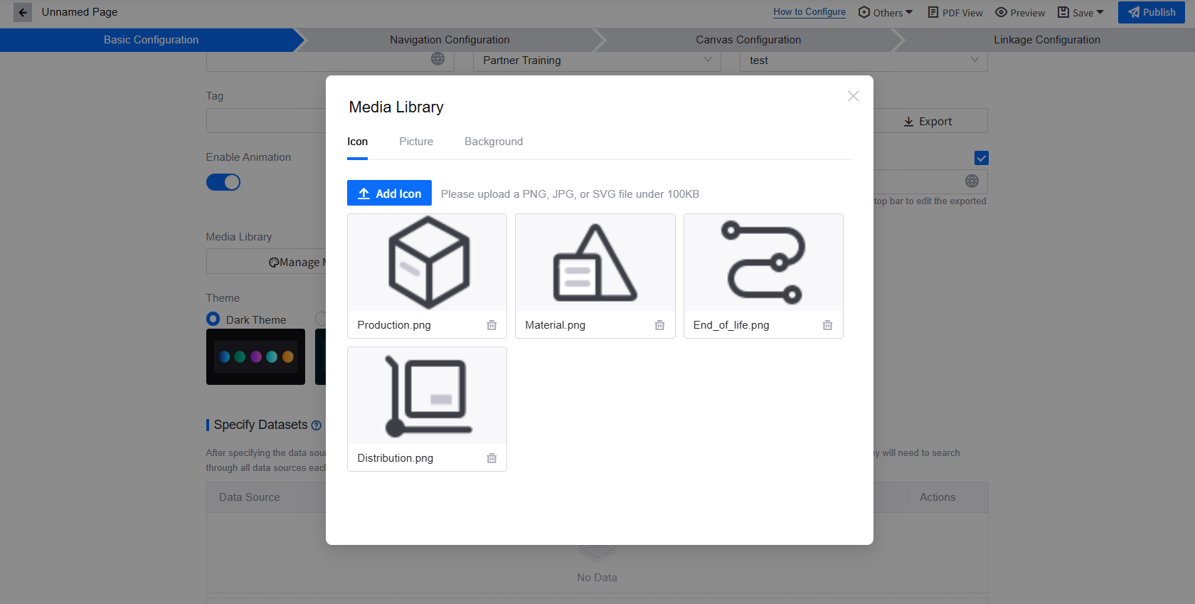
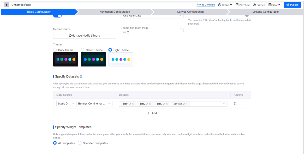
Media Library: SelectManage Media Library and upload the 4 icons and 2 background images from the Media zip.
Theme: Select Light Theme. The theme you select will decide the color of navigators, canvases, and widgets.
Specify Datasets: Click +Add and select all four datasets created under the static data source
Bentley Continental Gt3during Preparation Step 2: Prepare Data Resources.Specify Widget Templates: Select All Templates.


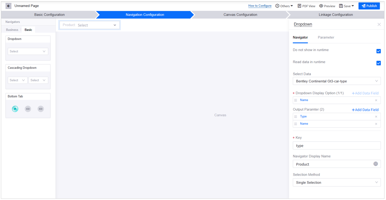
Step 2: Configuring Navigators
As shown in the animation, the app page allows users to filter product type through a Dropdown navigator by single selection. Follow the steps below to add the navigator:
In Navigation Configuration, add a Dropdown filter from the Basic navigator list.
Configure the Dropdown filter:
Do not show in runtime: Select the checkbox to display the filter at the Canvas Title Bar during runtime.
Read data in runtime: Check the checkbox. Although not displayed in the runtime interface, this filter will be quoted in the canvas, hence allowing it to read data is necessary.
Select Data: Select the
car-typedataset from theBentley Continental Gt3data sourceDropdown Display Option: Click +Add Data Field and select Name. Product type names will be the options in the dropdown menu.
Output Parameter: Click +Add Data Field and select both Type and Name. Users switching between filter options will trigger the transmission of
TypeandNameparameter values to the linked canvas or widgets.Key: Enter
typein the input box. The navigator outputs this key to help identify the source of parameters, enabling the application page to determine which canvas or widgets to display.Navigator Display Name: Select
 to assign the navigator’s name in different languages. Enter
 Productin the input box.Selection Method: Select Single Selection.

Step 3: Configuring Canvas
In Canvas Configuration, you will create canvases and layers and configure them according to the design draft.
Tips: Since Canvas 1 and Canvas 2 share the same widgets and data, you can use the Reuse Layer feature to avoid repetitive configuration.
Configuring Canvas 1
A 1-layer canvas with full-screen layout is generated by default when you create the page. From the animation at the beginning of the tutorial you can see that the page layout is not full-screen layout. You need to create a layer with a panel on the right.
In Canvas Configuration, select
 Add Layer in Canvas1 under the Page Hierarchy.
In the Add Layer popup window:
Layer Name: Fill in
Layer2in the input box.Layer Layout: Select the layout with the right panel.
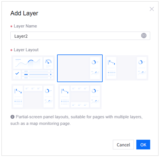
Select
 Configure Layer of Layer2 to open its configuration panel.
In the configuration panel, apply the settings below:
Layer Name:
Layer2Reuse Layer: None
Layer Mask: None
Layer Layout: Right Panel
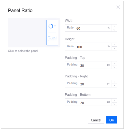
Panel Ratio:
Width: 60%
Height: 100%
Padding - Top: 30px
Padding – Right: 20px
Padding – Bottom: 20px
Embedding Content: Editor
Enable Rounded Panels: Enable
Background Color: Go by the default setting—use theme color
Background Effect: Solid Color
Padding: V 0px, H 0px
Grid Height: 40px. Clear the Adaptive checkbox
Widget Spacing: V 12px, H 12px
Grid Columns: 12
Import Widgets from Dashboard: No configuration needed
Container Rotation: Disable
Enable Rounded-Corner Widgets: Enable
Enable Transparent Background for Widgets: Disable
Widget Header Height: 48px
Widget Header Color: No configuration needed
Refresh Frequency: No Refresh
Merge Request: Enable
Loading Priority: No configuration needed
Select Delete Layer of Layer1 at the Page Hierarchy to remove the default layer. Once you select Delete, the Page Hierarchy will no longer display layers, as Canvas1 will become a one-layer canvas.
Select
Configure Canvas of Canvas1 and apply the following:Canvas Name:
Bentley Continental Gt3Background Image: Upload car1.png from the Media zipped folder
Background Fill: Adaptive
Enable Canvas Title Bar: Enable
Other settings: remain as default.


Configuring Canvas 2
At the Page Hierarchy, select
 Add Canvas to add the second canvas.
In the Add Canvas popup window, set the following:
Canvas Name:
Terra Trek Jeep GladiatorCanvas Type: Single-layer canvas
Select OK to confirm adding the canvas.
At the Page Hierarchy, select
Configure Canvas on canvas Terra Trek Jeep Gladiator and apply the following:Background Image: Upload car2.png from the Media zipped folder
Background Fill: Adaptive
Enable Canvas Title Bar: Enable
Reuse Layer: Bentley Continental Gt3 – Layer2.
Other settings: remain as default.
Editing the Canvas Title Bar
In the target app page, the Dropdown filter is placed at the upper right corner of the canvas. This can be achieved via the Display Navigator in Canvas Title Bar feature.
In Canvas Configuration, select
 from the Canvas Title area to open the configuration panel.
Apply the following settings:
Title: Delete the default text
Canvas Titlefrom the input boxDisplay Navigator in Canvas Title Bar: Select
Dropdown (Product)
Other settings of the Canvas Title Bar: remain as default.
Repeat the above steps in the Terra Trek Jeep Gladiator canvas.

Step 4: Adding Widgets
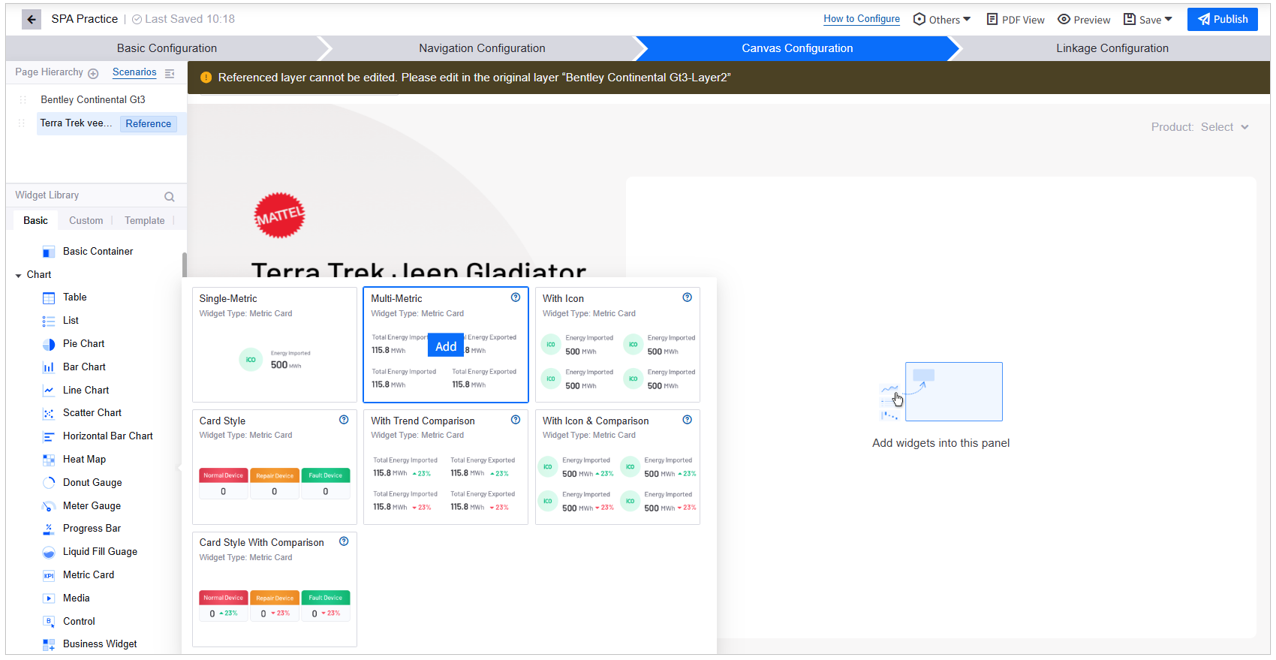
Now that the canvas is ready, you can start configuring the widgets. The image below shows the containers and charts used to build the target application page.

Adding Multi-Metric Cards No.1-4
In Canvas Configuration, find Metric Card from the Widget Library > Basic > Chart list and select Multi-Metric.
Select Edit on the added Metric Card to open its configuration panel.
On the Data tab of the Metric Card configuration panel, apply the following settings:
Select Data Source > Select Data:
Bentley Continental Gt3-data1.Metric: Delete the default items (if any). Select +Add Data Field and select
number (ID: number).Extension: Select +Add Data Field and select
Name. This is not for display purposes but to selectNameas the Static Data Primary Key.Static Data Primary Key: Select Settings and select
Name.Other settings: remain as default.
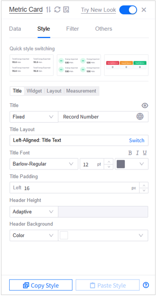
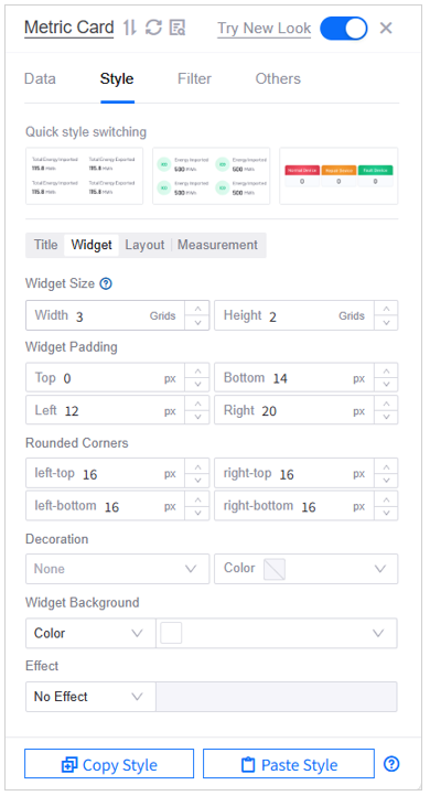
Go to the Style tab and apply the following settings:
Style > Title
Title: Select Fixed and then enter
Record Numberin the input boxTitle Layout: Left-Aligned: Title Text
Title Font: Barlow-Regular, 12pt, color Hex
#757685Title Padding: Left 16px
Header Height: Adaptive
Header Background: Solid color Hex
#FFFFFF
Style > Widget
Widget Size: Width 3 grids, Height 2 grids
Widget Padding: Top 0px, Bottom 14px, Left 12px, Right 20px
Rounded Corners: 16px
Decoration: None
Widget Background: Solid color Hex
#FFFFFFEffect: No effect (Metric Cards No.2-4: Shadow Effect)
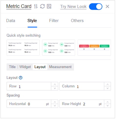
Style > Layout:
Layout: Row 1, Column 1
Spacing: Horizontal 0pt, Row Height 2pt
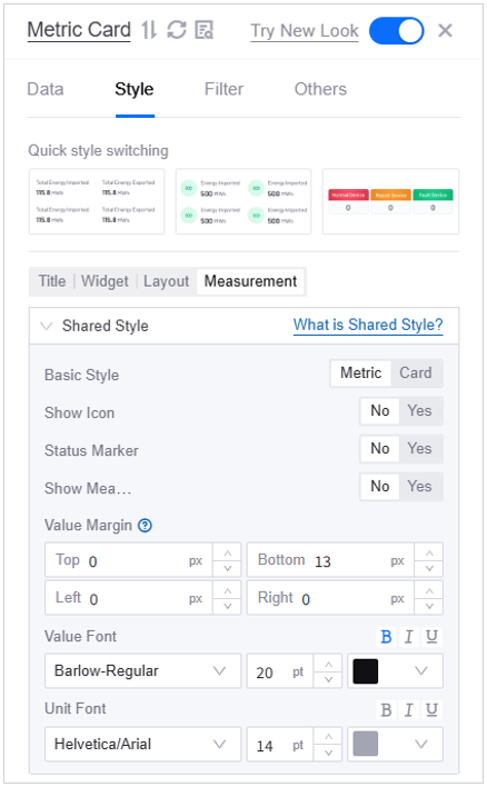
Style > Measurement
Basic Style: Metric
Show Icon: No
Status Marker: No
Show Measurement: No
Value Margin: Top 0px, Bottom 13px, Left 0px, Right 0px
Value Font: Barlow-Regular, 20pt, color Hex
#101015Unit Font: Helvetica/Arial, 14pt, color Hex
#A4A5B3
Add 3 more Metric Cards and apply the above settings on the Style tab.
Go to Style > Title, enter the following titles:
Metric Card No.2:
Calculation BoundaryMetric Card No.3:
Quantity (Declared Unit)Metric Card No.4:
Reporting Period
Go to the Data tab of the Metric Cards and apply the following settings:
Select Data Source > Select Data: Select
Bentley Continental Gt3-data1Metric: Select +Add Data Field and select:
Metric Card No.2: Select
boundaryMetric Card No.3: Select
quantityMetric Card No.4: Select
period
Go to the Filter tab of the Metric Cards and select Click to add linkage. Apply the following settings in the Data Linkage Between Widget and Navigator popup window.
Parameter from Navigator:
NameLinked Data Field:
NameCondition:
=
After establishing the linkage, selecting an item in the navigator will prompt the widget to display metric data whose
Namevalue matches the navigator’s output parameter value.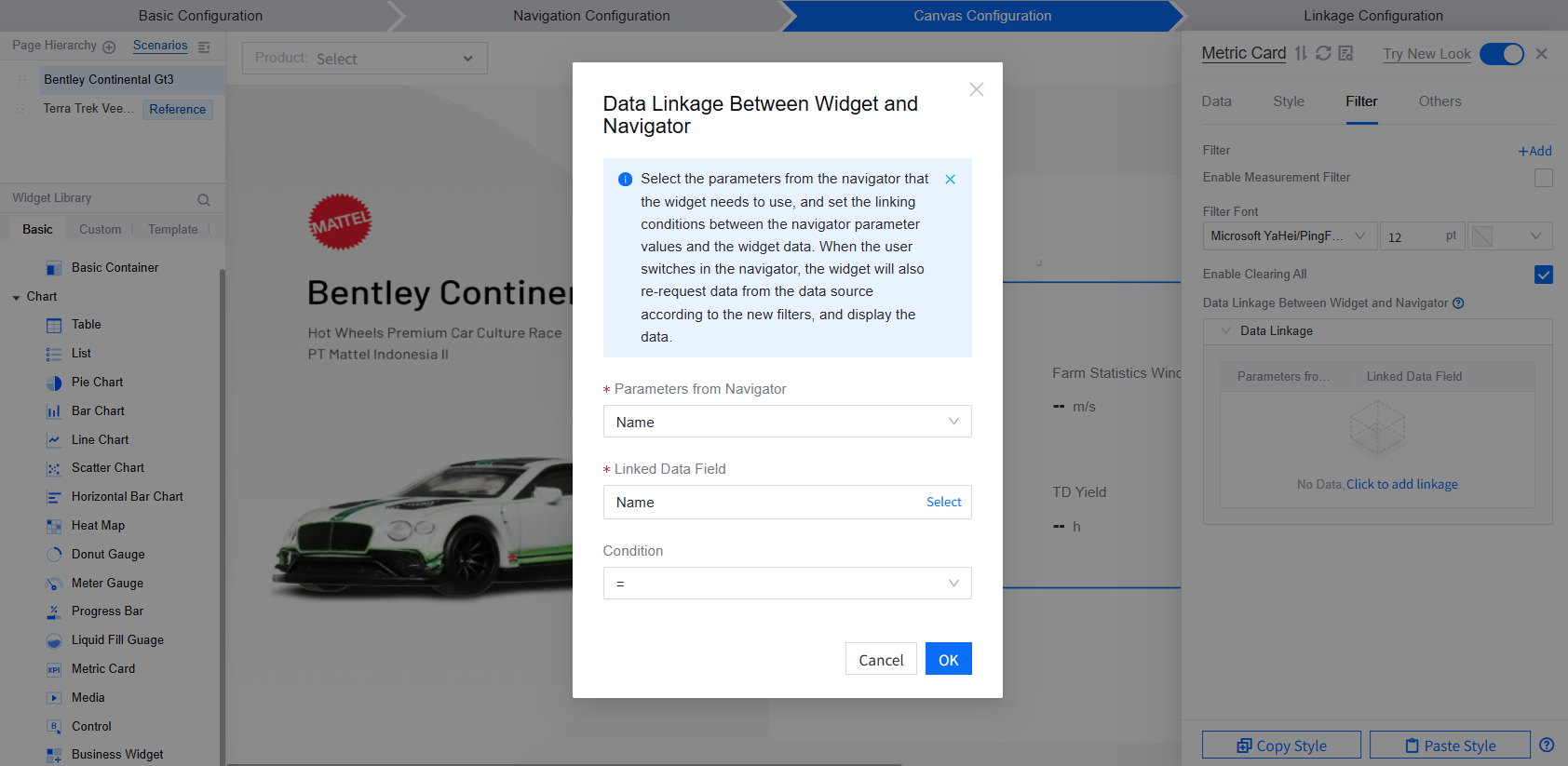
Close the configuration panel. You can then select and drag the Metric Cards to change their position on the page. Ensure that after repositioning, their locations are as follows:
Metric Card No.1: Located in page grid (0, 0).
Metric Card No.2: Located in page grid (3, 0).
Metric Card No.3: Located in page grid (6, 0).
Metric Card No.4: Located in page grid (9, 0).
By hovering over
 on the widgets, you can check their position on the page. They will be arranged as shown in the image below:


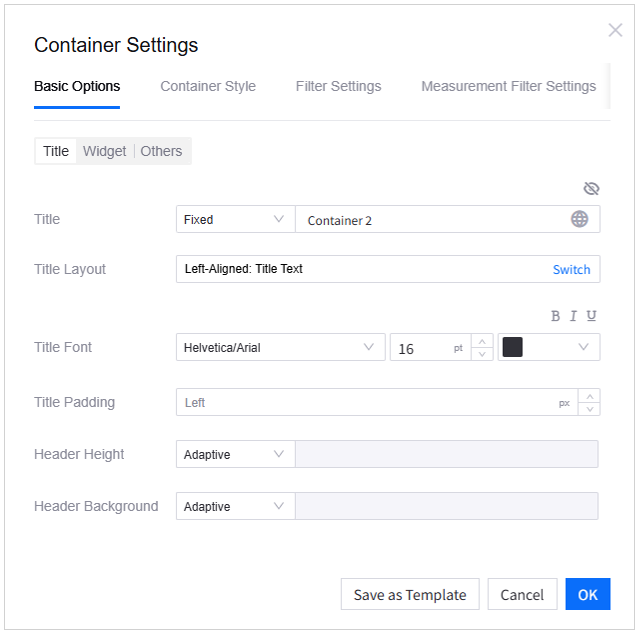
Adding Container No.1
Containers are designed to hold and manage other widgets. You can add a container and some charts into the panel before moving the charts into the container. Follow the steps below to set up Container No.1:
In Canvas Configuration, go to Widget Library > Basic > Container > Basic Container, add the Default container to the page.
Select Edit
 on the container.
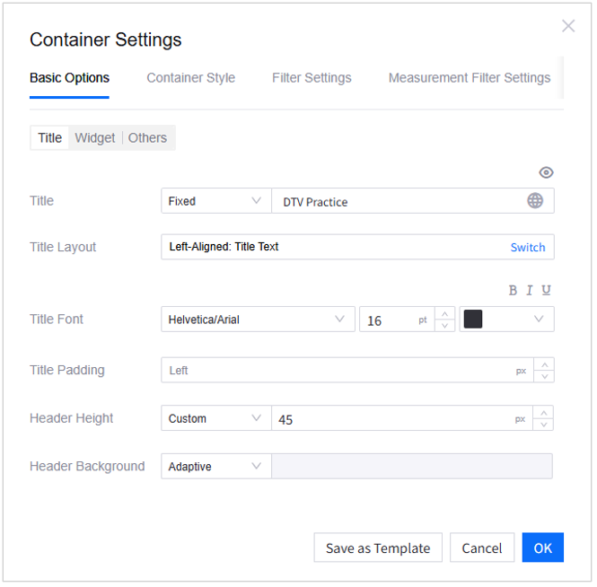
On the Basic Options tab of the Container Settings popup window, apply the settings below:
Title:
Title: Select Fixed and enter a custom title
Header Height: Custom, 45px
Widget:
Widget Size: Width 12 grids, Height 6 grids
Widget Padding: Top and Bottom 0px, Left and Right 14px
Grid Height: 40px, clear the Adaptive checkbox
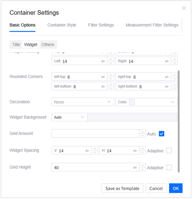
Other settings: remain as default.


Adding Multi-Metric Card No.5
Following the same steps while creating Metric Cards No.1-4, add a Multi-Metric Card. Select Edit to open its configuration panel.
On the Data tab, apply the following settings:
Select Data Source > Select Data:
Bentley Continental Gt3-data1Metric:
Delete the default items (if any)
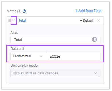
Select +Add Data Field, and then select
Total (ID: total)In the expanded section of Total, for Data Unit, select Customized, and enter
gCO2e
Extension: Select +Add Data Field and select
Name. This is not for display purposes but to select Name as the Static Data Primary KeyStatic Data Primary Key: Select Settings and select
Name
On the Style tab, apply the following settings:
Title
Title: Select Fixed and enter
TotalTitle Font: Helvetica/Arial, 18pt, color Hex
#101015Title Padding: Left 20px
Widget
Widget Size: Width 3 grids, Height 1.8 grids
Widget Padding: 0px
Rounded Corners: 8px
Decoration: None
Effect: Shadow Effect
Shadow Style: X Offset 0px, Y Offset 0px, Blur 20px, Spread 0px
Layout
Layout: Row 1 and Column 1
Spacing: 0pt
Measurement
Basic Style: Metric
Show Icon: No
Status Marker: No
Show Measurement: Yes
Layout: Alignment Left, Name Top
Name-Value Spacing: -5px
Name Margin: 0px
Value Margin: Top 0px, Bottom 0px, Left 0px, Right 9px
Name Font: Barlow-Regular, 14pt, color Hex
#5F5F6BValue Font: Barlow-Regular, 36pt, color Hex
#101015Unit Font: Barlow-Regular, 12pt, color Hex
#5F5F6BDecimal Places: 2, enable Show Thousands Separator
Switch to the Filter tab, select Click to add linkage, and apply the following settings in the Data Linkage Between Widget and Navigator popup window:
Parameter from Navigator:
NameLinked Data Field:
NameCondition:
=
Other items: remain as default.
Close the configuration panel.
Hover over the Multi-Metric Card 5 and select
 Add to Container to put it into Container 1.
Select and move the Multi-Metric Card No.5 to arrange its position at the (0, 0) of the container. Its position should be as shown below.


Adding a Table
In Canvas Configuration > Widget Library > Basic > Chart, select Table with Progress Bar.
Add the table to Container No.1. Its position within the container should be (0, 1.8).
Select
to start configuring the table.Apply the settings below:
On the Data tab:
Select Data Source > Select Data:
Bentley Continental Gt3-data2Dimension: Delete the default items (if any) and select +Add Data Field to select
itemMeasurement: Delete the default items (if any) and select the +Add Data Field to select
data,percent-value, andpercentExtension: Select +Add Data Field and select
NameandpercentStatic Data Primary Key: Select Settings and select
Name
On the Style tab:
Title: Select
 to hide the title
Widget:
Widget Size: Width 12 grids, Height 9 grids
Widget Padding: 0px
Rounded Corners: 8px
Layout:
Enable Pagination: Disable
Rows per Single Page: 50
Row Height: 1
Column Width: Disable Auto and apply
Data: 100px
Percent: 200px
Item: 150px
Percent-value: 50px
Series:
Show Thousands Separator: Enable
Percent (Measurement): Apply the settings below in Content Color Rule > Configure Segment Rule to display data with gradient color in the progress bar:
From 0 to 0.02: Color Hex
#E81C2C,R232,G28,B44,A40From 0.02 to 0.4: Color Hex
#E81C2C,R232,G28,B44,A70From 0.4 to 1: Color Hex
#E81C2C,R232,G28,B44,A100
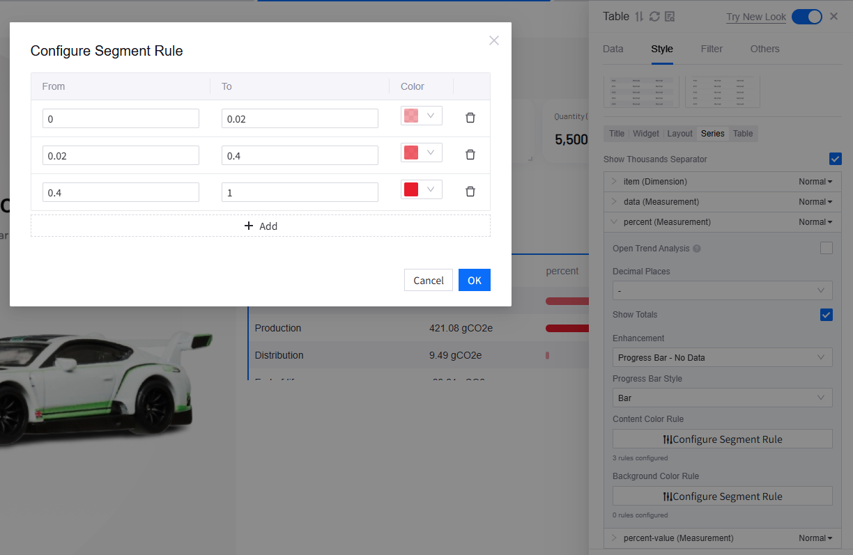
Table:
Header > Font: 0pt
Content > Font: Barlow-Regular, 14pt, color Hex
#848496
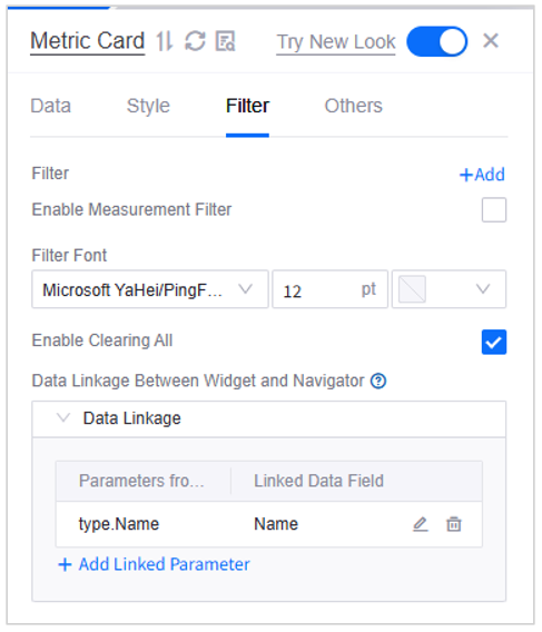
On the Filter tab, select Click to add linkage and apply the following:
Parameters from Navigator:
NameLinked Data Field:
NameCondition:
=
Other settings of the Table: remain as default.

Adding Container No.2-5
Repeat the above settings for Container No.1 to set up Containers No.2 to No.5. In addition, apply the settings below:
Select Edit to open the Container Settings popup window.
On the Basic Options tab:
Title:
Select
to hide the container titleTitle: Fixed. Enter Container No.2-5 respectively. This is to help you choose the right containers for adding charts, not for display on the page.
Header Height: Adaptive
Widget:
Widget Size: Width 3 grids, Height 4 grids
Widget Padding: 0px
Rounded Corners: 16px
Widget Spacing: 0px
Grid Height: 30px, clear the Adaptive checkbox
Other settings: remain as default
Select OK to save the settings.
Select and drag Container No. 2-5 to position them at the following location on the page:
Container No.2: Grid (0, 12)
Container No.3: Grid (3, 12)
Container No.4: Grid (6, 12)
Container No.5: Grid (9, 12)

Adding Multi-Metric Card No.6-9
In Canvas Configuration, find Metric Card from the Widget Library > Basic > Chart list. Select Multi-Metric and add four multi-metric cards to the canvas.
Select Edit on Metric Card No.6 to open its configuration panel.
On the Data tab, apply the following settings:
Select Data Source > Select Data: Select
Bentley Continental Gt3-data3Metric:
Delete the default items (if any)
Select +Add Data Field, and then select
Material Acquisition (ID: Material Acquisition)
Extension: Select +Add Data Field and select
Name. This is not for display purposes but to select Name as the Static Data Primary Key.Static Data Primary Key: Select Settings and select
NameOther settings: remain as default
Go to the Style tab and apply the following settings:
Style > Title
Title: Select
to hide the title of the metric card
Style > Widget
Widget Size: Width 12 grids, Height 1.3 grids
Widget Padding: Top 0px, Bottom 0px, Left 10px, Right 0px
Rounded Corners: 8px
Style > Layout
Layout: Row 1, Column 1
Spacing: Horizontal 0pt, Row Height 2pt
Style > Measurement
Basic Style: Metric
Show Icon: Yes
Status Marker: No
Show Measurement: Yes
Layout: Alignment: Left, Name: Top
Name-Value Spacing: -4px
Name Font: Barlow-Regular, 14pt, color Hex
#3E3E47Value Font: Barlow-Regular, 10pt, color Hex
#8A8B99Unit Font: Helvetica/Arial, 14pt, color Hex
#A4A5B3Single Measurement Style > Show Icon: Select Custom and use image Material.png
Icon Size: 12pt
Other settings: remain as default
Select Edit of Multi-Metric Card No.7-9 to open their configuration panels. Apply the same settings above on the Style tab.
On the Data tab of Multi-Metric Card No.7-9, apply the settings below:
Select Data Source > Select Data: Select
Bentley Continental Gt3-data3Metric: Delete the default items (if any)
Multi-Metric Card No. 7: Select +Add Data Field and select
ProductionMulti-Metric Card No. 8: Select +Add Data Field and select
DistributionMulti-Metric Card No. 9: Select +Add Data Field and select
End-of-life
On the Style tab of Multi-Metric Card No.7-9, customize their show icons in the Measurement section > Single Measurement Style.
Multi-Metric Card No. 7: Use image Production.png
Multi-Metric Card No. 8: Use image Distribution.png
Multi-Metric Card No. 9: Use image End-of-life.png
On the Filter tab of Multi-Metric Card No.7-9, select Click to add linkage and apply the settings below:
Parameters from Navigator:
NameLinked Data Field > Select > Data Field:
NameCondition:
=
Close the configuration panel.
Hover over Multi-Metric Card No.6-9 and select
Add to Container to place them into Container No.2-5 respectively.Select to move the Multi-Metric Cards. Keep their position at the (0, 0) of the corresponding containers.

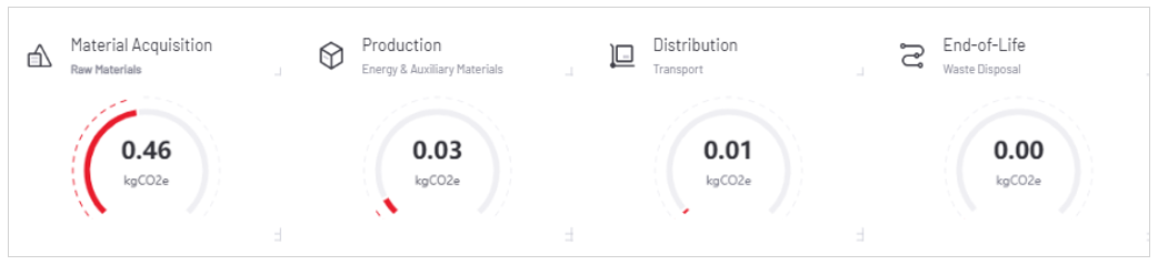
Adding Meter Gauge No.1-4
In Canvas Configuration, find Meter Gauge from the Widget Library > Basic > Chart list**.
Add 4 Basic Meter Gauges to the canvas.
Select Edit on the Basic Meter Gauge No.1 to open its configuration panel.
On the Basic tab, apply the settings below:
Title: Select
to hide the titleWidget > Widget Size: Width 12 grids, Height 4.5 grids
Widget Padding: 0px
On the Data tab, apply the settings below:
Select Data Source > Select Data: Select
Bentley Continental Gt3-data3Measurement
Delete the default items (if any)
Select +Add Data Field and then select
Material Acquisition (ID: Material Acquisition-d)Enter
kgCO2efor Unit in the expanded section
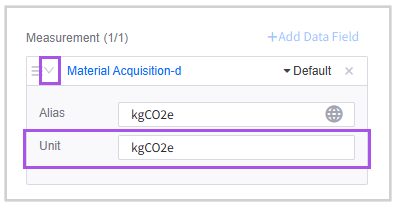
Extension: Select +Add Data Field, and then select
Name. This is not for display purposes but to selectNameas the Static Data Primary KeyStatic Data Primary Key: Select Settings and select
NameOther settings: remain as default
Go to the Style tab and apply the following settings:
Chart Layout: Ring Style
Show Name: Enable
Name Font: Barlow-Regular, 10pt, color Hex
#757685Unit Font: Barlow-Regular, Bold, 12pt, color Hex
#5F5F6BValue Font: Barlow-Regular, Bold, 20pt, color Hex
#313138Axis Range: Min 0, Max 1
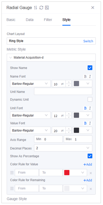
Color Rule for Value: Solid color, Hex
#E81C2CColor Rule for Remaining: Solid color, Hex
#EFEFF3Gauge Style: Gauge Thickness 5pt
Select Edit of Basic Meter Gauge No.2-4 and apply the same settings above.
On the Data tab, apply the settings below:
Select Data Source > Select Data: Select
Bentley Continental Gt3-data3Measurement: Delete the default items (if any)
Basic Meter Gauge No.2: Select +Add Data Field, and then select
Production-dBasic Meter Gauge No.3: Select +Add Data Field, and then select
Distribution-dBasic Meter Gauge No.3: Select +Add Data Field, and then select
End-of-life-d
On the Filter tab of Basic Meter Gauge No.1-4, select Click to add linkage and apply the settings below:
Parameters from Navigator:
NameLinked Data Field > Select > Data Field:
NameCondition:
=
Hover over Basic Meter Gauge No.1-4, and then select Add to Container to place them into Container No.2-5 respectively.
Select to move Basic Meter Gauge No.1-4, keeping their position at the (0, 13) of the corresponding containers.
After the arrangement, Basic Meter Gauge No.1-4 will be like the image below.


Step 5: Checking Canvas 2
In the previous settings, you have selected Canvas1 (Bentley Continental Gt3) to be the reused layer on Canvas2 (Terra Trek Jeep Gladiator). Now switch to Canvas2 and make sure that all your settings are applied.

Configuring Linkage
To enable users to seamlessly switch between different canvases and filter data using the navigators, it is necessary to establish linkages among the navigator, the canvases, and the widgets.
Linking the Navigator to Canvases
Begin by ensuring that the navigator is properly connected to each canvas. As users select different options, the corresponding canvas will update automatically to reflect their choice.
In Linkage Configuration, select the Canvas Linkage tab.
In the Select Navigator dropdown menu, select Dropdown (Product).
In the Select Condition for Switching Canvas via Navigator section, select Switch and select
Namein the Add Origin Data popup window. This ensures that when the navigator’s output parameterNamevalue matches the canvasNamevalue, the corresponding canvas will be displayed on the page.In the Link to Canvas section, select +Add Condition to establish the following links:
Condition:
Bentley Continental Gt3; Linked Canvas:Bentley Continental Gt3Condition:
Terra Trek Jeep Gladiator; Linked Canvas:Terra Trek Jeep Gladiator
In the Select Default Canvas section, assign
Bentley Continental Gt3to be the default canvas when the navigator is not used.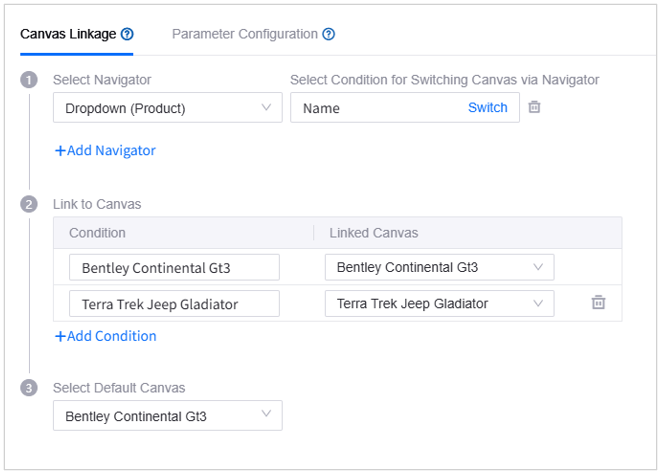

Linking the Navigator to Widgets
In Linkage Configuration, select the Parameter Configuration tab. In this section, you form links between the navigator and the widgets to ensure that, upon selection in the navigator, the relevant data is presented in the corresponding widgets.
The linkages that you have established during widget configuration at Step 4 are displayed on the tab. You can switch canvas to view, edit, or delete the links.

Publication
Once you have completed configuration for the page, you can follow the steps below to test and publish it.
Step 1: Previewing the Page
Select Preview to verify that data presentation and navigator linkages are accurately displayed in the runtime interface. You can go through the following items:
All widgets display the right data.
The Dropdown navigator is on the upper right corner of the page.
When you switch selections via the navigator, both the canvas and the widget data update accordingly.
Hover over
 on the upper right corner of the page to access the Integrated/Static toggle. If you select Integrated, the application page displays actual data from the connected devices; if you select Static, the page uses static data that you provide.

Step 2: Publishing the Page
Click
 to exit the preview runtime interface after ensuring that your page is all set.
Select Publish in the configuration interface.
Select OK to confirm publishing the page. This will trigger automatic configuration validation. Any issues found that may compromise the functionality of the app page will be displayed, reminding you to modify before publishing.
If you want to continue publishing without addressing the detected issues, select All Checked, Publish.
After successfully publishing the page, you can copy the Page URL and Static Data Entry Page URL from the popup window.

Step 3: Trying Static Data Entry
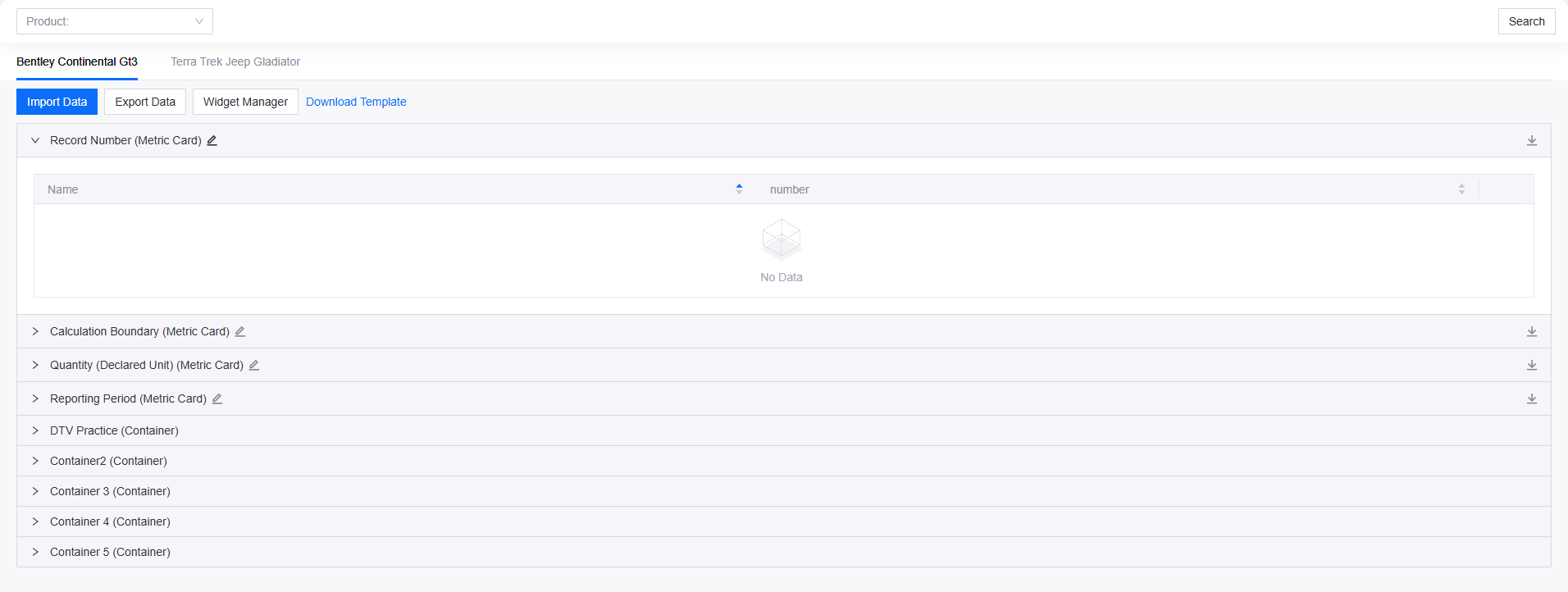
Open the Static Data Entry Page URL in your browser.
Choose one of the following ways to test the static data entry function:
Select Download Template, enter your static data, and select Import Data to upload the file.
Select
for each widget to enter static data.
Open the Page URL in your browser. Use the Integrated Data/Static Data toggle to verify that the static data you imported or entered is correctly displayed on the page. For more information, see Submit Static Data.

Step 4: Using the Page
You may now distribute the Page URL to the end users and assign page permissions accordingly. For more information, see Use the Page.
Summary
By completing this tutorial, you have acquired the skills necessary to build a web application for data visualization. As a next step, you are encouraged to explore the features and capabilities of the single-page application with the help of DTV’s documentation.