Horizontal Bar Chart
A horizontal bar chart compares values across categories using bars that extend horizontally. Compared with a vertical bar chart, its Y-axis is the category axis and its X-axis is the value axis, which suits long category names or a large number of categories and makes the chart easier to read and compare.

This topic describes the configuration items specific to the horizontal bar chart. Its configuration panel has four tabs: Basic, Data, Filter, and Style. For general content such as configuring data sources and data fields, filters, and widget linkage, see Common Configurations for Charts.
Types of Horizontal Bar Chart
When adding a widget, the Horizontal Bar Chart group provides the following options:
Horizontal bar chart preset |
Style |
Description |
Recommended scenario |
|---|---|---|---|
Basic Horizontal Bar |
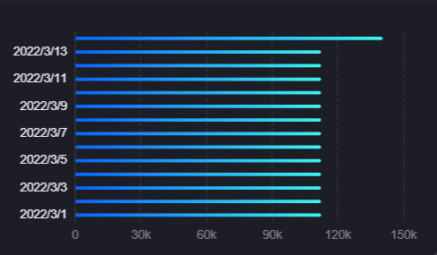
|
The bars of each measurement sit side by side under the same category, comparing absolute values directly. |
Comparing categorical data such as output per production line or alarm counts per region. |
Stacked Horizontal Bar |
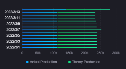
|
The bars of each measurement stack into a single bar under the same category, showing the total and its composition. |
Showing the total energy consumption of each workshop and the share of electricity, gas, and water within it. |
The two presets use the same widget and the same configuration panel, so you can switch between them in the style settings at any time after creating one. Their default values differ as follows:
Stack: cleared by default in the basic horizontal bar, selected by default in the stacked horizontal bar.
Legend: hidden by default in the basic horizontal bar, shown by default in the stacked horizontal bar; their default legend fonts differ too.
Demo data: the basic horizontal bar comes with 1 measurement, the stacked horizontal bar with 2.
Timeline and Pareto Chart are listed in the same group as the horizontal bar chart but are separate widget types whose configuration panels are entirely different. See Timeline and Pareto Chart.
Data of Horizontal Bar Chart
The horizontal bar chart centers on measurements, uses dimensions to divide categories, and uses extension fields to enrich the data shown in the hover tooltip.
For general information about data sources and data fields, see Common Configurations for Charts > Configuring Data.
Dimension
Dimension determines the categories on the Y-axis. Each dimension value corresponds to one group of bars, and the length of the bars is determined by the measurement values. A horizontal bar chart requires exactly 1 dimension field.
Measurement
Measurement is the core data of the horizontal bar chart and determines the length of each bar. The chart supports 1 or more measurement fields, and each measurement produces one bar series. When several measurements are added, the bars under the same dimension value sit side by side by default, and selecting Stack switches them to a stacked display.
Extension
Extension fields are not shown in the chart directly; they provide additional data in the tooltip when the mouse hovers over a bar. For example, to show a year-on-year value, a month-on-month value, or another reference value on hover, add those fields as extensions and then select the field to show in Data Shown on Hover. There is no limit on the number of extension fields.
Note
The horizontal bar chart does not support Comparison fields. To split series by comparison value, use the Bar Chart instead.
Style of Horizontal Bar Chart
The Style tab is grouped into metric style, axis style, and other settings.
The common configuration of the title, widget, and interactions sits on the Basic tab, in three groups, Title, Widget, and Others: for the Title and Widget groups, see the title and widget content in Common Configurations for Charts > Configuring Style; for the Others group, see Common Configurations for Charts > Configuring Other Items. The new configuration panel places this content on the Style and Others tabs instead, but the items themselves are the same.
Metric Style
Metric Style controls the colors of the bars and their overall arrangement. This section is shown only once a measurement field has been added.
Color
Once measurement fields have been added, each measurement gets its own configuration card, in which you select a solid or gradient color for its bars. Without individual configuration, the bars take colors from the theme palette in order.
Rounded Corners
Rounded Corners is selected by default, giving the four corners of a bar a 4 px radius, which softens the look of the chart. When cleared, the bars have square corners. The radius is fixed and cannot be set numerically.
Stack
When Stack is selected, the bars of several measurements under the same dimension value combine into one bar, showing the composition of the measurements as a whole. When cleared, the bars sit side by side, which makes the absolute values of each measurement easy to compare directly. The basic horizontal bar clears it by default and the stacked horizontal bar selects it by default.
Show Thousands Separator
When Show Thousands Separator is selected, the values in the tooltip and the tick labels on the X-axis and Y-axis are shown with a thousands separator, for example 1000000 becomes 1,000,000, which makes large values easier to read. Cleared by default.
Bar Spacing
Bar Spacing controls the vertical spacing between the bar groups of different dimension values, expressed as a percentage with a default of 75%. Increasing the spacing makes the categories easier to tell apart; reducing it makes the chart more compact.
Axis Style
Axis Style configures the appearance of the X-axis (value axis) and the Y-axis (category axis) separately. Each axis occupies its own section, and you can hide an axis with the eye button  on the section title.
Both axes share the following items:
Name: The name or unit shown beside the axis, as a single-line input box that does not support multiple languages. When left empty, the X-axis shows the alias or name of the first measurement field and the Y-axis shows the alias or name of the dimension field.
Name Axis Margin: The distance between the axis name and the axis line. When Auto is selected the system calculates it; clear Auto to enter a value manually.
Axis Range: Auto is selected by default and the system calculates the tick range from the data. Clear it to specify Min and Max manually; the X-axis additionally allows Seg (the number of segments), which the Y-axis does not provide.
Label Settings: Contains 3 side-by-side items. Type determines the field type used to interpret the tick labels, with options Value, Category, and Time; the X-axis defaults to Value and the Y-axis to Category. The options of Format vary with the type (Value:
auto,none,k,m,g; Time:YYYY-MM-DD HH:mm:ss,YYYY-MM-DD,HH:mm, and so on; Category: onlynone). Tilt Angle rotates the tick labels in degrees, which prevents long labels from overlapping.Label Axis Margin: The distance between the tick labels and the axis line. Also supports Auto or a manual value.
Axis Font: Sets the font, font size, color, bold, and italic style of the tick labels.
Unit Font: Sets the font, font size, color, bold, and italic style of the axis name.
Axis Line: Sets the line type, thickness, and color of the axis line. The X-axis defaults to a line width of 0, so no axis line is visible; the Y-axis defaults to a 1 pt solid line.
Grid Line: Sets the line type, thickness, and color of the grid lines extending from the ticks of this axis. The X-axis shows dashed grid lines by default; the Y-axis shows none.
Show Scalar Bar: Cleared by default. When selected, a draggable range bar appears beside the axis so that end users can zoom into part of the data at runtime, which is especially useful when there are many data entries.
The following items are provided on the X-axis only:
Dynamic Unit: When selected, values are converted automatically to a simplified notation according to their magnitude. For the DTV unit library and its conversion logic, see DTV Unit Library.
Decimal Places: Sets how many decimal places the numeric labels keep, with a default of 2. Shown only when the Type in Label Settings is Value. This setting also determines the decimal places of the values in the tooltip.
Other Settings
Legend
The legend helps users identify which color belongs to which measurement, which is useful once several measurements have been added. Use the eye button to show or hide it: the basic horizontal bar hides the legend by default and the stacked horizontal bar shows it. The Pareto chart reuses the same set of legend items.
Position: Determines the position of the legend relative to the chart. Options are bottom-middle, left-middle, top-middle, top-right, and right-middle, with bottom-middle as the default.
Legend Margin: Shown only when Position is top-right. When Auto is selected the system calculates it; clear it to set the top and right margins separately.
Legend Name-Value Middle Spacing: Controls the distance between the name and the value in the legend.
Size: Controls the size of the legend color blocks and the spacing between legend items. When Auto is selected, DTV calculates it from the chart size; you can also enter pixel values for precise control. Both horizontal bar chart presets clear Auto by default, with an 8 px block and 40 px spacing.
Legend Font: Sets the font, size, and color of the legend text so that it matches the overall visual style.
Data Shown on Hover
Data Shown on Hover sits inside the Legend section and lets you select one field from the Extension data fields. When the mouse hovers over a bar, the value of that field replaces the measurement value in the tooltip as reference information. For example, use the value for the same period as an extension field, and hovering compares the current value with it without switching views.
The dropdown list defaults to None, and its options come from the extension fields currently configured. If an extension field is removed and the previously selected field no longer exists, this setting resets to None automatically.
Note
This item is hidden automatically once several measurements are added; it is shown only when there is no more than 1 measurement.
Interactions at Runtime
The widget provides the following behaviors at runtime:
Tooltip: Hovering the mouse over a category shows a tooltip listing the name, color, and value of each series in that category, along with the unit of the data field. Whether the tooltip appears is controlled by Show Tooltip. See Common Configurations for Charts > Show Tooltip.
Widget linkage: The horizontal bar chart can act as a linkage source. Once linkage is configured, selecting an area of the chart triggers it with the dimension value at the clicked position, and the clicked category is marked with a highlight band. The Reset Link icon in the upper right corner of the chart clears a triggered linkage value. For the configuration method, see Link Other Widgets.
Zooming: Once Show Scalar Bar is selected in Axis Style, a range bar appears beside the axis and end users can drag it to zoom into part of the data.
Empty state: When no measurement field has been added, an empty-state prompt is shown; when a measurement has been added but the query returns no data, an empty coordinate system is shown.