Pie Chart
Note
This widget already supports the new configuration panel, and this topic describes the new panel by default. You can switch panels at any time in the upper right corner of the chart configuration panel without affecting your configuration.
A pie chart uses a circle divided into slices of different proportions to show the share each part takes in the total, usually expressed as a percentage. All parts of a pie chart add up to 100%.

This topic describes the configuration items specific to the pie chart. For the items common to all charts, such as the Filter tab and the Others tab, see Common Configurations for Charts.
Types of Pie Chart
The basic type of pie chart is a donut-shaped pie chart. Building on it, DTV presets several common pie chart types. When adding a pie chart to a page, choose from the following according to your business scenario:
Pie chart type |
Style |
Description |
Recommended scenario |
|---|---|---|---|
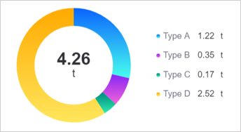
Basic Pie |
|
Shows the composition of a single measurement. |
Showing the overall composition of one measurement. |
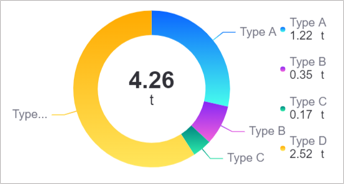
With Label |
|
Adds data labels on top of the basic pie chart. |
When specific values need to be shown as well as proportions. |
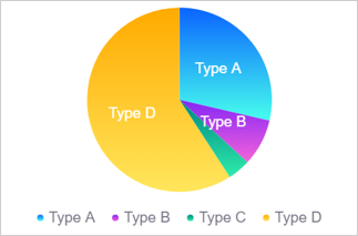
Solid Pie |
|
Fills the pie chart solid on top of the basic pie chart. |
When a stronger visual effect is wanted. |
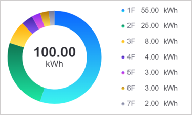
Multi-Metric Pie |
|
Shows the composition of multiple measurements. |
When the data has only multiple measurements and there is no single dimension to summarize them, the multi-metric pie chart produces a pie chart of the proportions of several measurements. |
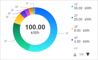
Multi-Metric with Label |
|
Adds data labels on top of the multi-metric pie chart. |
When specific values need to be shown as well as proportions. |
Note
The rose chart, the 3D pie chart, and the multi-metric 3D pie chart are separate chart types whose configuration differs from the traditional pie chart. See Rose Chart and 3D Pie Chart.
Data of Pie Chart
The data of a pie chart centers on Measurement, and Dimension splits a measurement into multiple slices. The field constraints of the basic pie chart and of separate presets such as the multi-metric pie chart may differ.
For general information about data sources and data fields, see Common Configurations for Charts > Configuring Data.
Basic Pie Chart
A basic pie chart requires 1 dimension and supports 1 or more measurements; comparison fields are not supported. Dimension values determine the slice categories and measurement values determine the value and proportion of each slice. In the example below, Type is the dimension and CarbonEmission is the measurement.

The data of the basic pie chart can then be configured as follows:

Measurement
Measurements are the core data shown in a pie chart. In the example above, the basic pie chart shows the value and proportion of CarbonEmission under each Type, with one slice per equipment type.
A basic pie chart supports 1 or more measurements. When you add several measurements, each one produces its own pie chart, and you can arrange those pie charts in rows and columns with Layout.

Dimension
Dimensions divide the slices into categories. In the data source, a measurement can be split into multiple rows by a field such as the equipment type Type; once that field is configured as the Dimension, the pie chart shows the composition of one measurement across the dimension values.

If the data has no dimension and you need to combine several measurements into one pie chart, select Multi-Metric Pie when adding the widget. The difference is that a basic pie chart with several measurements produces one separate pie chart per measurement (which you can arrange with Layout), while the multi-metric pie chart uses no dimension and combines the measurements as slices within a single pie chart.
Extension
The optional Extension field provides reference data beyond the measurements, such as the value for the same period last month. An extension field does not add slices on its own; once added, you can select it in Display Extension to show it as the center total or as the legend value. The dropdown options update in step with the current extension fields.

Extension data can be shown in the following positions of a pie chart:
Sum: The sum sits at the center of the pie chart and by default shows the total of all measurement values. In Display Extension you can replace that value with any Extension field, in which case Sum shows the first value of the extension field. For example, after you select
LastMonthCarbonEmission, Sum shows the carbon emission ofType Afor the same period last month.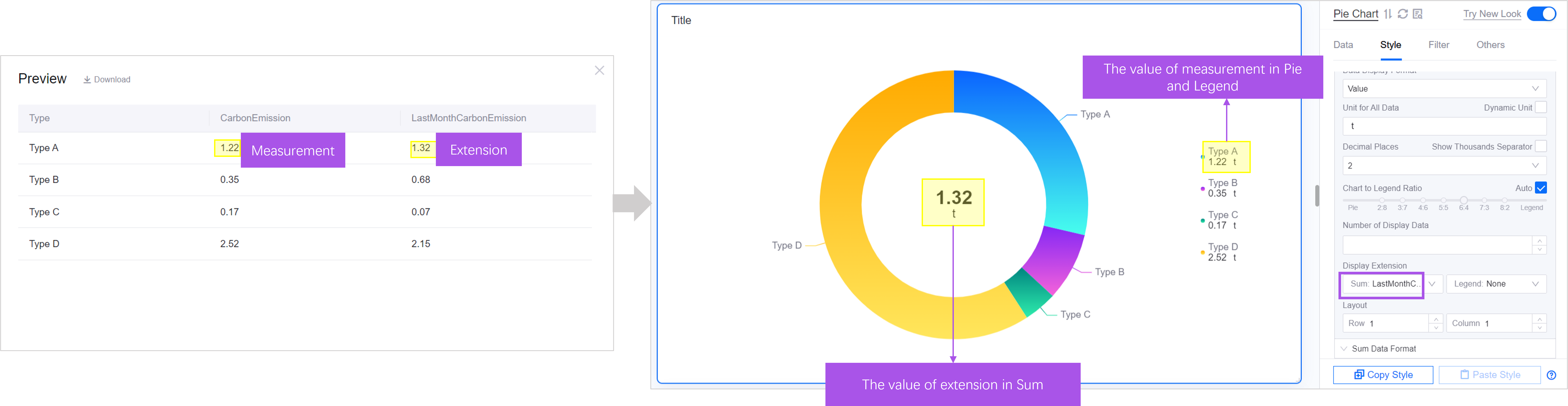
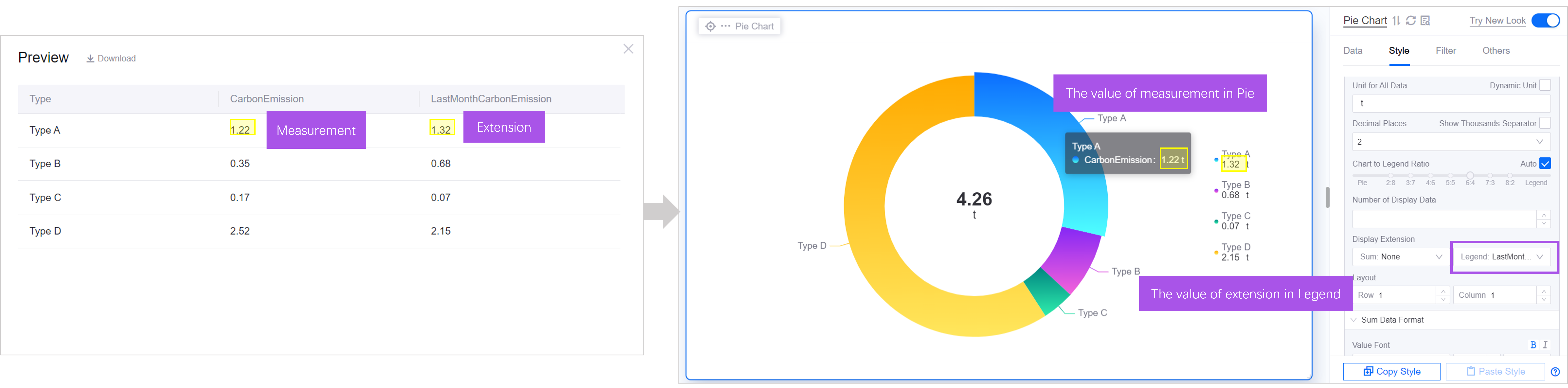
Legend: By default the values in the legend are the values of the slices. In Display Extension you can replace them with any Extension field, as reference data for the measurement values of the pie chart.


Multi-Metric Pie Chart
The multi-metric pie chart is a separate widget you can select when adding a widget. It suits data that has no dimension for splitting slices but several measurements to compare. It provides no Dimension data field entry; the measurements are combined directly as slices within a single pie chart.

The data of the multi-metric pie chart can be configured as follows:

Measurement
Measurements are the core data shown in a pie chart. In the example above, the multi-metric pie chart shows the share each Type measurement takes in the total. By default the latest entry is shown, that is the first row of the data list. If needed, use Aggregation to aggregate the data under a measurement by column, with methods such as Sum and Average. For more information, see Display Aggregated Data.


Extension
Extension fields have no effect in the multi-metric pie chart.
Unit
The units of the pie chart and the multi-metric pie chart are configured per data field on the Data tab; the Style tab provides no unit name or dynamic unit item.
In the settings of a data field you can configure Unit (select a standard unit from the Unit Library, or select Custom and enter it manually) and Unit display mode:
Display data units: Shows the unit that comes with the data field.
Display specified units: Always shows the unit you specify, in which case the Display units item appears.
Display units as data changes: Converts the value to a simplified notation according to its magnitude, for example “22000 t” is shown as “22 kt”. The The smallest unit item then appears to set the lower bound of the conversion. This mode is equivalent to Dynamic Unit in the old panel.
The Multi-Metric Pie Chart additionally provides Set as Global Unit, which uses the unit of one data field as the unit of the whole widget; this item does not apply to Extension data fields. The ordinary pie chart does not provide it.
For general information about units and the conversion logic of the unit library, see Common Configurations for Charts > Configuring Units per Data Field and DTV Unit Library.
Note
If a pie chart was configured with a unit name or dynamic unit in the old panel, those values map automatically to the settings above, with dynamic unit mapping to Display units as data changes.
Style of Pie Chart
The Style tab organizes the configuration items in the order Title, Widget, Pie Chart, Legend, and Mark. For the common title and widget styles, see Common Configurations for Charts > Configuring Style.
Pie Chart
Pie Fill
Pie Fill determines how the slices are colored. Options are Solid and Gradient.
Chart Format
Chart Format defines the appearance of the pie chart. The following shapes are supported:
Pie: A standard circular pie chart.
Donut: A donut-shaped pie chart with a hollow center.
Ring to Cutout Ratio
When Chart Format is Donut, the drawing area of the pie chart is determined by the outer and inner circles together:
Inner Diameter is the diameter of the inner circle at the center of the chart.
Outer Diameter is the difference between the outer and inner circle diameters.
Adjust the ratio between the inner and outer diameters to change the thickness of the donut. This item only takes effect when Chart Format is Donut.

Data Display Format
Data Display Format sets how the value of each data field is presented in the legend:
Value: Shows only the raw value of the data field.
Percentage: Shows only the share the data field takes in the total.
Value + Percentage: Shows both the raw value and its share of the total.
No Data: Shows neither the value nor the percentage, only the legend name.
Decimal Places
Rounds the displayed value to the specified number of decimal places, with a default of 2. The source data is not affected.
When Show Thousands Separator is selected, values in the tooltip are shown with a thousands separator, for example 1000000 becomes 1,000,000, which makes large values easier to read. Cleared by default.
Chart to Legend Ratio
Chart to Legend Ratio is the proportion of the widget taken up by the chart area and by the legend area. When the legend content is long, or the text on the chart is cut off, adjust the ratio to give the legend or the chart more room.
When the chart share changes, the pie chart scales proportionally while text, labels, and other elements on it keep their size. When the legend share changes, the legend shifts left or right while its text, labels, and other elements keep their size.

When Auto is selected, the legend sits at the far side (on the right by default; adjust it with Legend Position) and the chart and legend areas adjust their proportions automatically according to the widget size and the content shown.
The ratio item is shown only when the legend is positioned on the left or the right.
Display Extension
Once data fields have been added to Extension, use Display Extension to show an extension field as the center total or as the legend value. See Extension. The item contains two dropdown lists, one for the sum and one for the legend; when no extension field has been added, the only option is None.
Display Extension is hidden in any of the following cases:
There is more than 1 measurement.
The Label Position of Data Label is the center of the pie.
Number of Display Data is greater than 0.
Layout
Layout uses Row and Column to arrange several pie charts within the widget. When you add several Measurement fields, each one produces its own pie chart, and Layout controls how many rows and columns they occupy. For example, with 2 measurements added and Row set to 1 and Column to 2, the two pie charts sit side by side.
With only 1 measurement there is a single pie chart in the widget, and changing Layout makes no visible difference.
Summary Area
Summary Area is the data display area at the center of the pie chart. You can configure how it is presented and the style of its text.
Summary Area: Select whether the center area shows Show Value or Show Icon.
When Summary Area is set to Show Value, the following items take effect:
Value Font: Sets the font, font size, color, bold, italic, and other styles of the value text in the summary area.
Unit Font: Sets the font, font size, color, and style of the unit text in the summary area.
Show Unit in New Line: When selected, the unit sits on its own line below the value; when cleared, the unit follows the value on the same line.
When Summary Area is set to Show Icon, the following item takes effect:
Icon: Select an icon for the center of the pie chart. The icon picker is mutually exclusive with the value font and unit font items; when an icon is shown, no value is shown.
Legend
The legend is a common auxiliary element that helps users read the data of a pie chart. It typically contains:
Color icon: The color assigned to each slice.
Name: The name of the data field each slice represents. In a basic pie chart the name is usually the Dimension; in a multi-metric pie chart it is the name of the Measurement.
Value or percentage: The specific value or share of each slice.
Unit: The unit of the value.
Text Layout
Text Layout controls how the name and the value are arranged in the legend. Options are H (name and value side by side) and V (name above, value below). This item is hidden when Data Display Format is No Data.
Legend Name-Value Middle Spacing
Legend Name-Value Middle Spacing controls the distance between the name and the value in the legend.
Legend Name Length
Legend Name Length determines how many characters of the legend name are shown. For example, with Legend Name Length set to 3, only the first 3 characters of the legend name are shown and the rest are omitted. One Chinese character counts as 1 character.
When not specified, 10 characters are shown by default and the rest are omitted.

Legend Name Font
Legend Name Font sets the font, font size, color, bold, italic, and other styles of the name text in the legend.
Legend Value Font
Legend Value Font sets the font, font size, color, and other styles of the value text in the legend. This item is hidden when Data Display Format is No Data.
Legend Unit Font
Legend Unit Font sets the font, font size, color, and other styles of the unit text in the legend. This item is hidden when Data Display Format is No Data.
Note
The legend unit font and the Unit Font of the Summary Area are two separate items, controlling the unit text in the legend and at the center of the pie chart respectively.
Legend Position
Legend position is the position of the legend relative to the pie chart. It is on the right by default.
When the legend is on the left or the right, adjust the share it takes in the widget with Chart to Legend Ratio.
When the legend is at the top or the bottom, its share is fixed and cannot be adjusted.
Size
Size sets the size of the legend color blocks and the spacing between legend rows.
Icon: Sets the width and height of the legend color blocks, in pixels.
Line: Sets the spacing between adjacent legend rows, in pixels.
When Auto is selected, DTV calculates the best size from the chart size and the values you entered are no longer used.
Legend Name-Value Spacing
Legend Name-Value Spacing controls the horizontal spacing between the name and the value when Text Layout is H, in pixels. This item is hidden when Data Display Format is No Data.
Mark
A data label is the text or value annotated on each slice. Setting the position and style of data labels sensibly improves the readability of a pie chart.
Label Position: Places data labels outside the pie, on the pie, or at the center of the pie.
Label Font: Sets the font, size, and color of the data labels.

Others
The Others tab provides Show Tooltip, selected by default. When cleared, hovering the mouse over a slice no longer opens a tooltip. See Common Configurations for Charts > Show Tooltip.
The Others tab also provides Show “Expand” and Legend Interaction. For their effects, see Interactions at Runtime.
For the remaining common items such as refresh frequency, title interaction, and exporting widget data, see Common Configurations for Charts > Configuring Other Items.
Interactions at Runtime
The pie chart and the multi-metric pie chart behave as follows at runtime:
Tooltip: Requires Show Tooltip on the Others tab. Hovering over a slice shows its category name, color, measurement name, and value with unit; when Data Display Format includes a percentage, the share is included too. Slices merged by Number of Display Data are shown as
Others (measurement name). Hovering over a legend item opens the same tooltip.Legend filtering: Selecting a legend item hides or shows the corresponding slice, and the legend text of a hidden item turns gray. Hiding a slice recalculates three things: the total in the Summary Area only adds up visible slices, the percentages in the legend use the visible slices as the denominator, and the share in the tooltip is recalculated in the same way.
Slice selected state: Once widget linkage is configured, slices become clickable and the slice matching the current linkage value stays popped out. Only one slice can be selected at a time; selecting another moves the selected state. For the configuration method, see Link Other Widgets.
Legend jump: Once Legend Interaction is configured on the Others tab, selecting a legend item performs a jump instead of hiding a slice. This only works on the published page.
Expand: Once Show “Expand” is selected on the Others tab, when several measurements produce several pie charts, an Expand/Collapse button appears at the bottom of the widget, and expanding it lets users scroll through all the pie charts. The multi-metric pie chart does not provide this.
Note
The multi-metric pie chart provides neither Legend Interaction nor Show “Expand”; selecting a legend item always hides or shows a slice.