Common Configurations for Widgets
Widgets are the most important part of DTV. They are powerful visualization tools that can be used to present data in many different ways.
The configuration panel of each widget contains some common configuration items. You can learn about these common configuration items in this article. For the special configuration items of each widget, you can view the documentation page of the corresponding widget.
Configuring Data
To configure a widget, the first step is to configure the data in the widget. Follow these steps to configure the data source for the widget:

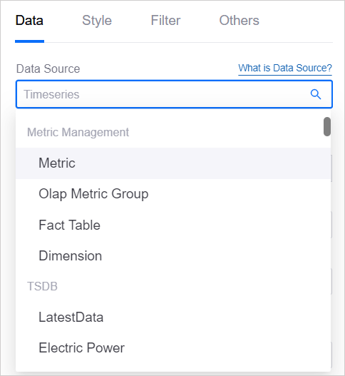
Step 1: Selecting Data Source
In Data Source, you need to specify a data source for the widget as the source channel for the widget to obtain data. For the data source types supported by DTV and their usage instructions, see Data Source Overview.
Step 2: Selecting Category
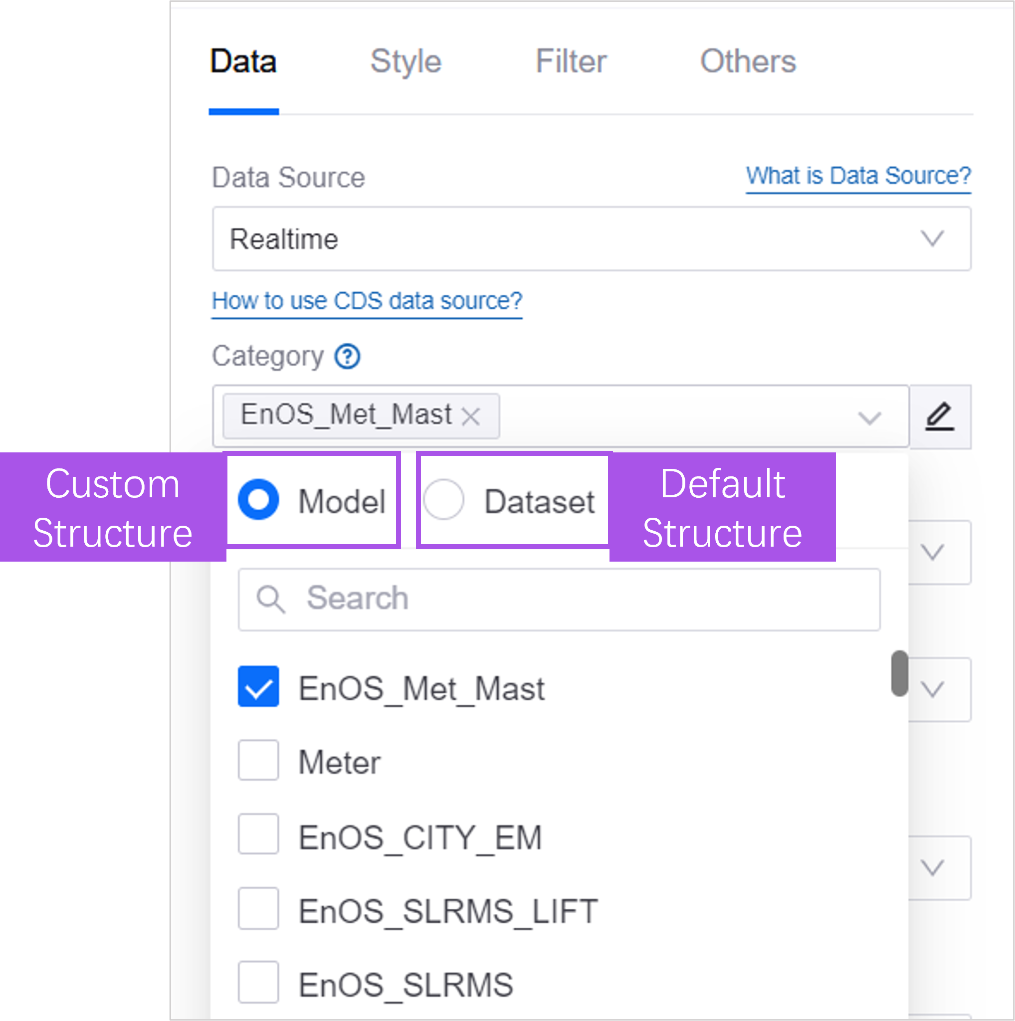
In Category, you need to further define the request structure and return parameters of the data for the widget. See Catagories of Data Source for more information.
Default Category: Select a default category such as Model, and the default data structure of the data source will be used. When the widget requests data, the data source Default Request Parameters needs to be provided. Properties, indicators and measurement points associated with the model can be displayed in the widget.
Dataset: When the default category cannot meet the needs, you can create a data set and customize the request parameters and return structure. When configuring a widget, users can specify the values of request parameters and specify which data items are returned.
Step 3: (Optional) Configuring Parameters
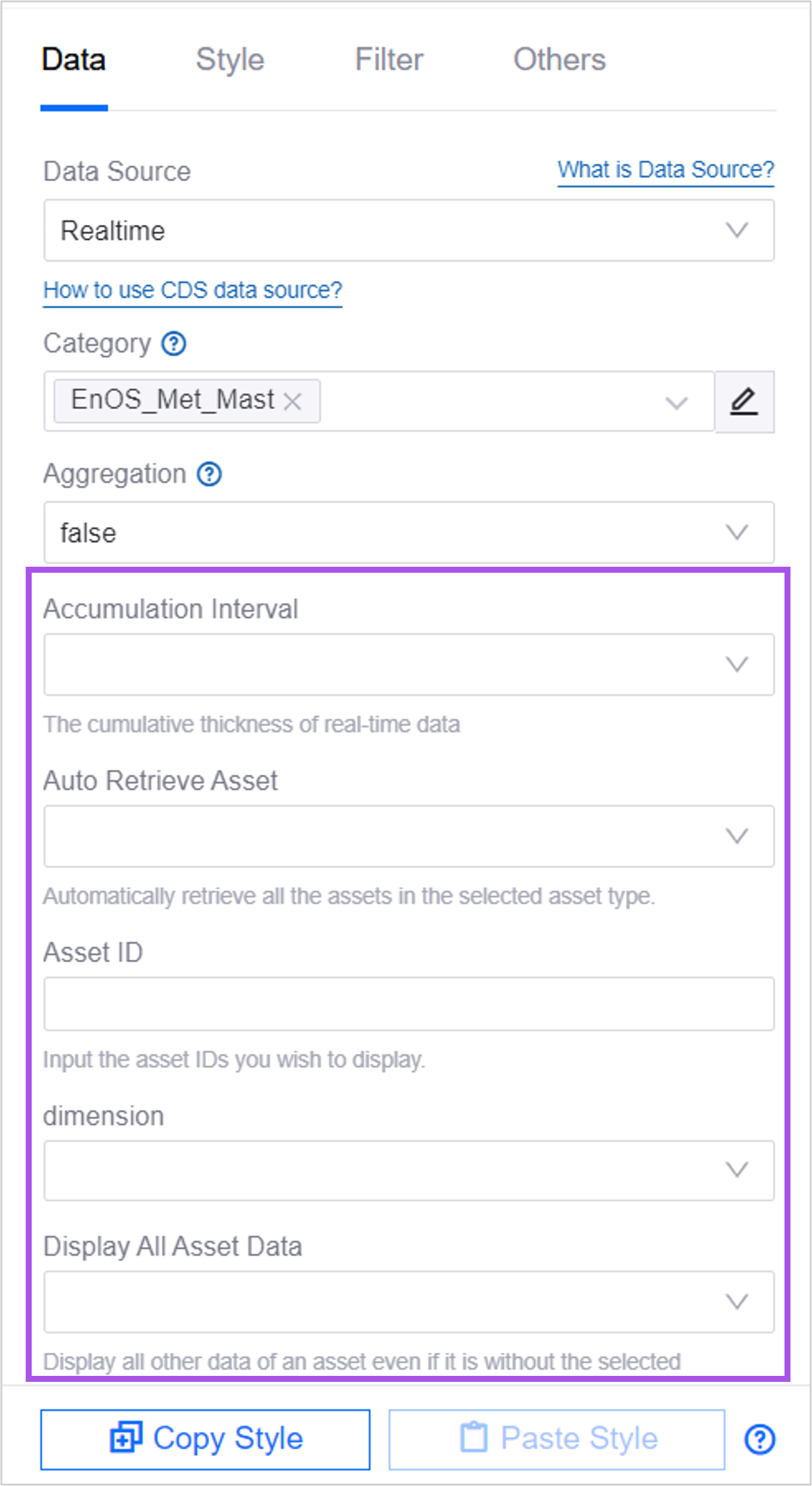
When Request Parameters is defined in the selected data source, parameter values can be specified for the data source parameters to further define the data request method, time range, etc.
Under Dimension Aggregation, select Expand Parameters.
Configure the values of the required parameters according to the instructions below.
Step 4: Adding Data Fields
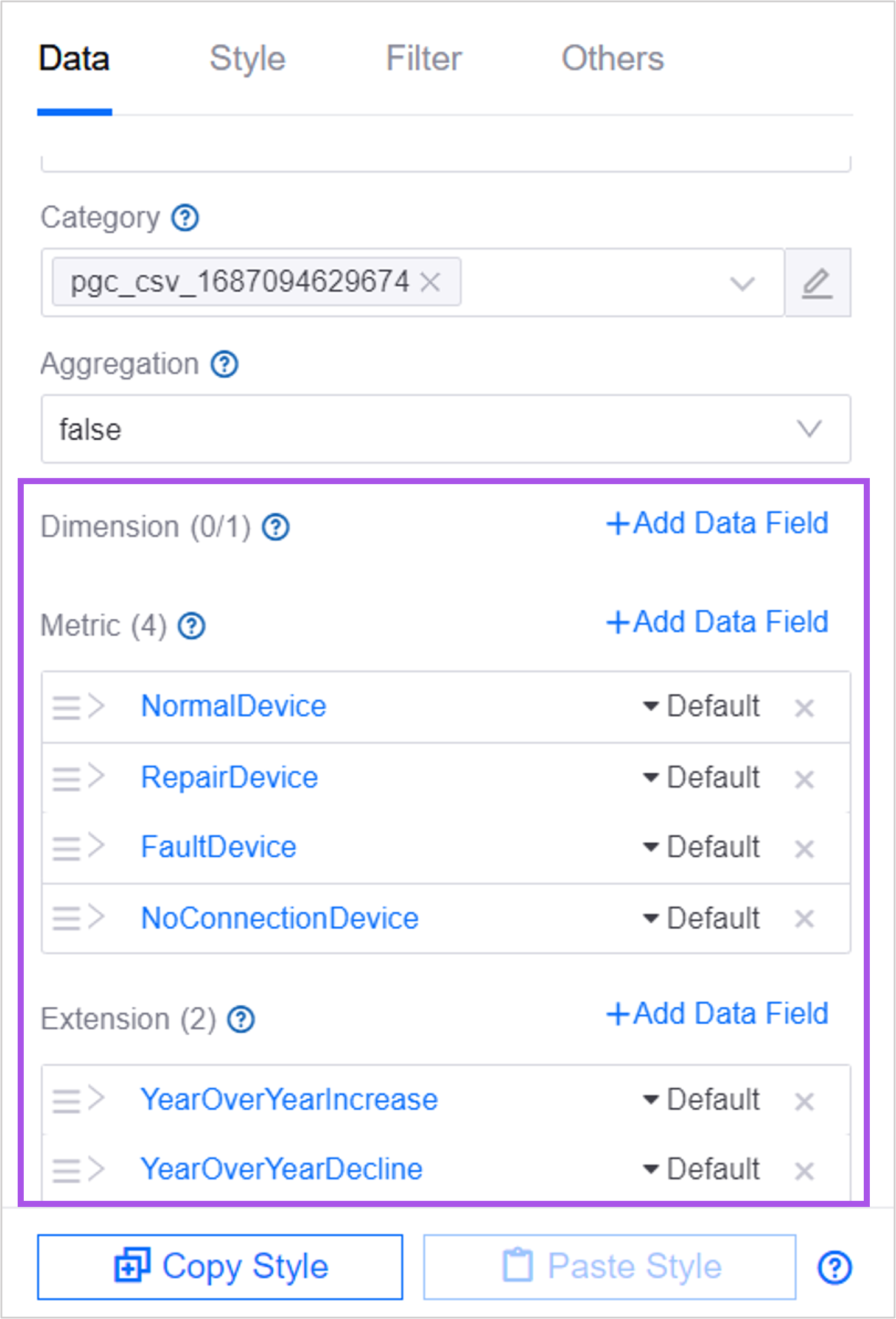
Data items are return parameters provided by the data source. In the widget, you can define which return parameters the widget needs to display, as well as the display form, etc.
Select Add Data Item of Dimension, Comparison, Indicator, Extension in order to add 1 or more data items to the specified location. See Data Source Overview for relationships between dimensions, comparisons, metrics, and extensions.
If the data item does not meet the requirements, you can select +Add Calculated Field in the Add Data Item pop-up window to perform simple operations on the existing data items to form a new data item. See Adding Calculated Fields. Once 3. is added, the data items will be listed in the panel.
Note
If you change the category, the configured data items will become invalid but will not be cleared automatically. You can hover the mouse over the name of the selected data item to replace the current data item to retain the chart style. Or select the × corresponding to the data item, remove the current data item, and reconfigure the chart style from scratch.
Step 5: (Optional) Adding Calculated Fields
You can continue to configure the aggregation method of data values, display order, etc.
Display Aggregated Data
Dimension aggregation supports aggregation of data displayed in widgets through different perspectives. When you configure a Comparison or Dimension data item for a widget, you can aggregate metric values with the same dimension/comparison value.
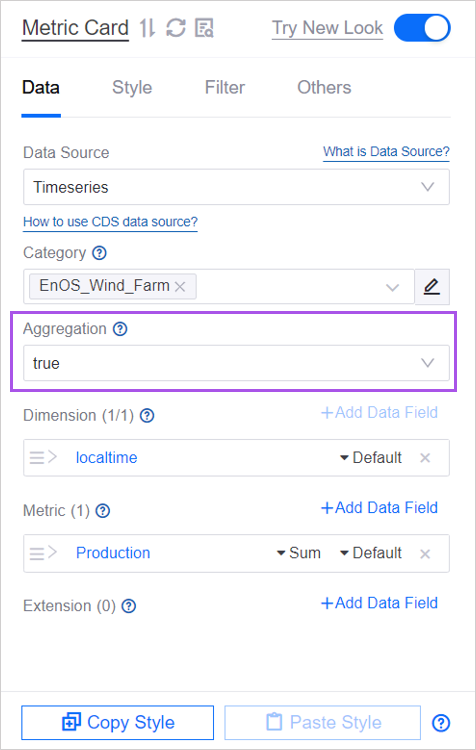
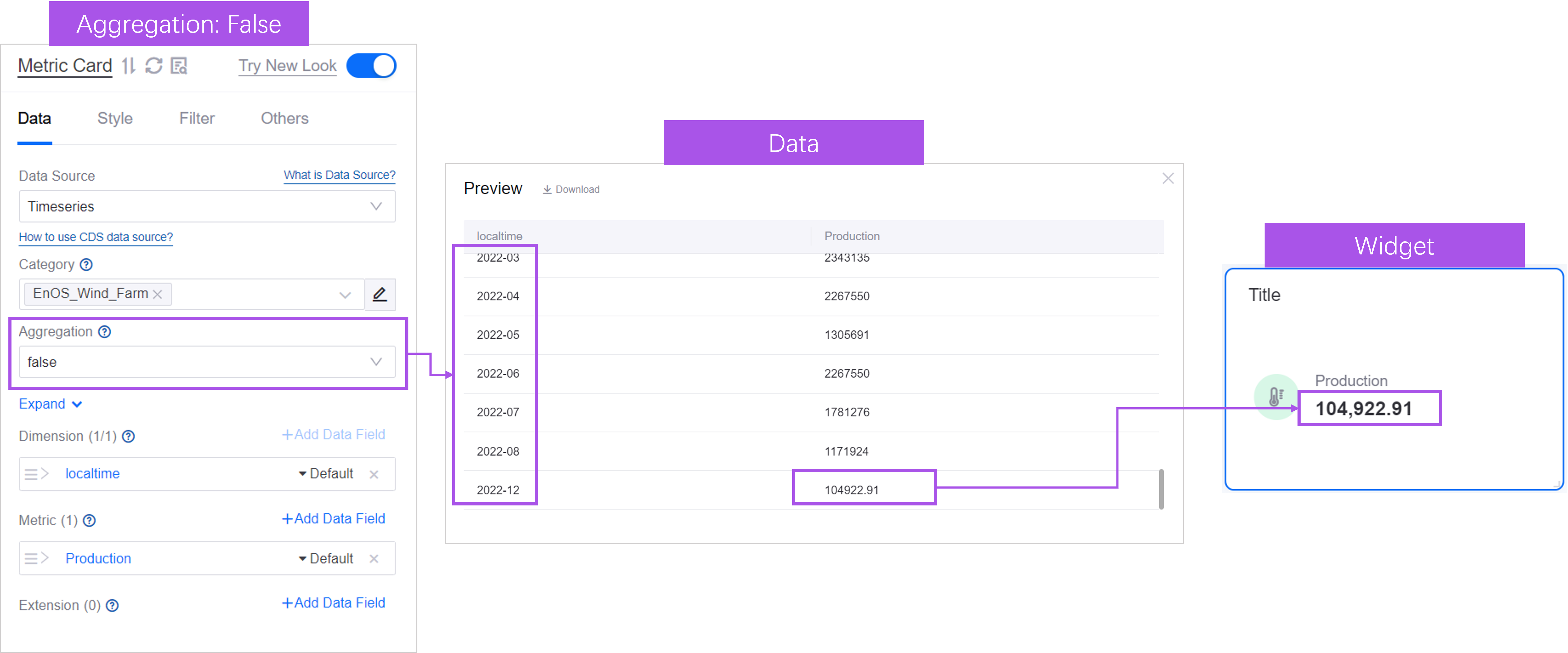
For example, the selected dimension is localtime, and the localtime with multiple indicator values is 2022-12. In the absence of aggregation, the default is to sort in ascending order by dimension, and the last indicator data is displayed in the widget.
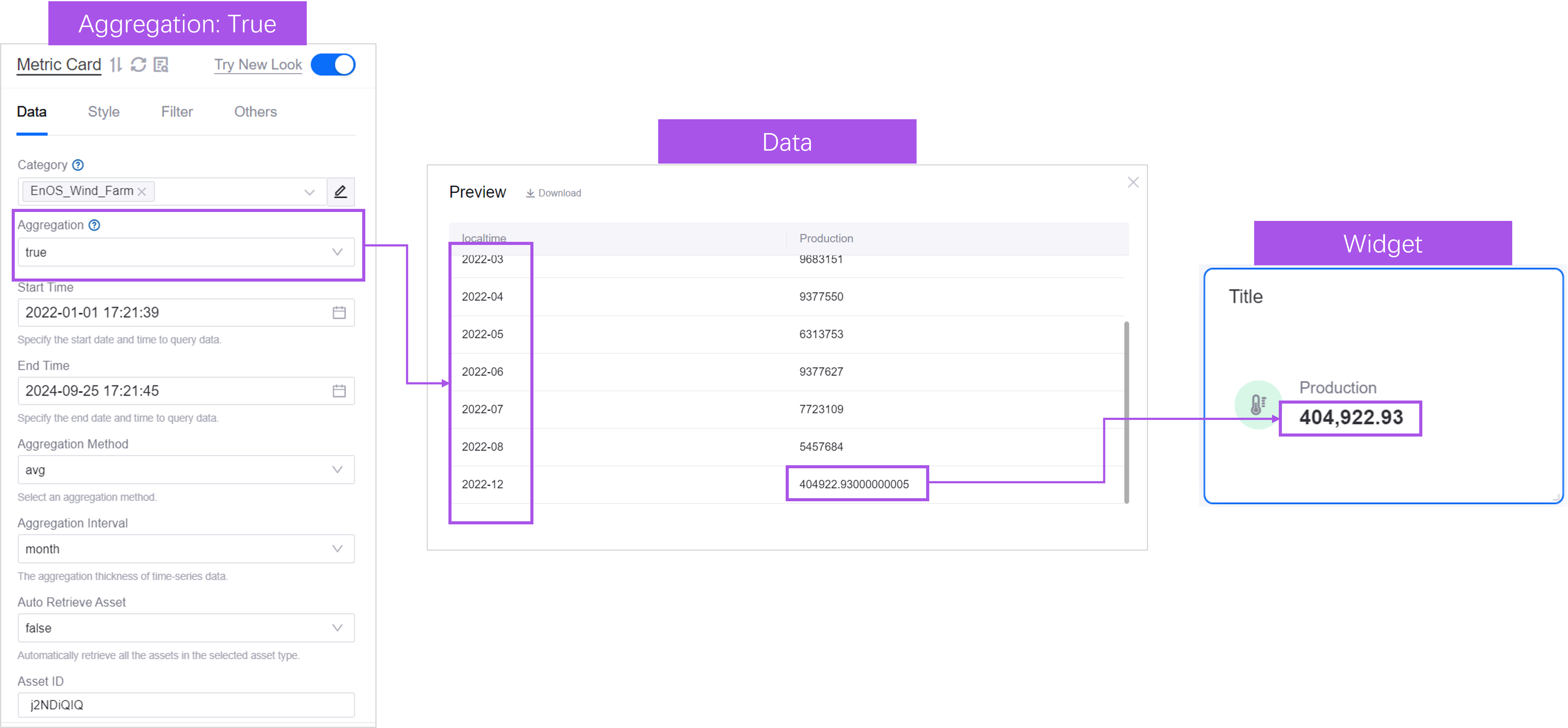
After dimension aggregation is configured, the indicator values with the same dimensions as 2022-12 will be aggregated and displayed. By default, they are aggregated in the sum method, arranged in ascending order by dimension value, and the last piece of data is displayed in the widget.
For another example, the Comparison selected is localtime, and the localtime with multiple indicator values is 2022-12. In the case of no aggregation, the default is arranged in ascending order of comparison, and the last indicator corresponding to each comparison value is displayed in the widget. data.
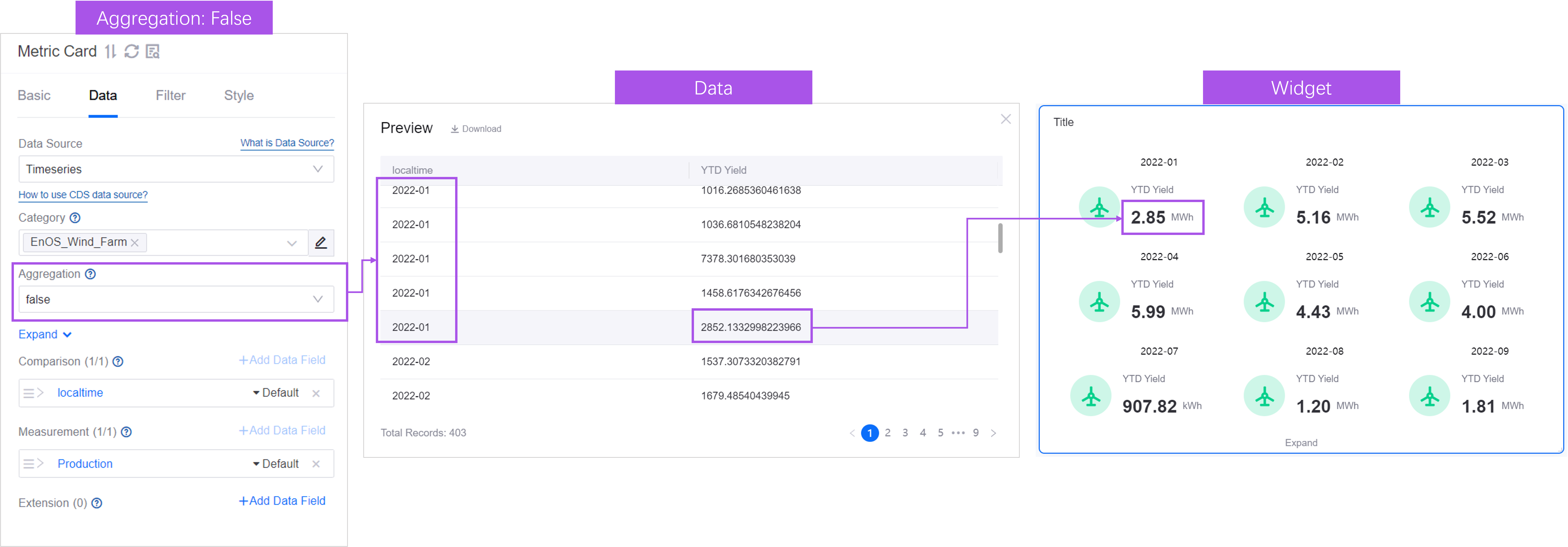
After aggregation, the indicator values with the same comparison items as 2022-12 will be aggregated and displayed. By default, they are aggregated in the sum method, sorted in ascending order by comparison value, and the last piece of data is displayed in the widget.
If necessary, you can select the Sum corresponding to the data item and switch to other aggregation methods.
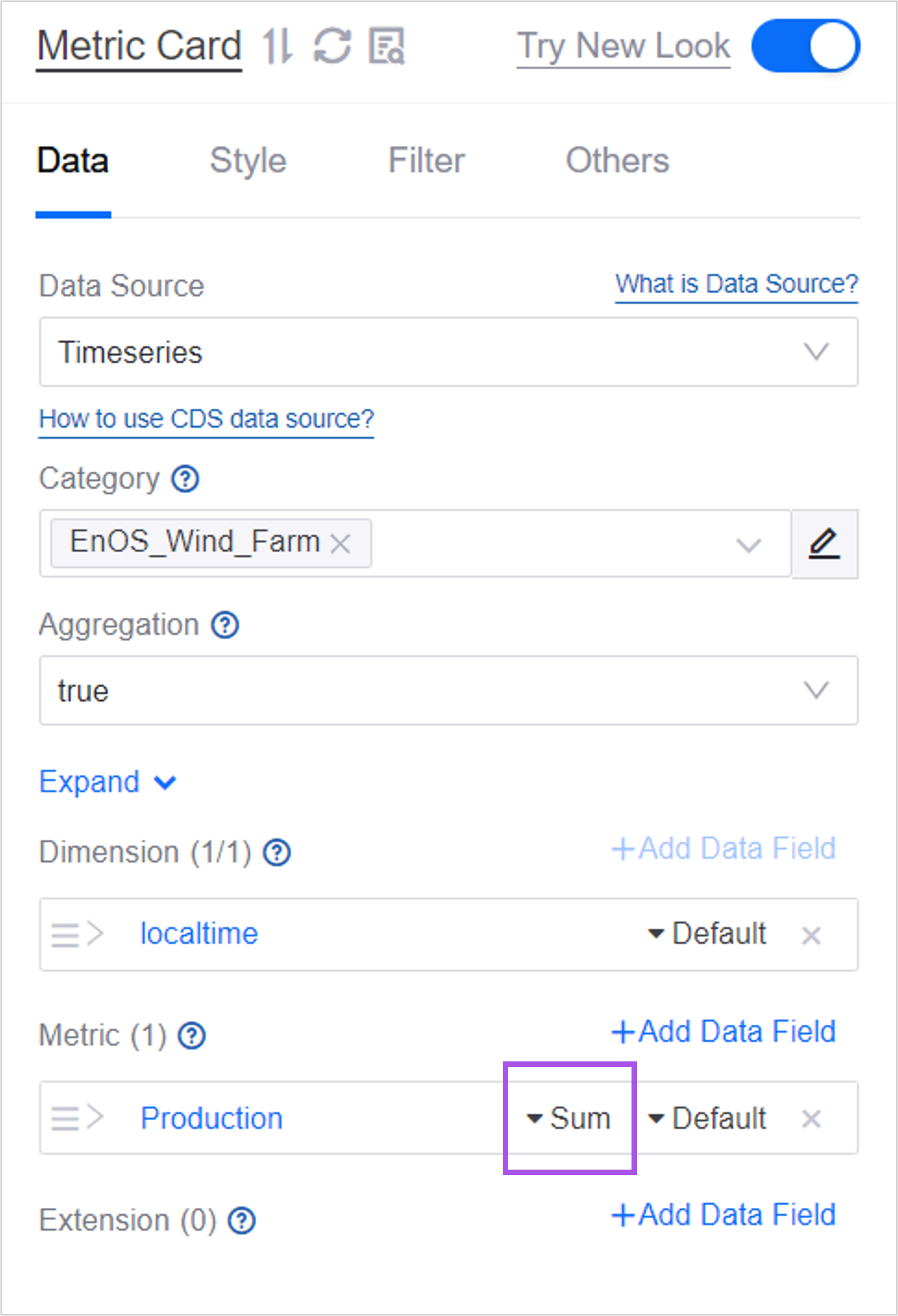
DTV supports aggregation using the following functions:
Function |
Description |
|---|---|
SUM |
Displays the unweighted sum of indicator values. |
Average |
Displays the average value of the indicator. |
Empty average |
Displays the average of non-empty indicator values. For example, if there are 10 values and 6 of them are non-null, then TrueAveraging will return the average of the 6 non-null values (whereas the average function will return the average of all 10 values). |
Maximum |
Displays the maximum value of this indicator in the returned data. |
Min |
Displays the minimum value of the indicator in the returned data. |
First |
Displays the first indicator value. |
Last |
Displays the last indicator value. |
Count |
Displays the number of data items under the dimension of the indicator. |
Deduplication count |
Displays the number of deduplication data items under the dimension of the indicator. |
Ordering Value
When a data item displays multiple values, the values can be sorted in ascending or descending order. The default is ascending order. The ordering priority of values is Dimension > Comparison > Indicator. For example, if you select a sort order for Dimension, the sort order for Contrast and Metric will be ignored.
If there are multiple data items in a dimension or metric, the first one added will be sorted first.
If the first indicator added on the X-axis has a zero value, the sort order of the next indicator with a non-zero value will be used.
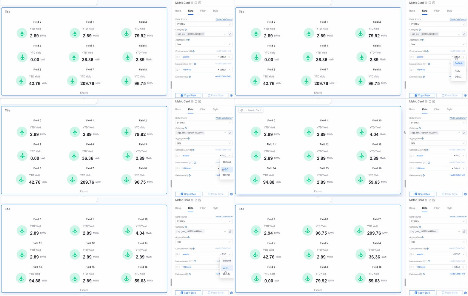
Ordering Data Field
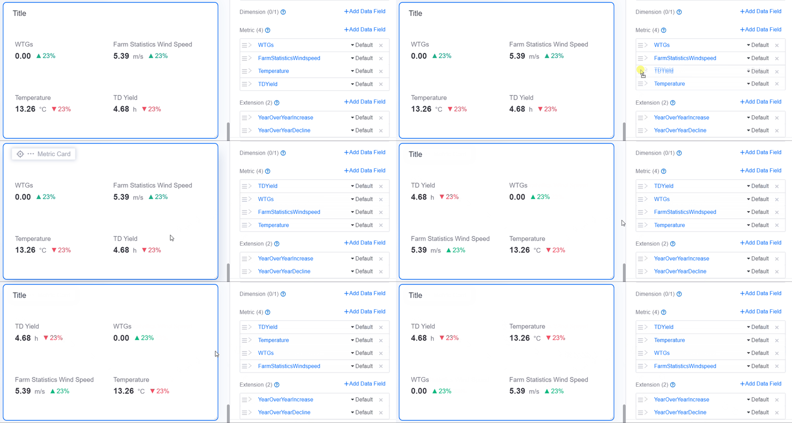
For multiple data items, the display order between data items can be adjusted by dragging.
Alias
After adding a data item, the name of the data item is used as the display name in the widget by default. You can customize the display name via alias.
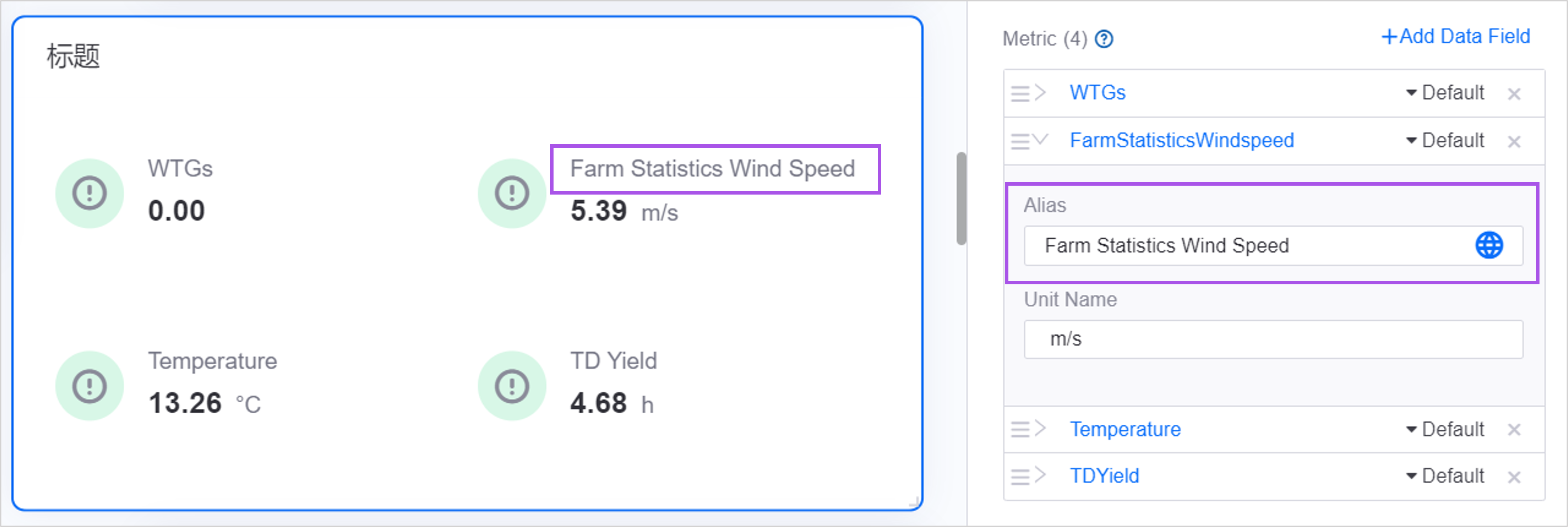
In some widgets, if you do not need to display the name, you can modify the field name to no name.
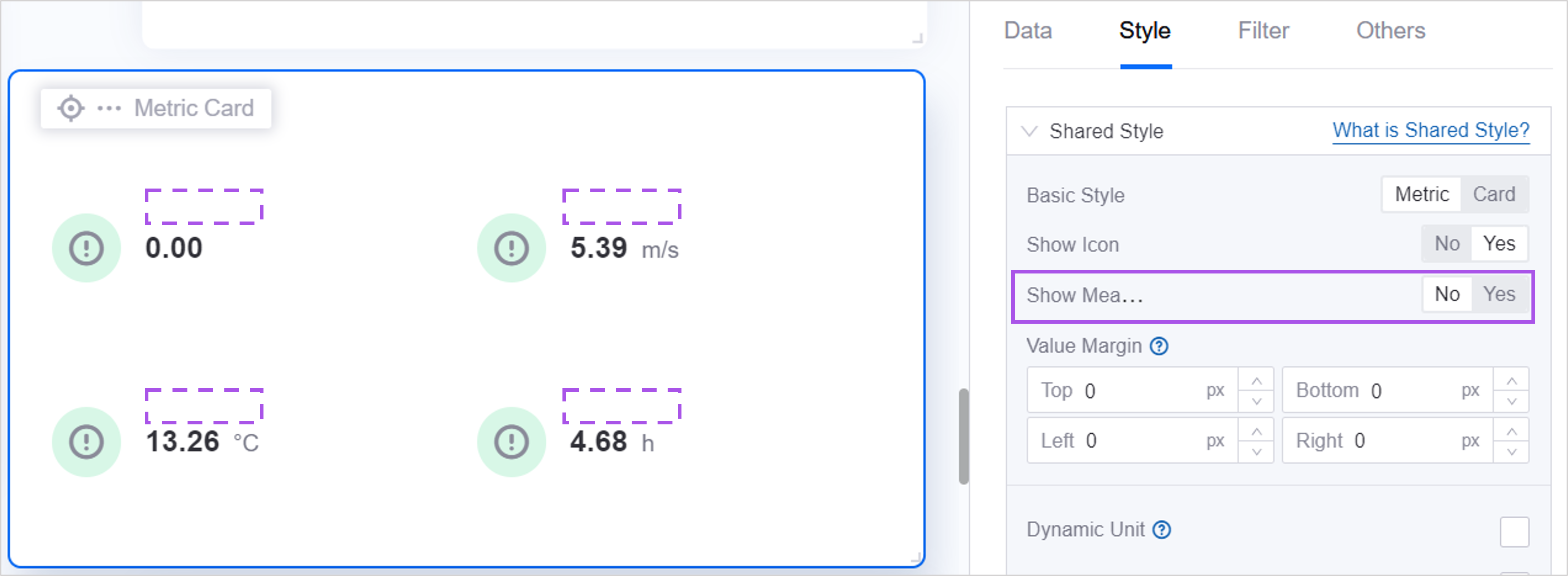
Unit Name
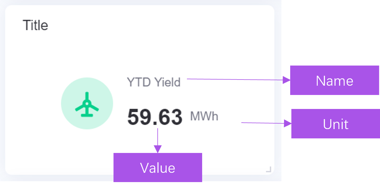
The unit is displayed next to the indicator’s value. By default, the unit displayed in the widget is the data item’s own unit. If the data item does not have a default unit, or you need to customize other units, enter the unit name.
Configuring Style
Configure styles for widgets in the Style tab.
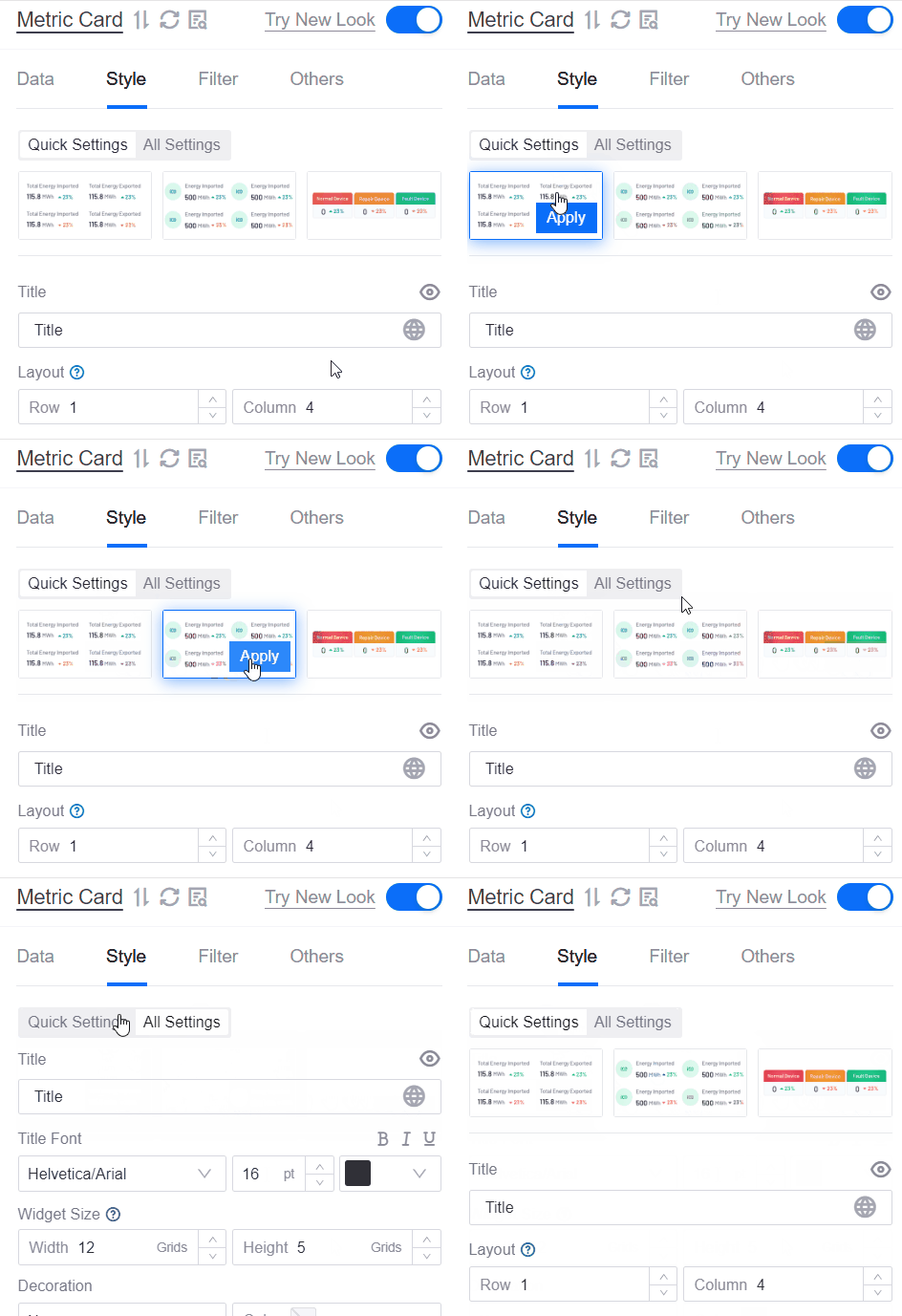
Quick Settings
Quick Configuration Contains quick styles and common configuration items for widgets. You can configure common styles of widgets in Quick Configuration. If you need to configure more details, you can switch to All Configuration. After switching, the existing quick configuration content will be retained.
All Settings
In All Configuration you can configure finer style details. After switching to All Configuration, the existing quick configuration content will be retained.
Dynamic Unit
The unit is displayed next to the indicator’s value. DTV has a large number of common units preset in its unit library. When the unit that comes with the data item or your customized unit name matches the item in the unit library, check Adaptive unit, and the widget will automatically convert it to a simple notation, for example, “22000 tons” will be converted to “22,000 tons.” At the same time, if the unit has preset internationalization in the unit library, the display will be adapted to the current language. For example, “59.63 MWh” will be converted to “59,600 kWh” in the Chinese page.

For DTV unit library and its adaptive logic, see DTV Unit Library.
Decimal Places
Specifies the number of decimal places that the value in the widget needs to be displayed.
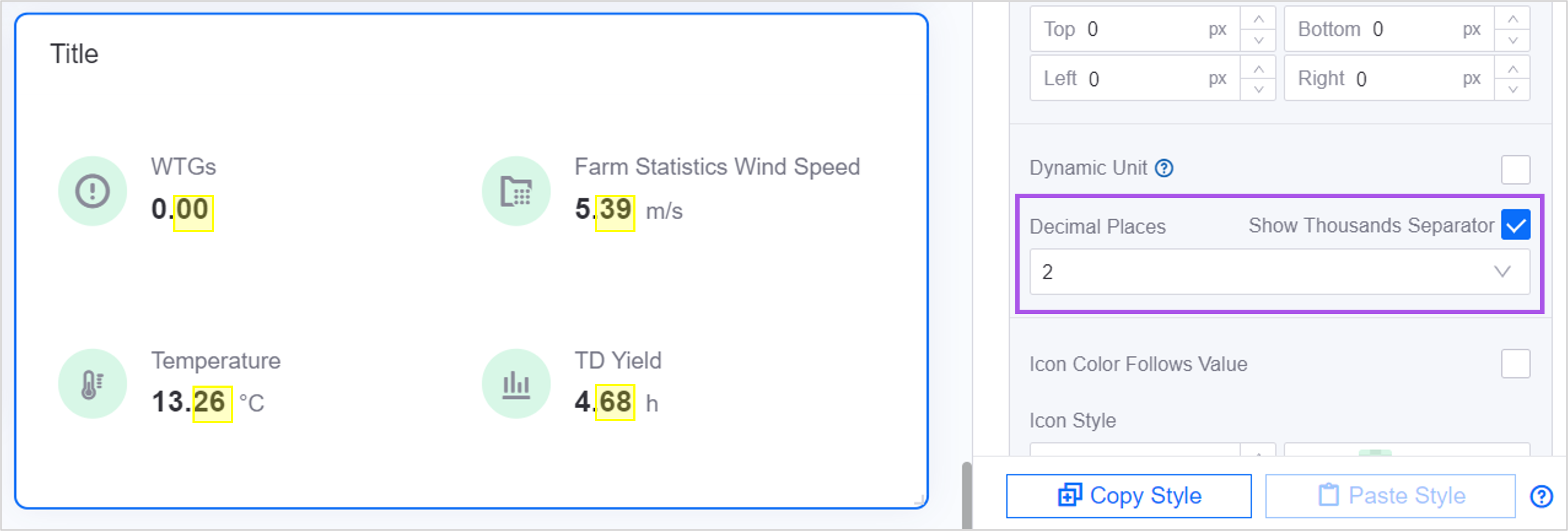
Show Thousands Separator
When the value is too large, you can check Show thousandths, and the value in the widget will display the thousandth separator, for example, “722550” is converted to “722,550”.
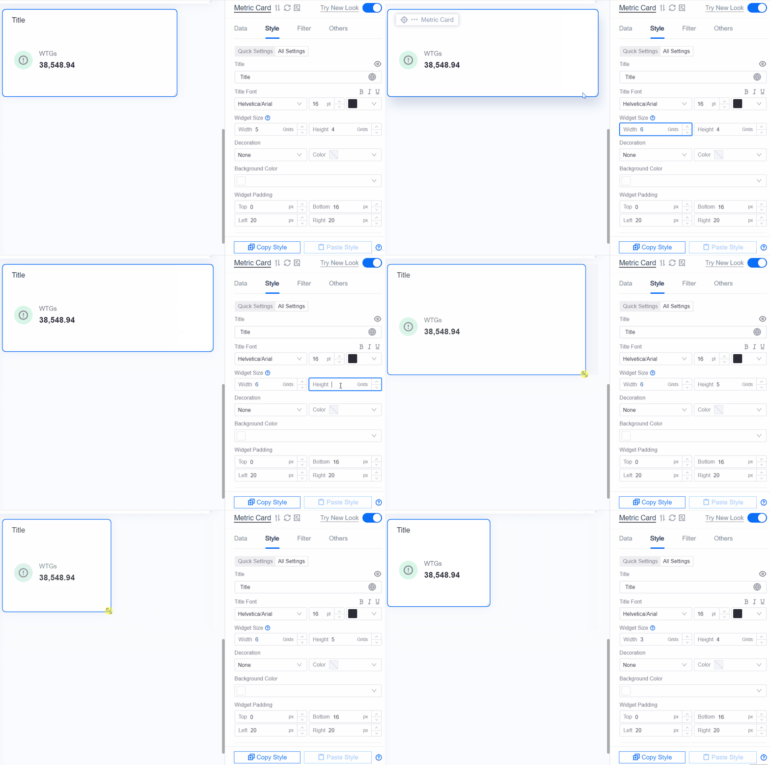
Widget Size
Widget size is determined by the number of grids. Update the size of the widget by dragging or directly editing the value. What is Grid >>
Description
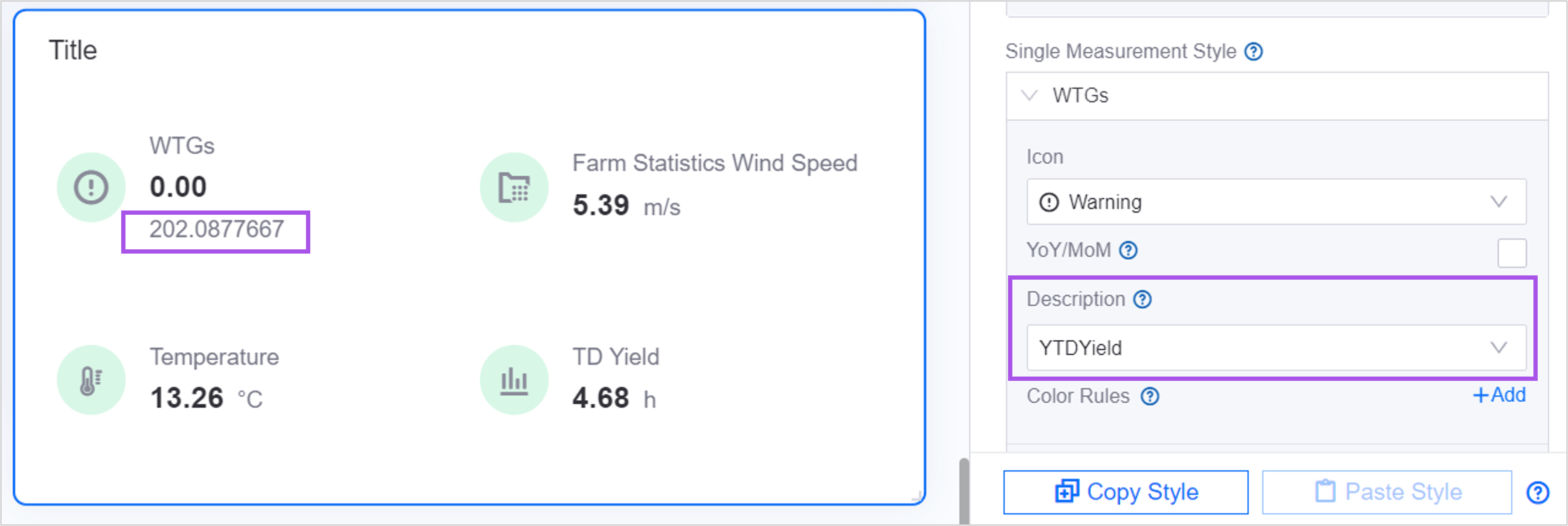
The description is to add other additional information to the indicator value. For example, when you need to display the value for the same period last year or the value for the previous quarter below the indicator value, you can configure it as a description.
Before configuring the Description, make sure you have added the Extension field to the Data page. The data in the extension will serve as the source of the description value. Select an extension field as additional information for a certain indicator data. Once selected, the value of the extension will be displayed below the value of the indicator.
Color Rules
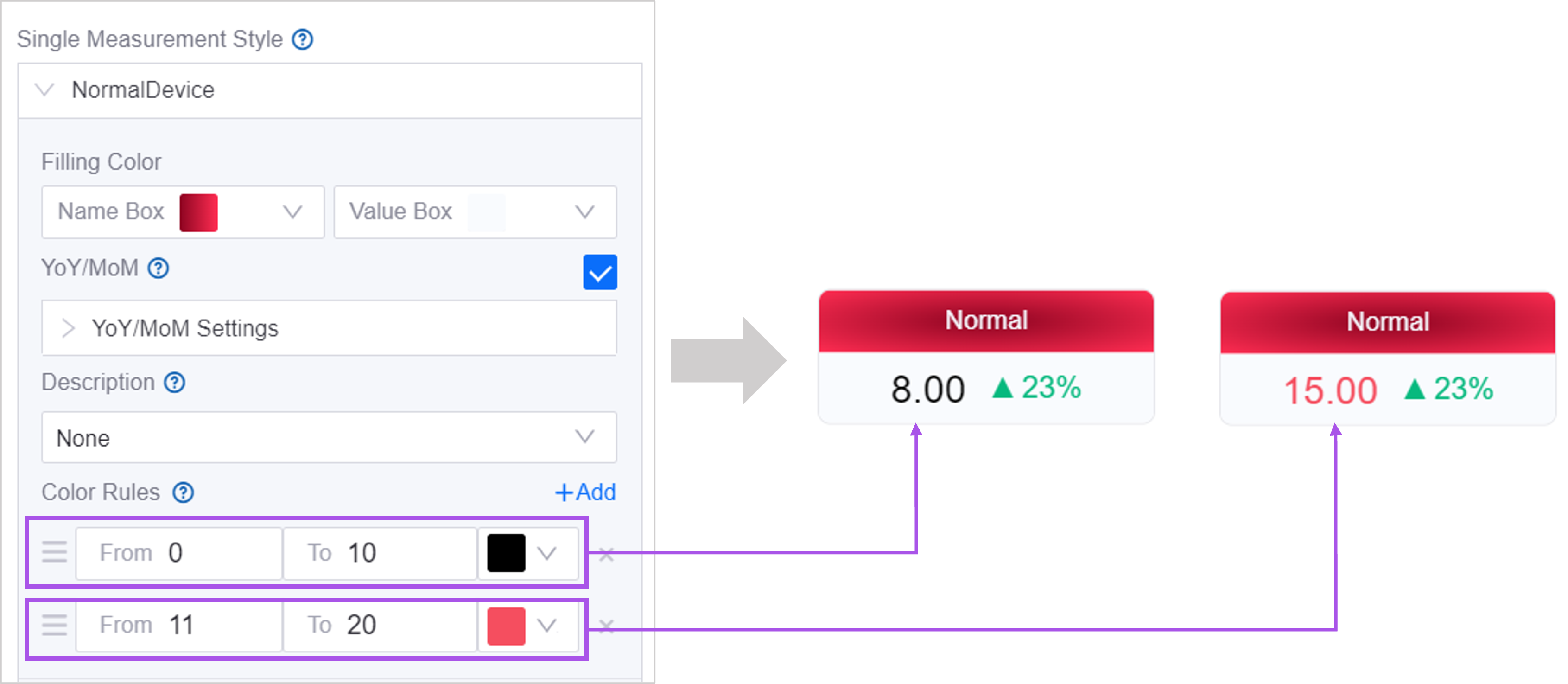
Color rules define the relationship between the numerical size and numerical color of each indicator, allowing users to quickly notice anomalies or critical values. For example, when the indicator value is 0-10, it is displayed in black, and when the value is 11-20, it is displayed in red.
Notice:
Numerical values support dynamic parameter transfer. See Using Dynamic Parameters for more information.
When there are multiple conflicting color rules, the topmost rule takes precedence. You can drag up or down to change the order of the rules.
The following widgets support configuring color rules:
Circular instrument panel
Pointer instrument panel
Hybrid dashboard
Mixed graph
Cartesian coordinate system diagram
progress bar
Indicator cards
Water polo diagram
sheet
Rich text
Asset list
List
Configuring Others
In the Other tab, you can configure the widget’s interactive actions, refresh frequency, etc.
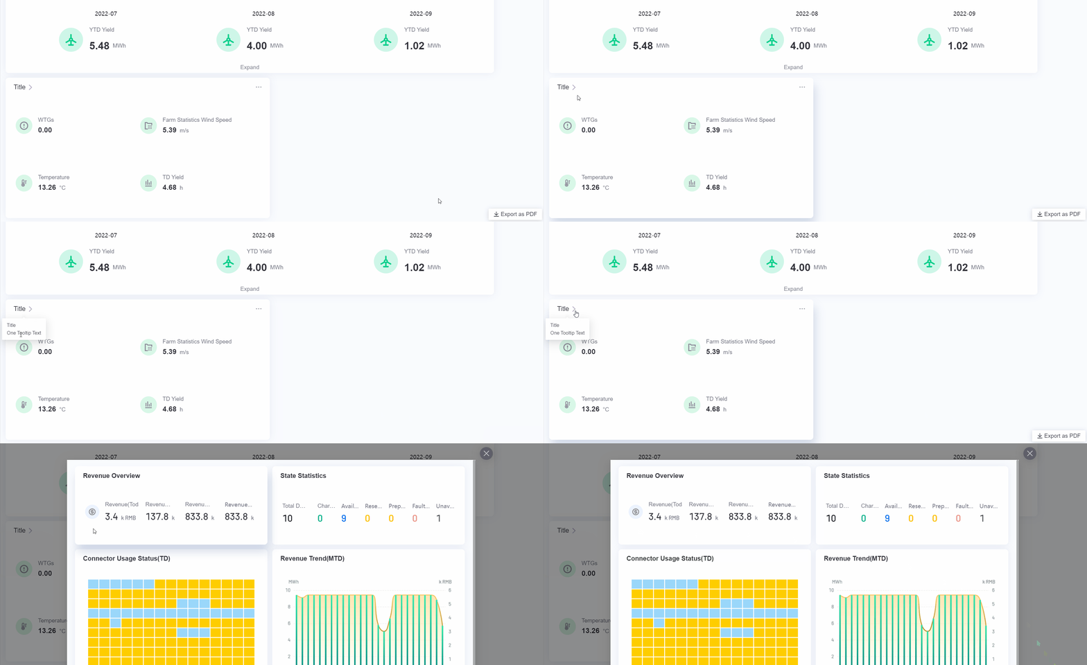
left title interaction
You can define the user’s interactive actions on the widget title, including prompt text when the mouse hovers, jump when the title is clicked, etc. When a user views the page, a “>” icon will appear to the right of the title.
For example, when configuring the following:
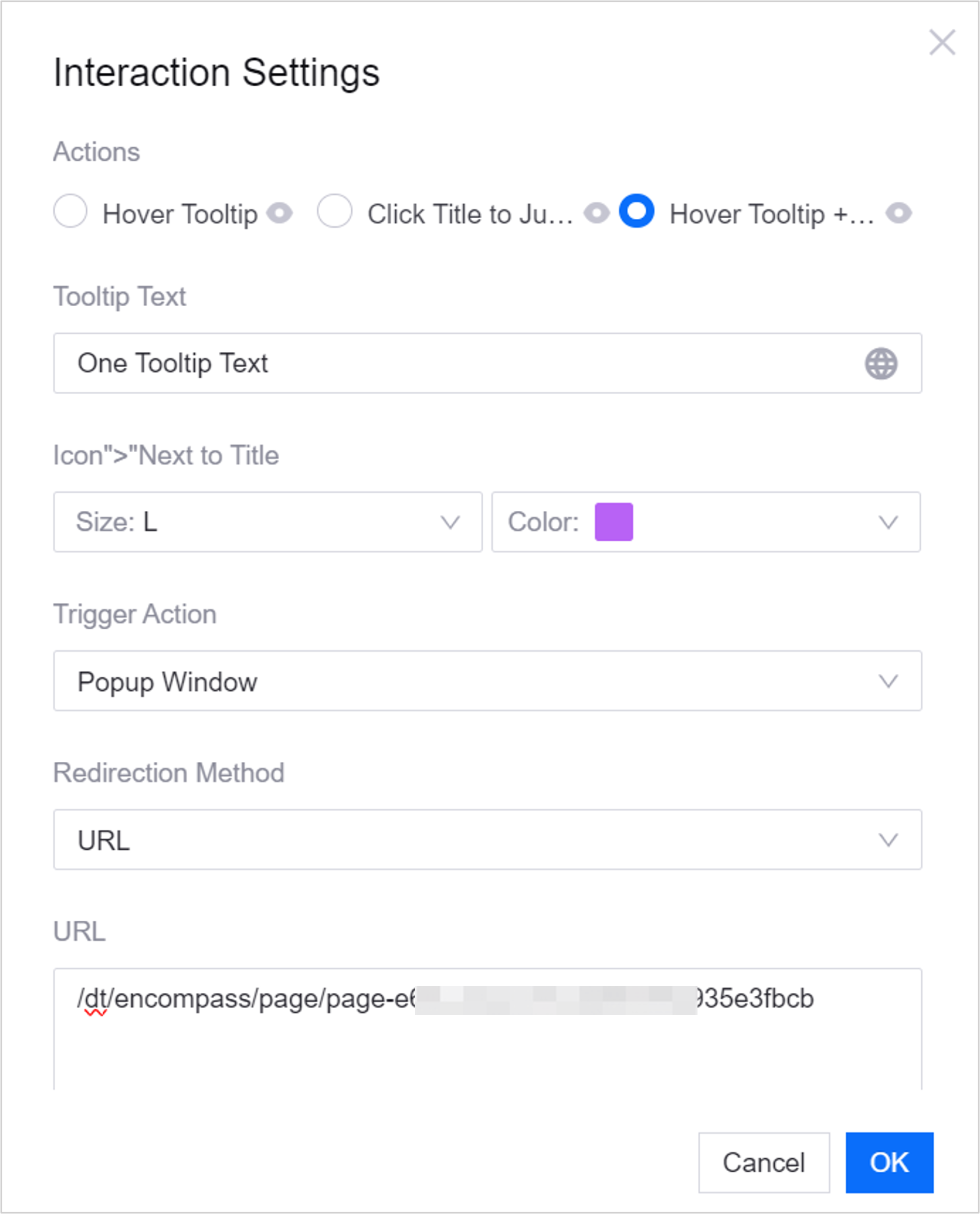
Users can perform the following operations on the page:
··· Interaction
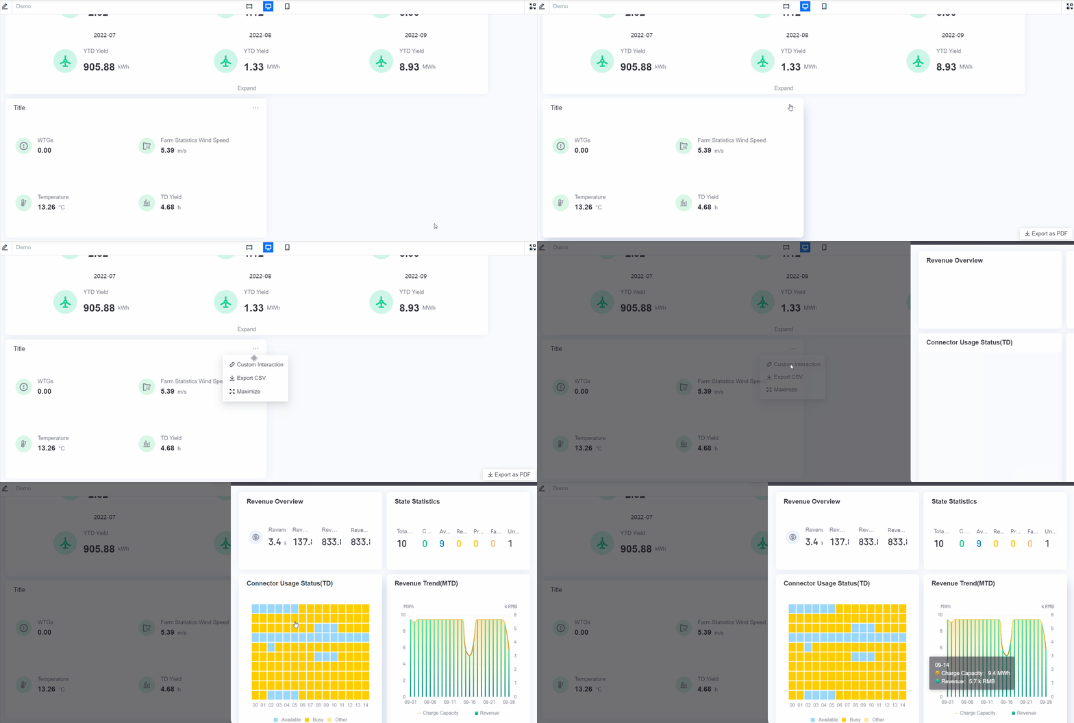
You can define other interactions with the widget. When the user views the page, a… button will appear in the upper right corner of the widget. The user can hover the mouse over… to open more interactions.
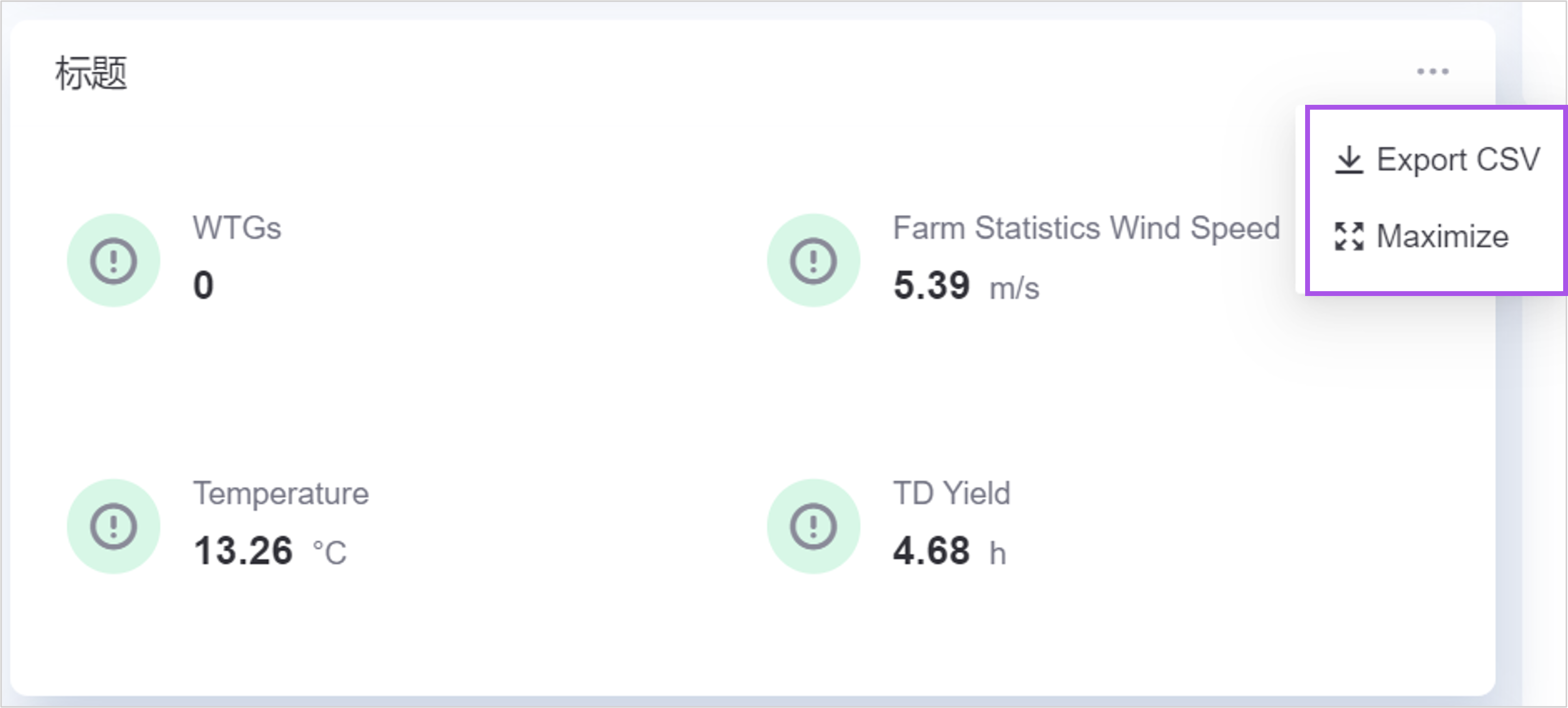
Now supports configuring the following interactive actions:
Maximize widget: Users can display the widget in full screen.
Export widget data: Users can export the data being displayed in the widget to CSV format. The data in the CSV file is arranged in the order of dimension, contrast, metric, and expansion. The original name of the data item is used by default, if an alias is defined for the data item, the alias will be used in the file. At the same time, if units are configured for the data item, the units will also be exported.
Custom configuration: Add other interactive actions.
URL
You can enter any URL when the trigger action is New Page Open or Replace Current Page.
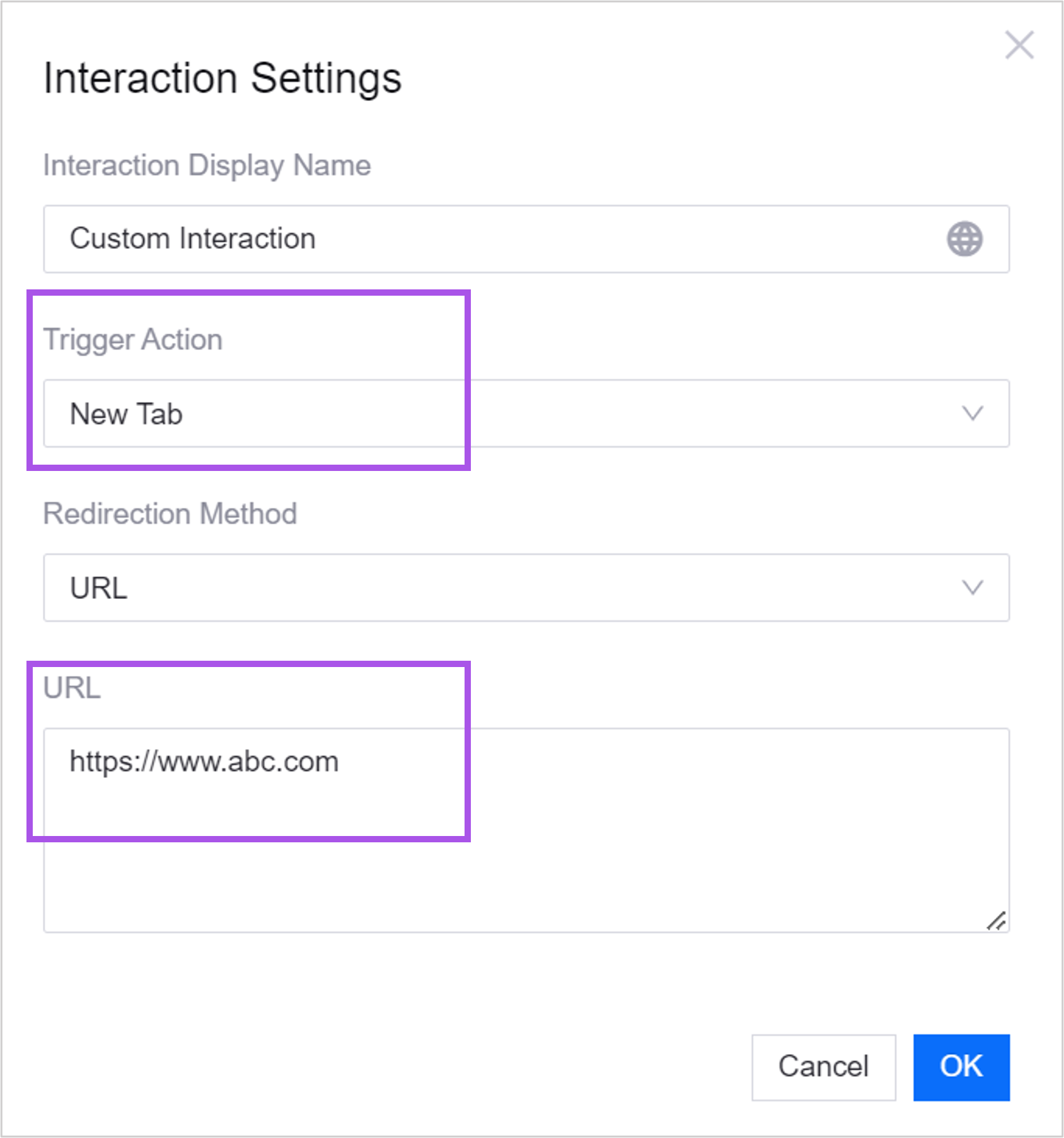
When the trigger action is pop-up, bottom drawer, side drawer, only relative paths under the same domain name are supported.
For example, when configuring the following:
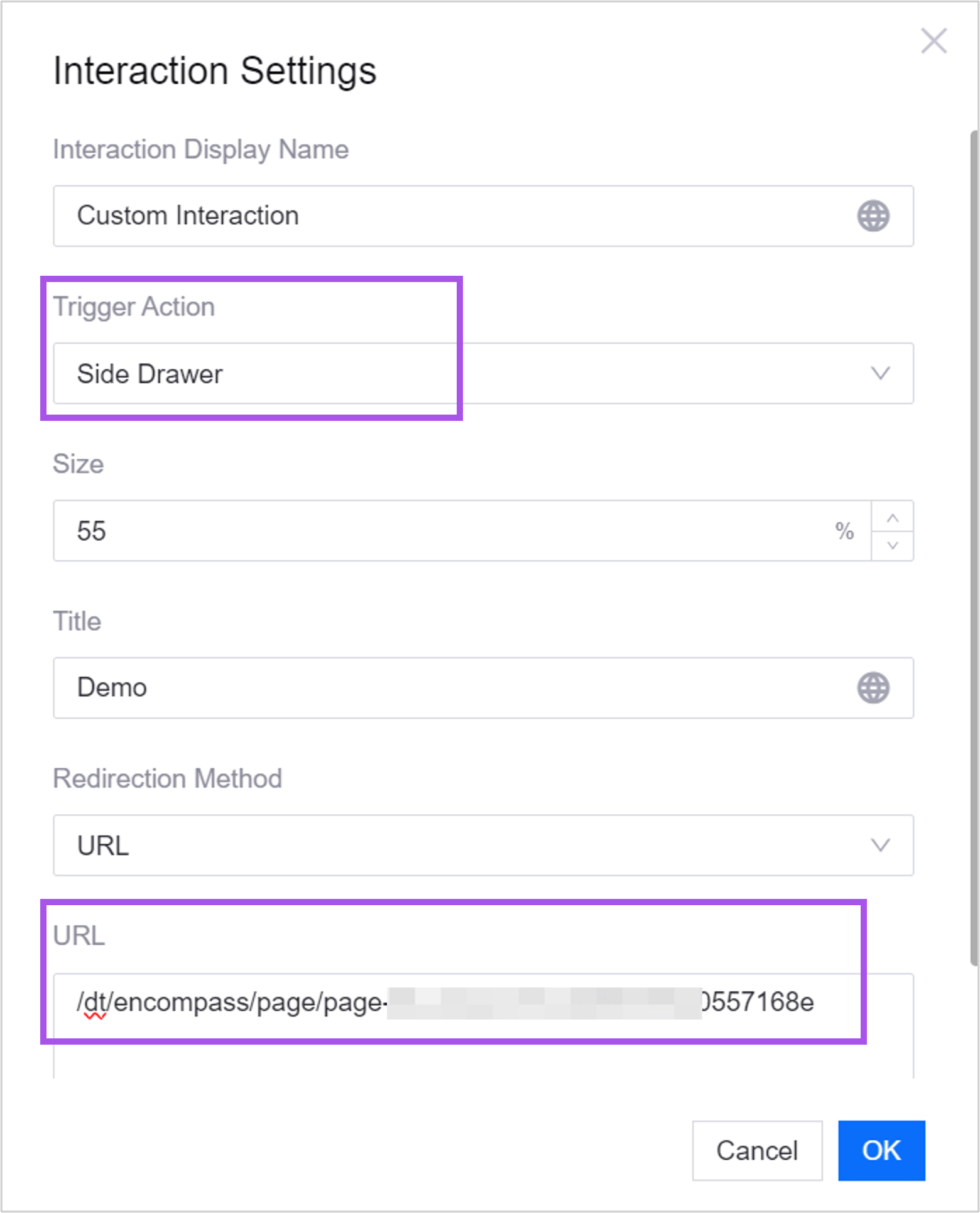
Users can perform the following operations on the page:
HTTP Request
After defining the HTTP request, when the user clicks the interaction button, an HTTP request will be automatically triggered.
Service address: relative path needs to be filled in.
The return format of the interface must be:
{code: '', data: {}, message: ''}.Status code: 0 or 200 indicates success, other status codes are considered failures.
Request feedback: After the user triggers the request, whether the page prompts “Request Successful”/”Request Failed”.
Trigger Action through SDK Dispatch
After selecting Dispatching events through SDK, the widget will support receiving events dispatched by DTV SDK. Developers use the API or functions provided by DTV SDK. When the user clicks on the title, the SDK will actively dispatch an event, which can be monitored and responded to by other codes.
Merge Request
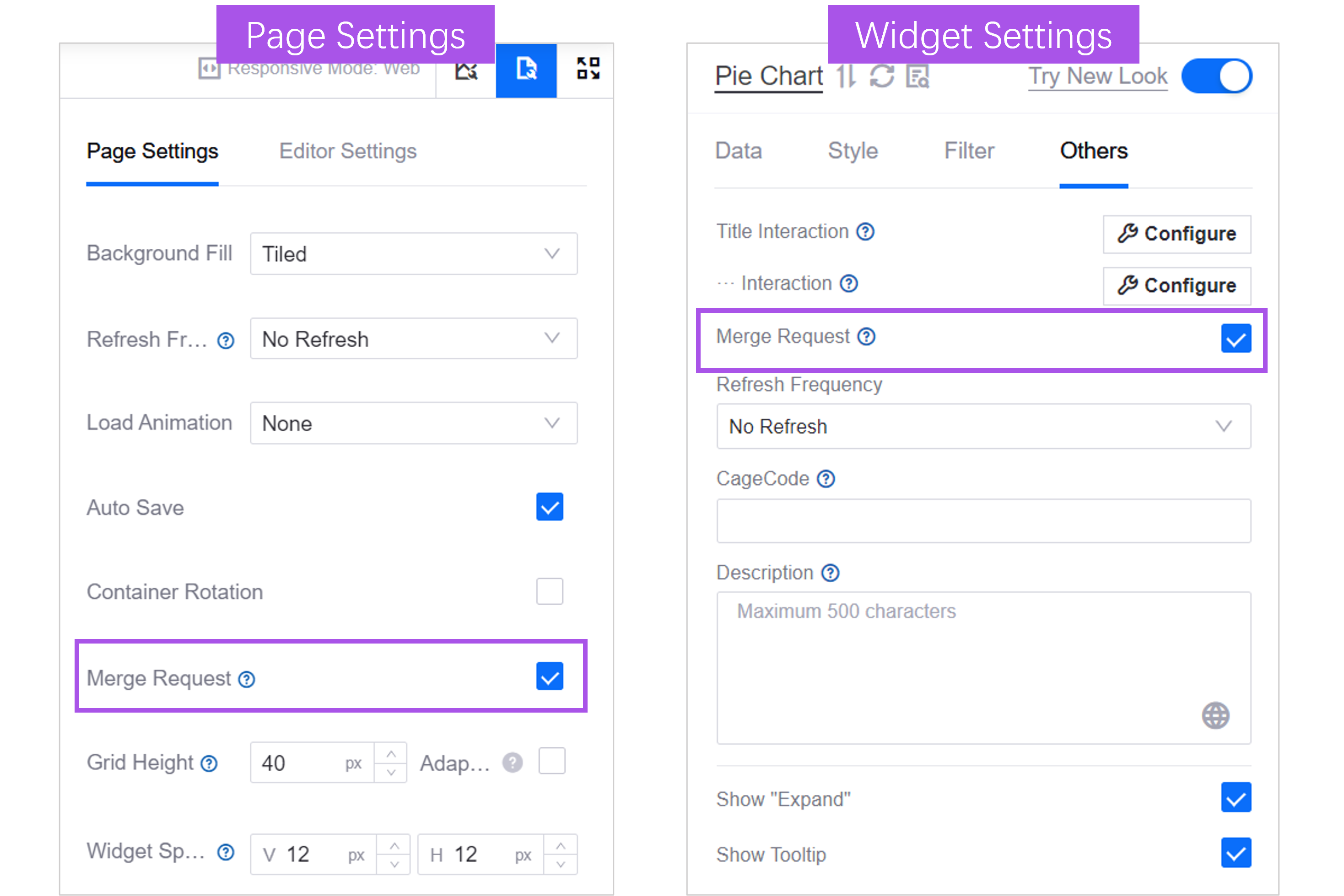
When multiple widgets in the page use the same data source and are refreshed at the same time, check Request Merge in Widget Settings to merge the request of this widget with the requests of other widgets to improve the response speed. Enabled by default. Enabling it within the widget will only take effect if Request Merge is also enabled in Page Settings.
Refresh Frequency
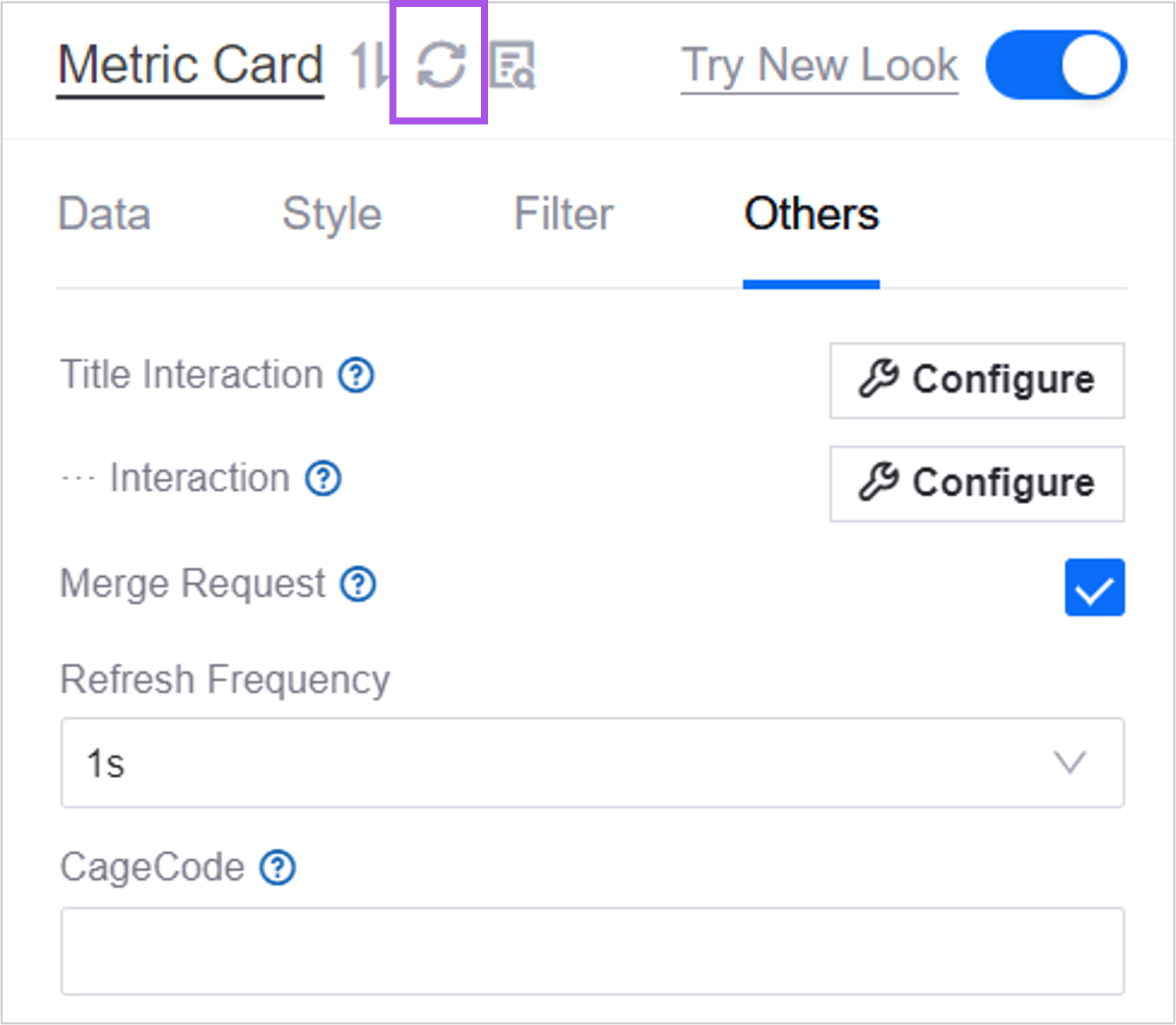
Select how often the widget retrieves data from the data source and automatically refreshes.
You can also click the Refresh Data button to manually refresh the data.
CageCode
The widget’s identification code. When an event is dispatched externally via the DTV SDK, if an identifier is provided, only the object with that identifier will respond.
Description
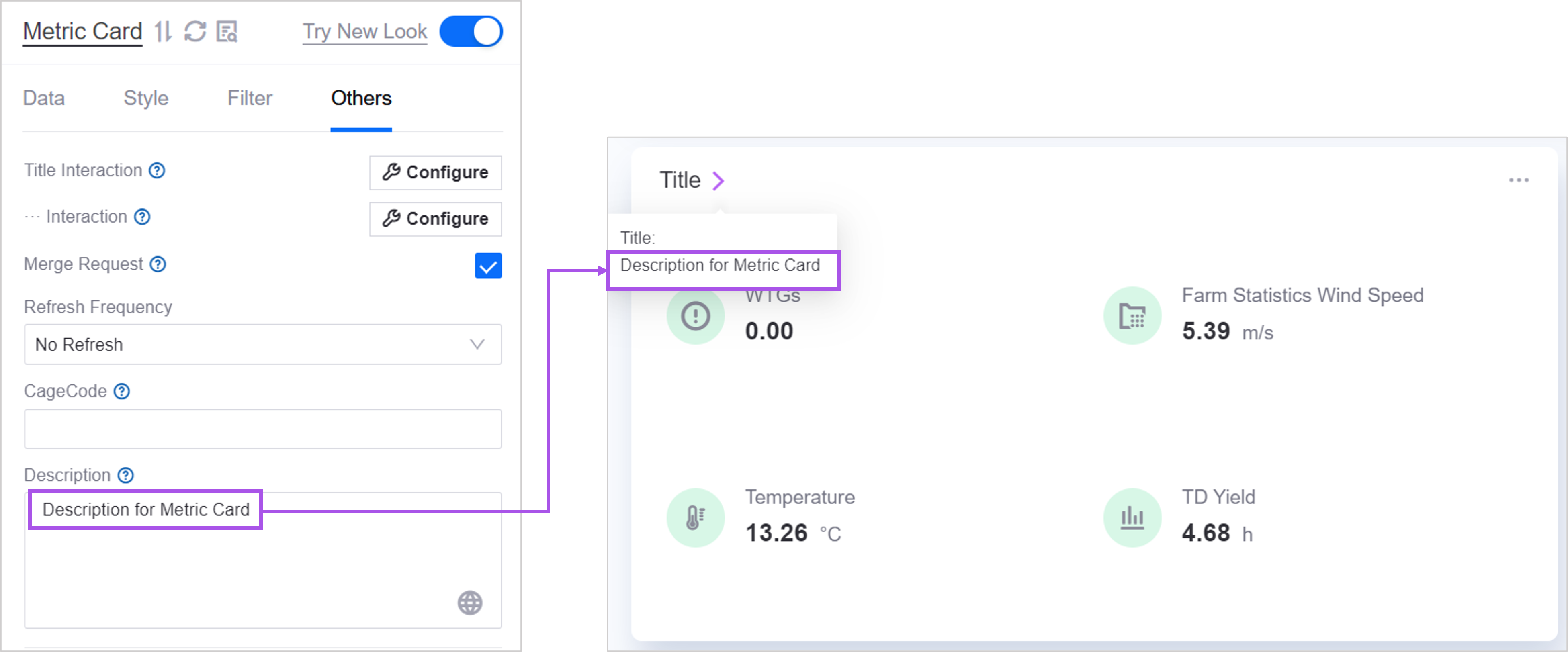
The description is a supplementary description of the widget. When the user hovers the mouse over the widget title, they will see this prompt.
Single Metric Style
In Single Indicator Style you can define separate interactions, trend analysis, asset aggregations and asset parameters for each indicator.
Open Trend Analysis
After turning on trend analysis for the indicator data, when the user hovers the mouse over the indicator data, the trend analysis pop-up window will open to view the data trend curve of the selected indicator.
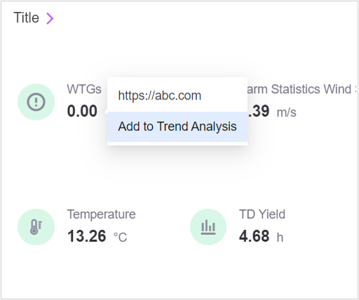
The following widgets support trend analysis:
Topology map
Multiple indicator cards
sheet
progress bar
Asset Aggregation
After checking Asset Aggregation, the same indicator data of multiple assets will be aggregated in the trend analysis pop-up window.
Asset Parameter
Asset parameters are the asset data that need to be displayed in the custom trend analysis curve.
When asset aggregation is not enabled, the asset ID returned by the data source used by the widget is displayed in the graph. Multiple asset IDs can be referenced through the
#{mdmId}format, separated by commas.After asset aggregation is turned on, the asset ID defined in the data source request parameters used by the widget is displayed in the graph. Multiple asset IDs can be formatted as
@{mdmId}, separated by commas.
Copy&Paste Widget Style
Copying and pasting styles allows you to copy and paste styles between widgets of the same type just like copying and pasting text, and quickly reuse widget styles.
Note
Pasting into widgets of the same type is only supported in the current OU, and the copy/paste style function is enabled in the target widget. If necessary, you can contact the system administrator to enable the copy/paste function for certain types of widgets.
When you have configured the A widget and want to reuse the style of the A widget in the same type of B widget and reduce the configuration steps, you can do the following:
Select Copy Style below the A widget’s configuration panel.
Open the configuration panel of widget B, select Paste Style, and paste the following content of widget A into widget B:
Title font
background color
Widget decoration
Spacing within widgets
Icon style
Filter fonts
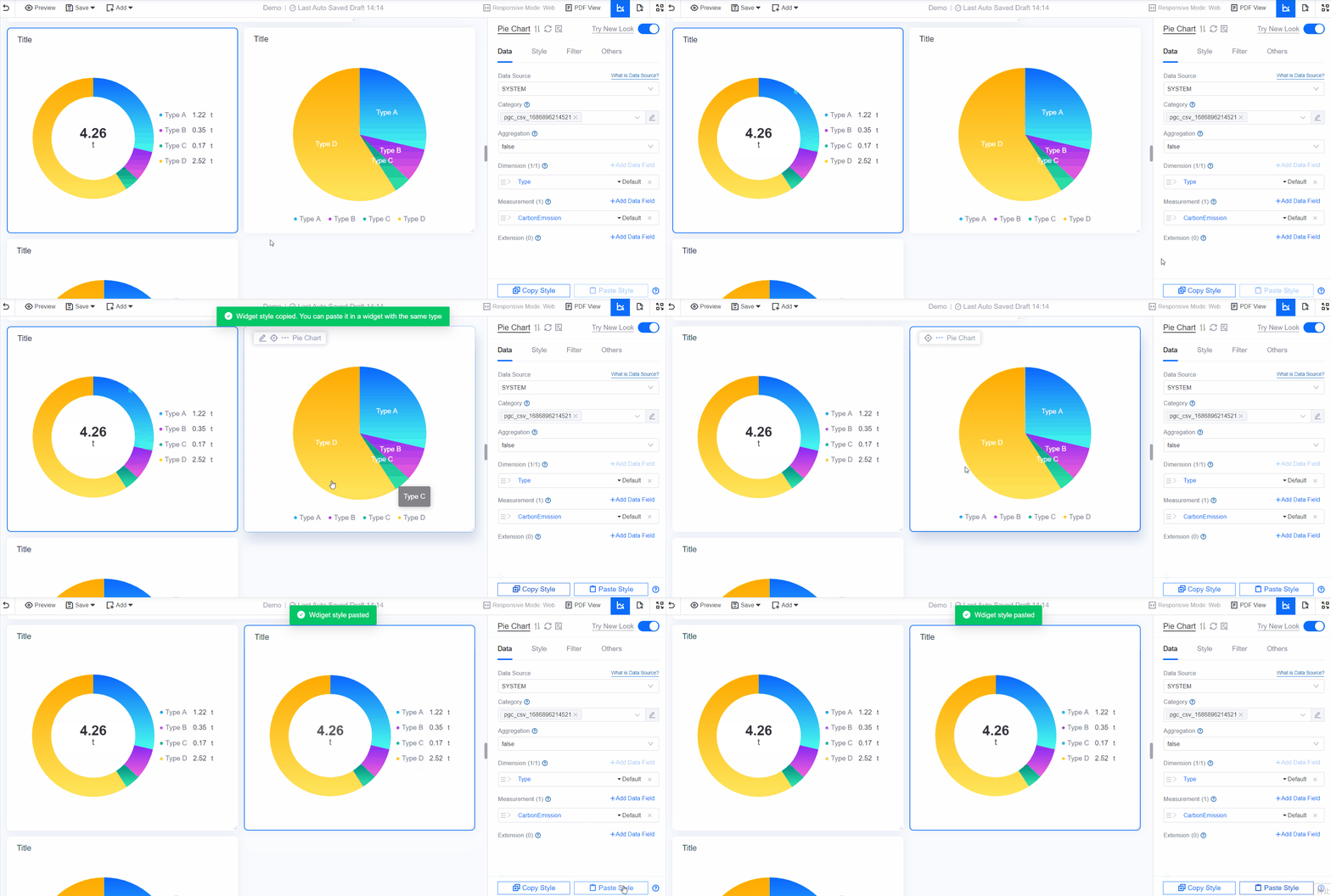
Note
Copied content is only valid in the current session. If you close the current page in the browser, the copied content will be lost.
Some style configurations associated with data items will be pasted one by one in order. If the data items of the original widget are less than those of the target widget, paste them one by one in order, and the remaining data items will retain their original styles.
Functions that use extended fields, such as marking lines, marking surfaces, same-ring ratio, etc., do not support pasting at the moment.
Currently only the following types of widgets are supported:
sheet
List
Asset list
Pie chart
Mixed graph
Bar chart
Waterfall chart
Timing diagram
Heat map
Circular instrument panel
Pointer instrument panel
Hybrid dashboard
progress bar
Water polo diagram
Indicator cards
Multiple indicator cards