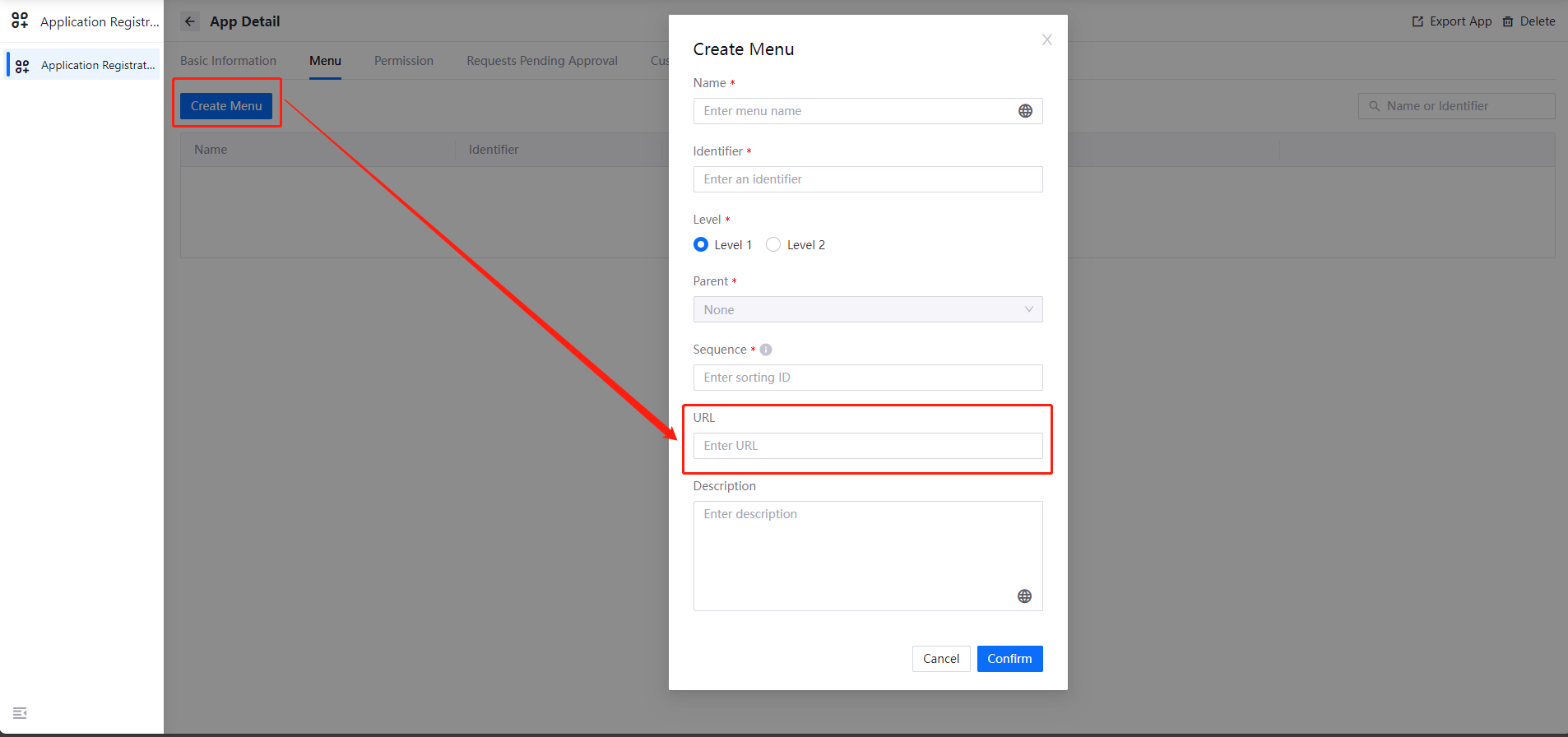
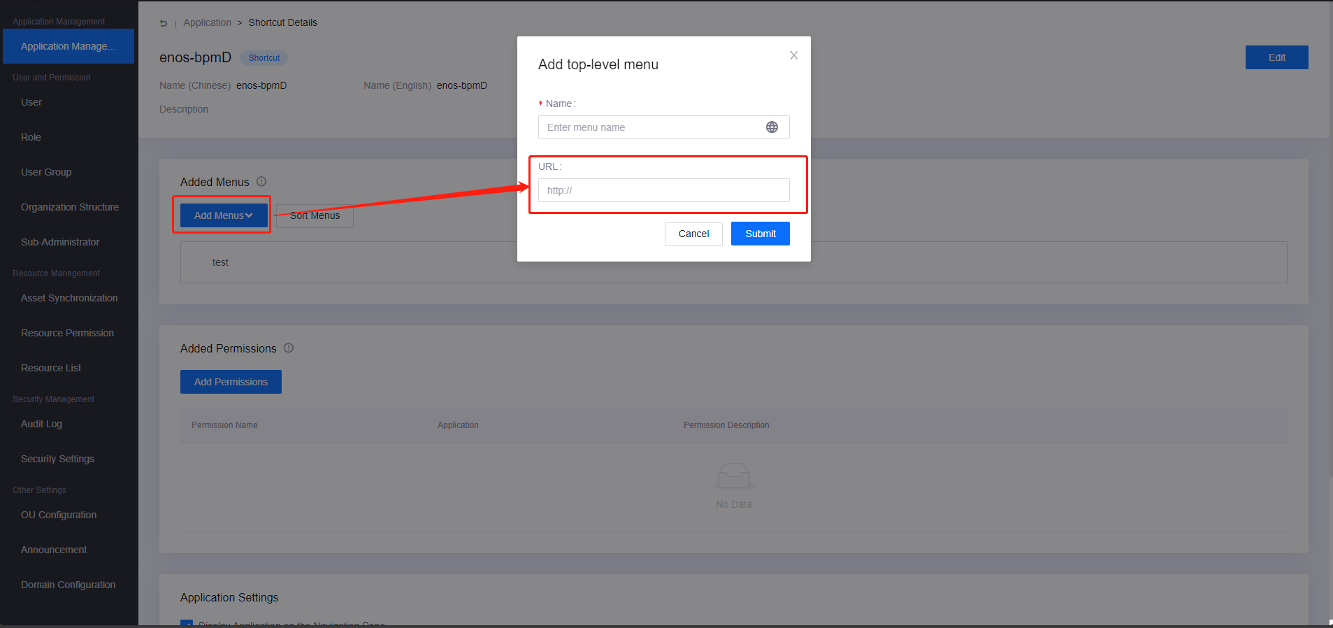
Visualizing Static Data
Overview
EnOS Digital Twin Visualization (DTV) supports building dashboard pages based on static data to visualize key metrics and measurement points, and to integrate the page into your own applications. This guide walks you through how to build a visualized dashboard page in DTV using static data.
Scenario
In this guide, you will build a dashboard page to demo in terms of the building carbon consumption scenario. Suppose that you have already received the design draft of a DTV demo page on carbon emission scenarios, which is shown below.
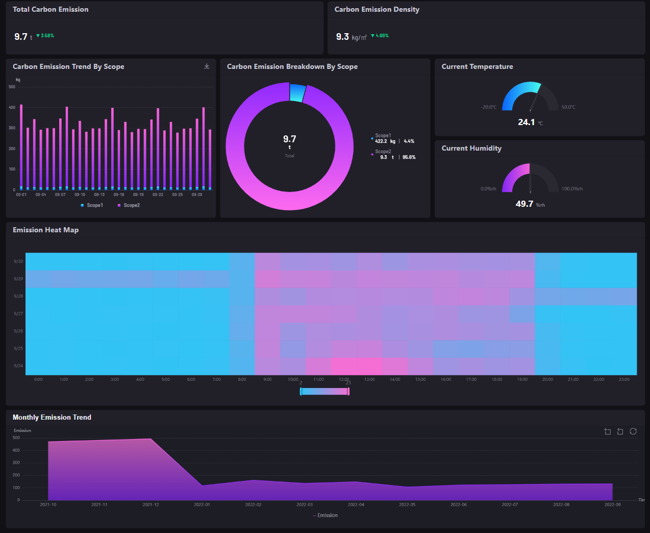
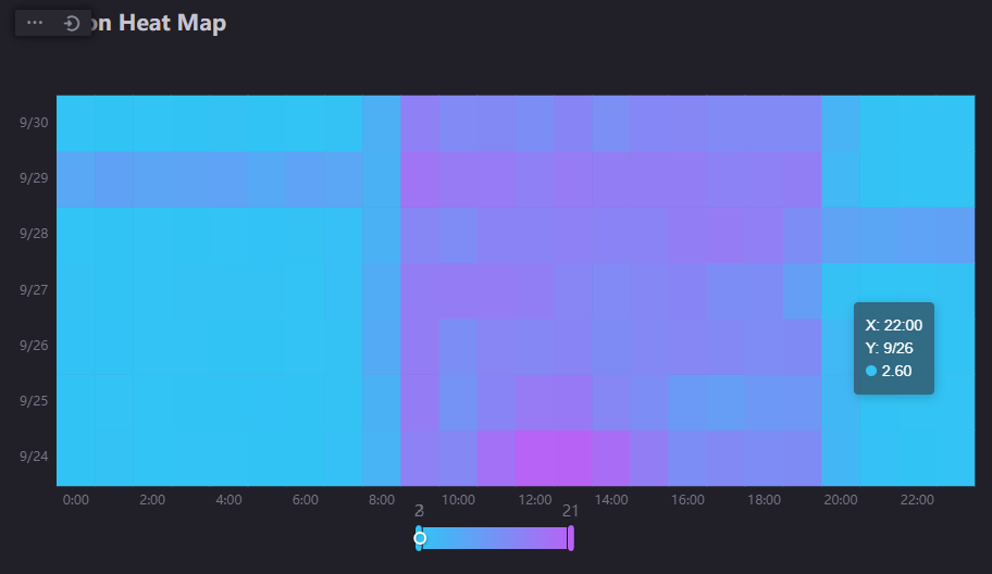
We will take the Emission Heat Map widget as an example to illustrate how to use static data to configure a widget and build a visualization page in DTV. For more information, see Heat Map.
Workflow
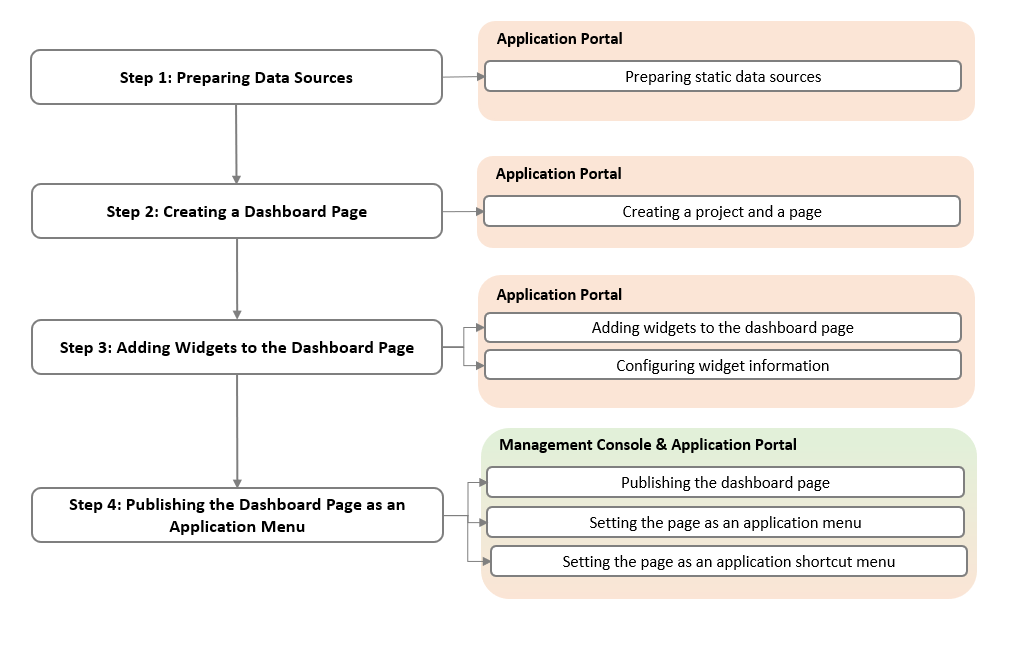
Prerequisites
Before you start, ensure the following items:
You have permission to access EnOS Application Portal and EnOS Application Portal > Developer Console of the target OU.
You have the permissions of the required assets.
To obtain the access permissions above, contact the OU administrator.
Design Mode
This section introduces how to configure a visualization page in DTV to display static data.
Step 1: Preparing the Static Data Source
To build a dashboard page according to the design draft you received, you need to first know which kinds of data sources you will use in page widgets. You can resort to the developers or project stakeholders to confirm the available data sources. In this section, suppose that the developers suggest using the static data for configuring Emission Heat Map.
Data Source Type |
Description |
|---|---|
Static Data |
To upload local static data in CSV files, which can be used to quickly build demo pages. |
You can check whether the required data source and the corresponding datasets already exist and are enabled in your DTV by the following steps:
Log in to Application Portal and select Digital Twin Visualization > Data Sources.
On the External Data Sources tab, check whether the target static data source exists.
Select Dataset to check whether the target dataset exists.
If you cannot find the target dataset or need to create your own static data source, follow the steps below:
Go to Data Source.
On the External Data Sources tab, select New Data Source.
Configure the details of your external data source in the pop-up window. You can refer to the following configuration list.
Configuration |
Required/Optional |
Example |
Description |
|---|---|---|---|
Type |
Required |
Static Data |
Besides Static Data, DTV supports other types of external data sources. |
Name |
Required |
DT Demo |
You will select the name of the data source when you configure the data of widgets. |
Metadata Cache |
Optional |
/ |
Specify the metadata cache of the data source. |
Data Cache |
Optional |
/ |
Specify the data cache of the data source. |
4. Find the data source you created in the data source list, and select Dataset.
5. Select New Dataset, enter the dataset name “DT Emission Heat Map”, and upload your CSV data file. You can upload Static Carbon Emission Heatmap File as a sample file.
Step 2: Creating a Dashboard Page
DTV organizes visualized widgets by dashboard page. Therefore, you must first create a dashboard page to hold the widgets and data that you want to display. Create a dashboard page by the following steps:
Go to Dashboards.
Select New and configure the name and project of the page.
Select Page Settings and configure the following items.
Configuration |
Required/Optional |
Example |
Description |
|---|---|---|---|
Theme |
Optional |
dark |
The color theme of your dashboard page. DTV now supports dark, green, and light themes. |
Widget Header Height |
Optional |
48 |
The height of widget header area. If you want to make your page more compact, you can turn down the height. |
Step 3: Adding Widgets to the Dashboard Page
After creating the dashboard page, you can now add the widgets to your dashboard page by the following steps:
Select Add > Add Widget/Container > Widget, and select the target widget type in the pop-up window to add a widget to the page. Taking the Emission Heat Map widget as an example, select Coordinate System Chart > Heat Map in the pop-up window.
Hover over the widgets you added and select Edit.
Configure the following information for the widgets you added.
| Category | Configuration | Example | Description |
|---|---|---|---|
| Basic | Title | Enter "Emission Heat Map" | Enter the title of the widget. |
| Hide Title | Disable this function | Enable/disable this function to hide/display the title of the widget on the dashboard page. | |
| Data | Data Source | Select "DT Demo" | After selecting the data source, you need to configure the following data source parameters: 1. Category: Select the corresponding category to get the data that you need to display in the widget. The options are the datasets uploaded to the DT Demo static data source. For example, select "Emission for Heat Map" in this guide. 2. Aggregation: Select true/false to decide whether to aggregate data when querying data from the dataset. For example, select false in this guide. |
| Dimension | Select "Hour" | Dimension is the data field displayed as the X-axis in the heat map widget. You can select "Add Data Field" and select "Hour" in the pop-up window to set the X-axis as the hours of a day. | |
| Comparison | Select "Date" | Comparison is the data field displayed as the Y-axis in the heat map widget. You can select "Add Data Field" and select "Date" in the pop-up window to set the Y-axis as the days of a week. | |
| Measurement | Select "Total Emission" | Measurement is the data field displayed in each cell of the heat map. You can select "Add Data Field" and select "Total Emission" in the pop-up window to display the carbon emission data as cells in the heat map widget. | |
| Style | Axis Style | - | The Axis Style section defines how the X and Y axes are displayed in the widget. You need to select "category"-"none"-"0" in Label Settings for both X-Axis and Y-Axis to display X-axis and Y-axis values in the format specified in the original dataset. |
| Heat Map Style | - | The Heat Map Style section defines the display style of the cells in the widget. You need to configure the following items: 1. Coloring Method: Select "Gradient" to Show the data cells in gradient colors. You can customize the gradient effect in the Gradient configuration. 2. Mark Min Value: Enable this function to display the "Min" tag on the cell with the minimum value on the heat map. 3. Mark Max Value: Enable this function to display the "Max" tag on the cell with the maximum value on the heat map. | Other Settings | - | The Other Settings section defines the display style of the legend of the widget. You need to select "Bottom-Middle" for "Position" to show the legend on the middle under the chart. |
For more information about the configuration of heat maps, see Heat Map.
Runtime Mode
Viewing the Visualization Page Built with Static Data
After completing the steps above, you can access the application in Application portal and select the menu added in the previous step to view the configured visualization page.
FAQ
Q: Why can’t I select Static Data as a data source when configuring the widget?
A: It may be because the static data source is not enabled in DTV. Select Digital Twin Visualization > Dashboard > Data Sources > External Data Sources in the Application Portal, and simply turn on the switch for the static data source.
Q: Why can’t I see the configured page menu in Application Portal?
A: This may be because your account does not have access permissions to the relevant menu group. To obtain menu group access permissions, contact the OU administrator.
