Fleet Asset List
Note
The fleet asset list is an independently deployed business widget and sits under the Business Widget group. Its configuration panel is provided by the widget itself and works differently from other chart widgets.
The fleet asset list presents the real-time and historical data of several assets together as a list or as cards, and lets users start batch actions, controls, and service requests directly from the list. It suits site inspection, device inventory management, and batch operations.
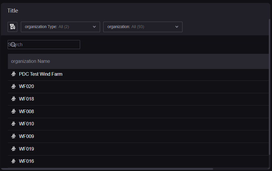
Data of Fleet Asset List
The fleet asset list does not use the DTV dimension, measurement, and comparison data fields, and the configuration panel has no entries for them. Its data comes from two places:
Page parameters: The widget reads the page-level asset selection (site, node, device, asset type) and determines which assets to show from it. When the page provides no asset selection, the widget shows no site data.
The service of the widget itself: Once the asset scope is determined, the widget queries the real-time data, historical data, attributes, and measurement point values of those assets directly from the backend.
To use this widget, therefore, provide an asset selection entry on the page (an asset navigator, for example) and then limit the asset type scope on the Asset tab of the widget.
Note
Which columns the list shows (or which metrics appear on the cards) is not set in the configuration panel but chosen in Column/Card Settings while the widget is running.
Configuration Panel of the Fleet Asset List
The configuration panel has 4 tabs:
Tab |
Description |
|---|---|
Basic |
The common basic information of DTV, such as the title and background. See Common Configurations for Charts. |
Function |
The overall form of the widget, the toolbar buttons, and the refresh intervals. |
Asset |
The asset scope and the filters. |
Action |
Batch actions, controls, and service requests. |
Function
Function Scope
Asset Dimension: Determines what one row (or one card) represents. Options are Site (default), Region, and Device. Switching it resets the asset type configuration.
Data Type: A multiple selection of Realtime (default) and Historical, which determines the kind of data the widget can show. Required.
Style Type: A multiple selection of the display forms of the widget. Required; with several selected, end users can switch between them at runtime. The options vary with the asset dimension: with Site, the options are List (default), Card, and Compact Card; with Device, they are List (default) and Card; with Region, only List is available and no card styles are offered.
Card Trend Chart: Shown only when the style type includes Card. When enabled, a trend chart appears on the asset cards. Disabled by default.
Aggregate by Region: Shown only when the asset dimension is Site and server-side pagination is not enabled. Disabled by default.
Grouped by Site: Shown only when the asset dimension is Device and server-side pagination is not enabled. Disabled by default.
Toolbar Configurations
Function Button: Enabled by default; controls whether the toolbar is shown. Once enabled, select the buttons to show in the dropdown list below: search box, list configuration, export, column/card settings, style switch, and metric card configuration.
Metric Card Mode: Shown only when Function Button is enabled and metric card configuration is selected in the dropdown list. It determines how metric cards filter: Multiple-AND (default, all conditions must be met), Multiple-OR (any condition), or Single Selection.
Other Configurations
Asset Paging In: Options are Client (default) and Server. Only provided when the asset dimension is Site or Device.
Asset Pinning: Lets end users pin the assets they care about to the top of the list. Shown only when server-side pagination is not enabled and the asset dimension is site or device. Disabled by default.
Metric Card Counting: Shown only when server-side pagination is not enabled. Disabled by default.
Permission on Column/Card Settings: When enabled, only users with the relevant permission can access the column/card settings. Disabled by default.
Total Row: Shown only when server-side pagination is not enabled and the asset dimension is not device. Enabled by default.
Total Row Position: Shown only when the total row is enabled. Options are Top and Bottom (default).
Total Row Prefix: Controls whether prefixes such as sum and formula are shown inside the total row. Enabled by default.
Local Time: Controls whether the current time of the data is shown. Enabled by default.
Once Server paging is enabled, Aggregate by Region, Asset Pinning, Metric Card Counting, and Total Row are all turned off, and Selection Method, Filter by asset, and Asset Tree Style on the Asset tab are no longer provided.
Refresh Interval
Realtime: The refresh interval of real-time data, in seconds, with a default of 60 and a range of 3 to 3600.
Timeseries: The refresh interval of historical data, in seconds, with a default of 60 and a range of 10 to 3600.
UI Text Customization
Sets custom content for the interface text of the widget, which can be entered per language. Use it to replace the default wording (for example “Site”) with the term your business uses.
Asset
Asset Scope
Asset Type: Select the types the widget shows from the asset type tree. Required. Once selected, drag the rows in the table below to change the display order.
Device Type: Shown only when the asset dimension is Device. Select the device types to show. Required, and also supports drag ordering.
Multi-Site Device Query: Shown only when the asset dimension is Device. Disabled by default. When enabled, devices can be queried across sites.
Note
Enabling multi-site device query may affect performance.
Filters
The items below control which filter entries are available at runtime; turn them off as needed to simplify the interface.
Asset Type Filter: Enabled by default. Once enabled, you can also set Display Name, either By Type (default) or By Industry. Taking wind power as an example, by type it reads “Wind Farm” and by industry “Wind Power”.
Site Filter: Shown only when the asset dimension is site or device. Enabled by default. Filter nodes without permission beneath it is read-only; its value comes from the menu parameters and is not edited here.
Region Filter: Shown only when the asset dimension is Region. Enabled by default.
Device Type Filter: Shown only when the asset dimension is Device. Enabled by default. Once enabled, you can set:
Filter Type: Either Dropdown (default) or Grid Button.
Selection Method: Either Single Selection (default) or multiple selection. Only provided when server-side pagination is not enabled.
Filter by asset: Only provided when the asset tree style is By List and the selection method is single selection. Enabled by default.
Device Filter: Shown only when the asset dimension is Device. Enabled by default. Once enabled, you can set Asset Tree Style, either By List (default) or By Hierarchy.
Action
Batch Action
Batch Action is disabled by default. Once enabled, select Configure Batch Action to set the following in the dialog box:
Site Type or Device Type: The asset types the batch action applies to. Required.
The action list holds at most 3 entries, each containing:
Action Button Name: The text shown on the button, which can be entered per language.
Max Actions: The maximum number of assets one action can cover, from 1 to 200 with a default of 200.
Link Type: Options are New Tab (default), Current Tab, Bottom Drawer, Side Drawer, and Popup Window.
URL: The target address of the action.
Batch Criteria: When selected, you can choose 1 attribute as the action condition. When the batch action button is used on the page, only assets with the same value for that attribute can be selected together for the batch action.
Control
Single Control: Disabled by default. Once enabled, select the site types or device types it applies to.
Batch Control on Sites or Batch Control on Devices: Disabled by default. Once enabled, select the types it applies to and set Max Controls (10 by default for sites and 1000 for devices).
Send Service Request
Disabled by default. Once enabled, select the site types or device types it applies to.
When the asset dimension is Region, neither Control nor Send Service Request is available and the interface reports that the configuration is not available.
Interactions at Runtime
The widget provides the following behaviors at runtime, with no configuration needed:
Sorting: Selecting a column header sorts by that column. With server-side pagination enabled, sorting happens on the backend.
Pagination: When there are more assets than one page holds, a paginator appears and the number of rows per page can be adjusted.
Search: Filter assets by name with the search box in the toolbar.
Adjusting column width: Drag a column boundary in the list to change its width.
Column/card settings: Choose the columns or card metrics to show from the toolbar.
Batch selection: Once batch actions are enabled, the list provides check boxes for selecting several assets.
Export: Once export is enabled, the current list data can be exported; the widget warns when the data exceeds the limit.
Automatic refresh: Data is fetched again at the Refresh Interval.
Note
The Asset Paging In item is not provided when deployed on EnOS 3.x.