Progress Bar
A progress bar uses the length of a bar to show how far a value has progressed within a target range. It supports comparing several bars side by side, icon annotation, color rules, and more, and is commonly used for KPI completion rates and equipment utilization.
This topic describes the configuration items specific to the progress bar. For the items common to all charts, such as the Basic tab and the Filter tab, see Common Configurations for Charts.
Types of Progress Bar
DTV presets several common progress bar types. When adding a progress bar to a page, choose from the following according to your business scenario:
Progress bar type |
Style |
Description |
Recommended scenario |
|---|---|---|---|
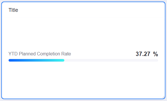
Basic Progress |
|
A single bar showing the completion of one measurement, with support for color rules and trend analysis. |
KPI completion rates and the progress of a single metric. |
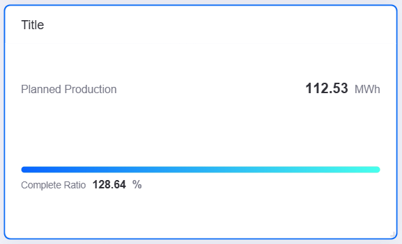
With Metric Card |
|
Shows up to 3 metric cards (KPI values) beside the progress bar, bringing the completion and the related values into one view. The progress graphic can be switched between donut gauge, meter gauge, progress bar, and liquid fill. Comparison fields are not supported. |
When progress and several related KPIs (such as current value, target value, and year-on-year) need attention in the same view. |
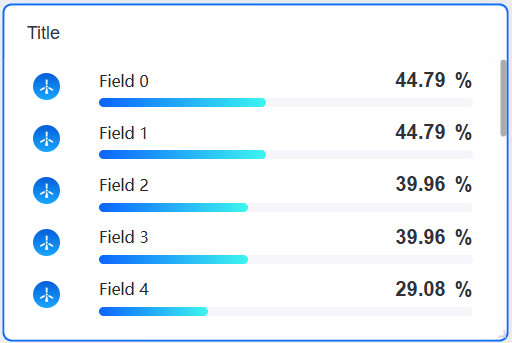
With Icon |
|
Shows an icon driven by an extension field value beside the progress bar, conveying status through the icon color. |
When icons need to distinguish device status or alarm severity. |
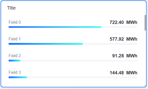
With Comparison |
|
With a comparison field configured, splits the data into several bars side by side by comparison value, with support for carousel paging. |
Comparing multiple sites or devices, such as the annual plan completion rate of each site. |
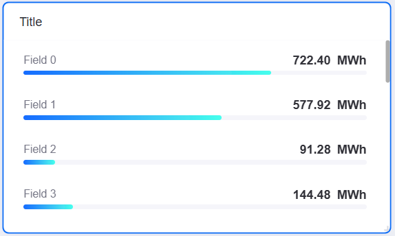
Ranking List |
|
A progress bar with comparison, sorted by value, with a rank index in front of each bar and a click to toggle between ascending and descending order. Suits large screens. |
Ranking site generation or KPI completion rates. See Ranking List. |
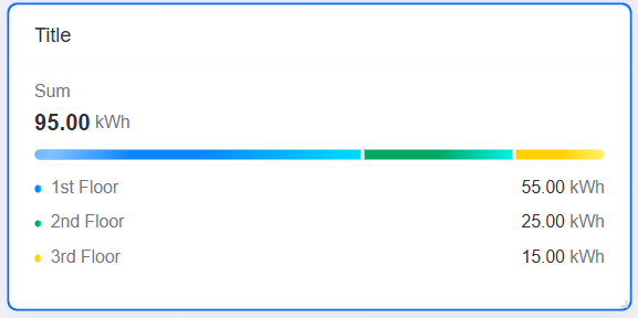
Stacked progress bar (with legend) |
|
Several measurements stack into one bar, with names and values shown as a legend below the bar and an optional summary of all measurements on the right. |
When a legend is needed to explain the categories, such as a summary of the generation share by energy type. See Stacked Progress Bar. |
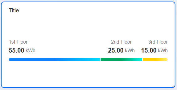
Stacking progress bar (value on top, no icon) |
|
Several measurements stack into one bar, with the name and value of each series labeled directly above the bar in a compact layout and no separate legend area. |
When space is limited but the value of each series needs to be labeled on the bar. See Stacked Progress Bar. |
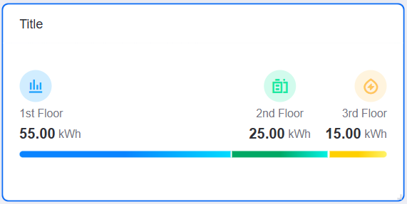
Stacked progress bar (with icon) |
|
Several measurements stack into one bar, with built-in or custom icons configurable beside the name and value of each series, positioned at the top or on the left. |
When icons should strengthen the visual identity of each category, such as a branded large-screen display. See Stacked Progress Bar. |
Data of Progress Bar
The progress bar uses three kinds of data field to control different aspects of the display: Measurement determines the bar length; Comparison splits the data into several bars side by side; Extension provides additional information per bar, such as the basis for an icon or a custom label name.
For general information about data sources and data fields, see Common Configurations for Charts > Configuring Data.
Measurement
A progress bar requires at least 1 measurement field and accepts several; each measurement field corresponds to one bar. In Metric Style you can configure the unit, percentage display, decimal places, and other styles of each measurement separately.
Comparison
A Comparison field splits the data into several separate progress bars by value, one bar per comparison value, with the comparison value shown as a label on the left. Only 1 comparison field is supported. Once a comparison field is added, Comparison Style becomes available.
Note
The With Metric Card type does not support comparison fields.
Extension
The progress bar supports several Extension fields. Extension fields are not shown as bar content directly; they have the following uses:
Icon condition: The value of an extension field is matched against the icon condition rules to show a corresponding icon per bar. Specify the extension field to match in Data Field.
Bar Name: The value of an extension field replaces the comparison field value as the display name of the label on the left. Specify the extension field for the name in Bar Name. This use requires a Comparison field; otherwise the label on the left still uses the comparison field value.
Note
These two items are the only uses of extension fields in the progress bar. Adding extension fields without referencing them there changes nothing in the chart.
Style of Progress Bar
The progress bar uses five groups of style settings for different aspects of the display: Comparison Style manages the arrangement and labels of several bars; Metric Style configures how a measurement is presented; Name, Unit and Value sets the appearance of the name, unit, and value; Progress Bar defines the style and layout of the bar; and Icon adds a status indicator to each bar.
For general information about the title and the widget, see Common Configurations for Charts > Configuring Style.
Comparison Style
Note
The With Metric Card type does not support comparison style.
Shown once a Comparison field has been added under Data, this section controls the overall arrangement and label style of several bars.
Interaction Settings
Configures the jump action triggered by clicking a comparison label. See Common Configurations for Charts > Interaction Settings.
Layout
Row and Column specify the maximum number of rows and columns per page. For example, with 2 columns the progress bars sit two by two.
Show “Expand”
When enabled, an Expand button appears at the bottom of the widget, which end users select to view all the progress bars.
Unified Unit
When enabled, the values of all progress bars are converted to the same unit, which makes them easy to compare.
Value Font
The font style of the comparison label to the left of each progress bar in the chart.
Carousel Effect
Takes effect when the number of comparisons exceeds what one page shows. Options are None (no carousel), Scroll (scrolls upwards), and Page Flip (switches whole pages).
Rotation Interval
The interval of the automatic carousel, in seconds. Set it to 0 to disable the automatic carousel.
Bar Name
Select one of the Extension fields and use its value as the display name of the label on the left of the bar, replacing the comparison field value. Select None to show the comparison field value.
Metric Style
Shown once a Measurement field has been added, this section provides style settings for that measurement.
Interaction Settings
Configures the jump action triggered by clicking a measurement value. See Common Configurations for Charts > Interaction Settings.
Note
The measurement value area is also the trigger point for the progress bar to link other widgets. When configuring widget linkage, you can select that measurement field as the trigger action. See Link Other Widgets.
Open Trend Analysis
When enabled, end users can open the Trend Analysis dialog box by hovering over a measurement value. Only common data service data sources are supported. See Open Trend Analysis.
Once enabled, configure the following:
Asset Aggregation: Aggregates the same metric data across several assets.
Asset Parameter: Specifies the asset IDs shown in trend analysis, separated by commas. The placeholders
${parameter_key},@{parameter_key}, and#{field_ID}are supported.
Unit Name
The unit text of the measurement. The unit is not shown while Show As Percentage is enabled.
Dynamic Unit
When enabled, the value automatically takes a suitable unit, for example 10000 becomes 10 k. See Unit.
Show As Percentage
When enabled, the measurement value is converted into a percentage of the maximum in Axis Range, and the unit name is hidden automatically.
Decimal Places
The number of decimal places of the displayed value for this measurement (0 to 3).
Name, Unit and Value
Controls the display style of the name, unit, and value, and the color rules.
Show Name
Controls whether the name label is shown. Without a Comparison configured, the name is the measurement field name; with a Comparison configured, the name is the comparison field value, in which case the label font is controlled by Comparison Style > Value Font and the name font settings below have no effect.
Name Font / Unit Font / Value Font
Set the font style of the name label, the unit text, and the value respectively. The name font only takes effect when no Comparison is configured.
Axis Range
Specifies the minimum (Min) and maximum (Max) of the progress bar manually, which determines the full-scale baseline. When left empty, the maximum of the data is used as full scale. With Show As Percentage enabled, Max is the baseline that corresponds to 100%; it is empty by default (taking the maximum of the data automatically) and can also be entered manually.
Color Rules
Assigns different colors to the bar and the value text by value. A rule with no value entered acts as the default color. See Color Rules.
Progress Bar
Controls the appearance and layout details of the bar itself.
Progress Bar Height
The thickness of each bar, in px.
Name Margin / Value Margin
The percentage of the row width taken by the name label area and the value label area respectively. Their sum determines the width of the bar area. Only takes effect in the horizontal layouts.
Name Alignment / Value Alignment
The alignment of the text inside the name and value labels (left, center, or right).
Layout
How the bar, the name, and the value are arranged:
Bar before Value: Name on the left, bar in the middle, value on the right.
Bar after Value: Name and value on the left, bar at the far right.
Bar below Value: Name and value above, bar immediately below. Suits a widget with limited height.
Unit Position
The position of the unit text relative to the value: Follow Value (shown to the right of the value) or Top Left (shown as a superscript above and right of the value).
Show Rank Index
When enabled, a rank index (1, 2, 3, and so on) appears in front of each bar. A sort icon appears beside the index, and end users can select it to switch between DESC and ASC. You can also configure:
Ranking Label Color: The background color of the rank index.
Ranking Label Font: The font style of the rank index.
Dynamic Effect
When enabled, the progress bar plays an animation growing from 0 to the current value in a loop.
Icon
Maps the value of an Extension field to different icons through condition rules and shows the icon beside each progress bar.
Data Field
Select one of the Extension fields as the basis of the icon conditions.
Icon Configurations
Select + Add to configure the icon style per field value:
Configuration item |
Description |
|---|---|
Value |
The field value that triggers the rule. Leaving it empty matches every value not hit by another rule, acting as a fallback rule. |
Select Icon |
Select an icon from the built-in icon library. |
Icon Color |
The color of the icon, with solid and gradient colors supported. |
Icon Size |
The size of the icon, in px. |
Icon Area Width Ratio |
The percentage of the row width taken by the icon area (0 to 100). |
URL |
The URL to open when the icon is selected. Dynamic parameters are supported. |
Interactions at Runtime
The progress bar behaves as follows at runtime:
Bar click linkage: The bar area is always clickable and the mouse pointer is a hand. Once linkage is configured on the Filter tab, selecting a bar triggers it. For the configuration method, see Link Other Widgets.
Value jump and trend analysis: Once Metric Style > Interaction Settings is configured, selecting a measurement value performs the jump, which only works on the published page. Once Open Trend Analysis is enabled, Add to Trend Analysis appears when hovering over a value. When both are configured, hovering shows a two-item menu with the jump and Add to Trend Analysis; when neither is configured, the value has no hover or click effect.
Comparison label jump: Once Comparison Style > Interaction Settings is configured, selecting the comparison label on the left performs the jump.
Icon jump: When a URL is entered for an icon rule, selecting the icon opens that address in a new window.
Toggling sort order: Once Show Rank Index is enabled, a sort icon appears beside the index and selecting it switches between descending and ascending order. No sort icon is provided when Carousel Effect is Page Flip.
Carousel and expand: When Carousel Effect is Scroll, hovering the mouse pauses the scroll and moving away resumes it; Page Flip does not pause on hover. Once the carousel is enabled, the Show “Expand” button is no longer provided.
Full text: A name or value that overflows its area is truncated, and hovering the mouse shows the full text.