Configuring Navigators
In Navigation Configuration, you will configure the navigators that enable users to switch canvases and filter data in the single-page application, to create a unified, flexible, and efficient data visualization experience. To learn more about navigators, see DTV Key Concepts.
Navigator Types
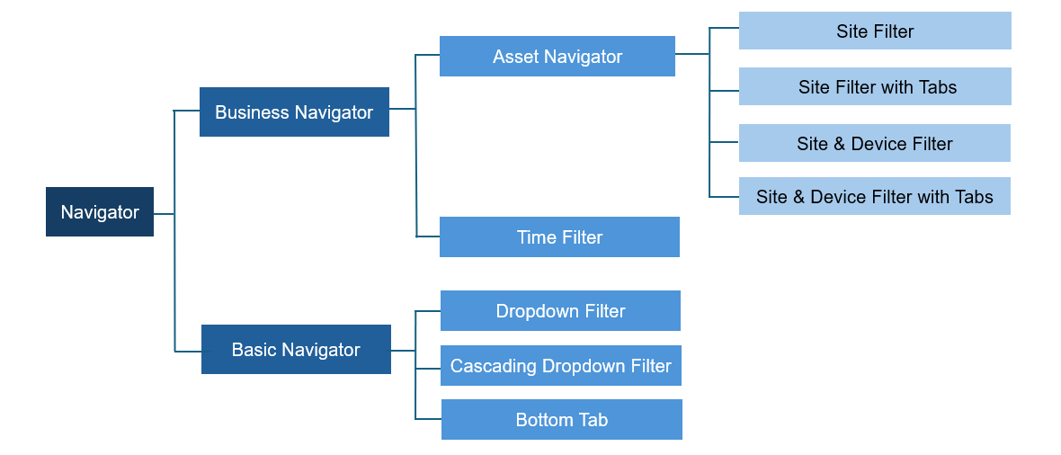
Navigators are categorized into Business Navigators and Basic Navigators. Their sub-types and usage rules are as follows:
Business Navigators
Asset Navigator: You can add only 1 business-type asset navigator to the page, but you can use it along with other navigator types.
Time Filter: You can add only 1 time filter to the page, but you can use it along with other navigator types.
Basic Navigators
Dropdown Filter: Supports duplicate addition and using along with other navigator types.
Cascading Dropdown Filter: Supports duplicate addition and using along with other navigator types.
Bottom Tab: You can add only 1 bottom tab navigator to the page, but you can create multiple tabs within it and use it along with other navigator types.
Adding Navigators
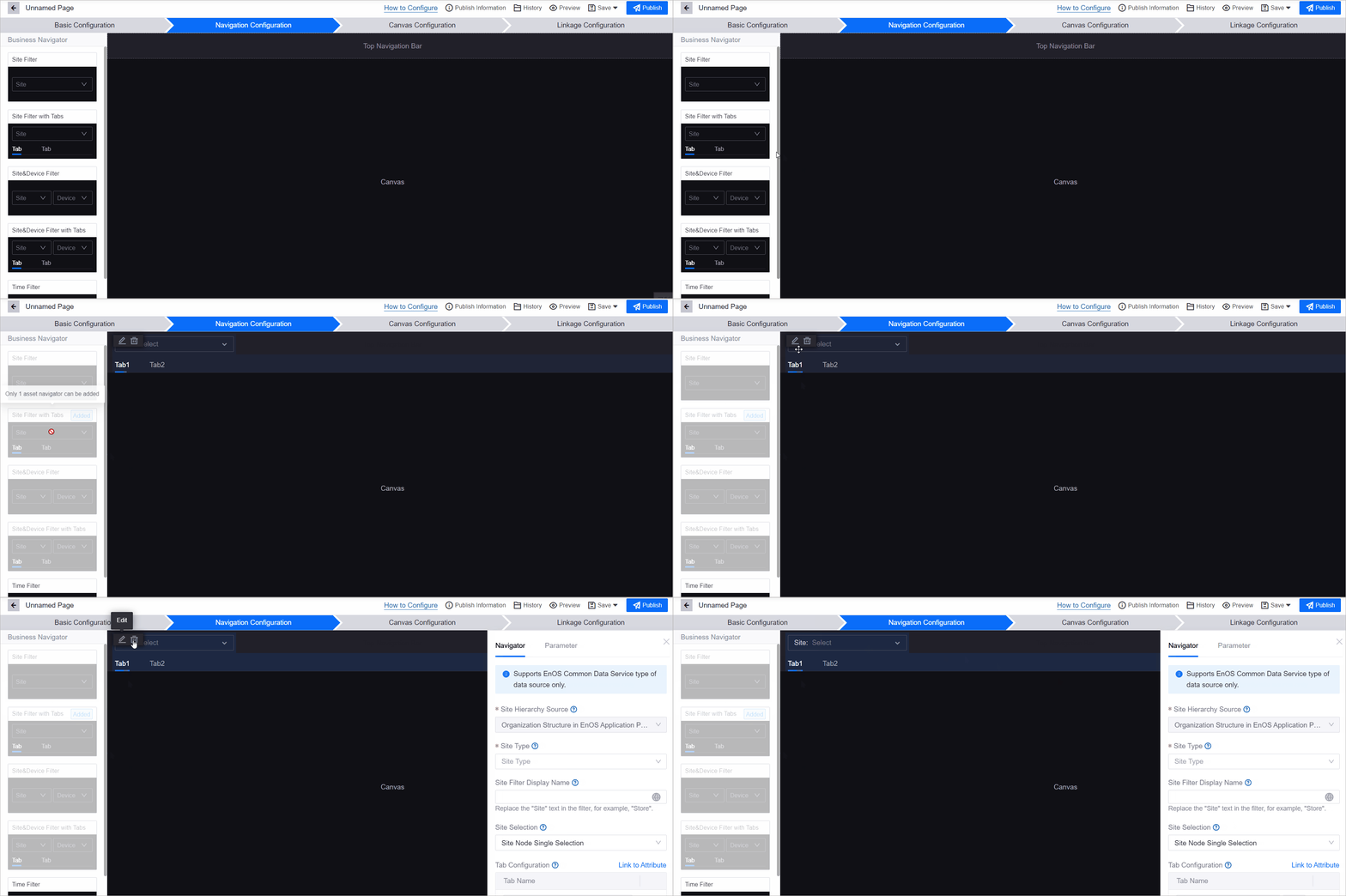
To add a navigator, choose one from the list on the left and select Add. You can reposition any navigator by dragging it. Follow the guide below to configure the navigators that you added.
Configuring Business Navigators
After adding a navigator, configure it in the panel that opens on the right. If you have added multiple navigators, hover over a navigator and select  to open its configuration panel.
Configuring Asset Navigator
Do not show in runtime
When enabled, the navigator will be hidden from the navigation bar in runtime. It will only be visible in the configuration interface.
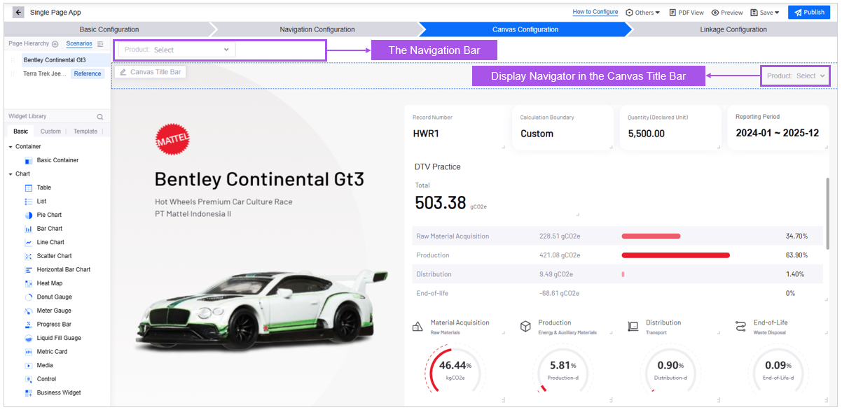
After hiding the navigator from the navigation bar, you can follow the steps below to put it into the Canvas Title Bar for better user experience:
Go to Canvas Configuration, select Configure Canvas of the target canvas in the Page Hierarchy.
In the Configure Canvas panel, select the checkbox of Enable Canvas Title Bar.
In the item Display Navigator in Canvas Title Bar, select the navigator.
Site Hierarchy Source
Configure the options displayed in the site filter’s drop-down menu, including group, region, site type, and site list. The site hierarchy is defined by the organizational structure in the EnOS Application Portal. You can obtain the organizational structure that a specific user has permission to via the Get Structure by User API.
Site Type
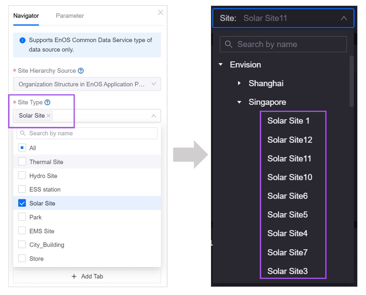
Configure the site types displayed in the site filter’s drop-down menu, The site types are defined by Business Objects in Common Data Service. Users of the page will be able to view and select the types of sites and the devices within these sites.
Site Selection
Configure the selection method of the filter:
Site node radio selection: Users can select one station, and the aggregated data of the selected station will be displayed.
Any node radio selection: Users can select one station, region or group, and the aggregated data for the region or group will be displayed.
Multiple Selection: Users can select multiple stations, regions or groups, and the aggregated data of the highest-level selection will be displayed.
Filter Site by Attribute
When enabled, you can configure a filter rule to display only the sites that meet the attribute values you specified.
Device Hierarchy Source
Configure the options displayed in the device filter’s drop-down menu. The device hierarchy is defined by the asset level of the Common Data Service. You can obtain the hierarchical structure of devices via the Query Asset Hierarchy API.
Device Type
Configure the device types displayed in the device filter’s drop-down menu. The device types are from Business Objects in Common Data Service. Once selected, users will be able to view and filter only these types of devices on the page.
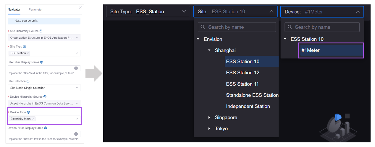
Site/Device Filter Display Name
Type in the display name of the filter.

Filter Site by Device
When enabled, you can configure a filter rule to display only the devices that meet the attribute values you specified.
Remember Asset Filters
After refreshing the page or navigating to a different page, the previously set asset filter conditions will still be retained. Only single selection is supported.
Tab Configuration
Users can switch the displayed canvas by switching tabs. In tab configuration, you can add and delete tabs for the page, customize the tab name, and associate attributes for the tab.
By default, when users filter assets, the asset data displayed in the canvas changes correspondingly, while the tabs remain unmodified. To display different tabs for different assets, you can select Link to Attribute to associate an attribute value with each tab. One tab only corresponds to one value, and it is recommended to associate attributes with enumerable values.
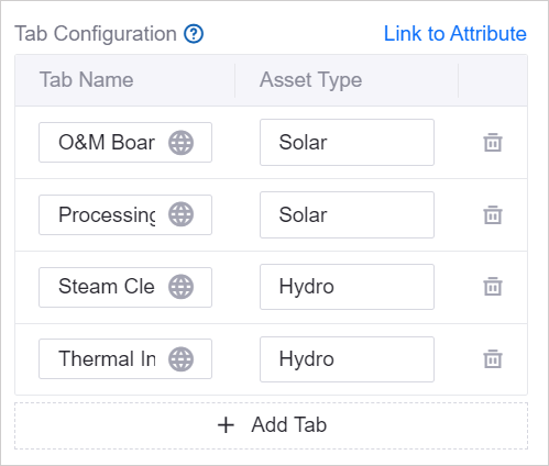
After configuring as shown in the figure, when the users filter assets on the page, if the mdmType attribute value of the selected asset is Solar, the page will display two tabs: O&M Dashboard and Power Generation Performance. If the mdmType attribute value of the selected asset is Hydro, Steam Cleaning Panel and Thermal Insulation will be displayed on the page.
Remember Tab Filters
When enabled, after refreshing the page or navigating to a different page, the previously selected tab will be retained.
Filter associated resources based on Asset Type
When enabled, the navigator will only display resources aligned with the selected asset type. For example, if the Site Type is solar site, only solar sites will be shown in the dropdown menu of the site filter.
Configuring Time Filter
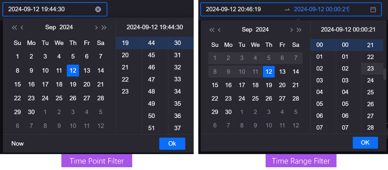
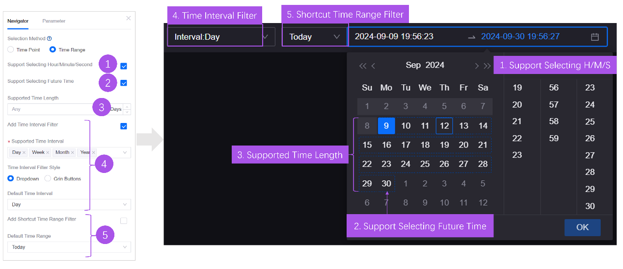
Time filters provide users with access to data within a specified time range. Firstly, you need to configure the selection method of the time filter. You can choose Time Point or Time Range. The remaining configuration items differ according to the selection method.
Time Point Filter
In the time point filter, users specify an end time, and the system determines the start time based on the default time interval or the user-specified time interval to derive the time range. For example, the time interval is day, and the end time is 2024-08-06 18:23:42. The time range of the data displayed on the page will be 2024-08-06 0:00:00 to 2024-08-06 18:23:42.
Time Range Filter
In the time range filter, users can specify the start and end time of the data displayed on the page.
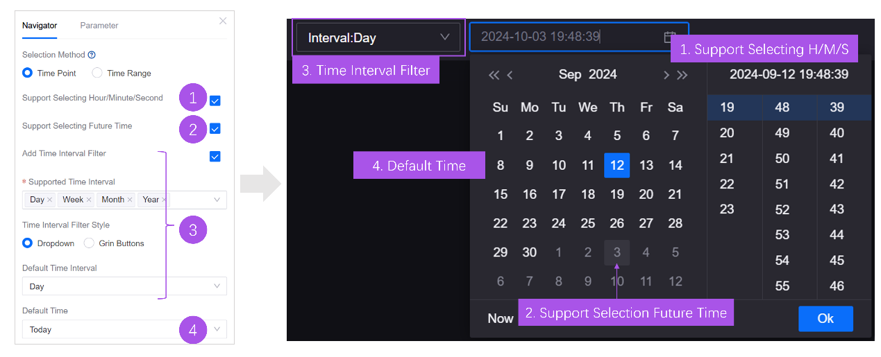
Support Selecting Hour/Minute/Second
If enabled, when the time interval is Day, the user can specify hour, minute and second, and the time range will be from 0:00:00 of the day to the specified hour, minutes and seconds.
Support Selecting Future Time
If the time range specified by the user includes future time of the current time zone, and the widgets support displaying future forecast data, forecast data for the corresponding period will be shown. If the widget does not support displaying forecast data, data from the specified start time to the current moment will be displayed.
The timeframe will vary depending on whether future time is supported. For example, at 11:40:58 on August 6, 2024, the user selects the time interval as Day and specifies the time point as 2024-08-06,
When Support future time selection is enabled, the time range will be
2024-08-06 0:00:00to2024-08-06 23:59:59, with the end time being the last 1 second of the day.When Support future time selection is not enabled, the time range will be
2024-08-06 0:00:00to2024-08-06 11:40:58, with the end time being the moment the user using the filter.
Time Interval Filter
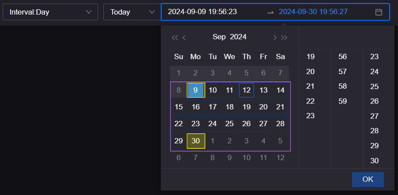
The time interval filter allows users to specify the time range of data in natural time units. For example, when the user defines the time interval as Week and selects 2024-07-10 to 2024-07-20, data between the 28th week (the week of 2024-07-10) and the 29th week (the week of 2024-07-20) of 2024 will be displayed. The actual time range is 2024-07-08 0:00:00 to 2024-07-21 23:59:59.
Remember All Filters
When enabled, after refreshing the page or navigating to a different page, the previously set time filter conditions will be retained.
Configuring Business Navigator Parameter
Shown in this tab are the available parameters for the navigator. These pre-defined output parameters vary between different navigators. Users filter data by selecting items from the drop-down list of the navigator, and the navigators transmit the Key in a pre-defined format to the backend to enable page interaction.
Configuring Basic Navigators
When users switch between items provided in the filter, the widgets that use the corresponding data source will display data accordingly.
Select Data and Data Source
Specify data source for the navigator. See Data Source Overview to learn about the data source types that DTV supports.
Dropdown Display Option
Set the display option in the dropdown menu of the navigator.
Output Parameter
When users choose one of the options from the dropdown menu, the navigators transmit its output parameter to the server.
Key
Define the mapping between the options displayed in the navigator and its output parameters, to translate frontend filter selections into corresponding backend instructions.
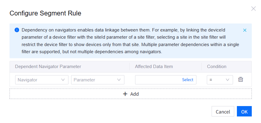
Depend on Other Navigator
When enabled, you can form linkages between navigators by configuring segment rules—selecting dependent parameters, affected data item, and the condition.
Navigator Display Name
Fill in the display name of the navigator. If a custom name is not provided, data item name will be used as navigator name by default.
Selection Method
The navigator supports either single selection or multiple selection.
Tab Name
Customize the tab name displayed in the navigator.
Enable Tab Icon
When enabled, you can upload an icon for each tab or select from the built-in icon library.
After finishing Navigation Configuration, you move on to Canvas Configuration to set up the canvas, layers, and panels on the page.
