- Documentation
- Configuring Charts
- Control
- Button
Button
The button widget places a clickable action entry on a dashboard page. Selecting it can jump to a specified link, issue a request, or trigger data linkage with other widgets.
For common configuration such as the title, background, padding, and style copying, see Common Configurations for Charts.
Data of Button
The button accepts 1 dimension field. For general information about data sources and data fields, see Common Configurations for Charts > Configuring Data.
With the action set to Redirection, no data field is needed.
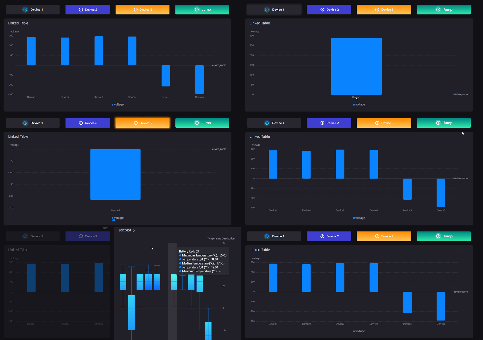
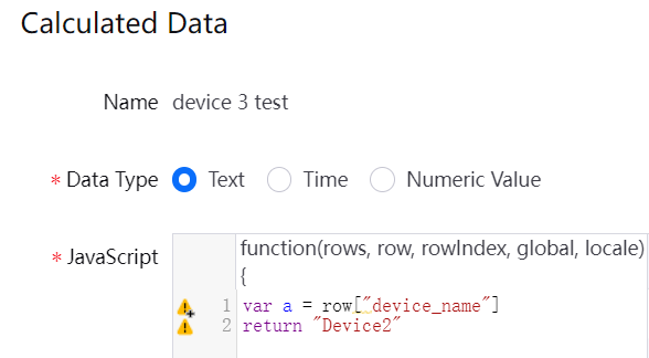
With the action set to Link Widget, the button broadcasts the first entry of that dimension field to the other widgets as the linkage value. If the first entry is not the value you want to filter on, add a calculated field with a fixed return value. For example, when the linkage target needs
device_name = Device2, add a calculated field that always returnsDevice2.
Style of Button
Action
Action determines what happens when the button is selected. Options are Redirection (default) and Link Widget.
Redirection: Jumps or issues a request as configured in Interaction Settings.
Link Widget: Broadcasts the dimension value the button carries to the widgets on the page that have a linkage relationship configured. Selecting this hides Interaction Settings.
Interaction Settings
Shown only when Action is Redirection. Select Interaction Settings to configure the behavior on click in the dialog box. For details of each item, see Common Configurations for Charts > Interaction Settings.
Icon Type
Icon Type determines the source of the button icon. Built-in by default:
Built-in: Select from the DTV built-in icon library, after which you can configure Icon, Icon Background, and Icon Color.
Custom: Use Custom Icon to upload or select an image from the asset library. Selecting this hides Icon, Icon Background, and Icon Color.
Icon
Shown only when Icon Type is Built-in. Select a specific icon from the built-in icon library.
Custom Icon
Shown only when Icon Type is Custom. Upload an image or select one from the asset library as the button icon.
Icon Background
Shown only when Icon Type is Built-in. When selected, a semi-transparent block is placed behind the icon as a backing, taking its color from Icon Color.
Icon Color
Shown only when Icon Type is Built-in. Sets the icon color, with solid and gradient colors supported. Once Icon Background is selected, the backing takes the same color.
Icon Size
Sets the display size of the icon, with a default of 20.
Icon Position
Sets the direction of the icon relative to the button text. Options are Left (default) and Right.
Icon-Text Spacing
Sets the distance between the icon and the button text, with a default of 12.
Button Text
Enter the text shown on the button. It can be entered per language, which suits multilingual pages.
Font
Sets the font, font size, color, bold, italic, and underline style of the button text.
Background Color
Sets the fill color of the button, with solid and gradient colors supported. When the background on the Basic tab is set to automatic, the button takes the default base color of the current page theme.
Border Color
Sets the color of the button outline, with solid and gradient colors supported.
Border Width
Sets the width of the outline, with a default of 2. Set it to 0 to hide the border.
Rounded Corners
Sets the corner radius of the button, with a default of 2. Increasing it makes the button approach a capsule shape.
Interactions at Runtime
The widget provides the following behaviors at runtime, with no configuration needed:
Turning linkage on and off: With the action set to Link Widget, the first click broadcasts the linkage value and a second click cancels the linkage and restores the other widgets. While linkage is active, a halo appears around the button.
Hover tooltip: With the action set to Link Widget, the tooltip reads Linked Widgets before linkage is triggered and The widget linked. Click again to cancel the linking. afterwards; with the action set to Redirection, the tooltip text is the interaction display name entered in Interaction Settings.
Pointer with no jump configured: With the action set to Redirection but no valid jump target configured, the mouse pointer does not become a hand.
Note
When you switch preset styles, Action, Interaction Settings, and Button Text are preserved and not overwritten by the preset.