Meter Gauge
A meter gauge shows where a value sits within a specified range as a dial, and supports two layouts: Pointer Style and Ring Style. Once a comparison field is added, several gauges can be arranged side by side to compare multiple groups of data.
This topic describes the configuration items specific to the meter gauge. For the items common to all charts, such as the Basic tab and the Filter tab, see Common Configurations for Charts.
Types of Meter Gauge
When adding a widget, the Meter Gauge group provides the following options:
Preset |
Style |
Description |
Recommended scenario |
|---|---|---|---|
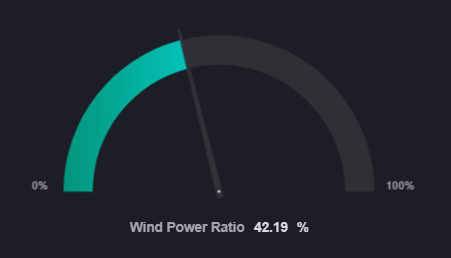
Basic Meter Gauge |
|
A semicircular dial with a pointer, with the lower and upper limits of the range labeled at both ends. |
Showing instrument readings of a single device such as speed, temperature, or pressure. |
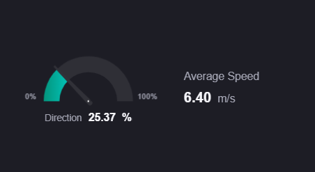
With Metric Card |
|
A meter gauge combined with up to two metric cards. For the configuration method, see Donut Gauge with Metric Card. |
Showing an instrument reading alongside a few key values. |
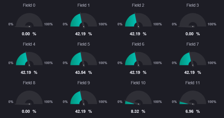
With Comparison |
|
Split into several meter gauges by comparison field and shown side by side. |
Comparing the speed of each unit or the temperature of each workshop. |
The configuration panels of Basic Meter Gauge and With Comparison are identical; the only difference is that the latter comes with a Comparison data field preconfigured. You can add or remove the comparison field at any time after creating one, so the two presets convert into each other.
In addition, Ring pointer instrument panel in the Donut Gauge group is this same widget, only preset to the ring style layout, so this topic applies to it as well.
Note
With Metric Card is listed in this group, but it is the same widget as With Metric Card in the donut gauge group, only with Type preset to the meter gauge. Its configuration panel is entirely different from the meter gauge and the data and style descriptions here do not apply. See Donut Gauge with Metric Card.
Data of Meter Gauge
In a meter gauge, Measurement determines the position of the pointer and Comparison splits the widget into several gauges.
For common configuration such as the data source, category, data source parameters, aggregation, sorting, alias, and unit, see Common Configurations for Charts > Configuring Data.
Measurement
Measurement determines the tick the pointer points to, or how far the ring arc is filled, and exactly 1 field is required. The measurement value is converted proportionally between the minimum and maximum of the Axis Range.
Comparison
Comparison is optional and accepts up to 1 field. Once added, the data is grouped by the values of that field, each value produces its own gauge, and the gauges are arranged side by side according to the rows and columns set in Layout.
Without a comparison field, the widget shows a single gauge and the Comparison Style section is hidden.
Style of Meter Gauge
The top of the Style tab holds Chart Layout, and below it the panel is organized into three sections: comparison style, metric style, and gauge style. The meter gauge and the donut gauge share one configuration panel, so every section except Comparison Style follows Style of Donut Gauge. For common styles such as the title, widget padding, and background, see Common Configurations for Charts > Configuring Style.
Once the data fields are configured, the titles of the Comparison and Metric collapsible panels show the names of the selected fields automatically, which makes it easy to confirm which field you are configuring.
Comparison Style
This section is shown only once a comparison field has been added, and contains a Comparison collapsible panel. It is configured in the same way as the donut gauge. See Style of Donut Gauge > Comparison Style.
The meter gauge does not provide Interaction Settings; neither the value nor the comparison label supports a click jump. For a jump, use Title Interaction on the Basic tab. See Common Configurations for Charts > Title Interaction (Left).
Interactions at Runtime
The meter gauge behaves as follows at runtime:
Value animation: On the running page, the pointer turns from the start to the target position, the arc fills from 0 to the target length, and the value text counts up. The editor shows the final value directly, which makes configuration easier.
Data retrieval: Without a comparison field, only the last record in the returned data is shown; with a comparison field, the last record under each comparison value is taken, and the gauges are arranged in the order the comparison values first appear in the returned data.
Multiple gauge arrangement: The gauges are arranged by the rows and columns of Layout and collapsed by default; when Show “Expand” is selected, the overflow can be viewed with Expand.
Adaptive size: Gauges scale automatically to the available widget width and height. Pointer Style reserves room for the range labels at both ends, so a long label shrinks the arc accordingly and the arc is slightly smaller than in Ring Style at the same size.
Hover tooltip: When the name, value, or unit is too long it is truncated with an ellipsis, and hovering the mouse shows the full text.
Empty state: When no measurement field has been added, an empty-state prompt is shown.
Invalid value: When the measurement value is not a number, the value shows
--and the arc is drawn at 0.
Note
The meter gauge provides neither a hover tooltip box nor a Show Tooltip item. See Common Configurations for Charts > Show Tooltip. The hover tooltips described above are provided by the widget directly and neither need nor allow a configuration switch.
The meter gauge does not support Link Other Widgets, and the Filter tab does not show that area. See Common Configurations for Charts > Scope.