Configuring Dashboards
In the top right corner of the page editor, select Page Settings to configure the page’s theme, background, data refresh, and other functions.

Theme and Appearance
You can configure the basic style of the end-user page and widgets:
Theme: Select a color theme for the page. The theme determines the base colors of the page, navigators, and widgets; you can still set individual widget colors when configuring widgets.
Enable Rounded-Corner Widgets: When enabled, widgets on the page will be displayed with rounded corners.
Widget Header Height: Set the height of the widget header on the page.
Widget Header Background: Set the background color of the widget header.
Background Color: Set the background color of the page.
Background Image: Upload and use a background image for the page.
Background Fill: Set how the background image fills the page, such as tiled or adaptive.
Refresh Frequency
The refresh frequency is the automatic refresh frequency of the data within the page. You can select the automatic refresh frequency from the dropdown list, or select No Refresh.
Load Animation
Sets the animation effect used when widgets on the page are loading data. When No Animation is selected, no animation is shown while widgets load data.
Auto Save
When Auto Save is enabled, changes made while editing the page will be automatically staged.
Container Rotation
When Container Rotation is enabled, tabs and other content within containers will be displayed in rotation according to the Container Rotation Interval setting.
Merge Request
When multiple charts on the page use the same data source and their data is updated together, enabling Merge Request will combine the requests into a single data request, improving data request efficiency. Enabled by default.
Grid Height & Grid Columns
DTV uses a grid system to divide the page into grids of the same size, and measures the height, width, and position of widgets with the grid as the smallest unit.
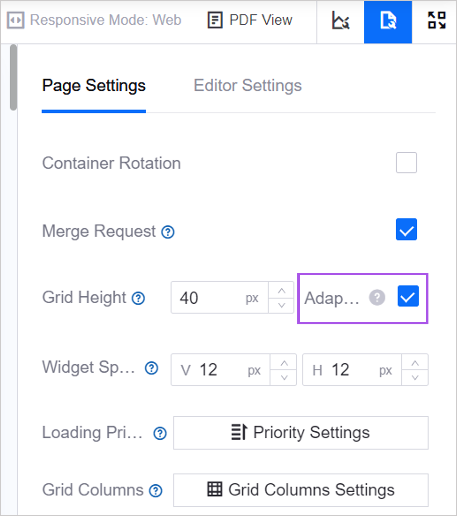
Grid Height: The vertical height of a single grid. The width-to-height ratio of the page determines the width-to-height ratio of the grid, which in turn determines the grid size of the page. Default is 40 px, minimum is 12 px.
Grid Columns: The number of grid columns the page can contain horizontally. The number of grid columns can be configured separately for pages in the 3 responsive modes. Minimum value is 6, maximum value is 72.
Large Screen: Default 24.
Web: Default 12.
Mobile: Default 6.
The grid height affects the area of widgets, and the number of grid columns determines the number of widgets the page can accommodate. The grid columns and grid height together determine the content density of the page. For example, when a widget’s size is set to 3*3 grids:
When the grid height is 48px, the widget’s height is 3×48px, and the widget’s width is adaptive. As the grid height increases, the widget’s area also expands.
When the number of grid columns is 6, the page can only accommodate 2 widgets horizontally. When the number of grid columns is expanded to 9, the panel can accommodate 3 widgets horizontally.

On pages that occupy only part of the screen, such as the left/right panels of a single-page application, or DTV pages embedded in popups, the grid will follow the proportions of the display area.

When you need to display the page on multiple screens of different sizes, you can check Adaptive Grid Height. The page will automatically calculate the required grid height based on the height of the display screen, the width of the panel, and the number of grid columns on the page, and apply it during page display.
Widget Location in Page
DTV uses the upper-left corner vertex as the origin of the coordinate system, and uses the upper-left corner vertex of the chart or container as the object to define its position.
Vertical axis: Extends downward, with the grid height configured on the page as one unit.
Horizontal axis: Extends rightward, according to the number of grid columns configured on the page.

Widget Location in Container
If a chart is in a container, the chart’s position within the container is displayed first, and then the position of the chart can be determined by combining it with the container’s page position. As with page position, the upper-left corner vertex of the container is used as the origin of the coordinate system, and the upper-left corner vertex of the chart is used as the object to define the chart’s position within the container.
Vertical axis: Extends downward, with the grid height configured on the page as one unit.
Horizontal axis: Extends rightward, according to the number of grid columns configured on the page.

Widget Spacing
Widget spacing is the distance between widgets within the page. You can set the widgets’ top-bottom spacing and left-right spacing separately to adjust the distance between adjacent widgets.

Loading Priority
Configure the loading order of widgets within the page. When the amount of data is too large or the network is unstable, widgets will be loaded from high to low priority as defined, to optimize page response efficiency. Widgets with the same priority will be loaded at the same time. If not configured, all widgets will be loaded together.
Widget Grouping Settings
You can group widgets to support cross-widget group interaction. After linking the data of charts within a group, multiple linked data displays can be triggered simultaneously.
Follow these steps to group widgets:
On the dashboard page editor, select Grouping Settings under Page Settings > Widget Grouping to open the widget grouping popup.
All existing widgets on the dashboard page will be displayed in the tabs at the top of the popup.
Drag the widgets that need to be linked into a group to enable widget linkage.
To remove a widget from a group, drag it back to the tab area.
Select OK to save the widget grouping settings.
Note
Only widgets whose dimension, metric, or comparison data values match can trigger the interactive display function.
Metadata Sync
When the metadata of a data source or dataset referenced by the page changes, select Synchronize to make the page use the latest metadata content. The change will take effect on the end-user page after republishing.
Fiscal Year
Select Fiscal Year Settings to configure the fiscal year range for the page, and specify the containers and widgets that need fiscal year enabled. Once enabled, financial data on the page will be displayed based on a unified time period, facilitating data comparison and analysis.
i18n Maintenance
Download the i18n maintenance template through Export. The template contains fields that support internationalization, such as the page name and widget names. After filling in the template, select Import to upload the file and batch update the i18n content of the page.
Media Library
Select Manage Media Library to upload icons, images, backgrounds, and other assets needed for the current page. Once uploaded, these assets can be quickly selected when configuring the page and widgets.
Exporting as PDF
After you select Enable PDF Export, the page will display an Export as PDF button. Users can select this button to export the dashboard page as a PDF file, for convenient offline viewing.

Customizing PDF File Name
The name entered in PDF File Name will be used as the default file name when the user exports the PDF. It supports internationalization. If not entered, the file name defaults to the same as the page name in the configuration state.
Configuring PDF View
The PDF view defaults to A4 size, with margins on all sides, and page separation lines between pages. By default, the width of page widgets adapts to the PDF view width, but the height may be compressed, causing widget distortion. Widgets may also be split across two pages by the page separation lines, resulting in an incomplete view. Additionally, if page widgets change, it is recommended to re-adjust the PDF view to fit the latest page.
Follow these steps to configure the PDF view:
In the top right corner of the configuration state, select PDF View. You can drag to adjust the size and position of widgets within the PDF page.
If unsatisfied, select Reset in the top right corner to revert to the default PDF view.
After adjusting, select Save in the top right corner. Once the page is published, the file exported by users in the runtime state will use the latest saved PDF view.

Editor Settings
You can configure display properties from the Editor Settings that only affect the dashboard page editor.
In the Page Editor, select Editor Settings to open the editor settings menu. You can perform the following configurations:
Select Enable Editor Settings. By default, the editor shares the same display properties as the page, but you can use editor settings to configure a dedicated style for the editor.
In the Page Width box, specify the page width for the editor.
In the Page Height box, specify the page height for the editor.
From the Background Color panel, select a background color for the editor.
Note
The page background color overrides the background layer of the editor. If Page Background Color has already been configured in Page Settings, the background color configured for the editor state will have no effect.