Waterfall Chart
Note
The waterfall chart uses the old configuration panel.
The waterfall chart is a separate preset in the bar chart group. It shows the cumulative change of data from a starting point to an end point in absolute and relative terms, which suits revenue breakdowns, cost composition, and month-on-month changes.
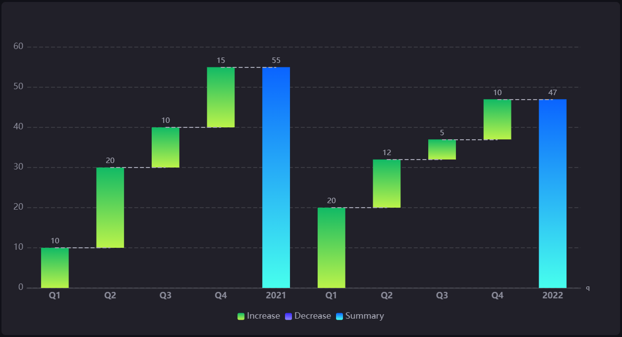
This topic describes the configuration items specific to the waterfall chart. For the items common to all charts, such as the Basic tab and the Filter tab, see Common Configurations for Charts.
Data of Waterfall Chart
The data fields of a waterfall chart have the following constraints:
Dimension: Optional, up to 1 field. Its value sequence forms the X-axis categories.
Measurement: Required, at least 1 field, with no upper limit. Measurement values represent the increase or decrease of each segment.
Comparison: Optional, up to 1 field, used after deduplication. Its role varies with the field combination; see the table below.
Extension: The waterfall chart does not consume extension fields; adding them has no effect on the chart.
Measurement is the only required field. Adding only a dimension, or only a comparison, without a measurement draws no bars at all.
The field combination determines the shape of the chart:
Field combination |
X-axis categories |
Waterfall series |
|---|---|---|
Measurement only |
The name (or alias) of each measurement |
Takes the last entry, one segment per measurement |
Dimension + Measurement |
Dimension values |
Expanded along the dimension values; with several measurements, each forms its own series |
Comparison + Measurement |
Comparison values |
Expanded along the comparison values, where the comparison acts like a dimension |
Dimension + Comparison + Measurement |
The dimension values of each group, concatenated in order |
Grouped by comparison value, with each group forming its own waterfall |
Once Summary is enabled, every combination appends a summary bar; in the “Dimension + Comparison + Measurement” combination each comparison group gets its own summary bar, and a manually entered summary value has no effect in that combination. See Summary.
Handling of empty and non-numeric values:
A measurement value that is empty,
null, or not a number counts as 0 in the calculation and still occupies a category position. Only in the “Measurement only” combination is a measurement whose value is empty in the last entry removed entirely and left off the X-axis.In the “Dimension + Comparison + Measurement” combination, data rows with an empty dimension value are filtered out; when a comparison value matches no data rows, that group produces neither bars nor a summary bar.
If the value of any measurement in the first entry is not a number, the chart draws only the axes and no bars. Choose numeric fields for measurements.
For data sources, aggregation, and sorting, see Common Configurations for Charts > Configuring Data.
Style of Waterfall Chart
The Style tab has three parts: Waterfall Chart Style, Axis Style, and Other Settings. For common styles such as the title and the widget, see Common Configurations for Charts > Configuring Style.
Waterfall Chart Style
This part contains the Waterfall, Summary, Increase, and Decrease sections.
Waterfall
Waterfall Type: Variable by default.
Variable: The summary bar sits at the end, showing the net change from the initial to the final value.
Composite: The summary bar sits at the start, showing how the segments make up the final total.
Rounded Corners: Off by default. When enabled, the bars use rounded corners.
Bar Spacing: 75% by default, expressed as a percentage; the larger the value, the wider the gaps between bars.
Summary
Use the  icon to the right of the section title to show or hide the summary bar. Shown by default. Once hidden, the summary bar is not added to the category axis or the data series of the chart.
Summary Value: With Auto selected, the value is aggregated from the data automatically, which is the default behavior; clear it to enter a fixed value manually. When both a dimension and a comparison are added, a manually entered value has no effect and the summary value is forced to automatic aggregation; with a comparison but no dimension, a manual value still takes effect.
Color: Sets the color of the summary bar, with solid and gradient colors supported. Gray by default.
Alias: Sets the display name of the summary bar, “Summary” by default. The name is used in the legend and the tooltip; in the “Dimension + Comparison + Measurement” combination, the X-axis category label of a summary bar shows the comparison value of its group rather than this alias.
Increase and Decrease
Increase and Decrease are two separate sections, and both provide:
Color: Solid and gradient colors are supported. Increase defaults to orange and decrease to cyan.
Alias: Sets the name of that bar type in the legend and the tooltip.
The Decrease section additionally provides Data Display, which is Display Negative by default; switch it to Display Positive to show decrease values as positive numbers. This option only changes the display, not the increase or decrease semantics of the data, and does not affect the summary calculation.
Axis Style
Both the X-axis and the Y-axis can be configured with a name, unit, unit font, font, axis line, grid line, and Show Scalar Bar (off by default).
Note
The waterfall chart is a separate widget, and its axis style items differ from the Coordinate Axis section of the presets in the bar chart, line chart, and scatter chart groups, including the item names. Follow this section instead.
The items of the two axes are not identical in a waterfall chart; the following three are provided on the Y-axis only: Dynamic Unit, data clipping, and value segmentation.
The default style of the Y-axis differs from other charts: no axis line is shown by default and dashed grid lines are shown by default.
Other Settings
This part contains the Legend and Auxiliary sections.
Legend
You can configure the visibility, position, spacing, icon size, and font. Shown by default, positioned at bottom-middle, with a rounded rectangle icon of size 8.
Auxiliary
Use the show/hide icon to the right of the section title to control it. On by default. When off, neither the connector lines nor the data labels are drawn.
Connector Line: Connects the tops of the bars, which helps track the cumulative change. You can configure the line type and width, with a 1 pixel dashed line by default.
Data Label Font: Sets the font of the bar value labels, size 12 by default.
Interactions at Runtime
The waterfall chart behaves as follows at runtime:
Tooltip: Always shown. The waterfall chart provides no Show Tooltip switch. See Common Configurations for Charts > Show Tooltip. Hovering over a category highlights the whole column and the tooltip lists the name, color, and value with unit of each measurement; hovering over the summary bar shows only the summary row. When Data Display of Decrease is set to Display Positive, decrease values in the tooltip are shown as positive too.
Scalar bar zooming: Requires Show Scalar Bar to be selected for the relevant axis in Axis Style. Drag the scalar bar to focus on part of the range.
Note
The legend of a waterfall chart is fixed at three items, Increase, Decrease, and Summary, and selecting a legend item does not hide the corresponding bars. The waterfall chart also provides no selection zooming tool and does not respond to Link Group ID.
Capability Scope
The waterfall chart supports data export, maximization, and copying and pasting styles between charts of the same type. For those operations, see Common Configurations for Charts.
The waterfall chart cannot trigger linkage in other widgets.