Pie Chart
A pie chart uses a circle divided into slices of different proportions to represent the proportion of data in the total amount, and the value is usually expressed as a percentage. All parts of the pie chart add up to 100%.

Types of Pie Chart
The basic type of pie chart is a donut-shaped pie chart. Based on this, DTV has preset several common pie chart types. When adding a pie chart to the page, you can choose from the following types according to the business scenario:
Pie chart type |
style |
describe |
Recommended scenarios |
|---|---|---|---|
Basic pie chart |
|
Display multiple proportions of a single measurement. |
Display the overall proportion of a certain measurement. |
Basic pie chart (with data labels) |
|
Add data labels based on the basic pie chart. |
In addition to displaying proportions, specific values also need to be displayed visually. |
Solid pie chart |
|
Fill the pie chart solid based on the basic pie chart. |
The visual effects are more prominent. |
Multi-measurement pie chart |
|
Display the composition ratio of multiple measurements. |
When your data only has multiple measurements and there is no single dimension to summarize each data, the multi-metric pie chart can help you generate a pie chart showing the distribution of the proportions of multiple measurements. |
Multi-measurement pie chart (with data labels) |
|
Add data labels based on multi-metric pie charts. |
In addition to displaying proportions, specific values also need to be displayed visually. |
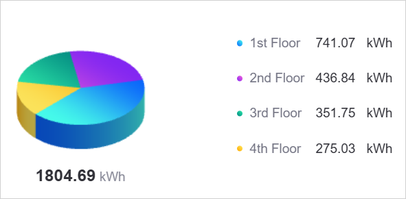
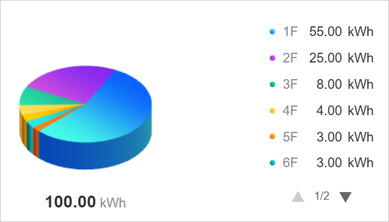
3D pie chart |
|
Display multiple proportions of a single measurement with a 3D effect for more intuitive visual effects. |
Display the proportion of a certain measurement while pursuing stronger visual impact. |
Multi-metric 3D pie chart |
|
Display the composition ratio of multiple measurements with a 3D effect. |
Suitable when the data only has multiple measurements and requires a 3D display effect. |
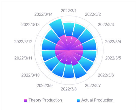
Rose chart |
|
Display the proportion of measurements in each dimension through the angle and length of the sector, and more clearly display the relative size and proportion of each measurement. |
Suitable for scenarios that require comparative analysis and proportion comparison. |
Data of Pie Chart
The data in the pie chart takes measurements as the core, limits and subdivides the measurement data through dimensions, and enriches the display of data trends through expansion. The following sections introduce the data configuration for basic pie charts(including 3D pie charts) and multi-metric pie charts(including multi-metric 3D pie charts).
For more information about data sources and data items, see Common Configurations for Widgets.
Basic Pie Chart
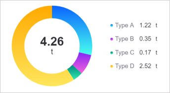
When your data contains both dimension and measurement data, for example, in the data below, Type is the dimension and CarbonEmission is the measurement.

At this time, the data of the basic pie chart can be configured as follows:

Measurements
Measurements are the core data displayed in pie charts. In the above example, the basic pie chart displays the data proportion of the CarbonEmission measurement under different Type. Each area in the pie chart displays the carbon emission value under each equipment type. The carbon emission here is the ** measurement. **. Only 1 measurement is supported in the basic pie chart.

Dimensions
In the data source, the measurements have been classified based on a certain dimension. For example, the measurement data can be divided into rows of data by device type Type. The Type data item can now be configured in the dimension. After configuration, the pie chart can display the data and proportion of one measurement data in different dimensions.

If there are no dimensions in your data and you want to use multiple measurement data to generate a single pie chart, you can use a multi-metric pie chart.
Extensions
If you need to display other information in the pie chart, such as the same period value of the measurement last month, you can add data items in Extension to display the same period data of the previous month in the pie chart.

Extended data can be displayed in the following locations in a pie chart:
Sum: The sum is located in the center of the pie chart. By default, Sum displays the accumulated value of all the measurement values. You can replace the value in the sum with any extension field in Show Extension Fields and Sum will show the first value of the extension field. For example, after selecting
LastMonthCarbonEmission, Sum will display the carbon emissions ofType Ain the same period last month.

Legend: By default, the values in the legend are the values of each sector in the pie chart. You can replace the values in the legend with any Extended fields in Show extended fields as reference data for pie chart measurement values.

Multiple-Metric Pie Chart
When your data does not have dimensions, such as in the table below, which only has multiple measurement data, the basic pie chart cannot support this type of data. At this time, it is recommended to use a multi-metric pie chart to generate the chart.

Data for a multi-metric pie chart can be configured as follows:

Measurements
Measurements are the core data displayed in pie charts. In the example above, the multi-metric pie chart shows each Type measurement as a percentage of the total. By default, the latest data is displayed, which is the first row of data in the data list. If necessary, you can use dimension aggregation to aggregate the data under the measurement in columns and display it. The aggregation methods include sum, average, etc. For dimension aggregation, see Display Aggregated Data.


Extensions
In multi-metric pie charts, extension fields have no effect.
Style of Pie Chart
In the Style tab, you can configure the style of the pie chart. The following is a description of some pie chart style configuration items.
Chart Format
Chart Format defines the visual type of the pie chart. DTV supports the following shapes:
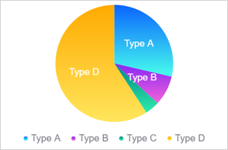
Pie: A standard circular pie chart.
Donut: A donut-shaped pie chart with a hollow area at the center.
Pie Radius
Pie Radius is expressed as a percentage and determines the relative size of the pie chart in the widget. Adjusting the radius changes the display area of the pie chart.
Ring to Cutout Ratio
When your pie chart shape is ring, the display area of the pie chart will be determined by both the outer circle and the inner circle. In:
Inner Diameter is the diameter of the inner circle at the center of the pie chart.
Outer Diameter is the difference between the diameter of the outer circle and the inner circle.
You can adjust the thickness of the ring by adjusting the ratio of the inner diameter to the outer diameter. This configuration item only applies when Chart Format is set to ring.

Pie Height (3D Exclusive)
The Pie Height configuration item is only available in 3D pie charts and multi-metric 3D pie charts. By adjusting the height value (in pixels), you can change the 3D depth effect of the pie chart. Higher height values produce stronger 3D visual effects.
Color JSON (3D Exclusive)
The Color JSON configuration item is only available in 3D pie charts. By writing JSON format configuration, you can precisely control the colors of each sector in the pie chart. This configuration item provides advanced customization capabilities, allowing you to specify specific color values for different data items.
The configuration format is a two-dimensional array, where each inner array contains 2 RGBA color values, representing the start and end colors of the gradient. For example:
[
  ["rgba(220, 87, 255, 1)", "rgba(255, 152, 224, 1)"],
  ["rgba(17, 186, 101, 1)", "rgba(187, 243, 74, 1)"],
  ["rgba(57, 40, 250, 1)", "rgba(142, 133, 255, 1)"],
  ["rgba(245, 10, 34, 1)", "rgba(245, 69, 192, 1)"],
  ["rgba(10, 100, 255, 1)", "rgba(71, 255, 237, 1)"],
  ["rgba(132, 39, 245, 1)", "rgba(245, 98, 218, 1)"],
  ["rgba(0, 133, 128, 1)", "rgba(46, 236, 172, 1)"],
  ["rgba(255, 170, 0, 1)", "rgba(255, 230, 92, 1)"],
  ["rgba(255, 88, 2, 1)", "rgba(255, 213, 0, 1)"],
  ["rgba(0, 115, 133, 1)", "rgba(46, 236, 232, 1)"],
  ["rgba(243, 56, 10, 1)", "rgba(255, 129, 19, 1)"],
  ["rgba(10, 175, 229, 1)", "rgba(133, 228, 255, 1)"]
]
Each color corresponds to a sector in the pie chart. In the RGBA format, the first three values represent the red, green, and blue channels (0-255), and the fourth value represents the transparency (0-1).
Shared Style
In the shared style, you can uniformly configure the style of each value in the pie chart, including sum, legend and data labels. Shared styles include:
Data display format
Global units
Number of decimal places

Chart to Legend Ratio
Layout ratio is the ratio of the pie chart area and the legend area in the pie chart widget. When the legend content is too long, or the text on the pie chart is not fully displayed, you can adjust the layout ratio to appropriately allocate more display space to the legend or pie chart.
When the proportion of the pie chart area changes, the pie chart will be enlarged or reduced proportionally, and the text, labels and other elements on the pie chart will remain the same size. When the proportion of the legend area changes, the legend will be shifted to the right or left, and the text, labels and other elements in the legend will remain the same size.

After checking Auto, the legend will be located on the far right (default is to the right, the position can be adjusted through Legend Position), and the pie chart area and legend area will automatically adjust the proportion according to widget size, display content, etc.
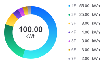
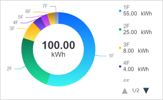
Number of Display Data
The number of data displayed is the number of data displayed in the pie chart. Other data not displayed will be merged into Others. For example, when the data display number is 2, the pie chart will be in descending order of values, and only the first 2 values with larger values will be displayed, and the remaining values will be merged into Other as the third value.

Note
After setting the data display number, the pie chart will always display data with larger values. At this time, adjusting the sorting of data items such as dimensions and measurements in the data tab page will be invalid.
Display Extension
After adding data items in Extension, you can configure the placement of the extension field in Display extension fields to display other data besides pie chart data. See Extensions.
Layout
Layout is the arrangement layout of the pie charts in the widget. In a basic pie chart, 1 measurement corresponds to 1 pie. If multiple measurements are added, multiple pie charts will be displayed in the widget. At this time, you can adjust the arrangement of the pie charts in the widget through Layout.

Summary Data
Summary Data is the value at the center of the pie chart. By default, Sum displays the sum of the values already on the pie chart, in the same units as the other values. If necessary, you can configure the center of the pie chart to display other fields in Display Extension.

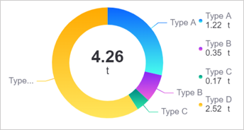
The legend is a common auxiliary element in pie charts to help users better interpret the data in the pie charts. Legends usually contain the following information:
Color icon: The color label corresponding to each sector area.
Name: The name of the data item represented by each sector area. In basic pie charts and 3D pie charts, the name is usually dimension. In multi-metric pie charts and multi-metric 3D pie charts, the name is the name of the measurement.
Value or percentage: The specific value or proportion of each sector area.
Unit: The unit of the value.

Legend Length
Legend name display word count determines the display length of the pie chart legend name. For example, when setting the number of characters displayed in the legend name to 3, only the first 3 characters of the pie chart legend name will be displayed, and other characters will be omitted. 1 kanji is counted as 1 character.
If not specified, 10 characters will be displayed by default and other characters will be omitted.

Legend Position
Legend position is the position of the legend relative to the pie chart. The legend position defaults to the right.
When the legend is to the left or right, you can adjust the proportion of the legend in the widget through Chart to Legend Ratio.
When the legend is moved up or down, the proportion of the legend is fixed and cannot be adjusted.

Data Label
Data labels are text or numerical information marked on each sector. Properly setting the position and style of data labels can effectively improve the readability of the pie chart.
Label Position: Configure data labels to be displayed outside the pie chart, on the pie chart, or in the center of the pie chart.
Label Font: Configure the font, size and color of data labels.
