Metric Card
The metric card can clearly display the data performance of a single or multiple metrics, such as the current day, current month, current year, and accumulated store revenue. The “daily income”, “monthly income”, “current year income” and “cumulative income” here are the metrics.

It can also display the data performance of multiple metrics in a certain dimension, such as the status of wind turbines in a certain wind farm. Here “a certain wind field” is a dimension, and “normal”, “maintenance”, “failure”, etc. are metrics.

Types of Metric Card
The basic types of metric cards are Single metric card and Multiple metric cards. On this basis, DTV has preset several common metric card types. When adding metric cards to the page, you can choose from the following types according to the business scenario:
metric card type |
style |
describe |
Recommended scenarios |
|---|---|---|---|
Single metric card |
|
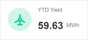
Only displays a single data of a single metric, supports adding comparison items to subdivide the display data, and also supports adding extension items to provide additional information for the metric. |
Display an metric that requires high-frequency attention separately to highlight key information. Or add it to pages with limited space such as mobile terminals, which is simple and clear. |
Multiple metric cards |
|
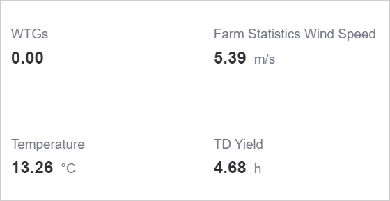
Display data of multiple metrics, support display according to a certain dimension, also support adding extension items to a certain metric, display the same-month comparison of a data and other extended information. |
Display multiple metric data in a certain dimension, such as the total output power, wind speed and temperature in a certain wind farm, as an overview of the station status. |
Multiple metric cards (icons) |
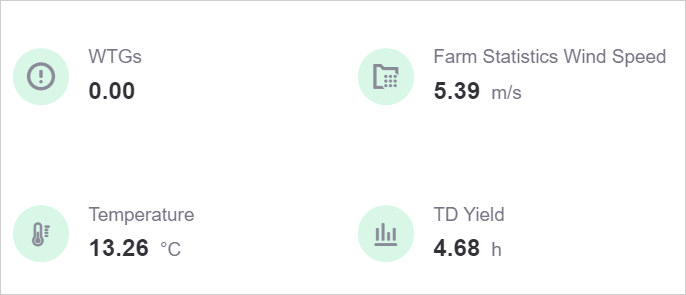
|
Add default icons based on the same-ring multi-metric card. |
Prompt data anomalies in a timely manner through color changes. |
Multi-metric cards (cards) |

|
Add card color to the basic multi-metric card, and use color to show the relationship between multiple metrics. |
Use colors to distinguish multiple related metric data, such as the distribution of multiple statuses of wind turbines in a certain wind farm, providing a reference for equipment maintenance and troubleshooting. |
Multi-metric card (same month-on-month) |
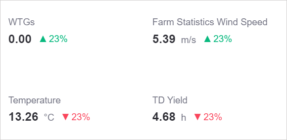
|
Supports the addition of multiple extensions based on the basic multi-metric card. Each metric can be compared with different extensions to derive data trends. |
Display multiple metric data in a certain dimension and their respective year-on-month comparisons, and reflect the data change trends of multiple metrics in real time. |
Multi-metric card (icon & year-on-year comparison) |

|
Add default icons and multiple extensions based on the same-ring multi-metric card. |
Promptly prompt abnormal metrics through color changes. |
Multi-metric card (card & same-month comparison) |

|
Add card colors and multiple extensions based on the same-ring multi-metric cards. |
Use colors to distinguish multiple related metric data and their same-month comparison data. |
Data of Metric Card
The data in the metric card takes metrics as the core, limits and subdivides the metric data through comparison and dimensions, and enriches the display of data trends through expansion.
For more information about data sources and data items, see Common Configurations for Widgets.
Best Practices for Single Metric Cards
Single metric cards are used to display the value of a single metric and can be used to display key metrics that have a significant impact on the business and are easy to understand. For example, when creating a resource monitoring panel, you can use a single metric card to display the group’s “annual production” metric total, or display data by asset segment.
Metrics
Metrics are the core data of single metric cards. After selecting the core metric “Annual Production (YTDYield)”, the center of the single metric card will display the latest data of this metric by default.
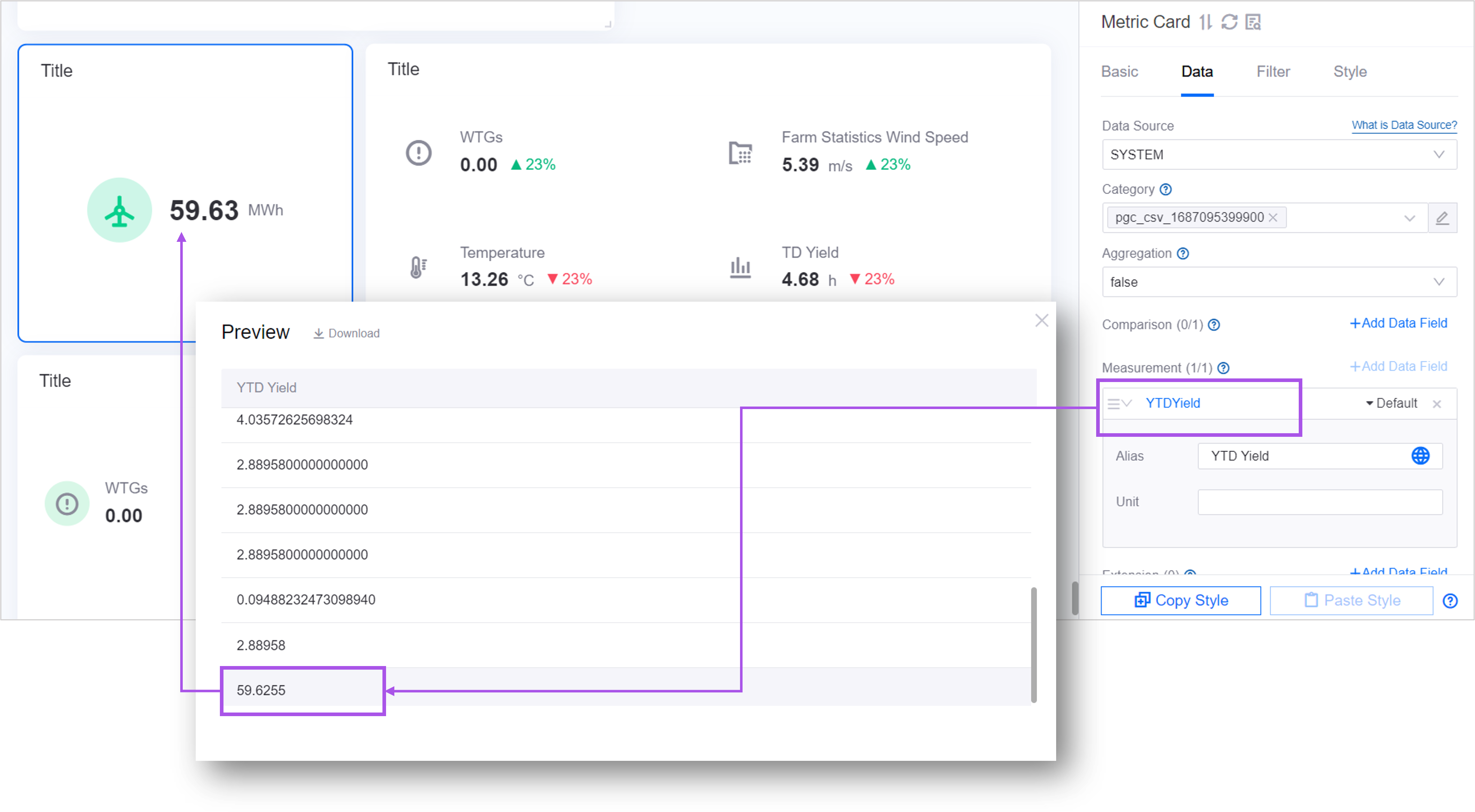
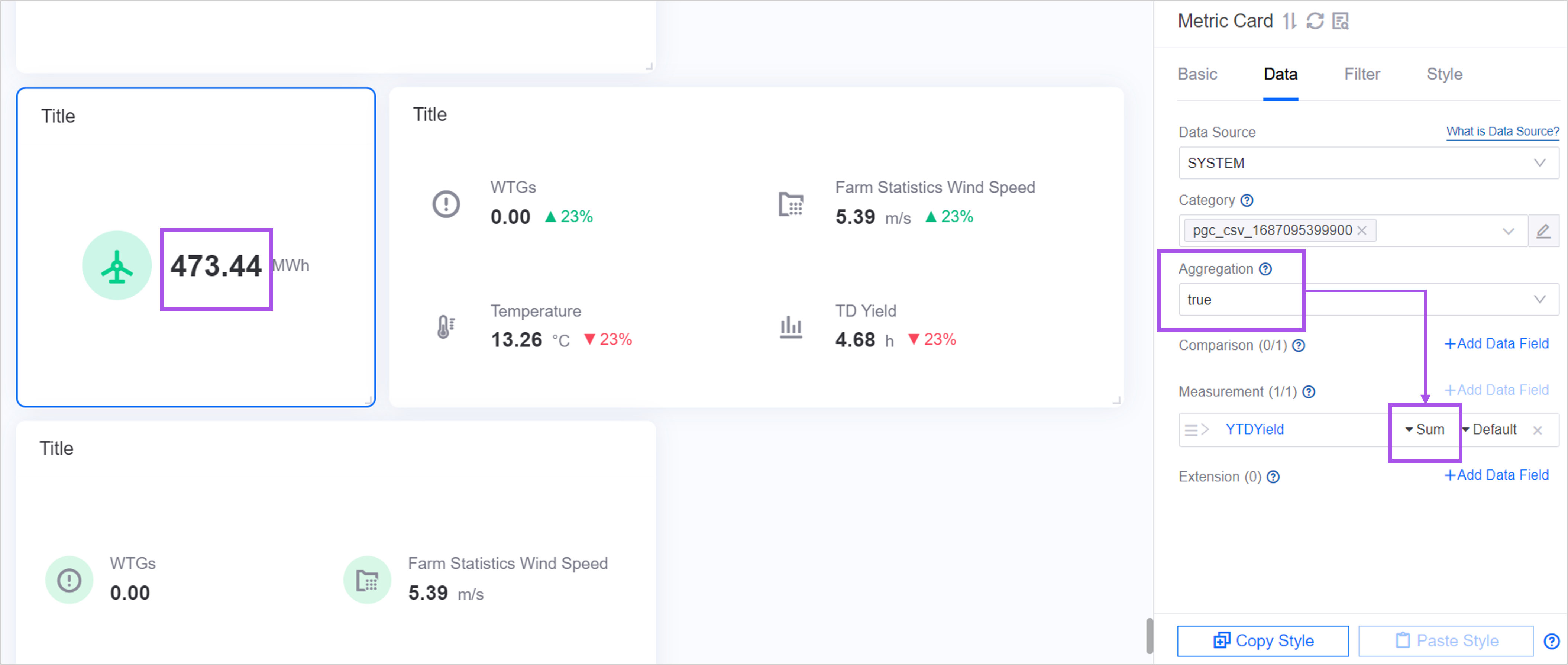
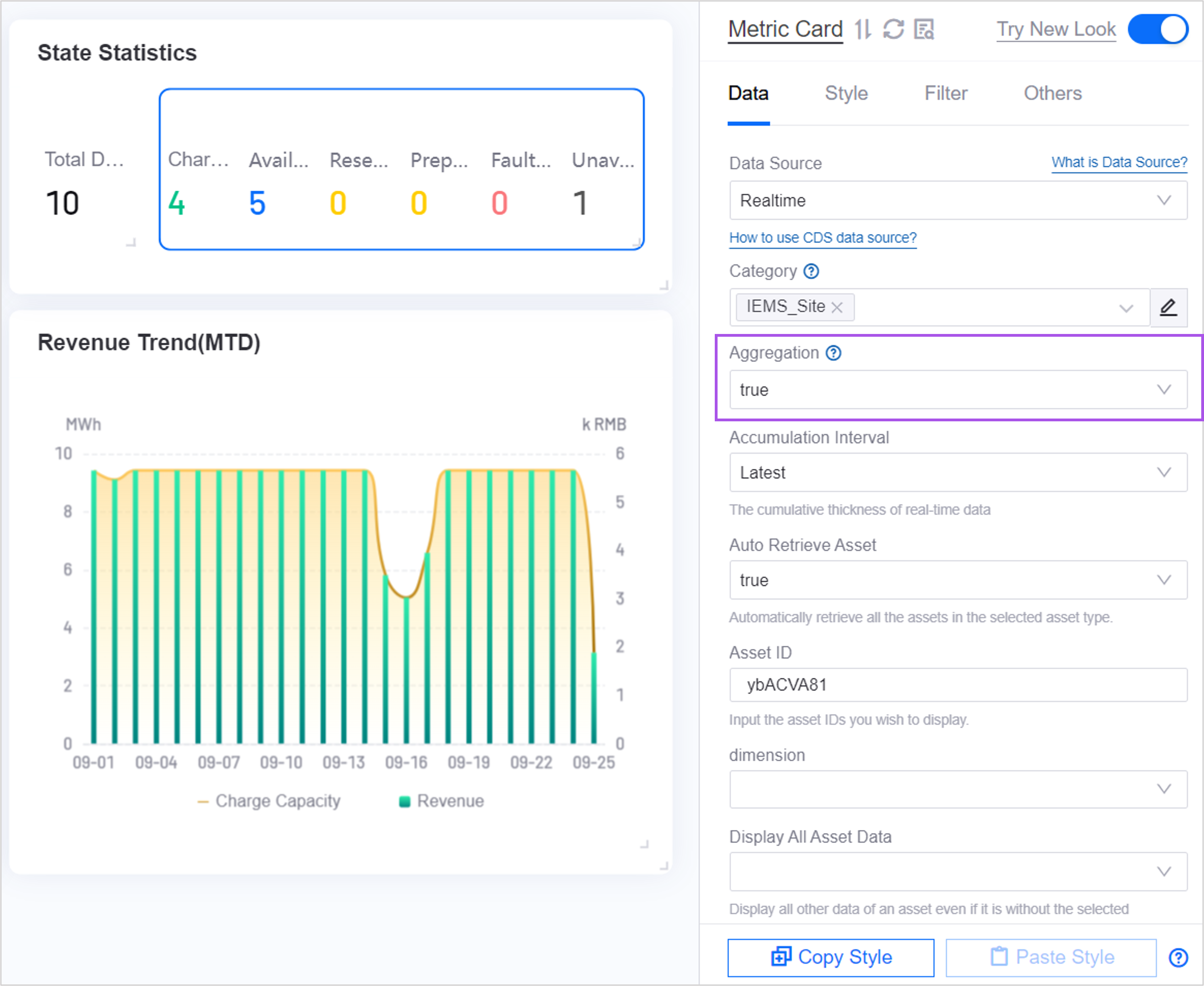
If you want to display the total annual output of all assets, you can use dimension aggregation to display the summation value. For more information, see Display Aggregated Data.
Comparisons
If you want to group and display the data of this metric according to a certain dimension, and focus on comparing the differences between each data item in this dimension, you can add data items in Comparison.
For example, adding a comparison item assetId to the metric YTDYield can display annual production by asset. At this time, the single metric card displays multiple data of the metric YTDYield divided by assets.

When multiple YTDYield corresponds to the same assetId, the same comparison metric data can be aggregated through Dimension aggregation. In this way, in a single metric card, 1 data will be displayed under 1 assetId. For more information, see Display Aggregated Data.
Extensions
In a single metric card, the extended data item is not valid. If you need to display year-on-month and other data, you can use multi-metric cards.
Best Practices for Multi-Metric Cards
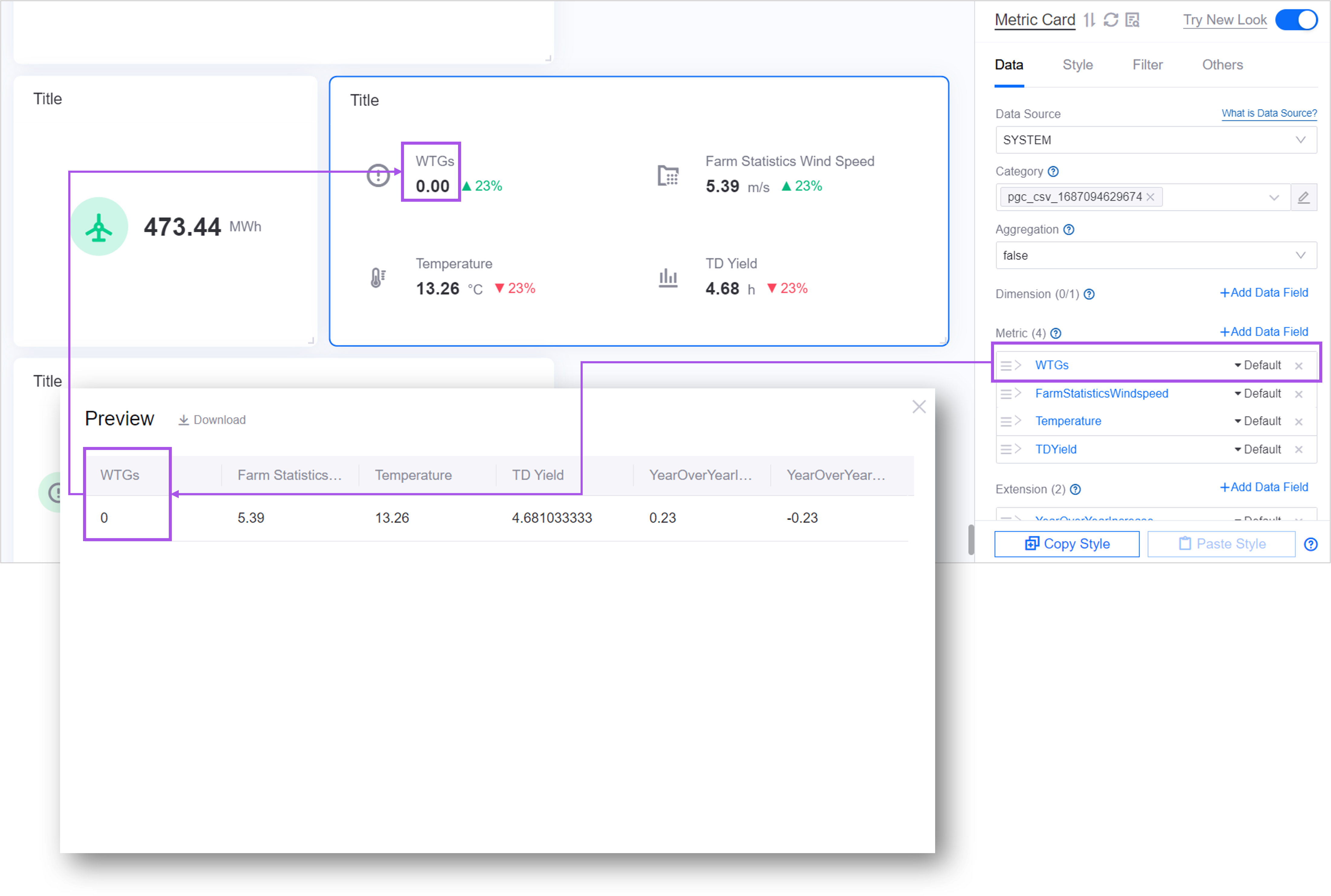
When you have created multiple metrics based on business needs, you can use multi-metric cards to display the data of multiple metrics in tiles. For example, a multi-metric card can be used to simultaneously display four metrics such as the number of wind turbines in a site, real-time wind speed, temperature, and daily power generation hours, and display the same-month value for each metric.
Metrics
When configuring the data of the metric card, the first thing is to determine the metric. Metrics determine what core data is displayed in the metric card widget. In multi-metric cards, multiple data items are supported. By default, the latest data passed in by the data item is displayed.
Dimensions
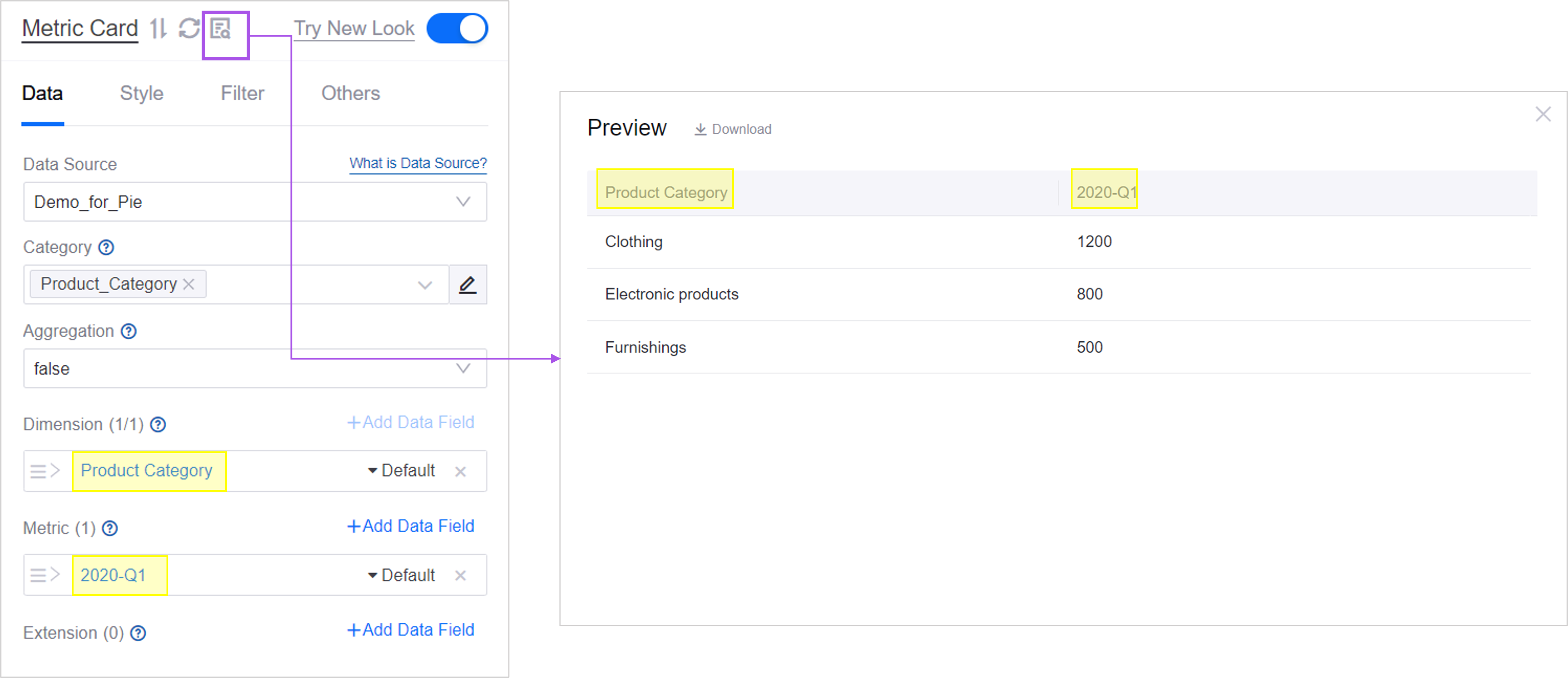
If you want to aggregate display and view the data of each metric according to a certain dimension, you can add data items in dimension.
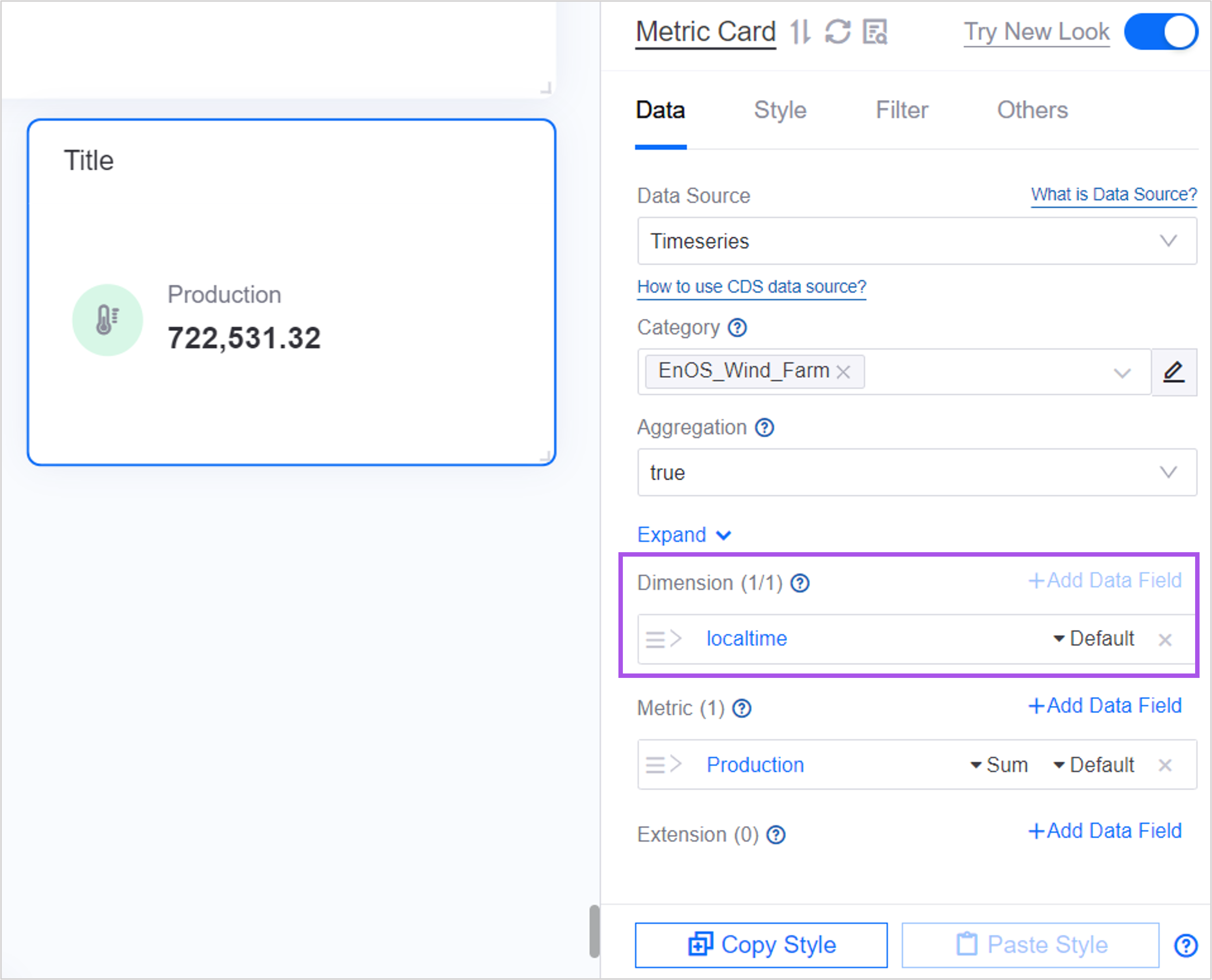
For example, in a multi-metric card using the Timeseries data source, you can follow the steps below to add the dimension localtime to the metric “Energy Generation” and aggregate and display the energy generation data by local time.
adds data items
localtimein dimension. At this time, in the data list, the first column is the selected dimension and the remaining columns are the selected metrics.
Select Yes in Dimension Aggregation, and configure the time, asset range, etc. of the data as needed after expanding parameters. The parameters depend on the selected data source. At this point the data will be asset data aggregated by dimension
localtime.

The last piece of data is displayed in the 3. metric card and is sorted in ascending order by dimension value by default. You can switch the ascending or descending sorting for the dimension
localtime. For more sorting methods, see Ordering Value.
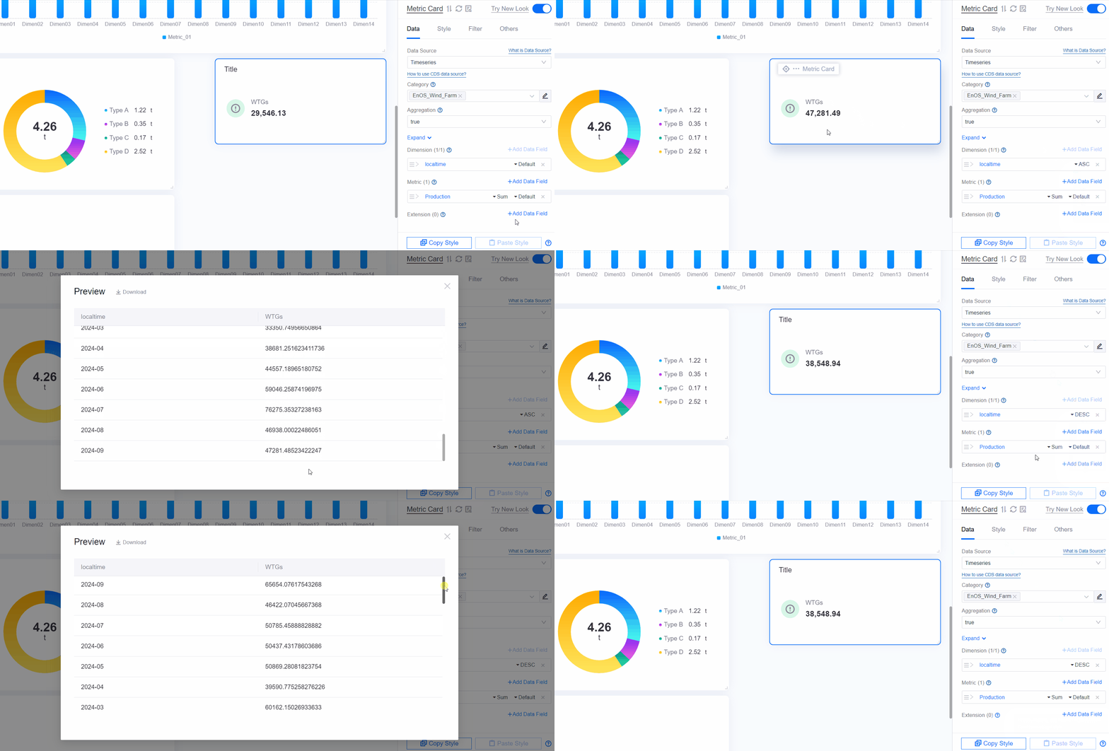
The metric data is aggregated by sum by default. Other aggregation methods can be defined for the metric
power generation. For more aggregation methods, see Aggregating Data.

In the above figure, the metric power generation is aggregated by month in a summation manner, and the latest monthly power generation value is displayed in the metric card.
Extensions
If you need to display additional information about metric data, such as Same-on-month configuration or Description, you can add data items in Extension.
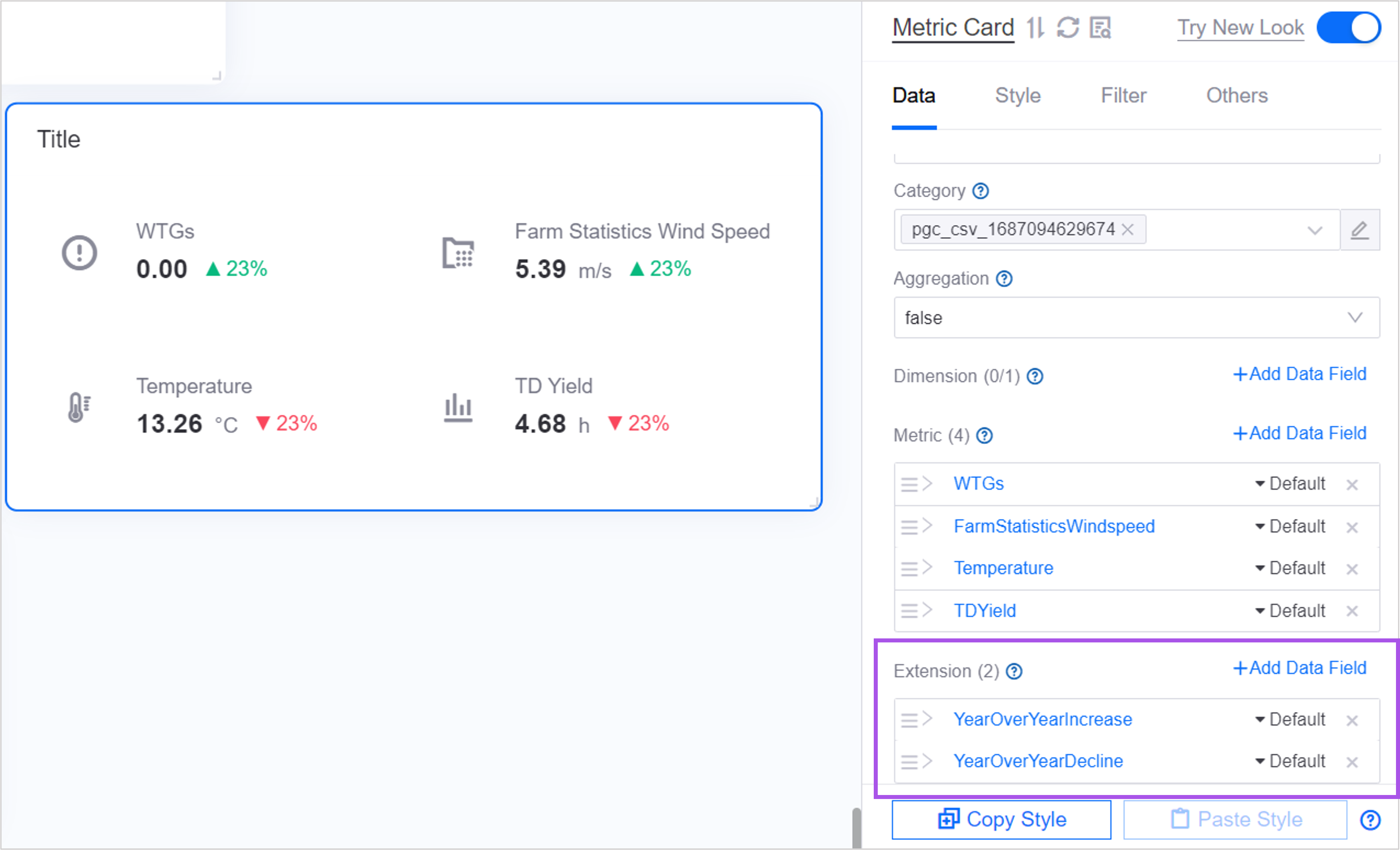
For example, adding the extension “Year-to-Year Net Emissions for the Year” to the metric “Net Emissions for the Year” can display the year-on-year results next to the metric value. YoY/MoM >>.

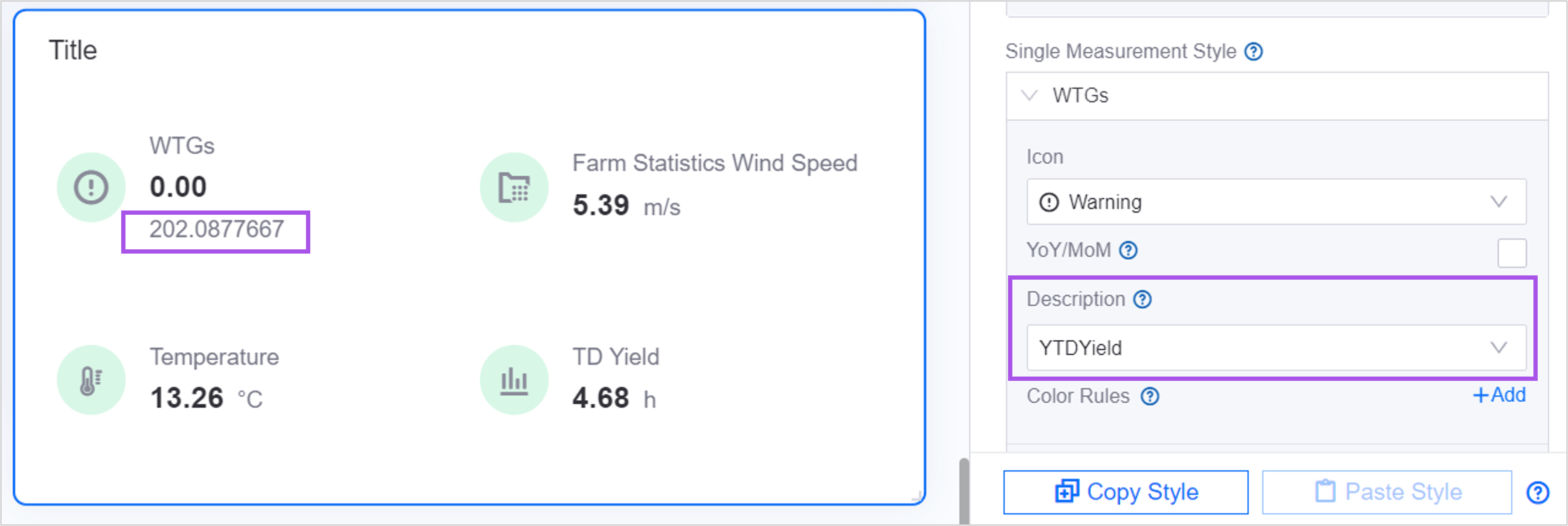
For another example, adding the extension item “Rated Temperature” to the metric “Temperature” can display supplementary rated temperature information below the metric value. Description >>.
If there is no suitable data item as an extended field, you can select Add Calculated Field in the Add Data Item pop-up window to perform simple operations on the existing data items and customize a data item, such as “Year” Net emissions year-on-year = (net emissions in the current year - net emissions in the previous year) / net emissions in the previous year × 100%.” For more information, see Adding Calculated Fields.
Style of Metric Card
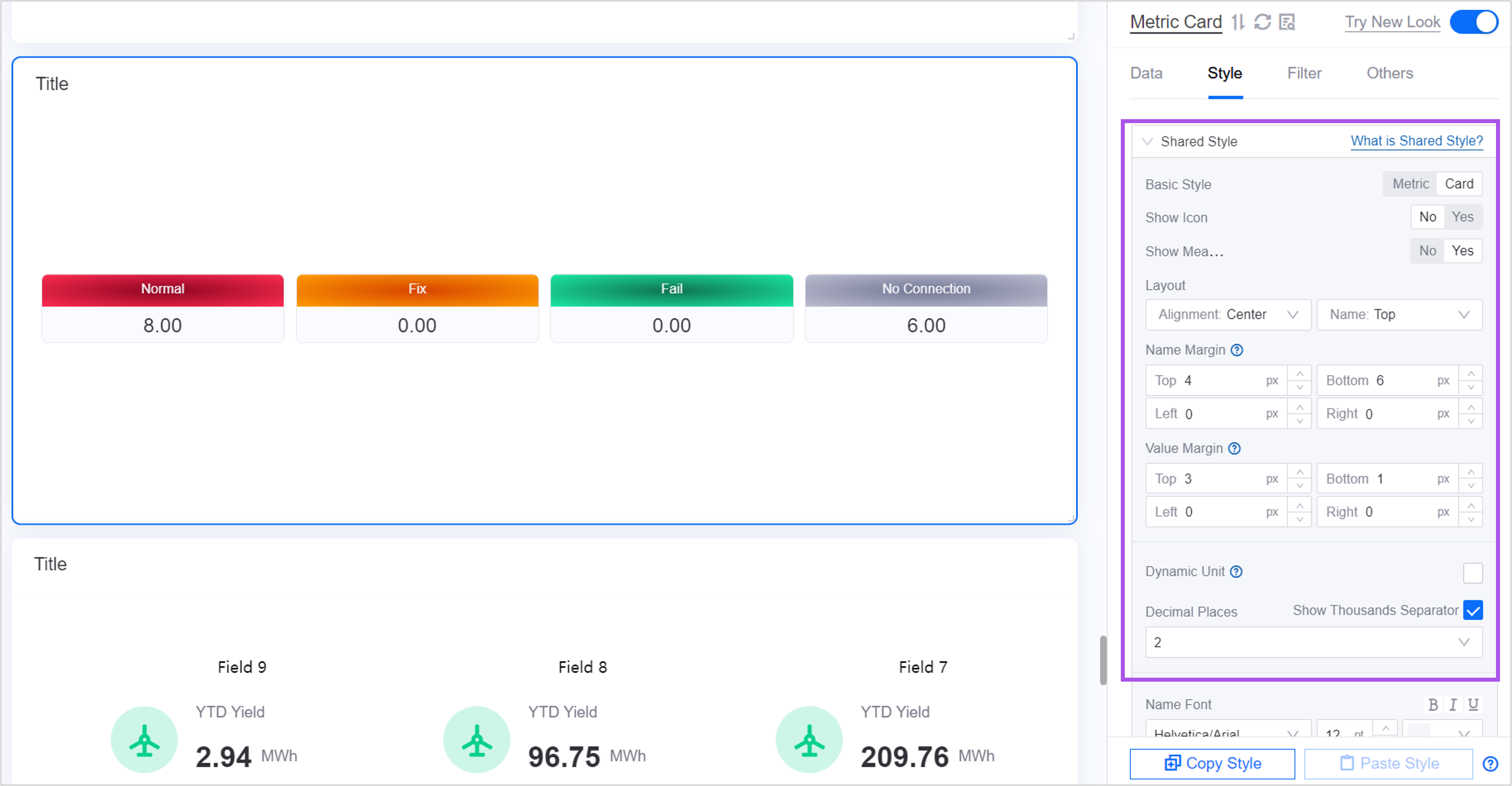
You can configure common styles of metric cards in Quick Configuration. If you need to configure more details, you can switch to All Configuration. After switching, the existing quick configuration content will be retained.
Single Metric Style
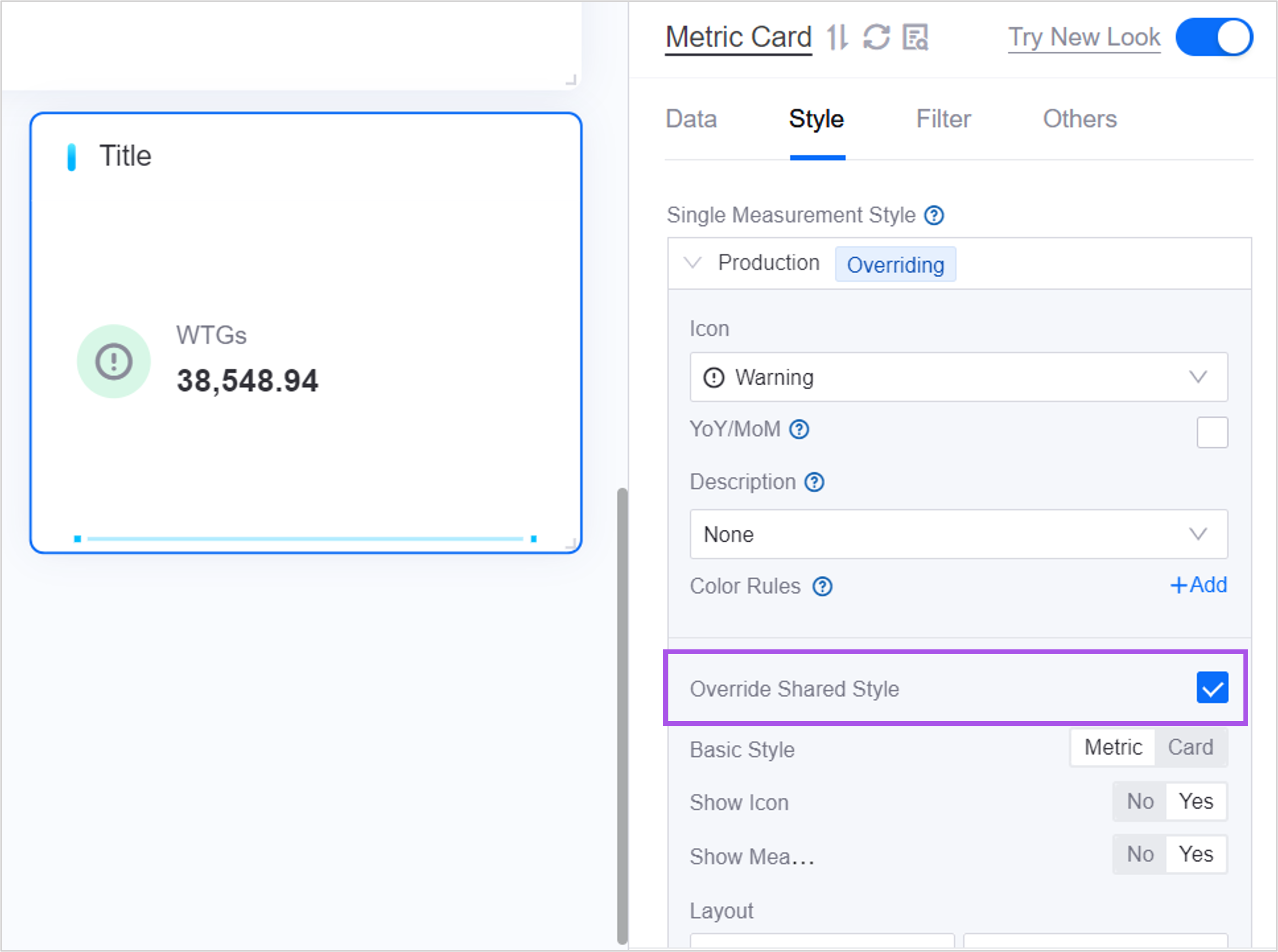
A single metric style is based on the shared style and further defines a separate style for each metric, such as icons, year-on-year comparisons, etc.
After configuring a single metric style for an metric, the individual metric style of this metric will override the shared style, and the remaining metrics that are not configured with a single metric style will use the shared style.
Quick Styles
In Quick Configuration, DTV provides several common styles. You can click Apply to apply the shortcut style with one click.

Layout
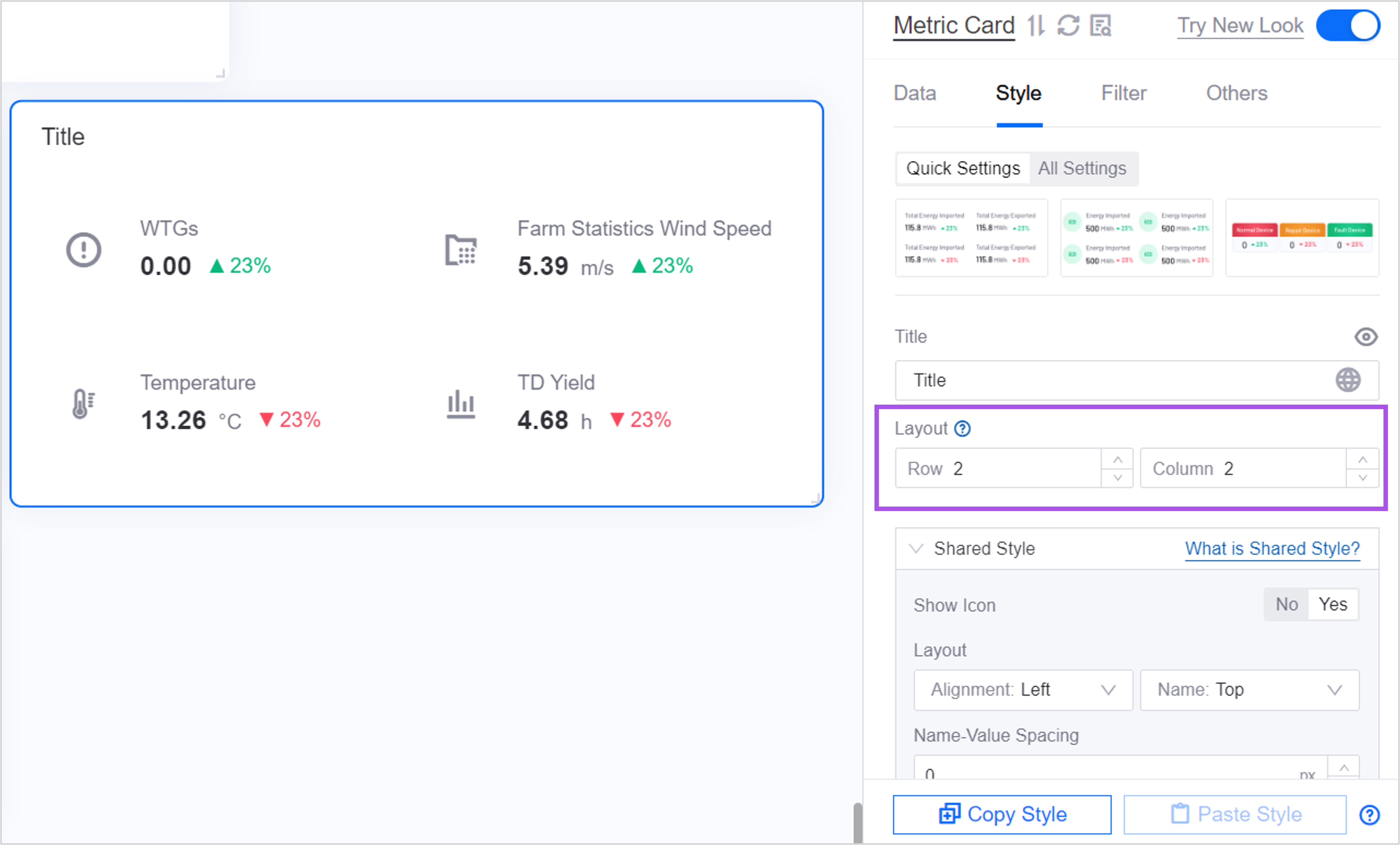
For multiple metric cards, as well as single metric cards configured with Comparison items, multiple data will be displayed in one widget. At this time, you can modify the row and column distribution of each data through Layout.

Name-Value Spacing
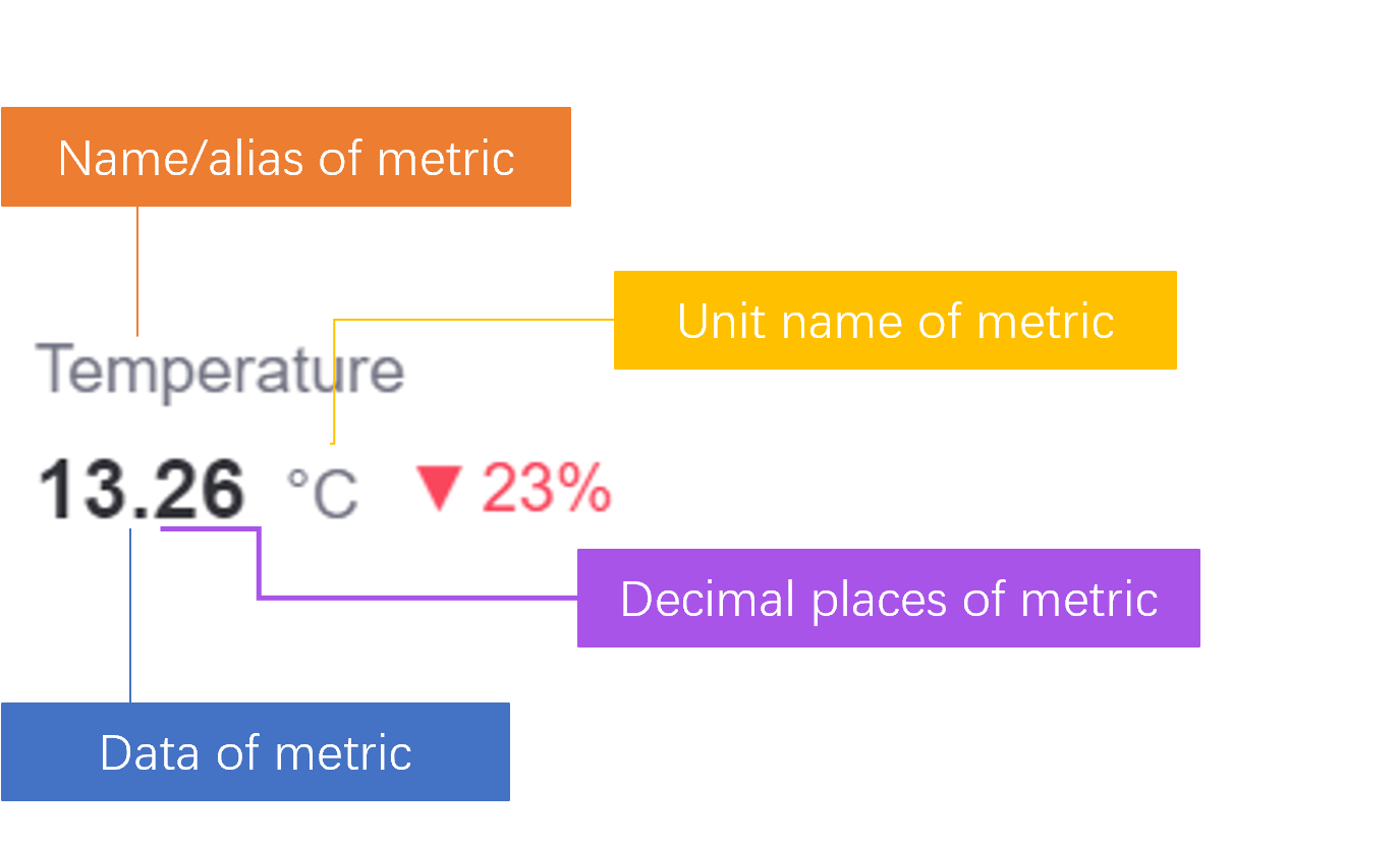
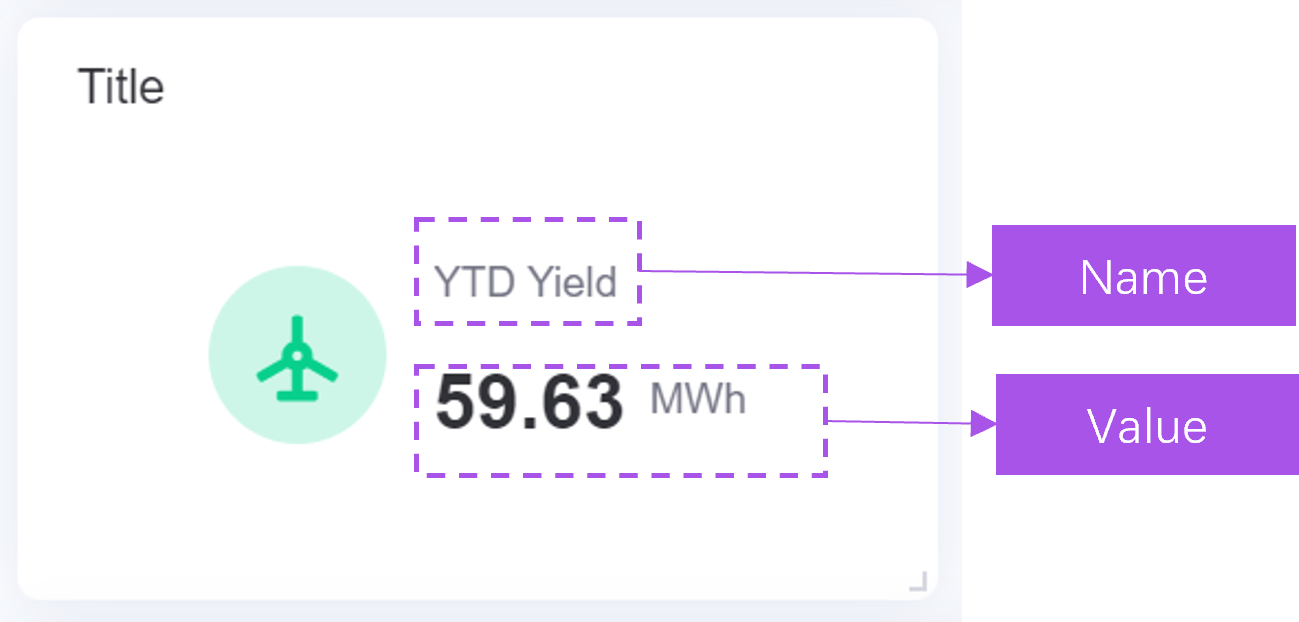
In the metric card widget, the data of an metric consists of two parts: name and value.

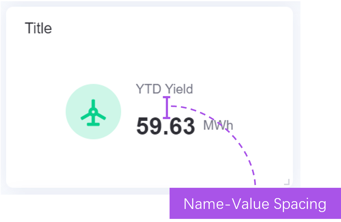
Name-Value Distance is the display distance between the metric’s name and its value.
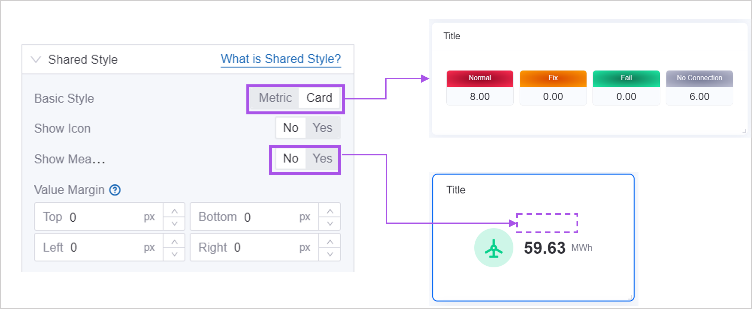
In the following cases, configuring name-value spacing is invalid. You can adjust the spacing by adjusting name margin or numeric margin:
Card styles.
None field name.
Name Margin
In the metric card widget, the data of an metric consists of two parts: name and value.


Name margin is the margin between the metric’s name and other elements, as shown in the figure:
top margin
bottom margin
left margin
right margin
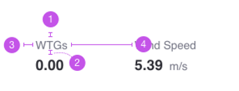
When you configure no name for a data item, the configuration of name margin has no effect.
Value Margin
In the metric card widget, the data of an metric consists of two parts: name and value.


Value margin is the margin between the metric value and other elements, as shown in the figure:
top margin
bottom margin
left margin
right margin

YoY/MoM
Year-on-year comparison is a way to compare data in adjacent time periods and is used to assist in displaying the changing trend of metric data. For example, when you need to visually display the change ratio of a certain metric from last year to this year, or the growth from the first quarter to the second quarter of this year, you can configure the same-quarter ratio.
Before configuring, make sure you have added the Extended data item in the Data page. The data in Extended will be used as the source of year-over-year comparisons.
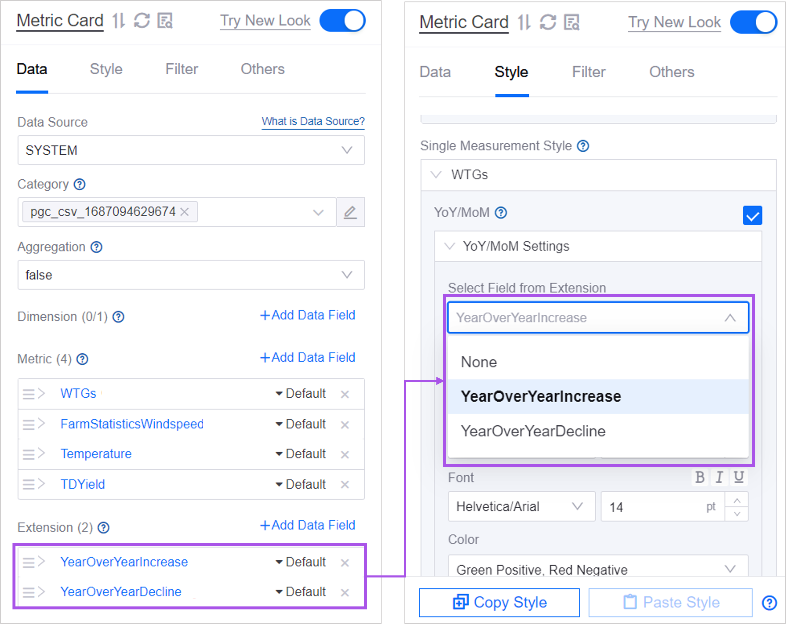
2. In Select Extended Field, select an Extended Field for the current metric as a year-on-year data item. After selection, the year-on-year value will be displayed next to the metric value.

3. You can further define the display method, position, color registration, etc. of the numerical value.

