Waterfall Chart
A waterfall chart combines absolute and relative values to present the relationship between several specific values in terms of quantity change. You can use it to express the change in quantity between two data points, for example, the change in the number of transactions per month.
Data Fields
The data fields required are:
| Field | Quantity |
|---|---|
| Dimension | 1 |
| Comparison | 0 - 1 |
| Measurement | ≥ 1 |
There are four combinations of data fields for the waterfall chart:
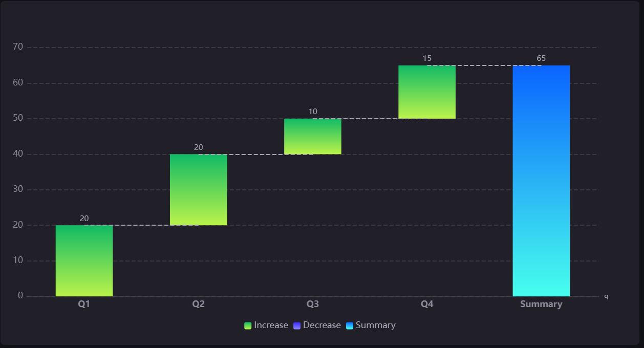
One dimension, and one measurement. For example, if the dimension is Quarters, the measurement is the electricity consumption of each quarter. The resulting waterfall chart will show the total power consumption for the year and the quarterly power consumption separately, clearly showing how much power is consumed and how it relates to the total.
Multiple measurements. For example, measurement 1 is the power consumption in Q1 and measurement 2 is the power consumption in Q2, so there are 4 measurements for 4 quarters. The resulting waterfall chart will automatically add up these measurements and form a summary, just as in the first case.
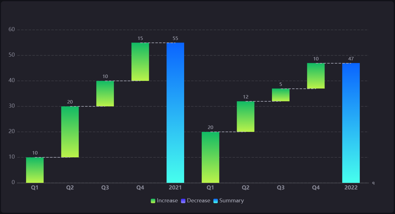
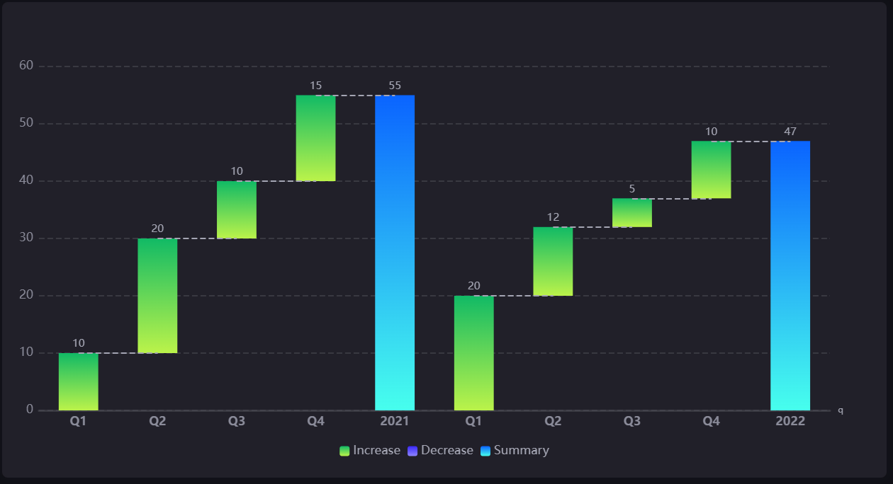
One dimension, one comparison, and one measurement. For example, the comparison is the year (2021 vs. 2022). The dimension and measurement are the same as in the first data case, and the resulting waterfall will show two waterfalls showing quarterly electricity consumption in 2021 and 2022 respectively.
One dimension, one comparison, and multiple measurements. For example, if the dimension and comparison are the same as in the third case, and the 4 measurements are corresponding to 4 quarters of electricity consumption, the waterfall diagram will be the same as in the third case.
Chart Style
Waterfall Chart Style
Style the elements in the waterfall chart.
| Field | Description |
|---|---|
| Waterfall Type | Specify the waterfall chart as Variable or Composite. The summary of Variable is displayed on the right and the summary of Composite is displayed on the left. |
| Rounded Corners | Select this to display bars with round corners. |
| Bar Spacing | Specify the vertical spacing between bars with different Dimension values. |
| Summary Value | It can be selected to be calculated automatically from the data or entered manually. |
| Color | Select the color of summary bar. |
| Alias | Add aliases for bars to be displayed in the chart. |
Axis Style
| Field | Description |
|---|---|
| Name | Specify the name or unit of the axes. |
| Dynamic Unit [1] | Select this to automatically use the suitable unit for your data values, and to automatically adjust the values on the axes. |
| Axis Range | Specify the minimum and maximum values on the axes, and the number of labels between them. |
| Label Settings |
|
| Axis Font | Style the axis name font. |
| Unit Font | Style the unit name font. |
| Axis Line | Style the line for the X axis. |
| Grid Line | Style the grid lines for the Y axis. |
| Show Scalar Bar | Select to show a bar that can limit the range of data displayed on the axes. |
[1] Only available for Y-Axis.