Table
The Table widget is used to display information in rows and columns.
Data Fields
The data fields required are:
| Field | Quantity |
|---|---|
| Dimension | 0 - 2 |
| Comparison | 0 - 1 |
| Measurement | Unlimited |
| Extension | Unlimited |
Chart Style
Column Style
Format the appearance of each column. [1]
The modes available for each column are:
- Normal: Basic mode that can be used for most columns.
- URL: Displays column data as hyperlinks.
- Hidden: Hides the column from view.
Normal
| Field | Description |
|---|---|
| Open Trend Analysis | Check to enable trend analysis. For more information, see Trend Analysis. |
| Asset Aggregation | Available when trend analysis is enabled. Check to aggregate data on the same measurement for multiple assets. |
| Asset Parameter | Available when trend analysis is enabled. Enter the asset ID, and separate multiple assets with commas(,). Supports the use of placeholder parameters. For more information, see Configuring Parameters. |
| Decimal Places | Round up the values to the selected number of decimal places. |
| Enhancement | Select one of the following to add to all cells in the column and complete the additional configurations:
|
| Show Filter | Toggle between enabling and disabling filter options for each column. Filter button will appear in the header cells when enabled. |
| Formatting Rules: Font Color | Set rules to display different value colors for different values. |
| Formatting Rules: Background Color | Set rules to display different background colors for different values. |
URL
| Field | Description |
|---|---|
| Open Trend Analysis | Check to enable trend analysis. For more information, see Trend Analysis. |
| Asset Aggregation | Available when trend analysis is opened. Check to aggregate data on the same measurement for multiple assets. |
| Asset Parameter | Available when trend analysis is opened. Enter the asset ID, and separate multiple assets with commas(,). Supports the use of placeholder parameters. For more information, see Configuring Parameters. |
| Enter text | Toggle between entering the link display text manually or selecting a data field. |
| Redirection Method | Choose the redirection method when the link is clicked on. |
| Show Filter | Toggle between enabling and disabling filter options for each column. Filter button will appear in the header cells when enabled. |
| Formatting Rules: Font Color | Set rules to display different value colors for different values. |
| Formatting Rules: Background Color | Set rules to display different background colors for different values. |
Note
Icon size is automatically aligned to the font size, under Content > Font.
Table Style
Header
Format the appearance of the header cells.
| Field | Description |
|---|---|
| Background Color | Select a background color for the header row. |
| Font | Style the headers. |
| Enable Sorting | Toggle between enabling and disabling content sorting in each column. |
| Alignment | Set the table header content alignment. |
Content
Format the appearance of the entire table. [1]
| Field | Description |
|---|---|
| Odd Row Color | Select a background color for odd rows. |
| Even Row Color | Select a background color for even rows. |
| Horizontal Border Color | Select a color for horizontal table borders. |
| Vertical Border Color | Select a color for vertical table borders. |
| Font | Style the values in the table. |
| Alignment | Set the table content alignment. |
Total
Configure the function to use for the Total row, and format its appearance. This is normally used to find the subtotal or to show the average of the numerical values in each column. Non-numerical values in the column will be ignored.
| Field | Description |
|---|---|
| Name | Specify the label for the aggregation row. |
| Aggregation | Select the aggregation method. |
| Position | Select the position to display the aggregation row. |
| Background Color | Select a background color for the aggregation row. |
| Font | Style the values in the aggregation row. |
| Alignment | Set the total row content alignment. |
Layout
Configure how the table and the content is displayed.
| Field | Description |
|---|---|
| Alignment | Choose how text is aligned for the entire table. |
| Enable Pagination | Toggle between paging or not paging the table. |
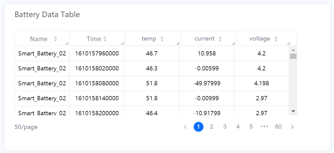
| Rows per Page [1] | Specify the number of rows per page. Default value is 50. |
| Transpose | Swap the rows and their corresponding columns. |
| Fixed Dimension Columns [2] | Enable or disable fixed dimension columns. After enabling, the dimension columns keep visible while the rest of the table scrolls. |
| Row Height | Specify the row height. Minimum and maximum value is 1 and 5 respectively. Supports up to two decimal places. Default value is 1.5. |
| Minimum Width of Last Column | Specify the minimum width of the last column. The default value is 120. |
| Show Thousands Separator | Select this to display the thousandths of the value. |
[1] Only available if Pagination is enabled.
[2] This function is not available for tables with sub tables.