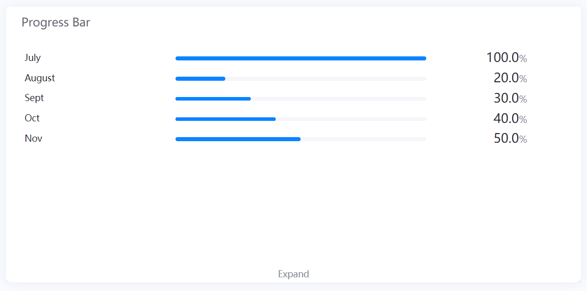
Progress Bar
The Progress Bar widget is used to display progress towards a goal in the form of bars.
Data Fields
The data fields required are:
| Field | Quantity |
|---|---|
| Comparison | 0 - 1 |
| Measurement | 1 |
| Extension | Unlimited |
Chart Style
Comparison Style
| Field | Description |
|---|---|
| Jump Configuration | Select it and configure the jump in the pop-up window. Read more in Title Jump. |
| Layout | Configure the number of rows and columns for displaying multiple progress bars. |
| Show “Expand” | Toggle between enabling and disabling the Expand function. It allows users to view more bars by clicking Expand at the bottom of the widget. Otherwise, the extra bars cannot be seen at all. |
| Unified Unit | Check to convert the values to uniform units. |
| Font | Style the Comparison Field label that is located at the left of each bar. |
| Rotation Interval | Specify the interval in seconds to cycle the data displayed. |
Measurement Style
| Field | Description |
|---|---|
| Jump Configuration | Set select measurement to jump to links. The configuration is the same as the title jump, see Title Jump. |
| Open Trend Analysis | Check to enable trend analysis. For more information, see Trend Analysis. |
| Asset Aggregation | Available when trend analysis is opened. Check to aggregate data on the same measurement for multiple assets. |
| Asset Parameter | Available when trend analysis is opened. Enter the asset ID, and separate multiple assets with commas(,). Supports the use of placeholder parameters. For more information, see Configuring Parameters. |
| Unit Name | Specify the unit for chart data. The unit name will not be displayed if you chose to show data as percentage values. |
| Dynamic Unit | Select this to automatically use the unit that suits your values. |
| Show As Percentage | Select this to display the chart data as percentage values. |
Name, Unit and Value Style
| Field | Description |
|---|---|
| Show Name | Toggle between displaying and hiding the label. |
| Name Font [1] | Style the label. |
| Unit Font | Style the unit. |
| Value Font | Style the value. |
| Axis Range | Specify the range of the progress bar. |
| Decimal Places | Round up the values to the selected number of decimal places. |
| Formatting Rules | Set rules to display different liquid fill color for different values. |
[1] Only takes effect when no Comparison is selected.
Progress Bar Style
| Field | Description |
|---|---|
| Progress Bar Height | Specify the thickness of the progress bar. |
| Name Margin | Specify the width of name label shown relative to the width of progress bar. |
| Value Margin | Specify the width of progress bar shown relative to the width of name label. |
| Name Alignment | Select the text alignment within name labels. |
| Value Alignment | Select the text alignment within value labels. |
| Layout | Format the placement of the progress bar:
|
| Show Sort Values | Sort the progress bars by descending order according to the values. |