| Icon |
Choose an icon from the icon library to be displayed alongside the chart data. |
| Icon Color |
Specify a color for icons used. Icon color displays the theme color by default. To change a color, uncheck Use Theme Color box. |
| Icon Size |
Specify the icon size to be shown in chart. |
| Name Position |
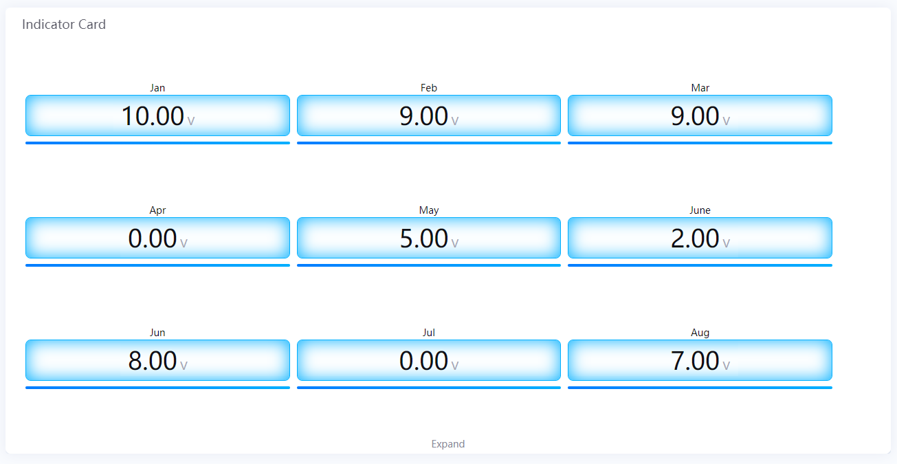
Position the indicator name label to the top, bottom, left or right of the value label. The indicator name is located below each chart by default. |
| Show Name |
Show the indicator name. |
| Name Font |
Style the indicator name labels. |
| Unit Name |
Specify the unit for chart data. The unit name will not be displayed if you chose to show data as percentage values. |
| Dynamic Unit |
Select this to automatically use the unit that suits your data values. |
| Unit Font |
Style the unit labels. |
| Value Font |
Style the value labels. |
| Decimal Places |
Round up the displayed chart data to the specified decimal places. |
| Show Thousands Separator |
Select to display thousands separator. |
| Formatting Rules |
Set rules to display different colors for different measurement values. |