Managing Projects and Pages
DTV organizes dashboard pages by using projects. Therefore, you must first create a project to hold any dashboard pages that you want to create.
Prerequisites
You need to be assigned the required asset permission and operation permission, and a menu group containing the Dashboards > Dashboards menu. If not assigned, contact the application administrator.
Creating a Project
Create a project by following these steps:
- Select Dashboards > Dashboards from the left navigation pane.
- Select New Project and complete the following configurations in the pop-up window:
- Name: Type the name of the project.
- Select OK to create the project.
Creating a Page
Create a page by following these steps:
Select Dashboards > Dashboards from the left navigation pane.
There are two ways to create a page:
- Select New Page.
Note
There must be an existing project.
Select an existing project. Select the empty card with a plus sign in the middle.
Complete the following configurations in the pop-up window:
- Name: Type the name of the page.
- Project: Select the project you want the page to be in.
- Template (Optional): Create a page by using a template.
- Tag (Optional): Select a tag for the page from the list or by creating one.
Select OK to create a page.
Editing a Page
Edit a page by following these steps:
- Hover over the card of the page you want to edit.
- A few options will appear, select Edit to access the Page Editor.
- To add widgets, refer to Adding Widgets for more information.
- From the toolbar, you can also configure the resolution response and customize the page and editor properties. For more information, see Page Editor.
Configuring Resolution Response
You can cater to various screen sizes by configuring the page resolution response settings. By setting the resolution range of each display mode, you control which display mode is used depending on the user’s screen size.
Hover over Responsive Mode and select Settings to reveal the following pop-up window with default configurations.
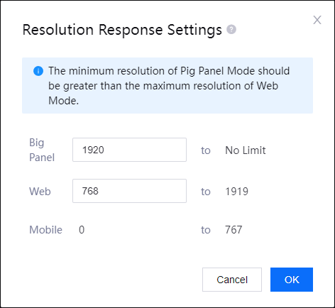
The range for mobile mode is fixed and you are only able to configure the ranges for web and big panel mode. The maximum screen size for web mode is adjusted accordingly to always be smaller than the minimum screen size for big panel mode.
Note
Error message with instructions will be shown if the values you keyed in are not suitable.
Customizing Page Properties
You can configure display properties that affect the entire page and Page Settings. By default, the page theme controls the colors used on all components of the page, including widgets, but you can change it in the independent component settings if necessary.
In the Page Editor, the Editor Settings tab is displayed on the right by default. You can configure the following items:
- Theme: Select a color theme for the page.
- Widget Header Height: Specify the height of the widget header.
- Widget Header Color: Select a background color for the widget header.
- Background Color: Select a background color for the page.
- Background Image: Upload an image to be displayed as the page background.
- Background Fill: If you are using a background image, you can choose how the image is displayed:
- Tiled: The image is repeated, while preserving its original size.
- Adaptive: The image is resized to fit the window.
- Refresh Frequency: Adjust the frequency of which the page is updated.
- Container Rotation: Configure the interval in seconds to cycle the container tab displayed.
- Merge Request: When multiple widgets within one page using the same data source are refreshed simultaneously, the data requests will be merged into a single request. Enabled by default.
- Grid Height: Specify the height of the grids on the page.
- Widget Spacing: Configure the vertical and horizontal spacing between widgets.
- Loading Priority: Select to open the Loading Priority window to specify the order to load widgets. Widgets will be loaded from high to low priority, and the widgets with the same priority will be loaded at the same time.
- Grid Columns: Select to open the Grid Columns window to specify the number of grid columns. The more grid columns there are, the narrower the widgets will be.
- Widget Group: Select to open the Widget Grouping window to group widgets. For more information, see Widget Grouping.
- Button Grouping: Select to open the Button Grouping window to group buttons. For more information, see Button Grouping.
Note
- The grids are not visible.
- The modifications made take effect on the page immediately.
Customizing Editor Properties
You can configure display properties that affect only the dashboard editor from Editor Settings.
In the Page Editor, select Editor Settings tab to open editor setting menu. You can configure the following items:
- Check the Enable Editor Settings checkbox. By default, the editor shares the same display properties as the page, but you can override them by enabling editor settings.
- In the Page Width box, specify the page width of the editor.
- In the Page Height box, specify the page height of the editor.
- From the Background Color panel, select a background color for the editor.
Note
The page background lies above the editor background. If you have selected a background color for the page, you will not be able to see the color of the editor background.
Configuring Page Settings
Back in the dashboard, you can configure or view relevant information of a page for your purposes.
Configure a page by following these steps:
- Locate the page card you want to configure, and hover over the Actions button to open a dropdown menu.
- Select Settings to configure or view the following configurations and information:
- Name: Edit the page name.
- Tag Select a tag from the list or create a new tag.
- Visibility: There are two modes available:
- Internal: Page will not be visible in other OUs after publishing.
- Public: Page will be visible in other OUs after publishing.
- Enable Debugging: Select to be able to view information on the widgets in Preview or the published page. For more information, see Viewing debug request details.
- Data Type: Select the debug data source.
- URL: Shows the link to the page. Not Published will be shown if the template is not published.
- Created: Shows the person who created the page and the date and time of creation.
- Last Updated: Shows the person who last edited the page and the date and time of the last edit.
- Snapshot: Shows when the page was last published. Not Published will be shown if the template is not published.
- Select OK to save the configurations.
Viewing Debug Request Details
After enabling debug mode in the page configuration, you can view the debug request details by following the steps below.
- Select Preview in the page card.
- Move the mouse over the widget and the debug button
 will appear in the upper right corner of the widget. If the button is not present, select ellipsis (…) and the debug button will appear in the drop-down options.
 - Select the debug button to open the request details popup.
Managing Page Details
After creating and configuring a page, you can view or edit the detailed information of the page by the following steps:
- Hovering over the target page card and select Details.
- Select the following tabs to view or edit corresponding page information:
- Version: view the versions of the current page, and perform operations such as editing, debugging, and publishing.
- Information: view or edit the basic and publish information of the current page, such as page name, page ID, and data source.
- History: view the publish logs of the current page, including the information such as version ID, time, and relevant personnel. You can also re-published a previous published version of the page.
Save as New Page
You can save the current page as a new page in a specified project. The new page inherits the configurations, containers, and widgets of the original page.
- Locate the page card you want to configure, and hover over the Actions button to open a dropdown menu.
- Select Save as New Page to configure the following information in the pop-up window:
- Name: Enter the name of the new page.
- Project: Select the project to hold the new page.
- Tag(Optional): Select a tag from the list, or create a new tag.
- Select OK to save the new page.