Mix Chart
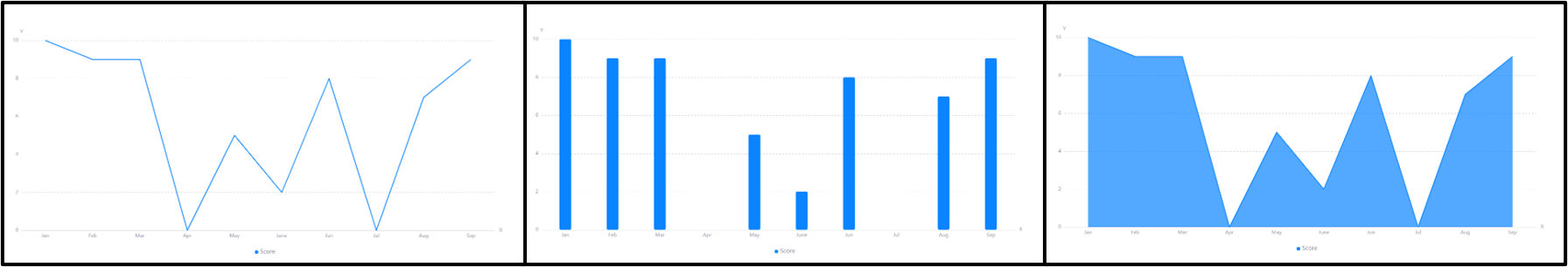
The Mix Chart widget is used to display the changes in data over a period of time or compare multiple sets of data. The mix chart supports presenting data in line chart, bar chart, target chart, scatter chart, area chart, bubble chart and dot-line chart.
Data Fields
The data fields required are:
| Field | Quantity |
|---|---|
| Dimension | 1 |
| Comparison | 0 - 1 |
| Measurement | ≥ 1 |
| Extension | Unlimited |
If the Measurement data values exceed two decimal places, they will be rounded off to 2 decimal places.
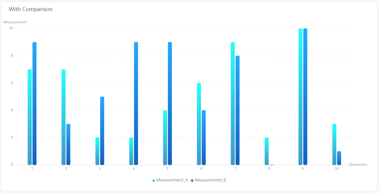
The Comparison data field enables you to segregate the data by their Comparison value and plot them as multiple charts on the widget. For example, the chart below shows how the data is separated into Measurement_A and Measurement_B.
You can also show/hide the charts according to their measurement data fields or comparison value by clicking their respective legend labels.
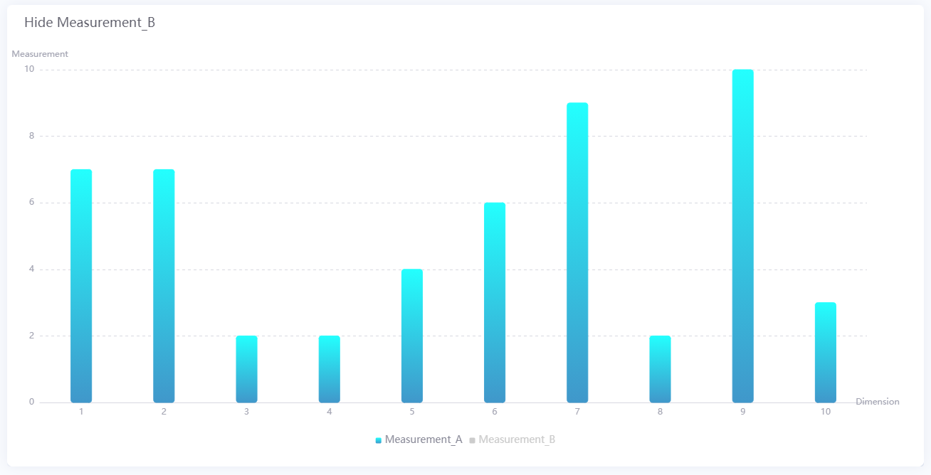
Chart Style
Measurement Style
For each Measurement field, you can set different styles, for example selecting the color of the chart, or the chart type.
| Chart Type | Field | Description |
|---|---|---|
| All | Dual Y-Axis | Select this to plot the data field on the second Y-axis. |
| All | Enable Future Style | Select this to use a special future data style for data whose time is in the future to help distinguish it from other data. |
| All | Chart Type | Select the type of chart to plot the data field. |
| All | Color | Select the color of the chart for the respective data field. |
| Line Chart, Area Chart, Dot-line Chart | Line Width | Specify the thickness of the line chart. |
| Line Chart, Area Chart, Dot-line Chart | Smooth | Select this to plot a smooth curve. |
| Bar Chart | Rounded Corners | Select this to display bars with round corners. |
| Bar Chart | Stack | Select this to place bars with same Dimension value on top of each other. |
| Bar Chart | Bar Spacing | Specify the horizontal spacing between bars with different Dimension values. |
| Target Chart | Target Height | Specify the length of the target bars. |
| Scatter Chart | Scatter Size | Specify the radius of the scatter dots. |
| Dot-line Chart | Size, Shape | Specify the radius and shape of the dots. |
Axis Style
| Field | Description |
|---|---|
| Name | Specify the name or unit of the axes. |
| Dynamic Unit [1] | Select this to automatically use the suitable unit for your data values, and to automatically adjust the values on the axes. |
| Label Length [1] | Specify the length of the axis label name. When the length is longer than the set length, the excess will be displayed as an ellipsis (…). Or you can select Auto, where the adjacent label names will not be displayed if a label is too long. |
| Axis Range [1] | Specify the minimum and maximum values on the axes, and the number of labels between them. |
| Label Settings |
|
| Font | Style the labels. |
| Axis Line | Style the line for the X axis. |
| Grid Line | Style the grid lines for the Y axis. |
| Show Scalar Bar | Select to show a bar that can limit the range of data displayed on the axes. |
[1] Only available for Y-Axis.
Note
- If you enter Name, enabling Dynamic Unit does not overwrite the Name, but only changes the values on the axes. If you enter Name as the unit, you should check the data after enabling Dynamic Unit.
- When the Dual Y-Axis checkbox is selected (in Measurement Style), the Secondary Y-Axis panel will become available, which enables you to format the second Y-axis with the same configurations
Other Settings
Mix Chart
| Field | Description |
|---|---|
| Enable Selection Zooming | You can box a data area in the chart to zoom in. Supports undo and reset operations. |
| Rounded Corners | Select this to display bars with round corners. |
| Stack | Select this to place bars with same Dimension value on top of each other. |
| Show Thousands Separator | Select this to display the thousandths of the value. |
| Bar Spacing | Set the bar spacing. |
Legend
| Field | Description |
|---|---|
| Position | Select the position of the legend. |
| Size | Specify the radii of the legend dots and the vertical spacing between them. Select Auto to automatically set the optimal size for the legend bar. |
| Legend Font | Style the text labels in the legend. |
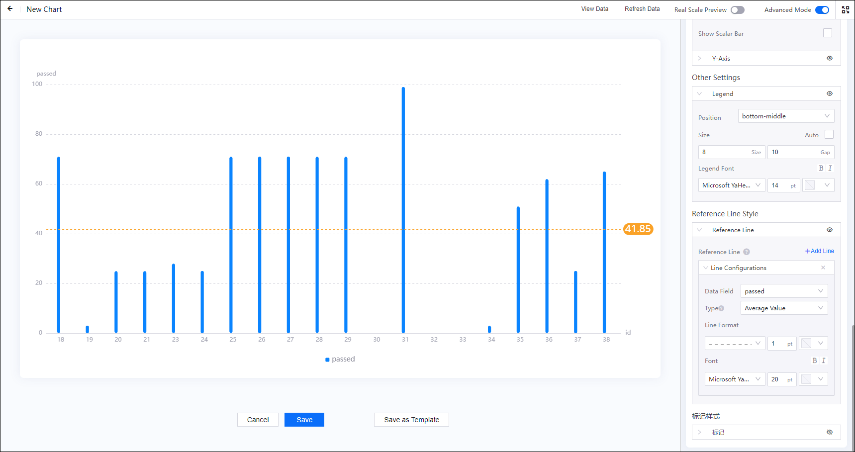
Reference Line Style
Reference Line
You can add multiple reference lines and customize them to mark out and quickly identify critical values and the corresponding data points.
Line Configurations
| Field | Description |
|---|---|
| Name | Specify the name of the reference line. |
| Name Location | Select the display position of the reference line name. |
| Data Field | Specify the data field you wish to add the reference line in. |
| Type |
|
| Line Format | Style the line. |
| Font | Style the marked value. |
Highlight Area Style
Highlight Area
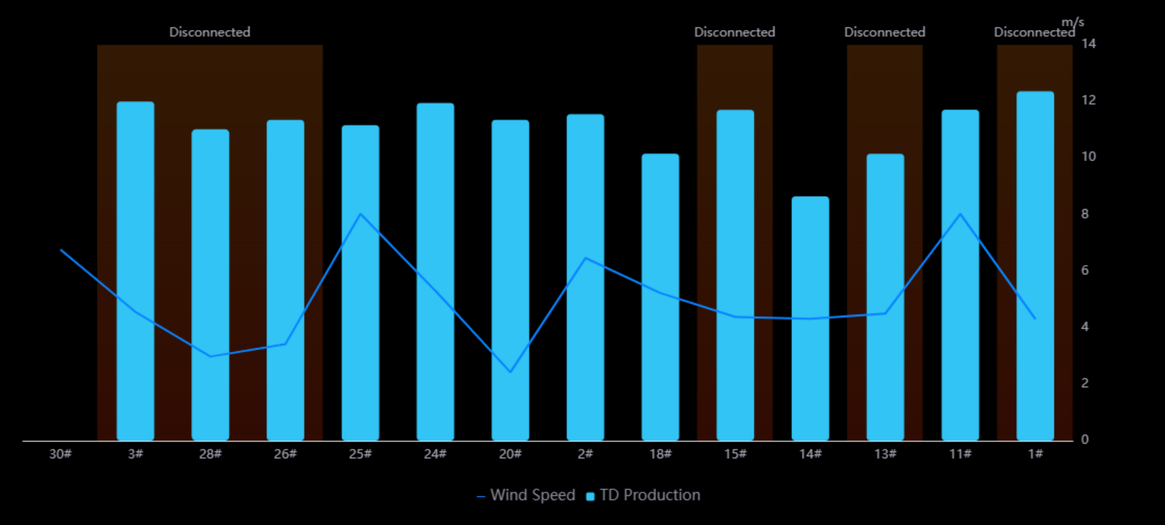
You can highlight the background area of specified data in a mix chart to emphasize information such as asset status and fluctuating power rate.
Highlight Area Configurations
Highlight Area is disabled by default. Select preview button  to enable Highlight Area. Select Add Highlight Area to configure highlight areas in the mix chart.
| Field | Description |
|---|---|
| Linked Axis |
|
| Data Field | Specify the data field of highlight areas. You need to add related fields to Data Fields > Extension first. |
| Identification Method |
|
| Formatting Rules | Specify the rules to highlight, including values or value ranges, displayed text, and highlight colors. |