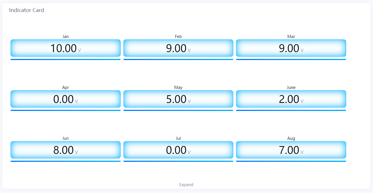
Indicator Card
The Indicator Card widget is used to display data on well-organized cards.
Data Fields
The data fields required are:
Field |
Quantity |
|---|---|
Comparison |
0 - 1 |
Measurement |
1 |
Chart Style
Comparison Style
Field |
Description |
|---|---|
Layout |
Specify how to arrange multiple charts |
Show “Expand” |
Select this to enable users to view more charts by clicking Expand at the bottom of the chart. Otherwise, the extra charts cannot be seen at all. |
Font [1] |
Style the Comparison field label that is located above each chart |
Measurement Style
Field |
Description |
|---|---|
Icon |
Choose an icon from the icon library to be displayed alongside the chart data. |
Icon Color [2] |
Specify a color for icons used. Icon color displays the theme color by default. To change a color, uncheck Use Theme Color box. |
Icon Size |
Specify the icon size to be shown in chart |
Name Position [2] |
Position the indicator name label to the top, bottom, left or right of the value label. |
Indicator Name |
Specify the name to be shown for all the charts. The indicator name is located below each chart by default. To change position, use Name Position. |
Show Name |
Show the indicator name |
Name Font [2] |
Style the indicator name labels |
Unit Name |
Specify the unit for chart data. The unit name will not be displayed if you chose to show data as percentage values. |
Dynamic Unit |
Select this to automatically use the unit that suits your data values |
Unit Font [2] |
Style the unit labels |
Value Font [2] |
Style the value labels |
Decimal Places |
Round up the displayed chart data to the specified decimal places |
Formatting Rules |
Set rules to display different colors for different measurement values |
Card Style
The Card Style is only available in Advanced Mode.
Field |
Description |
|---|---|
Value Card Padding |
Specify the vertical spacing around the value label |
Name Card Padding |
Specify the vertical spacing around the name label |
Card Color |
Select a background color for the cards |