Heat Map
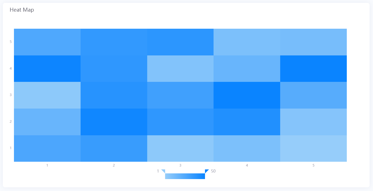
Heat Map is a graphical representation of data where each data value is represented as a color. It enables users to quickly compare large volumes of data and identify anomalies.
Data Fields
The data fields required are:
Field |
Multiplicity |
|---|---|
Dimension (X-axis) |
0 - 1 |
Comparison (Y-axis) |
0 - 1 |
Measurement |
1 |
Chart Style
Axis Style
Formats the horizontal and vertical axes of the heat map. You can hide any axis by clicking their respective  button.
Field |
Description |
|---|---|
Unit |
Specify the unit to be used for the axis label |
Dynamic Unit [1] |
Select this to automatically use the unit that suits your data values |
Label Settings |
Choose the type, format and the orientation of the tick mark labels |
Font [2] |
Styles the font of the tick mark labels |
Axis Line [2] |
Styles the axis line. Axis line is disabled by default, click |
Grid Line [2] |
Styles the grid lines. Grid lines are disabled by default, click |
Show Scalar Bar [2] |
Select this to show a bar that can limit the range of data displayed on each axis. This enables you to show only a part of the heat map. |
[1] Only available for Y-Axis. [2] Only available in Advanced Mode
Heat Map Style
Cell Style
Formats the appearance of the heat map cells. Only available in Advanced Mode.
Field |
Description |
|---|---|
Color Mapping |
Specify the range of data values |
Auto |
Select this to use the theme color as the color mapping |
Mark Min Value |
Select this to mark the cell(s) that contain the minimum value with the text “Min” |
Mark Max Value |
Select this to mark the cell(s) that contain the maximum value with the text “Max” |
Other Settings
Legend Style
Formats the legend. You can hide the legend by clicking .
Field |
Description |
|---|---|
Position |
Select the position to display the legend |
Legend Font [3] |
Configure the font of the legend text |
Size [3] |
Specify the size of the legend bar. Select Auto to automatically set the optimal size for the legend bar. |
[3] Only available in Advanced Mode