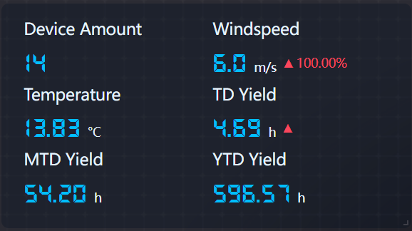
Metric Card
The Metric Card widget is used to display data on well-organized cards. Unlike the Indicator Card widget, the cards of the Metric Card widget can be configured separately, for example different units, different rules for formatting rules, and so on.

Each card displayed by the widget consists of two internal cards - name and value cards. The name card displays the name of the card, and the value card displays the value and the trend of the value, with the option to add a unit to the value.
Data Fields
The data fields required are:
Field |
Quantity |
|---|---|
Dimension |
0 - 1 |
Measurement |
Unlimited |
Extension |
Unlimited,used to set up data sources in the Change Rate Setting. |
Chart Style
Measurement Style
You can configure the Measurement Style for each Measurement data field.
Field |
Description |
|---|---|
Jump Configuration |
Set select measurement to jump to links.The configuration is the same as the title jump, see Title Jump. |
Icon |
Select an icon to be displayed beside the data field. |
Icon Color |
Select a color for the icon. |
Icon Size |
Specify the size of the icon. |
Show Name |
Show the indicator name. |
Name Font |
Style the indicator name. |
Unit Name |
Specify the unit for the value. |
Dynamic Unit |
Select this to automatically use the unit that suits your data values. |
Unit Font |
Style the unit. |
Value Font |
Style the value |
Decimal Places |
Round up the value to the specified decimal places. |
Show Thousands Separator |
Toggle between displaying and hiding thousands separator. |
Alignment |
Select the text alignment within the name and value cards. |
Name Position |
Select to display the name card in either top, bottom, left or right position of the value card. |
Description |
Select the Extension data field as the description, displayed below the value. |
Name-Value Card Spacing |
Specify the spacing between the name and value cards. |
Value Card Padding |
Specify the respective spacing within the value card. |
Name Card Padding |
Specify the respective spacing within the name card. |
Use Shading |
Check to enable card shading. |
Name Card Shading |
Select the color of the name cards. |
Value Card Shading |
When the name position is top or bottom, you can select the color of the value cards. |
Formatting Rules |
Set rules to color the value text depending on its value. |
Change Rate Setting |
Set the data change indicator for this measurement. The data field to be used for the indicator needs to be added to the extension data field. The style of the change indicator can be configured. |
Metric Card Style
Field |
Description |
|---|---|
Layout |
Specify how to arrange multiple cards |
Horizontal Spacing |
Specify the horizontal spacing between the cards |
Show “Expand” |
Select this to enable users to view more cards by clicking Expand at the bottom of the chart. Otherwise, the extra cards cannot be seen at all. |