Configuring Single-Page Applications
This article introduces the configuration process of a single-page application. After learning about Single-Page Application Overview, you can follow the instructions below to create and configure a single-page application.
Workflow
The process of configuring a single-page application is as follows:

Creating a new single-page application: Create a single-page application within a project.
Configuring basic information: Configure the basic information of the page, such as the project, label, response mode, theme, etc. to which the page belongs.
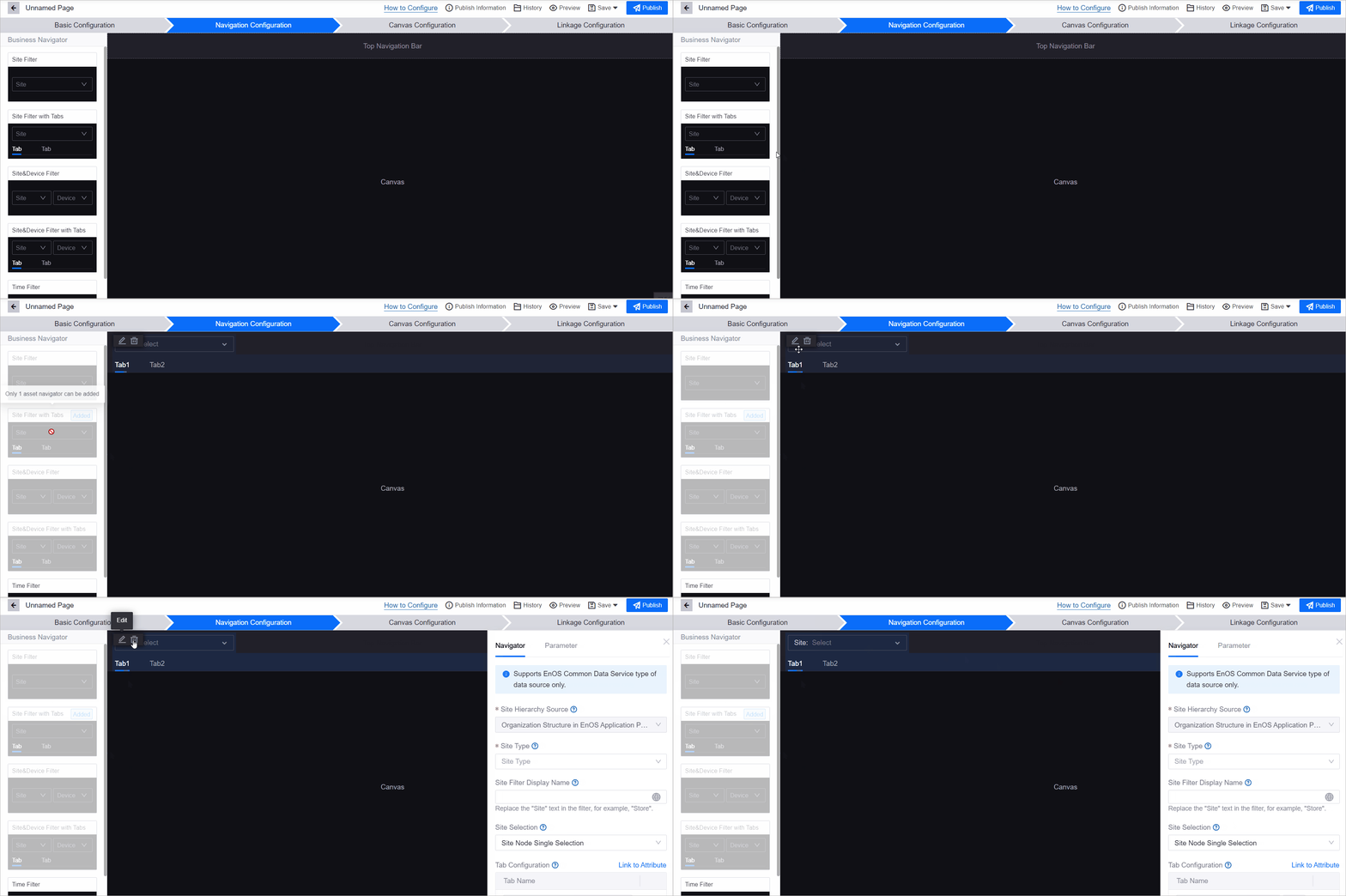
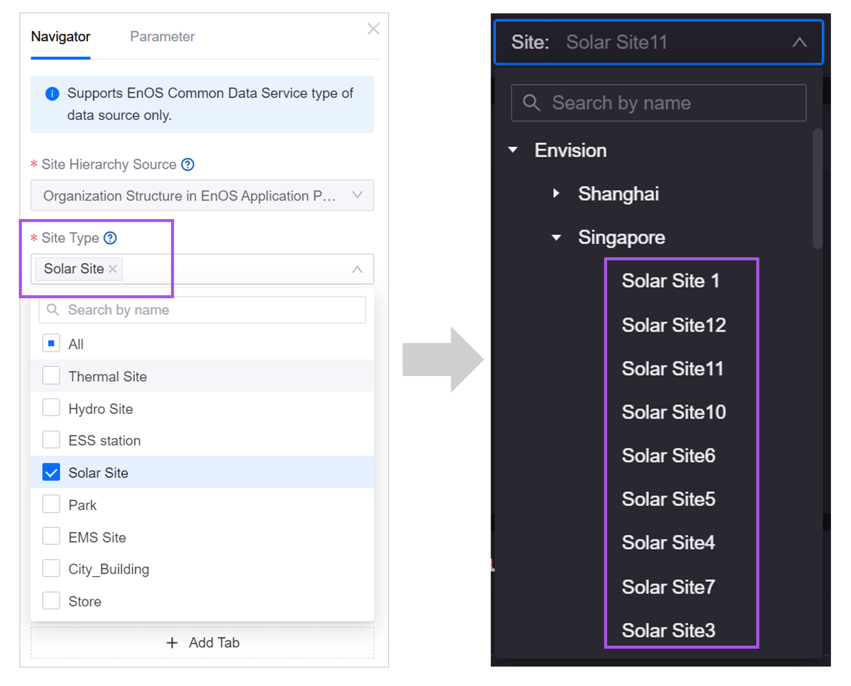
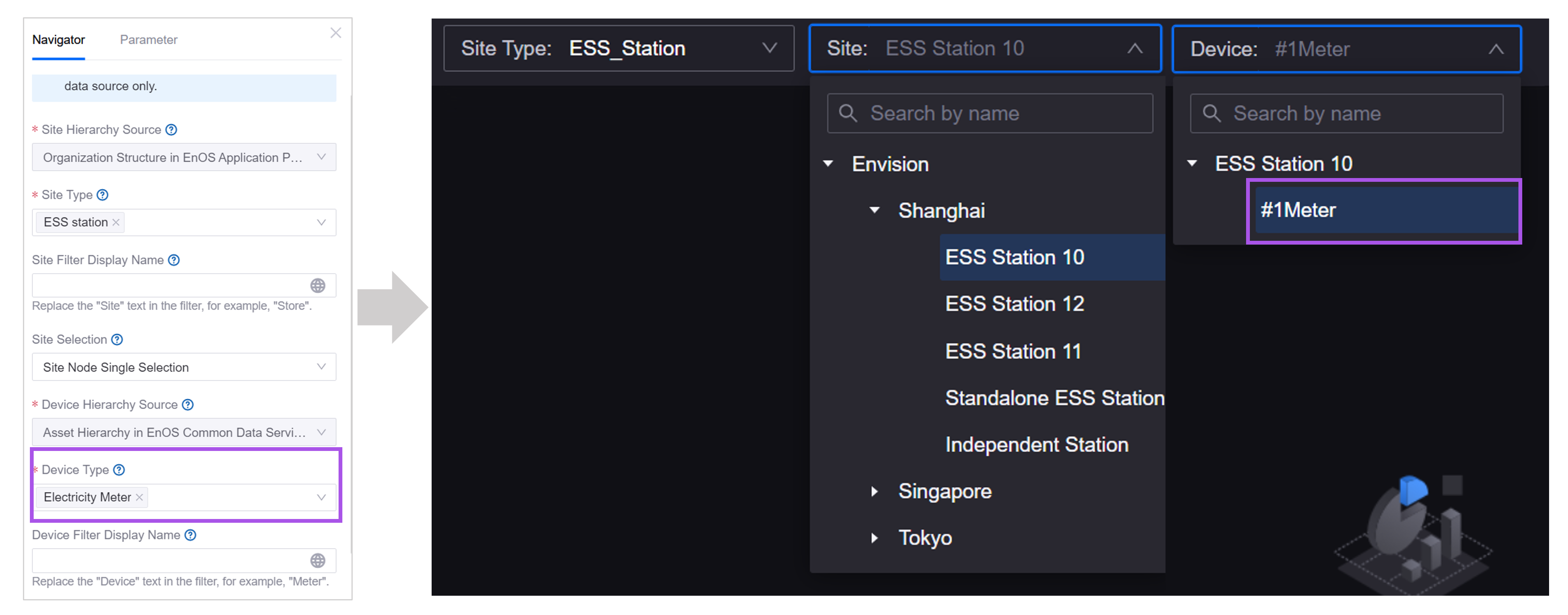
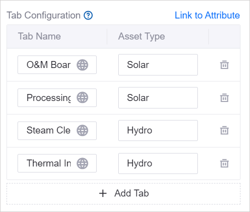
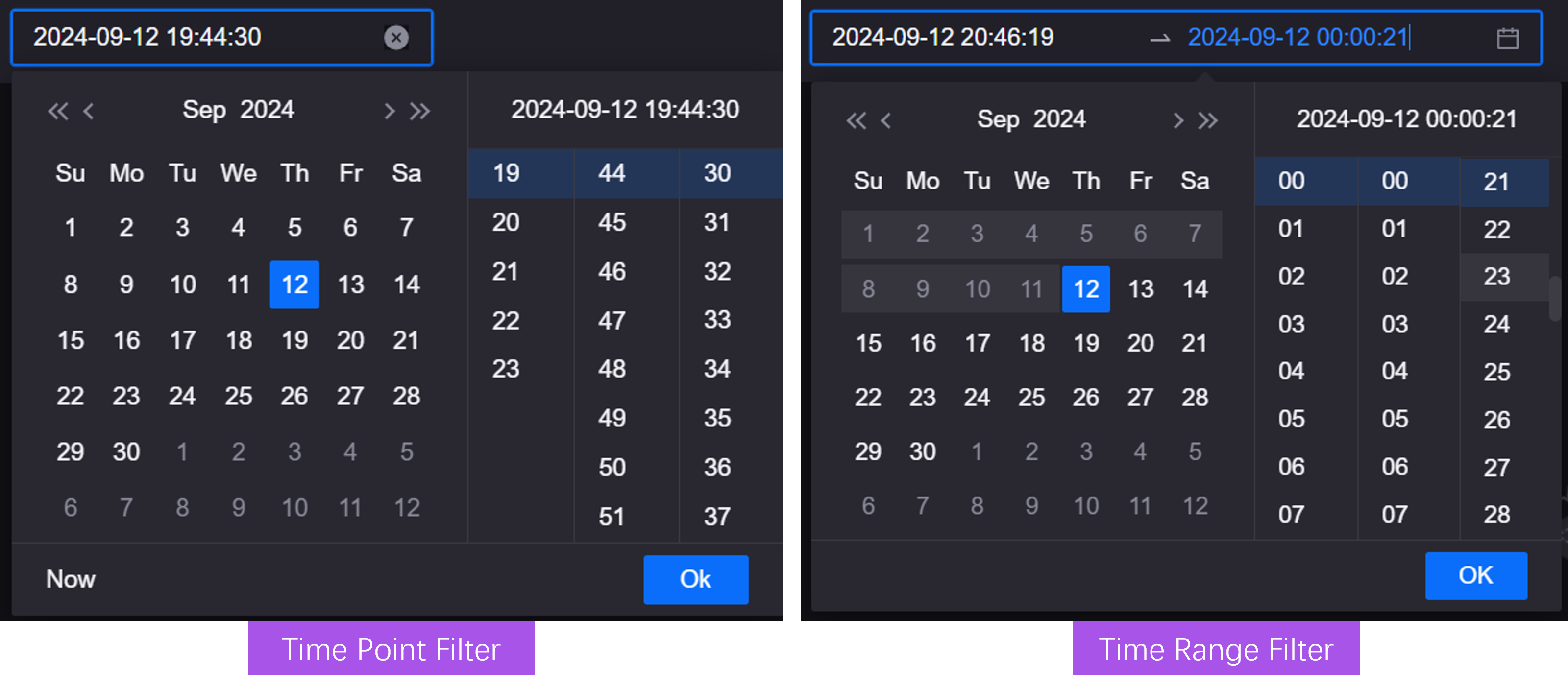
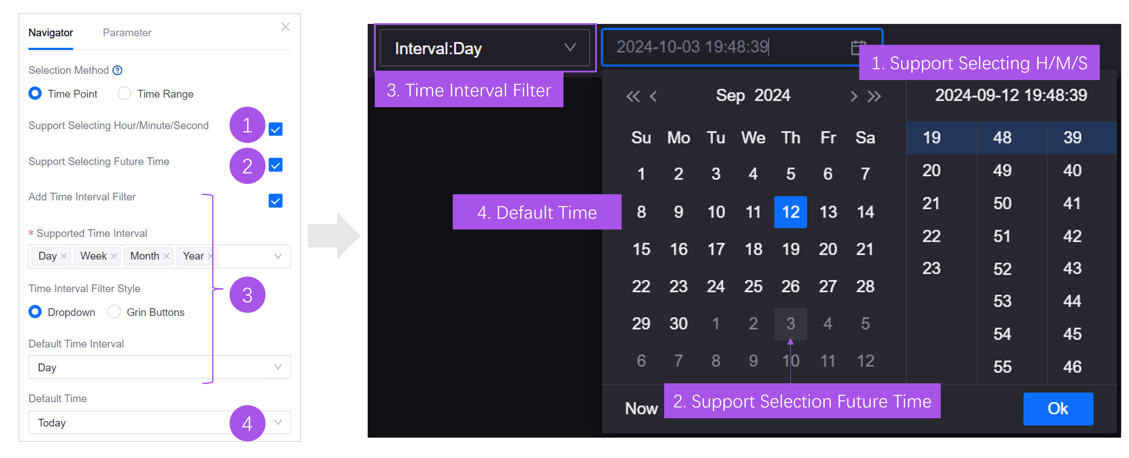
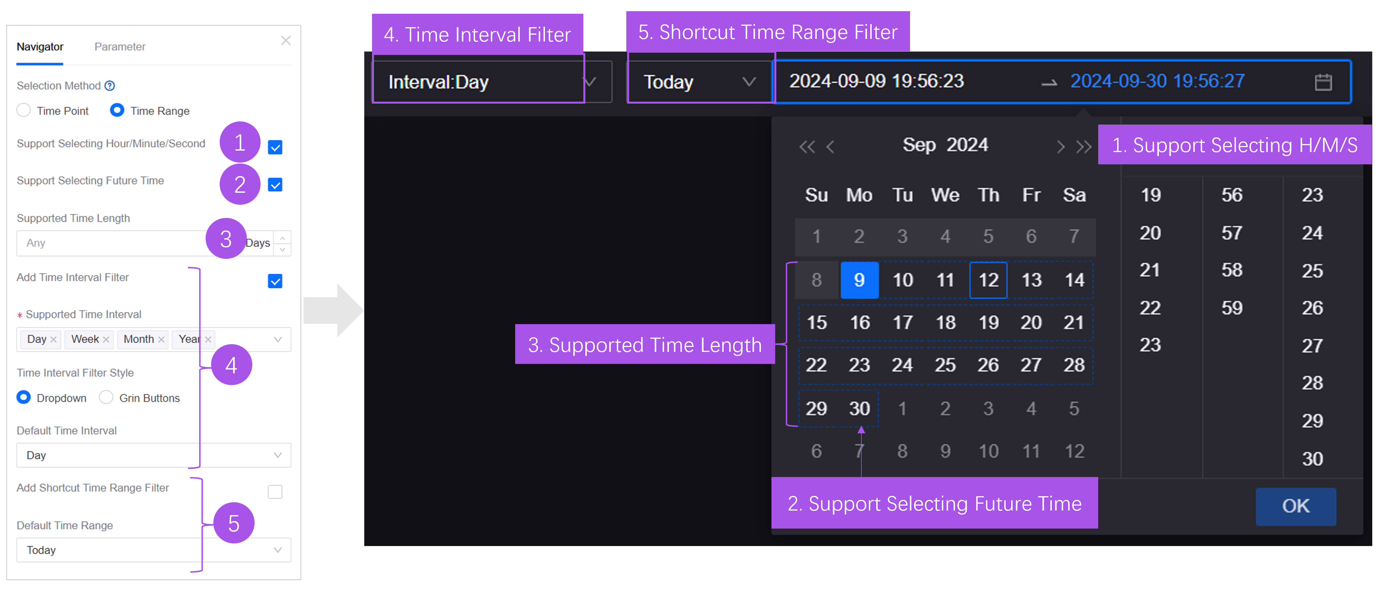
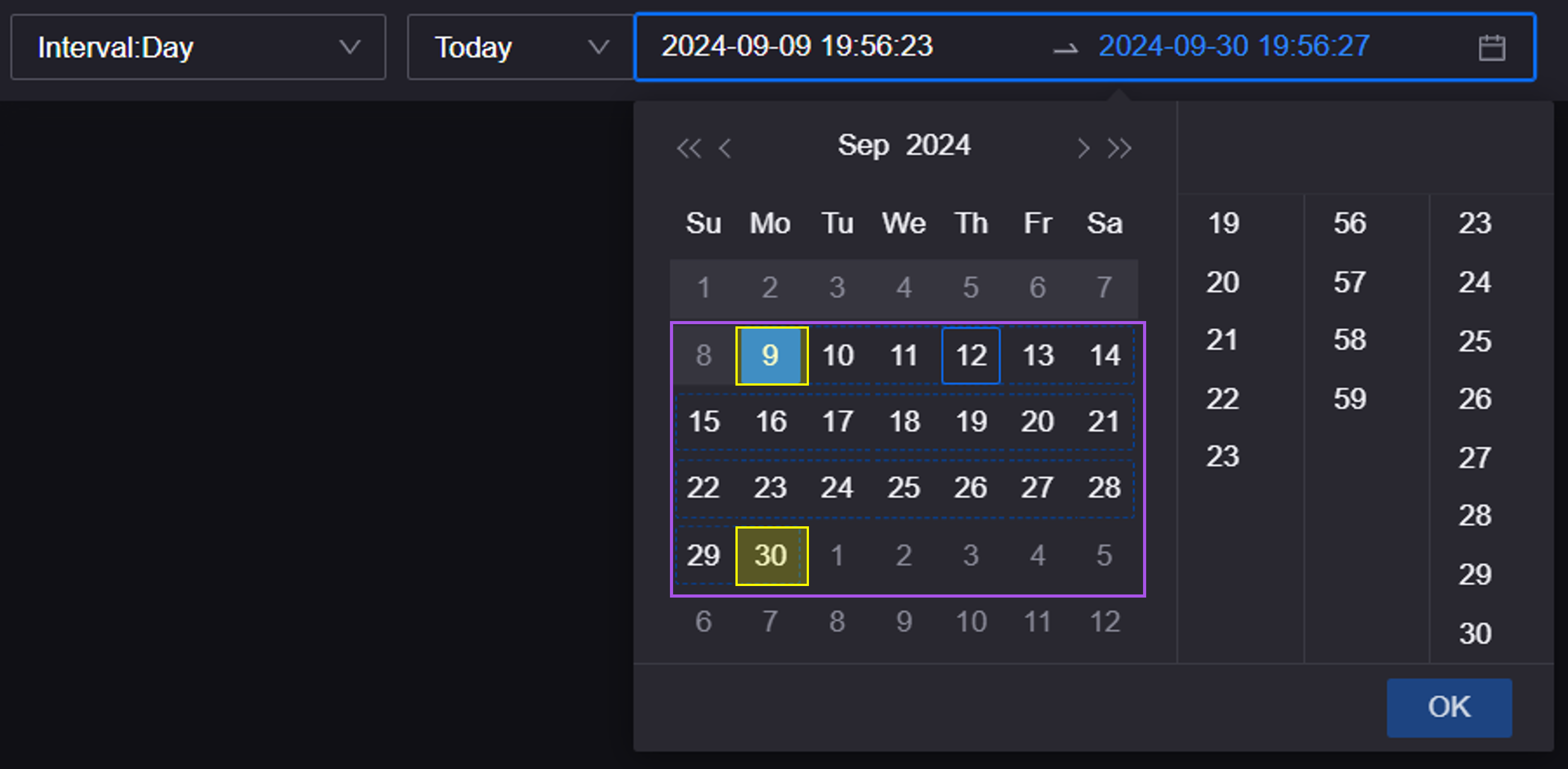
Configuring Navigation: Configure asset filters, time filters and tabs, and configure function entrances for users to filter data and switch pages.
Adding Canvas, Layers and Widgets: Configure the canvas level of the page, as well as the widgets and elements displayed on each level.
Configuring Linkage: Configure the page linkage between filters, tabs and canvas, and configure the data linkage between filters and widget data.
Publishing Page: Publish the page after completion, and you can embed the page URL into the application for use.
Unit 1: Creating New Single-Page Application
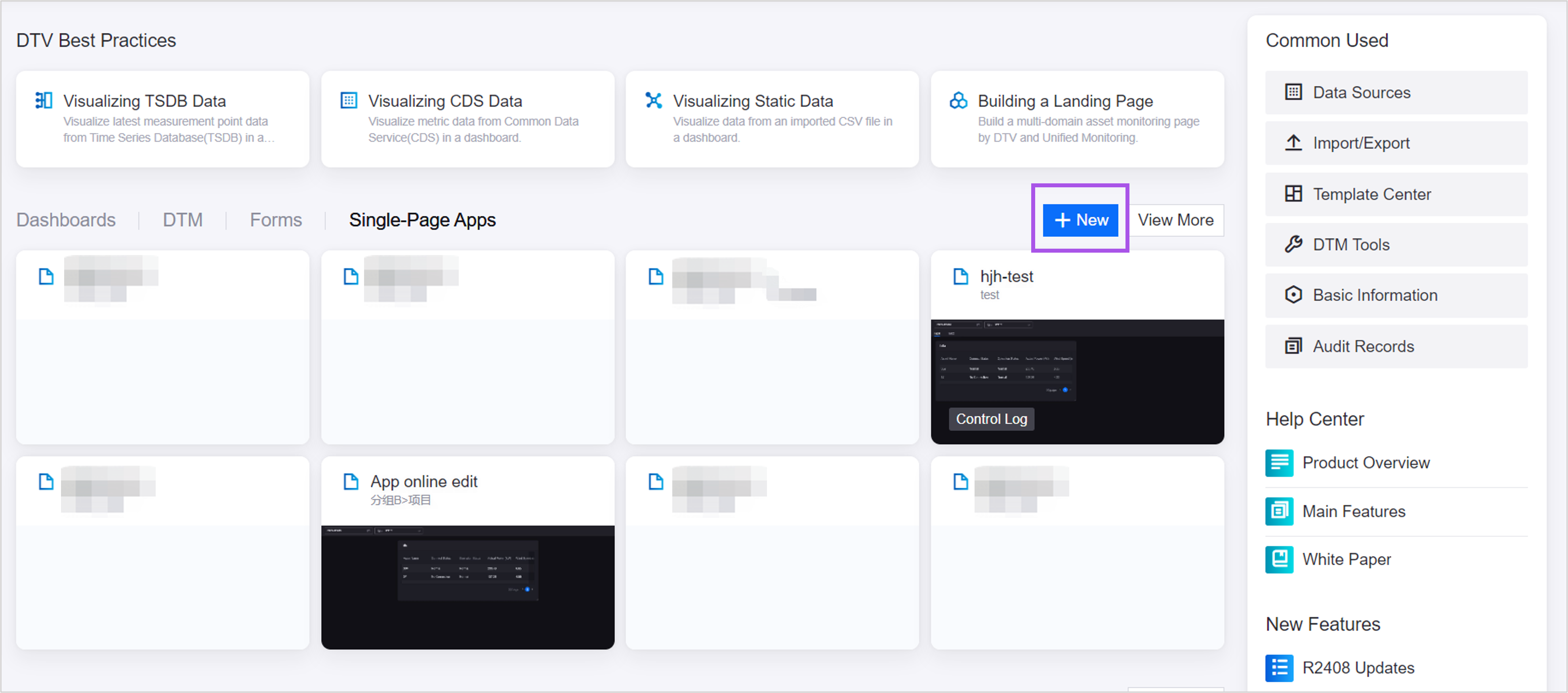
In the navigation bar, select DTV Center and choose one of the methods to create a page:
Select New in the Single-Page Apps tab.
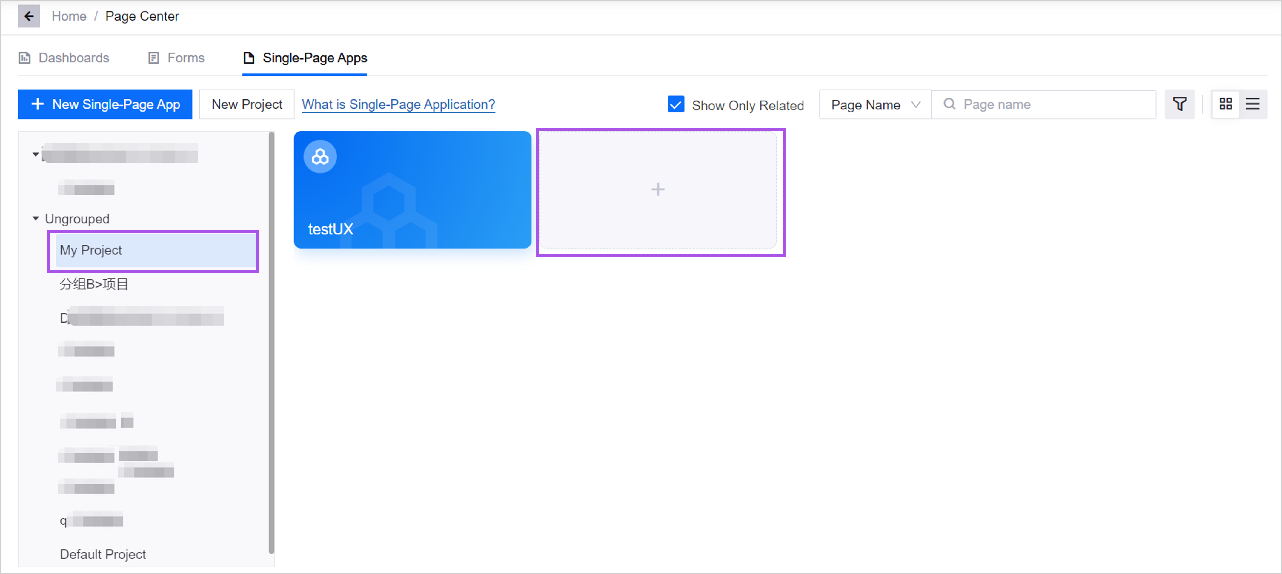
Select View More, find the required project in the project list on the single-page application tab, and select + in the project.
Unit 2: Configuring Basic Information
On the Basic Configuration page, you need to configure the basic information of the page, including:
Page Name
The page name is a name that is convenient for viewing and management within DTV. It can only be seen in DTV and cannot be perceived by users when viewing the page.
Tag
Add existing tags to the page, or create new tags. Tags are used to manage pages in bulk.
Belonged Group
Assign 1 group to the page. Only groups within the permissions of the current account are supported. For more information, see Managing Groups.
Project
A project is a unit of rights management in DTV, and multiple pages can be stored in a project. In the Projects drop-down list, you can only select projects that you have permission to edit. in:
Default Project is open to all users in the OU, and all users can view, edit, and delete pages in the default project.
The projects and pages in Ungrouped will be viewed by all users in the OU. If you need to reassign the group to which a project belongs, you can go to Basic Information > Projects to edit the project after assigning project resource permissions to the current account in the management background.
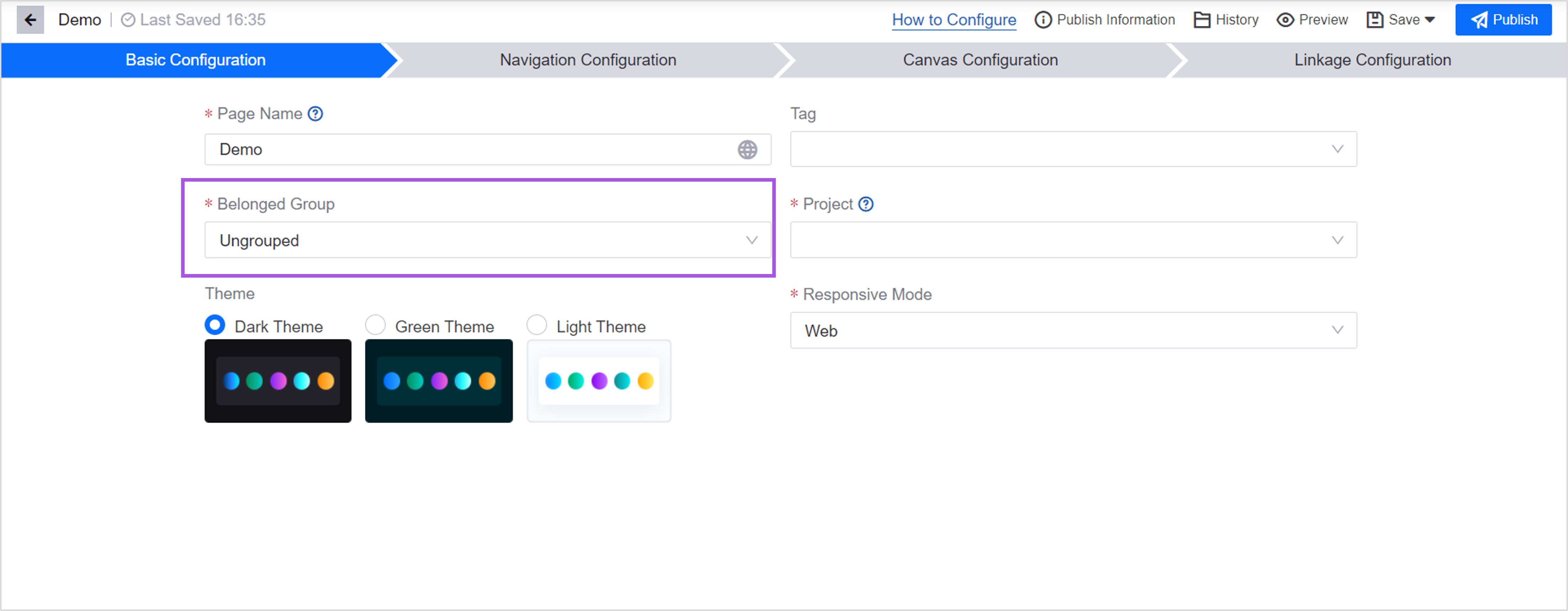
Theme
Specify 1 color theme for the page. The theme will determine the base color of the canvas and widgets in the page. You can also configure other colors for the widget when configuring it.
Response Mode
Responsive mode determines the proportions of the page, choosing in which mode the page opens. Once specified, the page will display the canvas, layers, and widgets according to the corresponding proportions.
Unit 4: Configuring Canvas
In the canvas configuration, you can add layers and widgets to the canvas and configure the data in each widget. See Single-Page Application Overview for the relationship between canvas, layers, and widgets.
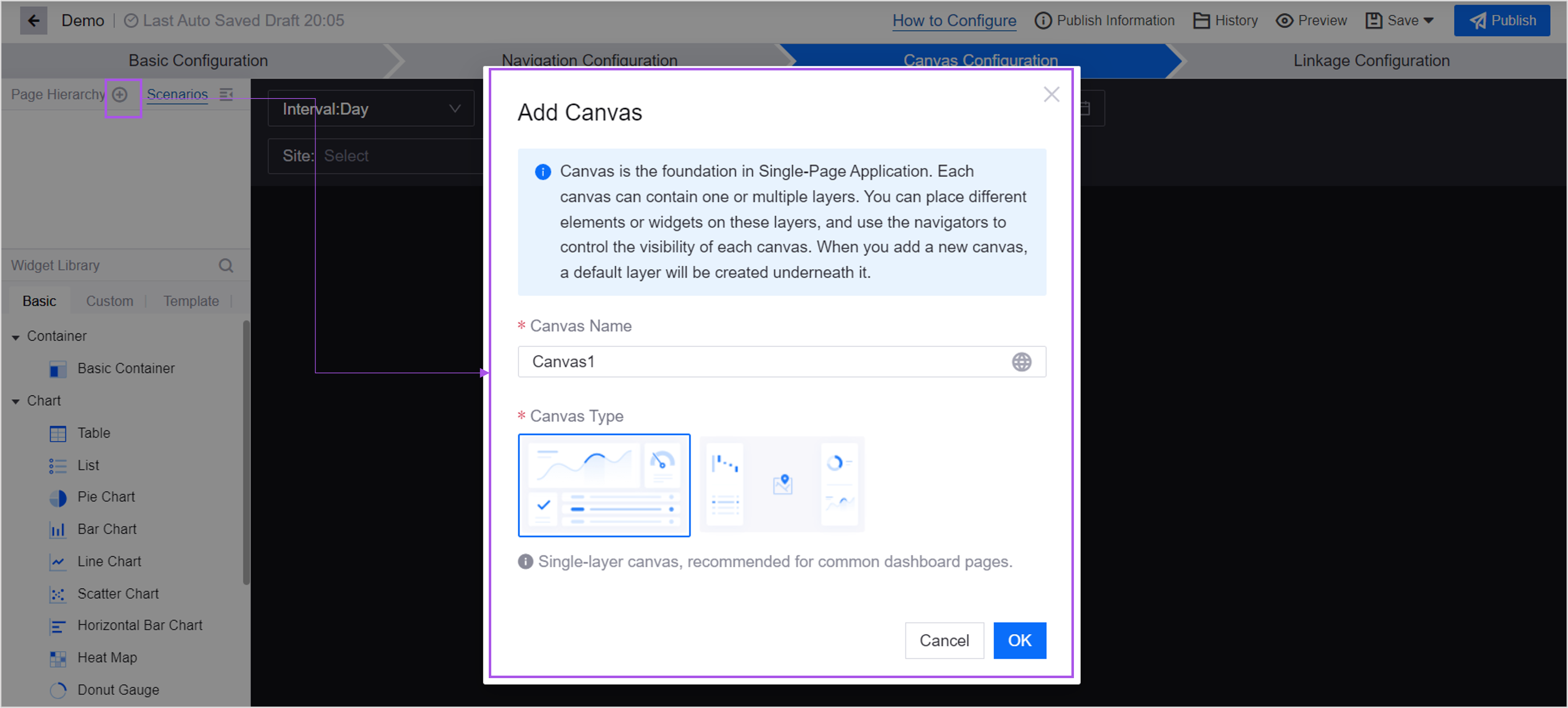
Step 1: Adding Canvas
Multiple canvases can be added to a page. Canvases are divided into the following types based on the number of layers added by default:
Single Layer Canvas: After creating this canvas, the canvas contains 1 layer by default. You can still add another layer to the canvas.
Multi-Layer Canvas: After creating this canvas, 2 layers are added by default.
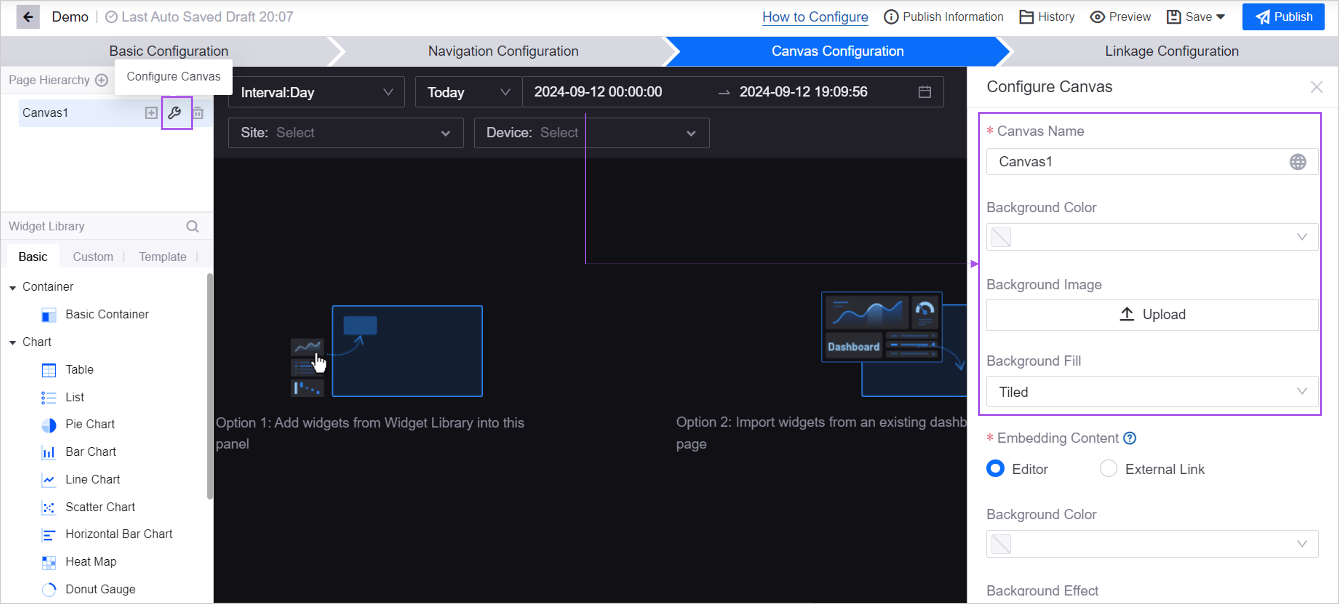
Step 2: Configuring Canvas
Select Canvas Configuration, and in the Canvas Configuration pop-up window on the right, you can configure the name, background color, filling method, etc. of the canvas.
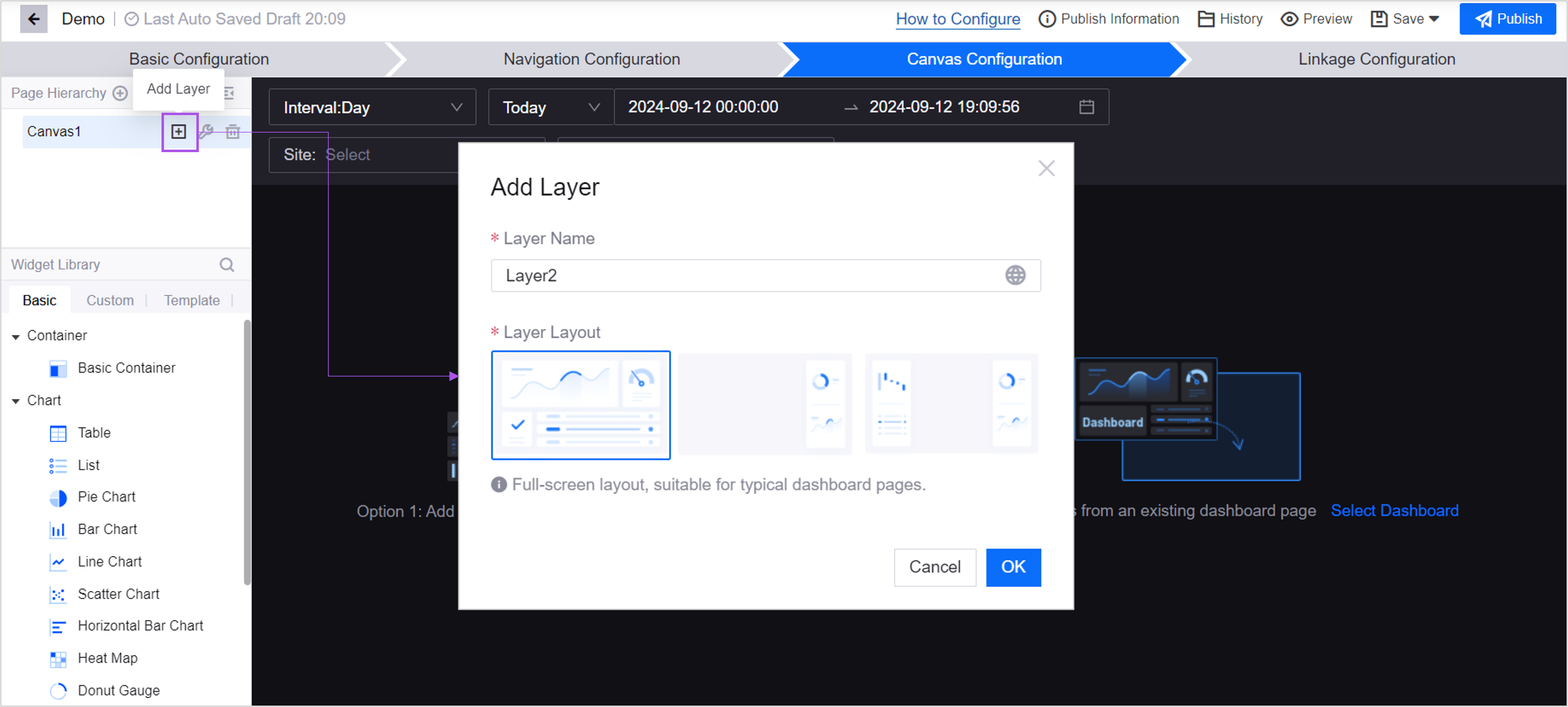
Step 3: (Optional)Adding Layer
When you create a canvas, 1 or 2 layers are created by default. If necessary, you can add additional layers to the canvas. You can add up to 2 layers to a canvas.
Step 4: Configuring Layer & Panel
Select Layer Configuration and configure the layout of the layer and the panels on the layer in the pop-up window on the right.
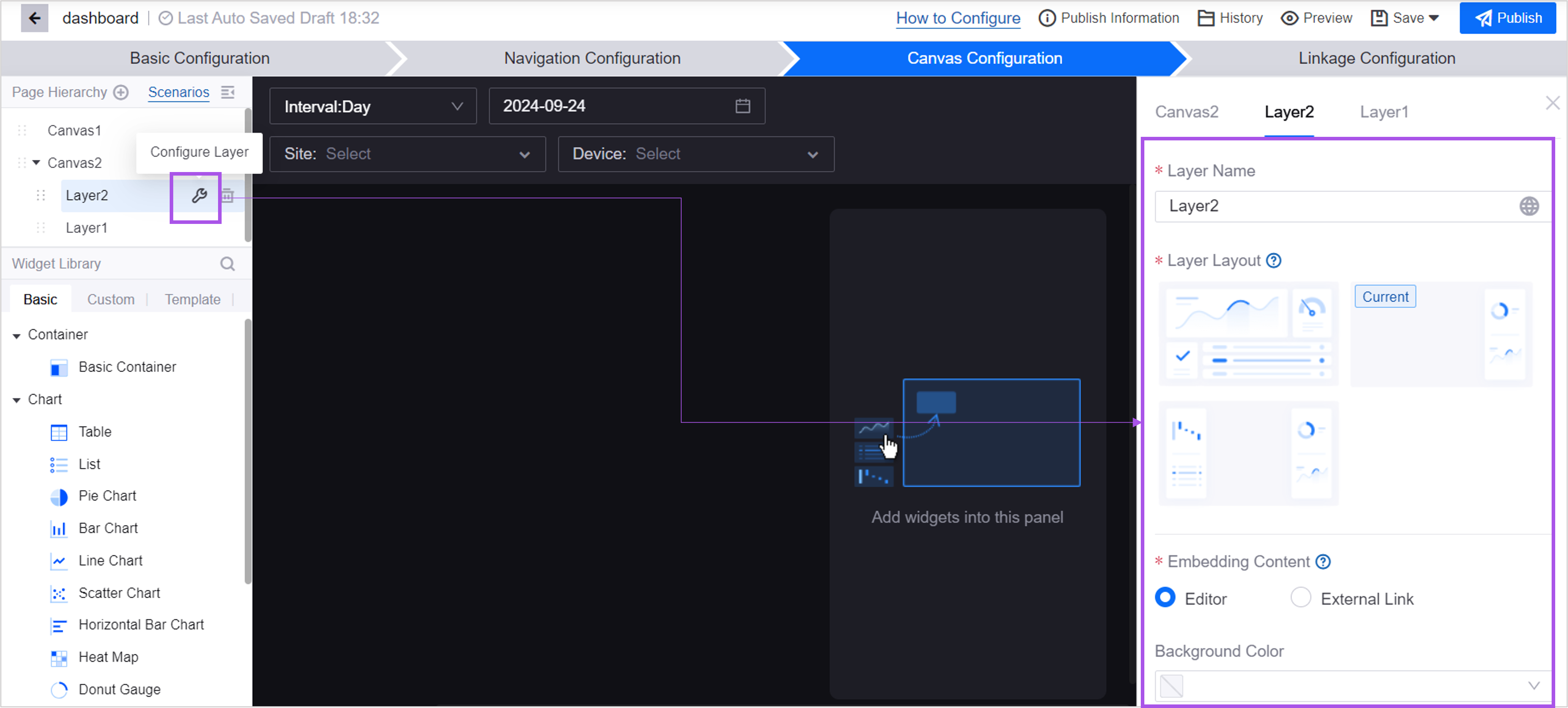
Refer to the instructions below for details on configuring layers and panels.
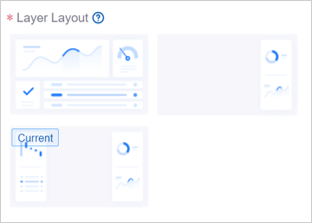
Layer Layout
In a single-layer canvas, there is only 1 layer, and the default layout is full-screen layout. In a multi-layer canvas, you can define the layer layout for each layer. Refer to the Layer section in Single-Page Application Overview to choose the layout you need.
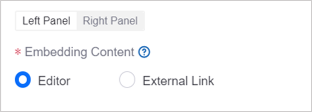
Embedding Content
A panel is a complete area in a layer where content is placed. It can be an entire panel covering the entire screen, or it can be a left/right panel located in a small area of the screen. You need to define the embedded content of each panel in the layer. When the user views the canvas, each panel of the layer can display different content.
You can choose from the following 2 contents:
Editor: The panel defaults to the DTV editor. You can add widgets to the panel and build visual pages.
External link: Insert links to other DTV pages in the panel and treat the panel as a pop-up window displaying other pages. The panel will display embedded page content and cannot be edited in the current page.
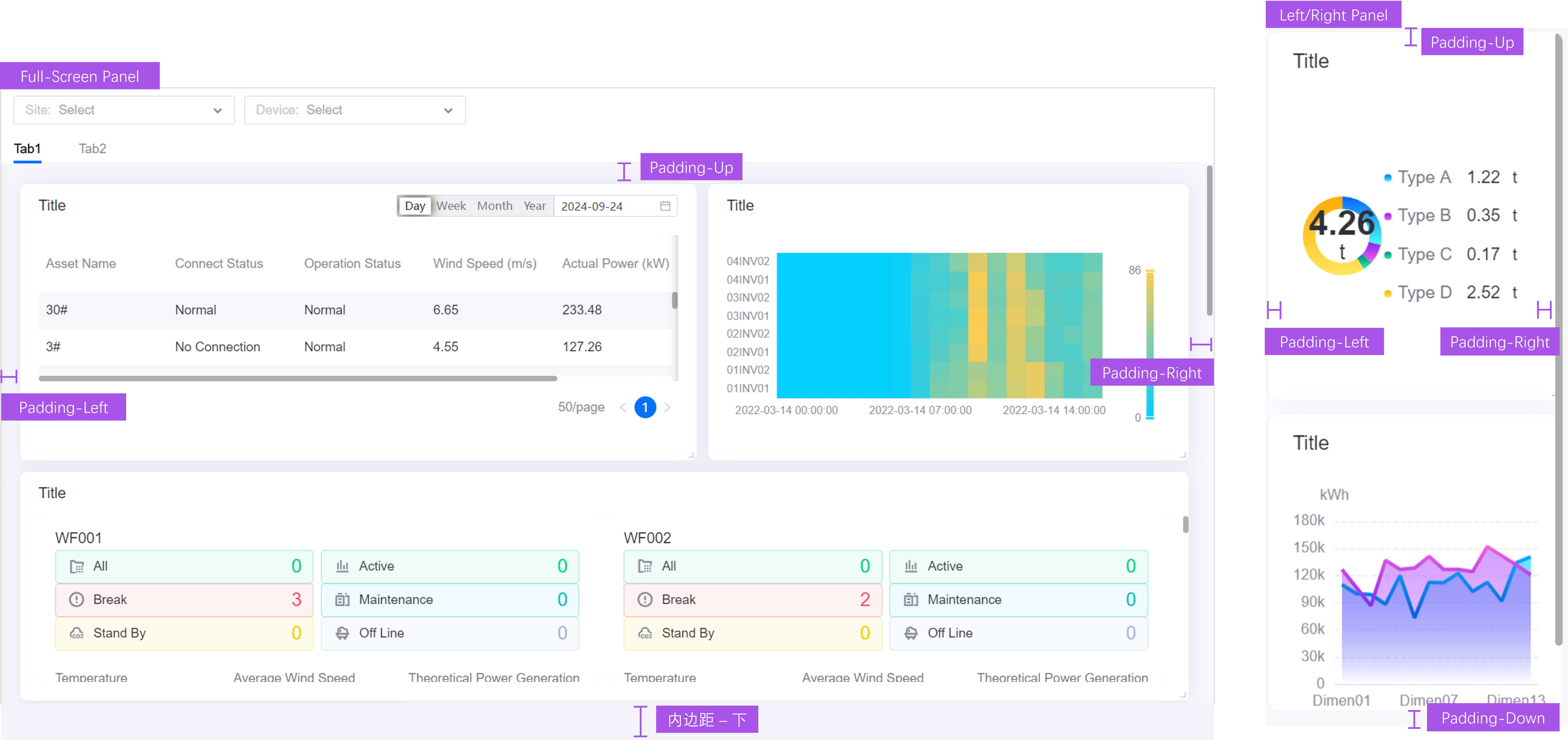
Padding
Padding is the distance between the inner content of the panel and the border.
Step 5: Adding Widget
There are 2 ways to add widgets in the layers panel:
Drag widgets from the widget library on the left and define the widget’s data, style, etc. from scratch.
Introduce widgets from existing dashboard pages and reuse widget configurations. Note: When there are already widgets in the panel, the introduced widgets will overwrite the existing widgets.
Step 6: Configuring Widget
Just like in the dashboard page, you can configure the data and styles of the widgets, drag and move widgets, etc. See Common Configurations for Widgets for a description of the widget configuration items.
Unit 5: Configuring Linkage
In the linkage configuration, you need to configure the linkage for the navigator, canvas, and widget data. See Single-Page Application Overview for descriptions and examples of relationships.
Step 1: Linking to Canvas
When you add multiple canvases to the page, you need to configure the linkage between the navigator and the canvas.
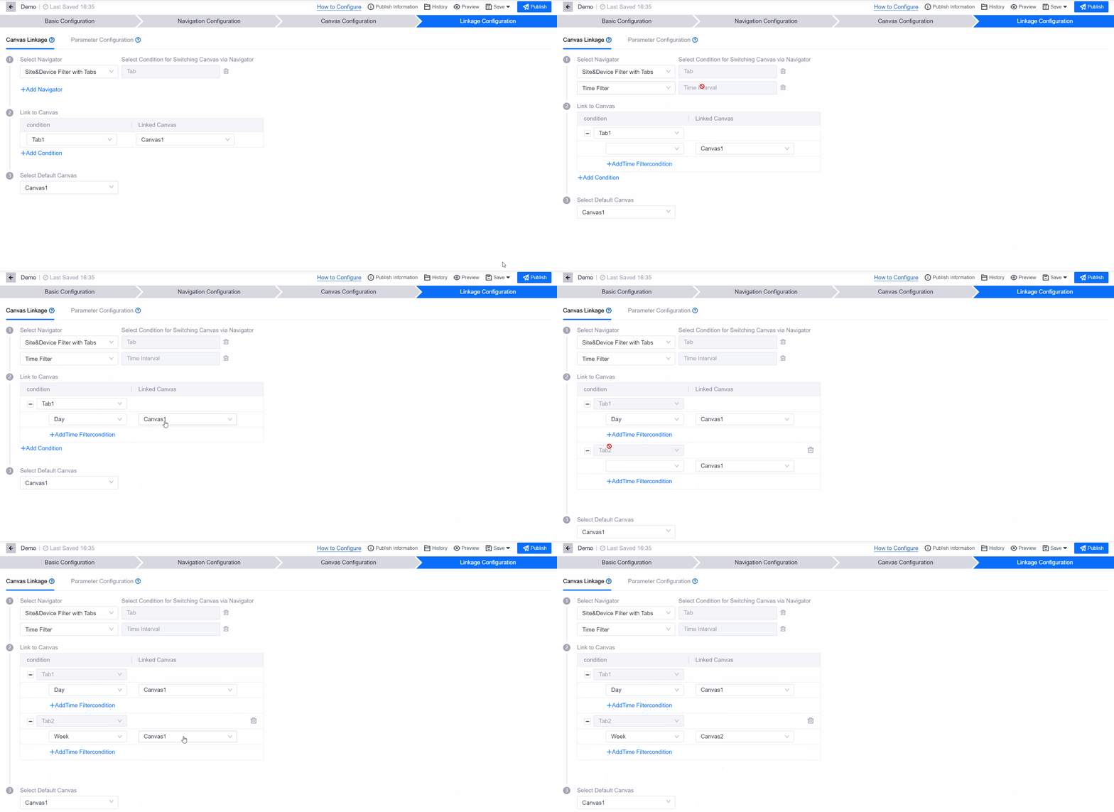
Follow these steps to associate a canvas:
Select a navigator: Choose a navigator from the navigators you added to the page. If not configured, when the user switches filter items or tabs in the navigator, the canvas will not be switched and only the data will be updated.
Select conditions for switching canvases via the navigator:
Time filter defaults to time interval as condition. When the user switches time intervals, switch canvases. The time interval options are determined by the configuration of Time Filter in Navigation Configuration.
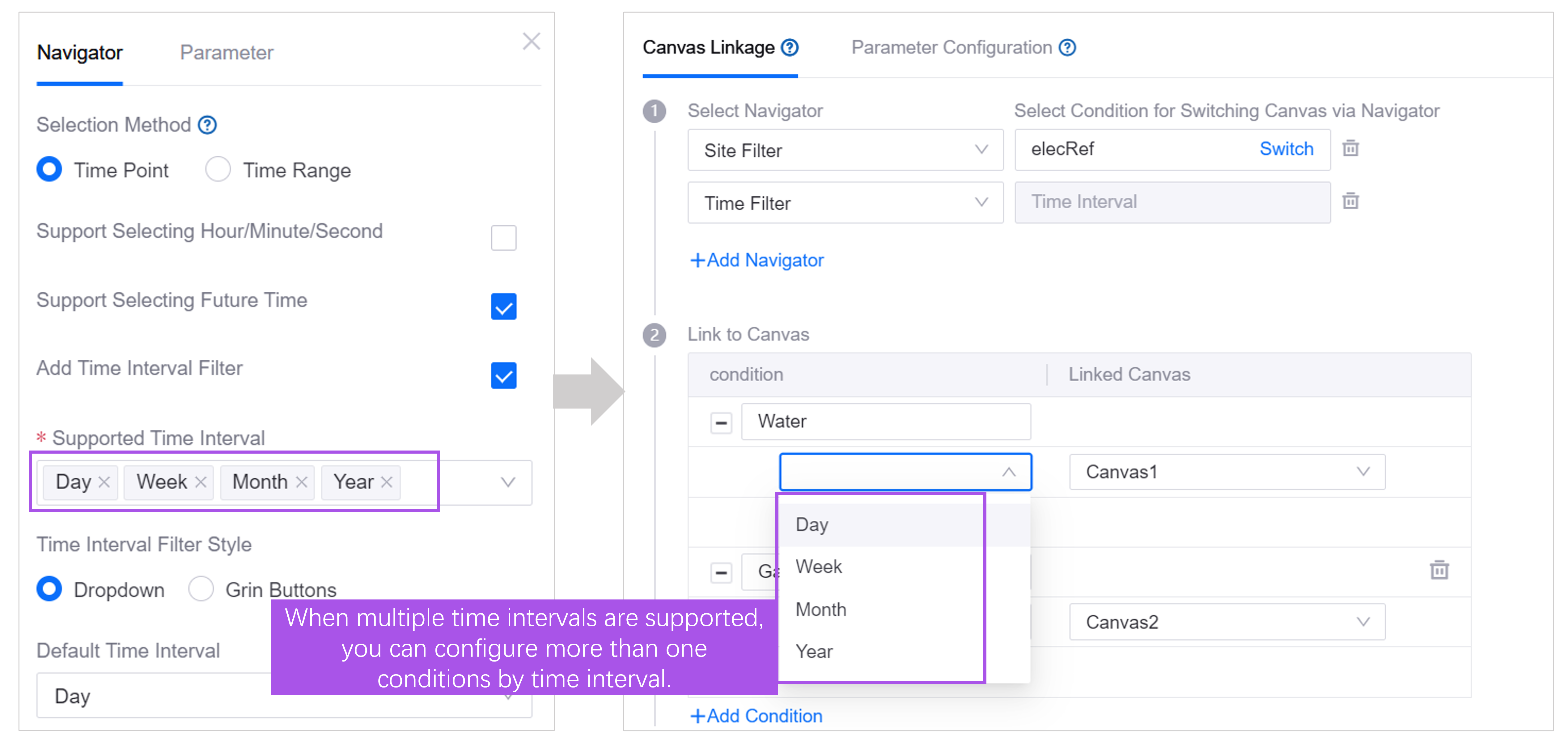
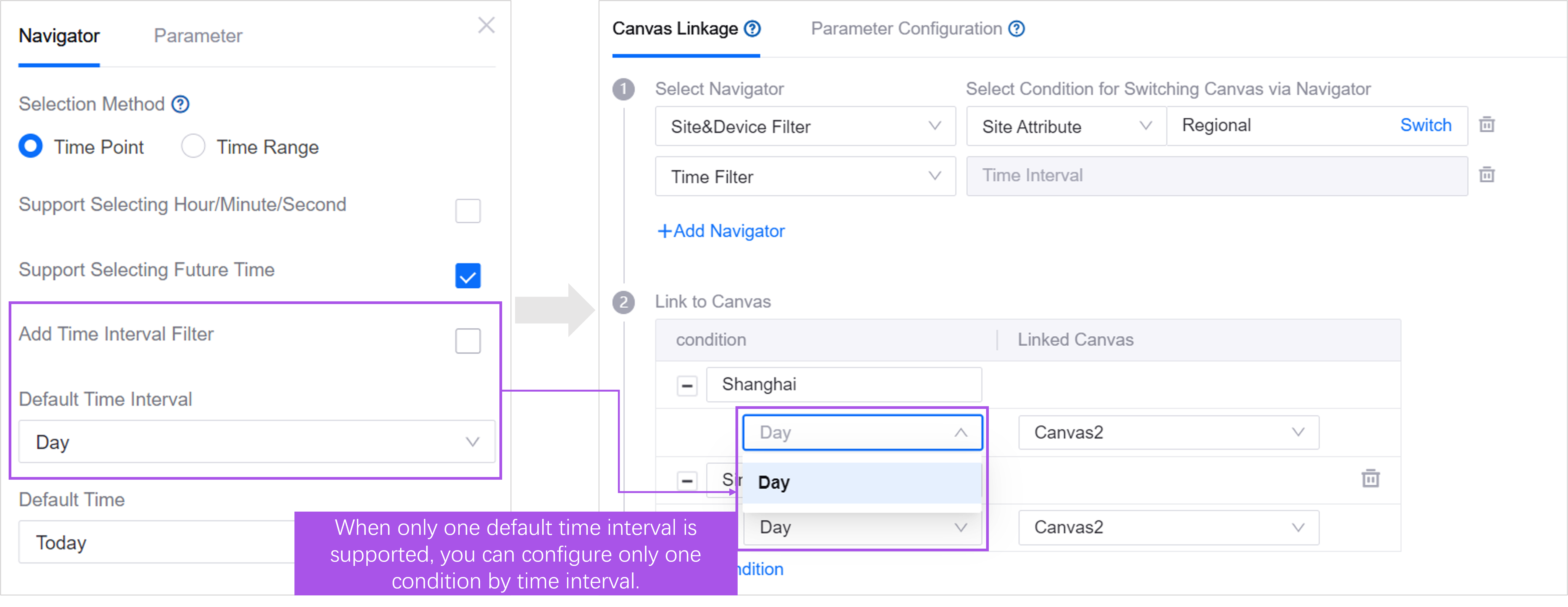
Navigators with tabs use tab as a condition by default. When the user switches tabs, switch canvases.
Site/device filters without tabs will be conditional on properties. Switches the canvas when any of the assets selected by the user in the filter has a property value that matches the defined value.
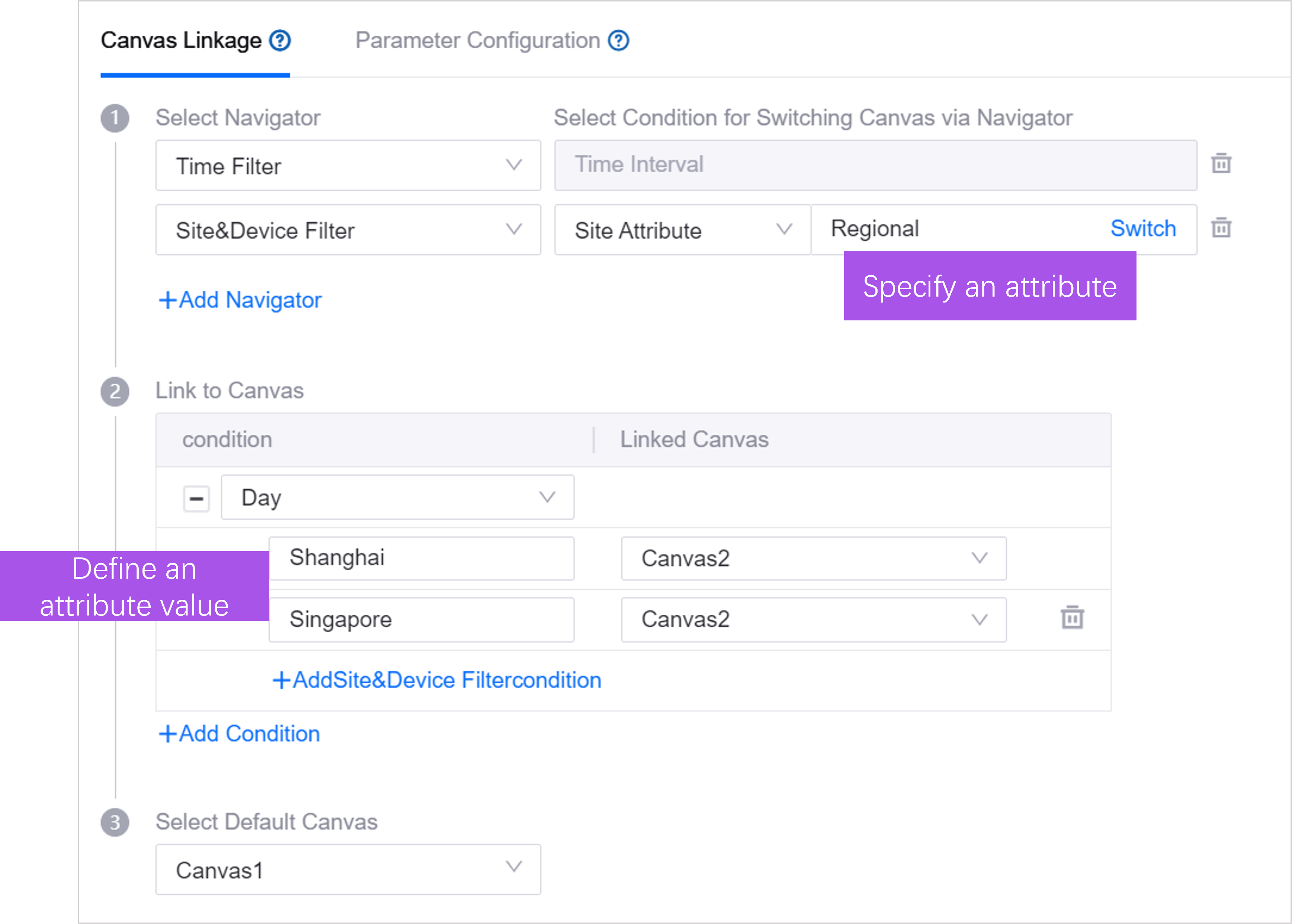
associates a canvas with each condition. For example, in the picture above, the user needs to select Day in Time Filter, and the selected assets contain assets with
Regionalattribute valueShanghaibefore they can switch to Canvas 1.selects the default canvas. When the user does not select any assets, or the selected assets do not meet the conditions defined in the above steps, the page will display the default canvas.
Step 2: Configuration parameters
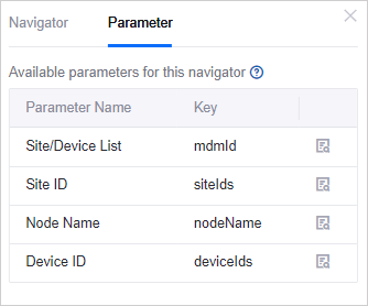
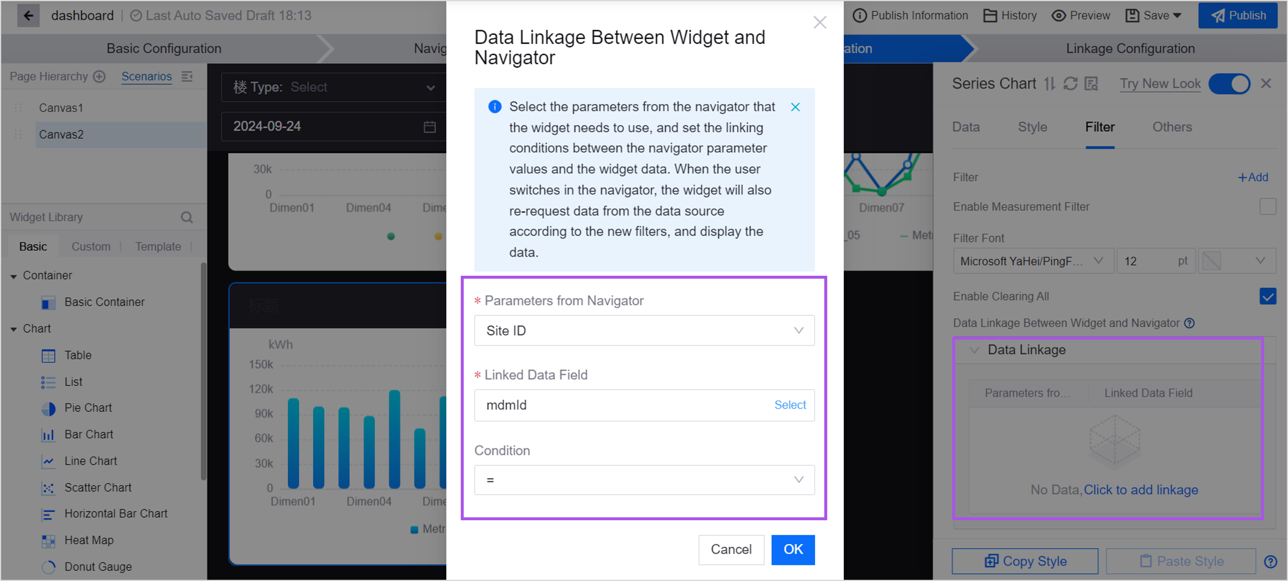
If you want the data in the widget to follow the navigation switch, you can batch configure the linkage between the navigator parameters and widget data items in Configuration Parameters. When the user switches the asset/time range in the navigator, the widget on the page will use the parameter values output by the navigator to request data from the data source and display the returned data in the widget to complete a data filtering behavior. Follow the steps below to configure widget parameters in batches:
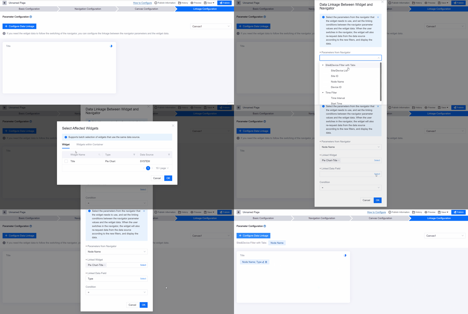
Select the canvas and layer where the widget is located in the drop-down box on the right.
Select the Configure Data Linkage button.
Select parameters and linkage conditions in the pop-up window:
Navigator Parameters: From the filters, asset types, selection methods, etc. you defined in the Navigation Configuration step.
Linked widgets: Select the widgets that need to be linked within the selected layer. widgets that use the same data source can be selected in batches to improve configuration efficiency.
Linked data items: Select data items from the data source being used by the widget. Data items are further divided into 2 categories:
Data source parameters: The request parameters given by the widget to the data source define the conditions for each request, such as the start time and end time of the data.
Data items: Return parameters of the data source. The widget selects the required data items from these return parameters and displays them in the widget in the form of indicators, extensions, dimensions, etc.
Linkage conditions: When the conditions between the navigator parameters and widget data are met, linkage occurs. in:
<>: Indicates that when the navigator parameter is within the range of the widget parameter value (including the endpoint value), linkage will occur.
like: Indicates that linkage occurs when the navigator parameters fuzzy match the widget parameter values. Wildcard characters % and _ are supported.
in: Indicates that linkage occurs when the navigator parameter is in the value list of the widget parameter.
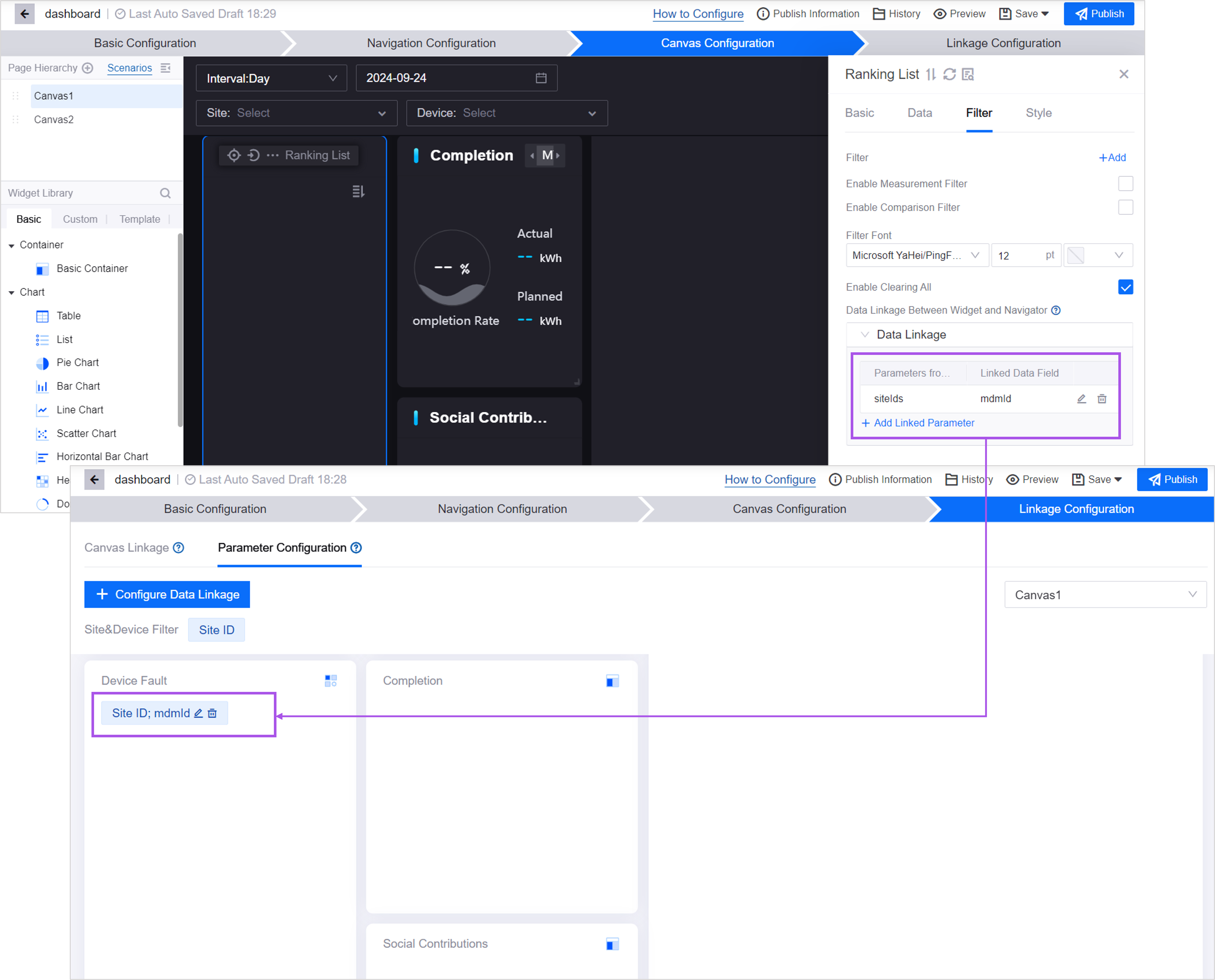
After completed, the configured linkage relationship will be displayed in the corresponding layer.
If a linkage relationship has been configured for a single widget in Canvas Configuration > widget Linkage Navigator, the linkage relationship will also be displayed in the corresponding canvas of the current page.
Unit 6: Publishing Page
After completing the page configuration, select Publish in the upper right corner to obtain the page URL and embed the page in the application.
