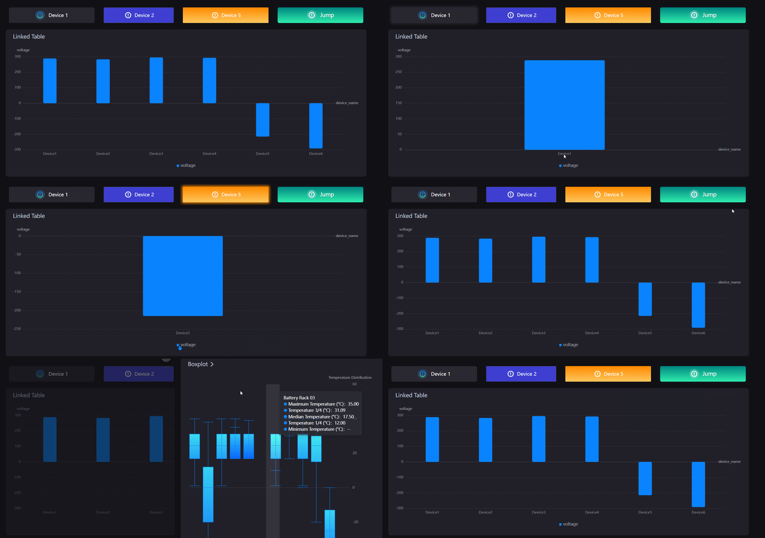
Button
By clicking a button to trigger a link jump or linked with other widgets.

Data Fields
The data fields required are:
| Field | Quantity |
|---|---|
| Dimension | 0 - 1 |
Note
If the action taken by the button is a link jump, no data item needs to be added.
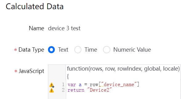
If the action taken by the button is a widget link, it will return the first data of the data item added by default. You can add a calculated field if the first data is not the required filter field. For example, if the data item to be linked is device_name, and the button needs to link the data of Device2, you need to take the value of device_name first, and then specify the return value as Device2 directly.

Chart Style
Set the action and style of the button.
| Field | Description |
|---|---|
| Action | Configure buttons for link jump or widget link. |
| Jump Configuration | If the action selects link jump, the jump configuration button will appear, select to enter the pop-up window for jump configuration. |
| Icon | Select an icon to be displayed beside the button text. |
| Icon Color | Select a background color for the icon. |
| Icon Size | Specify the icon size to be shown in button. |
| Icon Position | Specify the position of the icon and button text. |
| Icon-Text Spacing | Specify the spacing size between the icon and the text. |
| Button Text | Configure the content displayed in the button. |
| Font | Style the button text. |
| Background Color | Select a background color for the button. |
| Border Color | Select a color for button borders. |
| Border Width | Set the border width of the button. |
| Rounded Corners | Set the size of the rounded corners of the button border. |