Drawing Panels
In DTM Visualization Tool, you can build monitoring pages by adding elements and resources to panels, laying out elements and associating elements according to the actual business situation.
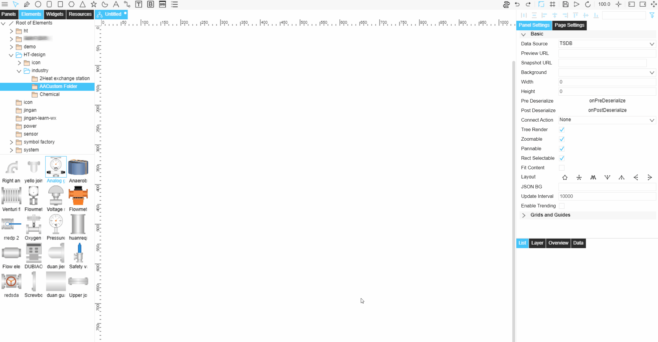
Adding Elements and Resources
Based on business requirements, select the elements template/files in the elements/resources management area on the left and drag and drop directly to add to the canvas.
If no template meets the requirement, you can draw the elements directly in the panels. For more information about drawing elements, see Using Elements.
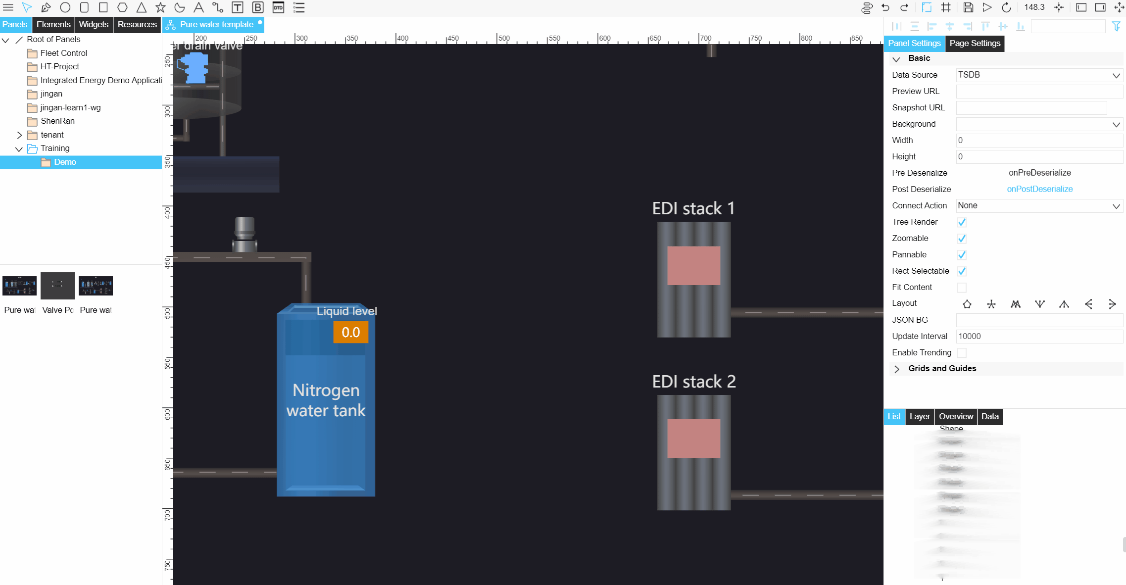
Arranging Elements and Resources
Adding Edge
Drag and drop the elements as needed, and use Edge  to link the elements.
Note
After using the edge to connect the elements, drag the elements and the edge will change with them.
Adding a control
Add controls Input Box and Button
 to the panels to control the asset data.
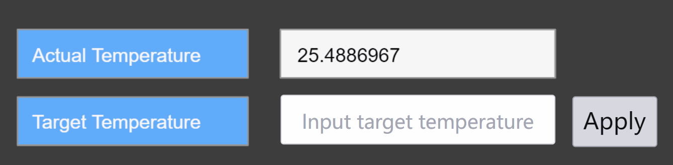
Configure controls as needed
Under the Panel Settings tab, you can configure the style of the control, the same as the configuration item for elements. For more information, see Configure elements.
Under the Widgets Settings tab, you can configure the content of the control and its style.
Input Box
Field |
Description |
|---|---|
Text content, font, size and color |
Can set the default input content of the input box, and support multi-language. And you can set the font, font size and color of the input content. |
Prompt content, font, size and color |
Can set the prompt content displayed in the input box, and support multi-language. And you can set the font, font size and color of the prompt text. |
Background Color |
Set the background color of the input box. |
Border Size and Color |
Set the border style of the input box. |
Adding a DTD Page
DTD Page  can be added to panels and parameters can be passed to the DTD Visualization Tool page. Under the Widget Settings tab, the following configurations can be made.
Field |
Description |
|---|---|
Page |
Select the DTD Page that you want to display. |
Responsive Mode |
Select the presentation mode of the page, and select between big panel, web and mobile. |
Filter Parameter |
If there are filters on the DTD page, you can configure the values of the filters to pass parameters. |
Adding an Alarm List
Add the asset Alarm List  in the panels, you can acknowledge the alarm or jump to the alarm console operation in DTM Visualization Tool. Under the Widget Settings tab, the following configurations can be made.
Field |
Description |
|---|---|
Asset ID |
Enter the asset ID, i.e. mdmId, of the asset for which you want to display. |
Asset Type |
Select the type of asset: Device or Site. |
Lines Per Page |
Configure the number of alarms per page. |
Enter Alarm Console |
Configure the URL of the source of the alarm list. |
Header - background color, font, font size and color |
Configure the style of the list header. |
Header - Alarm Field |
Configure the alarm fields shown in the list. |
Content - background color, horizontal border color, font, font size and color |
Configure the style of the list content. |
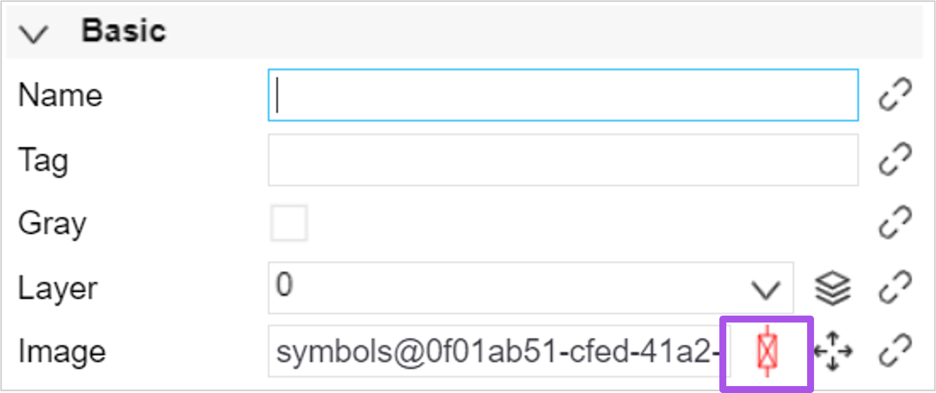
Configuring Elements
After selecting the elements, you can configure the control, layout, basic, text, and interactions for the elements.
Note
To add or edit elements attributes, double-click on the image graphic in the Basic Configuration column to quickly open the elements file. For more information on how to configure the element’s business attributes, see Editing Element Business Properties.
Configuring Elements Interaction
Under the Interaction tab, you can add one or more interaction events and actions for elements, the following interaction events are supported.
Event |
Description |
|---|---|
Click |
Triggered by a left mouse button click on elements. |
Double Click |
Triggered by left mouse button double-clicking elements. |
Hover |
Triggered by hovering the cursor over elements. |
Scroll |
Triggered by placing the cursor over elements and rolling the mouse wheel. |
The following interactive actions are supported.
Action |
Description |
|---|---|
Switch Page |
The current page can be switched to the target page. |
New Page |
Open the target page. The open mode can be set to open on a new page or in a popup window. The size of the popup window can be set. |
Previous Page |
Go back to the previous page. |
Script |
Enter the JSON script to set it. |
Control Script |
|
Show Hoverbox |
|
Note
Target pages can only be supported for pages in the same folder.
When you need to switch the target page to the current page asset data, in Replace Target Assets, you can configure the relationship between the target page asset and the current page asset. This function needs to be enabled External Parameter when binding assets. For more information, see Binding Asset.
If the current page is the initial page, the Previous Page action does not take effect.