Unit 3: Creating Your Dashboard in DTV
In this unit, you will learn how to create widgets in DTV to monitor battery status.
Prerequisites
Before you begin, please ensure the following.
The current OU has obtained and enabled Digital Twin Visualization. If not obtained, contact the system admin.
You need to be assigned the required asset permission and operation permission, and a menu group containing all menus in Digital Twin Visualization. If not assigned, contact the application administrator.
Step 1. Creating a Project and the Page
You need to create a project, and then a page to hold widgets.
Log in to EnOS Application Portal and select Digital Twin Visualization from the application list.
Select Dashboards > Dashboards from the left navigation pane.
Select New Project, and enter the name
Demo. Select OK to create the project.To create a new page, select New Page.
For Name, enter
Smart Battery Dashboard.For Project, select
Demo, the project that you just created.For Template, leave it blank.
Select OK to go to the Page Editor. Your page is created.
Step 2. Setting Your Overall Page Layout
Now you can configure the page to display the data.
Switch the theme to green in the right Page Settings. You can also change Background Color or upload your own Background Image.
Step 3. Creating a DTV Widget
Now, you will create and edit a DTV widget on the page you created.
You can choose many widgets on DTV for the best practice of data display and analysis. For instance:
Donut Gauge is good for measuring and displaying progress.
Horizontal Bar Chart is good for comparing data.
Map is good for displaying geographical information.
Mix Chart is good for visualizing and comparing trends.
Pie Chart is good for comparing and displaying the ratio of each data to the total.
Table is good for displaying complex data in an organized tabulated form.
Heat Map is good for comparing massive data and identifying anomalies by displaying data as color blocks.
For more information about other widgets on DTV, see Widgets.
Metric Card
To display the KPIs of multiple batteries, choose Metric Card.
Select Add > Widget on the top toolbar.
In the pop-up window, select Metric Card.
In Basic Information > Basic Options, configure chart title:
Status.In Data Fields, configure the data in your charts.
Data Source:
LastestData.Category:
SmartBattery_Model, the model you have created.Aggression:
Raw Data.Measurement:
health_levelwith the aliasHealth Level.cycle_numberwith the aliasCycle Number.currentwith the aliasCurrent,tempwith the aliasTemp.capacity, andvoltagewith the aliasVoltage.
To enable more widget configuration items, select Advanced Mode on the top right of the toolbar.
In Chart Style, configure measurement style and metric card style.
Measurement Style
health_level
Name Font:
14 pt.Unit Name:
%.Value Font:
Bold,20 pt, andGreen.Decimal Places:
0.Alignment:
Left.Name-Value Card Spacing:
0 pxValue Card Padding:
0 Up,0 Down,0 Left,0 Right.Name Card Padding:
0 Up,0 Down,0 Left,0 Right.
cycle_number
Name Font:
14 pt.Value Font:
Bold,20 pt, andGreen.Decimal Places:
0.Alignment:
Left.Name-Value Card Spacing:
0 pxValue Card Padding:
0 Up,0 Down,0 Left,0 Right.Name Card Padding:
0 Up,0 Down,0 Left,0 Right.
current
Name Font:
14 pt.Unit Name:
A.Value Font:
Bold,20 pt, andGreen.Alignment:
Left.Name-Value Card Spacing:
0 pxValue Card Padding:
0 Up,0 Down,0 Left,0 Right.Name Card Padding:
0 Up,0 Down,0 Left,0 Right.
temp
Name Font:
14 pt.Unit Name:
°C.Value Font:
Bold,20 pt, andGreen.Alignment:
Left.Name-Value Card Spacing:
0 pxValue Card Padding:
0 Up,0 Down,0 Left,0 Right.Name Card Padding:
0 Up,0 Down,0 Left,0 Right.
Capacity
Name Font:
14 pt.Unit Name:
KW.Value Font:
Bold,20 pt, andGreen.Alignment:
Left.Name-Value Card Spacing:
0 pxValue Card Padding:
0 Up,0 Down,0 Left,0 Right.Name Card Padding:
0 Up,0 Down,0 Left,0 Right.
voltage
Name Font:
14 pt.Unit Name:
V.Value Font:
Bold,20 pt, andGreen.Alignment:
Left.Name-Value Card Spacing:
0 pxValue Card Padding:
0 Up,0 Down,0 Left,0 Right.Name Card Padding:
0 Up,0 Down,0 Left,0 Right.
Metric Card Style
Layout: Row
2, Column3.Horizontal Spacing:
64 pt.Show “Expand”: disable.
To save your changes on the widget, select Save at the end of the page.
To view your new widget on the dashboard, select back button
 .
.
For more information about widget style configuration, see Metric Card.
Donut Gauge
To display the temperature of your batteries, choose Donut Gauge.
Select Add > Widget on the top toolbar.
In the pop-up window, select Donut Gauge.
In Basic Information > Basic Options, configure chart title:
Battery Health Level.In Data Fields, configure the data in your charts.
Data Source:
LastestData.Category:
SmartBattery_Model, the model you have created.Aggression:
Raw Data.Dimension:
AssetName.Measurement:
health_level.
Turn on Advanced Mode in the upper right corner of the toolbar to enable more chart configuration items.
In Chart Style, configure style information, including layout, donut thickness, and widget color.
Layout: Rows
3, Columns3.Axis Range: Specify the data range
0 - 100.Formatting Rules: By configuring the formatting rules for different intervals, when the values fall in different intervals, the color of the corresponding interval is displayed.
0 - 40is displayed asyellow.40 - 70is displayed asblue.70 - 100is displayed asgreen.
To save your changes on the widget, select Save at the end of the page.
To view your new widget on the dashboard, select back button
.
For more information about widget style configuration, see Donut Gauge.
Horizontal Bar Charts
To display the capacity of your batteries, choose Horizontal Bar Charts.
Select Add > Widget on the top toolbar.
In the pop-up window, select Horizontal Bar Chart.
In Basic Information > Basic Options, configure chart title:
Battery Capacity - Bar Chart.In Data Fields, configure the data in your charts.
Data Source:
LastestData.Category:
SmartBattery_Model, the model you have created.Aggression:
Raw Data.Dimension:
AssetName.Measurement:
Capacity.
In Chart Style, configure style information, including bar color, bar spacing, and axis style.
Color: Change the bar color to
Gradient Bluein Measurement Style > Color.Bar Spacing: You can specify the vertical spacing of each bar with different dimensions.
To save your changes on the widget, select Save at the end of the page.
To view your new widget on the dashboard, select back button
.
For more information about widget style configuration, see Horizontal Bar Chart.
Map
To display the geographical information of battery plants, choose Map.
Select Add > Widget on the top toolbar.
In the pop-up window, select Map.
In Basic Information > Basic Options, configure the chart title, title font, title link, and description.
Title:
Battery Map.Hide Title: Enable.
In Data Fields, configure the data in your charts.
Data Source:
LastestData.Category:
SmartBattery_Model, the model you have created.Aggression:
Raw Data.Dimension:
longitudeandlatitude.Measurement:
AssetName.
In Chart Style, configure style information, including map and interactive layers.
Center: Disable
Auto Calculate, with Lng103.8and Lat1.345.Zoom Level:
12.Map Source:
Google.Map Type:
Satellite.
Select New Layer, enter Layer Name and choose
Poifor Layer Type, then select OK.In the Poi configuration panel:
Longitude:
longitude.Latitude:
latitude.Asset Name:
AssetName.Show Coordinates: Enable.
POI Icon Size: Adjust icon size for the best display.
Choose
Enable Data Linkingto link Poi icons to your assets.Select
Link.Choose the
AssetNameonBattery Data Insights,Last Day Electricity, andStatus.
To save your changes on the widget, select Save at the end of the page.
To view your new widget on the dashboard, select back button
. You can view the distribution of your assets through the Poi icons on the map. Hover over a specific asset to view the name and location of the asset.
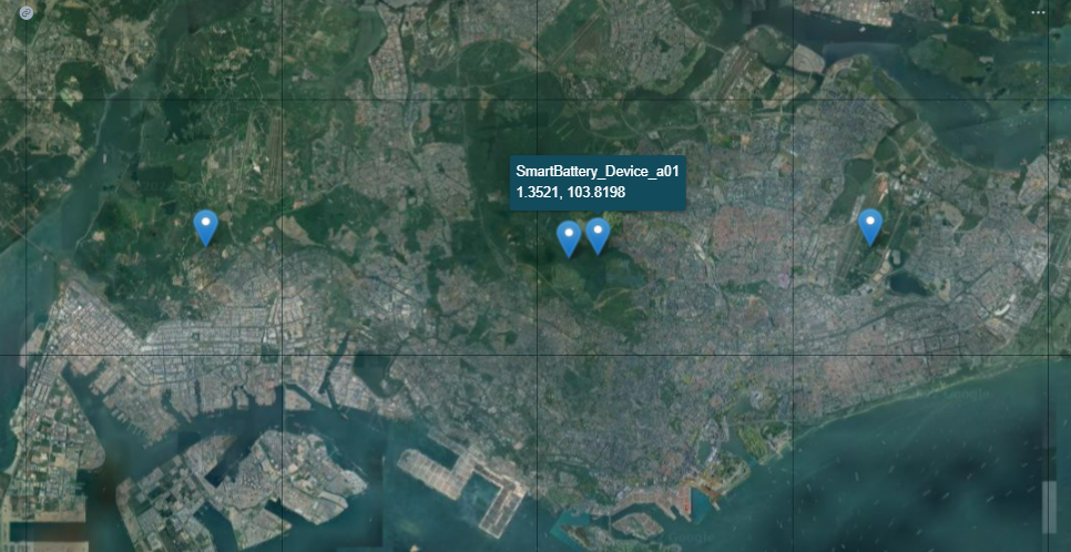
For more information about widget style configuration, see map.
Mix Chart
To monitor the change of battery current by time, choose Mix Chart.
Select Add > Widget on the top toolbar.
In the pop-up window, select Mix Chart.
In Basic Information > Basic Options, configure chart title:
Battery Data Insights.In Data Fields, configure the data in your charts.
Data Source:
AIRawinTSDB.Category:
SmartBattery_Model, the model you have created.Aggression:
Raw Data.StartTime: Select the start time of data acquisition.
EndTime: Select the end time of data acquisition.
Dimension:
time, which is the X axis of the chart.Measurement:
current,temp,voltage, which are the Y axes of the chart.
Select Add in Internal Filter > Filter, and configure your filter on the popup window.
Position:
Right of Title.Filter Type:
Time Range.Default Range:
Past Day.Link Data Fields: Select
StarttimeasStart, andEndtimeasEnd.
Select OK to save your internal filter configuration.
In Chart Style, configure style information, including chart type, color and axis style.
Chart Type: You can choose line, area, bar, target, scatter, or bubble charts for different data.
Dual Y-Axis: Enable
Dual Y-Axisintemppanel.Color: You can choose different colors for the line charts of the three measurements.
Smooth: Enable
Smooth.
Axis Style:
Label Settings: Select
timewith the formatHH:MM. The X axis will display in the format you choose.Show Scalar Bar: Enable, and you can drag the scalar to view the data over time.
To save your changes on the widget, select Save at the end of the page.
To view your new widget on the dashboard, select back button
.
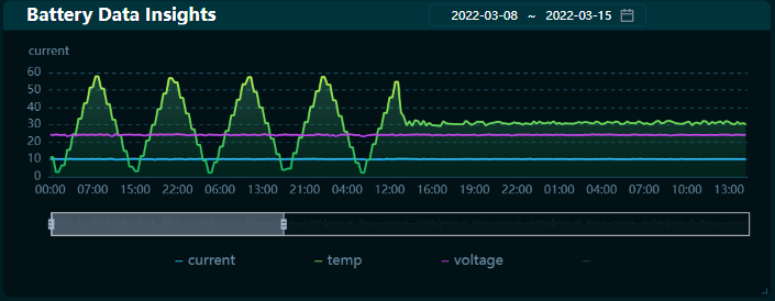
For more information about widget style configuration, see Mix Chart.
Pie Chart
To display the total capacity and the capacity of each battery asset, choose Pie Chart.
Select Add > Widget on the top toolbar.
In the pop-up window, select Pie Chart.
In Basic Information > Basic Options, configure chart title:
Battery Capacity - Pie Chart.In Data Fields, configure the data in your charts.
Data Source:
LastestDatainTSDB.Category:
SmartBattery_Model, the model you have created.Aggression:
Raw Data.Dimension:
AssetName.Measurement:
Capacity.
In Chart Style, configure style information, including pie chart style, color, and legend style.
Pie settings:
Use Gradient: Enable.
Decimal places:
0.Unite Name:
KW.
Legend
Position:
right-middle.Show Legend Value: Enable.
Value Font:
Green.Value Margin:
60.
To save your changes on the widget, select Save at the end of the page.
To view your new widget on the dashboard, select back button
.
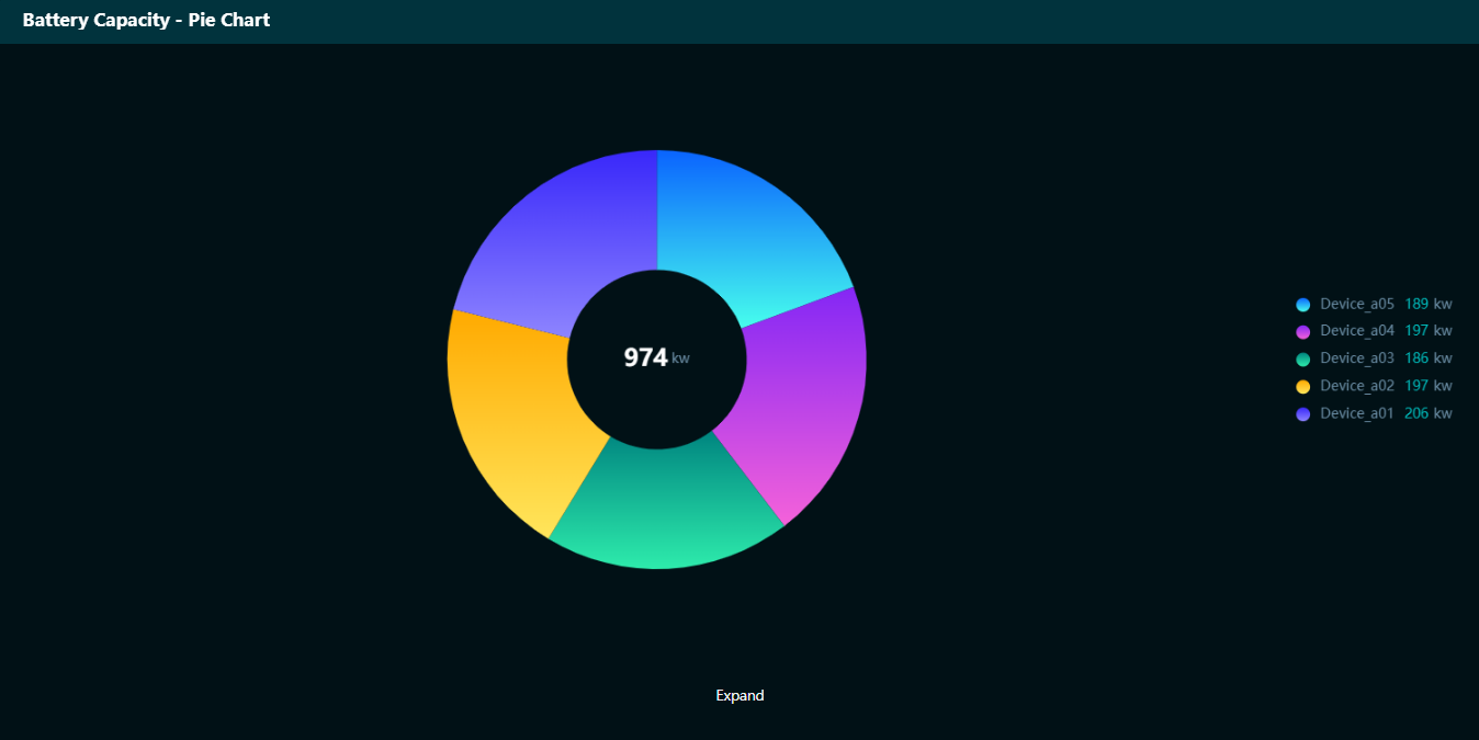
For more information about widget style configuration, see Pie Chart.
Table
To display massive data including capacity, voltage, longitude, and latitude, choose Table.
Select Add > Widget on the top toolbar.
In the pop-up window, select Table
 .
.In Basic Information > Basic Options, configure chart titl:
Battery Data Table.In Data Fields, configure the data in your charts.
Data Source:
LastestDatainTSDB.Category:
SmartBattery_Model, the model you have created.Aggression:
Raw Data.Dimension:
AssetName.Measurement:
current,temp,voltage,Latitude,Longitude.
In Chart Style, configure style information, including display style, header style and color.
Header settings:
Font: Choose font
GreenandBold.Enable Sorting: Enable sorting the data in each column.
Content:
Even Row Color:
GreenwithTransparency.Border Color:
000000.
To save your changes on the widget, select Save at the end of the page.
To view your new widget on the dashboard, select back button
.
For more information about widget style configuration, see Table.
Heat Map
To display the historical trend comparison of battery voltage or current, choose Heat Map.
Select Add > Widget on the top toolbar.
In the pop-up window, select Heat Map.
In Basic Information > Basic Options, configure chart title:
Last Day Electricity.In Data Fields, configure the data in your charts.
Data Source:
AI AggregationinTSDB.Category:
SmartBattery_Model, the model you have created.Aggression:
Raw Data.StartTime: Select the start time of data acquisition.
EndTime: Select the end time of data acquisition.
Dimension:
time.Comparison:
SimplifiedAssetNameMeasurement:
current.
Select Add in Internal Filter > Filter, and configure your filter on the popup window.
Position:
Right of Title.Filter Type:
Time Range.Default Range:
Past Day.Link Data Fields: Select
StarttimeasStart, andEndtimeasEnd.
In Chart Style, configure style information, including display style, color, and axis style.
Axis Style > X-Axis:
Label Settings: Select
timewith the formatHH:MMand the label rotation45°.
Heat Map Style:
Cell: Choose the cell color of the maximum and minimum values separately.
Mark Min Value: Enable.
Mark Max Value: Enable.
Legend:
Position:
bottom-middle.Size: length for
250, and width for8.
To save your changes on the widget, select Save at the end of the page.
To view your new widget on the dashboard, select back button
.
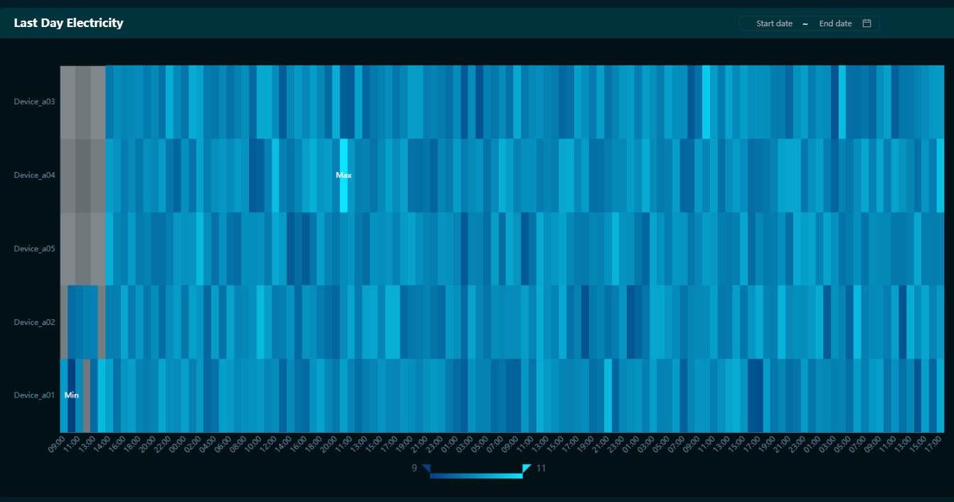
For more information about widget style configuration, see Heat Map.
Step 4. Configuring Data Link
Sometimes while viewing the data status of all batteries, it may also be desirable to view the data status of individual batteries or batteries in a single region. Adding a global filter after all widgets have been added will allow linkage between widgets. For example, if you select a single battery, the data displayed by all widgets will be filtered by that battery and displayed as data for that single battery. Select a region and all widgets will automatically display data for that region only.
Asset Filter
To add a Global Filter on assets, select Filters on the top toolbar.
Title:
Asset.Key:
assetas the parameter key.Attributes: Enable
Visible on PageandAccepting External Parameters.Filter Type:
Multi-Select Dropdown.Linked Data Source: Select
LatestData-SmartBattery_Model-AssetName.Name/Value:
AssetName-AssetName.
District Filter
To add a Global Filter on districts, select Filters on the top toolbar.
Title:
District.Key:
Districtas the parameter key.Attributes: Enable
Visible on PageandAccepting External Parameters.Filter Type:
Single-Select Dropdown.Enable “Select All”: Enable.
Linked Data Source: Select
LatestData-SmartBattery_Model-District.Name/Value:
District-District.
Step 5. Publishing and Using the Page
To publish your dashboard:
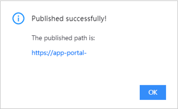
In Page Editor, Select Publish on the top toolbar.
Seconds later, you can see a popup window suggesting successful publishing. Copy the page URL to integrate your page into your applications.
For more information about publishing and using pages, see Publishing Dashboard Pages