Metrics Explorer
Metric Explorer is used to collect, analyze, and visualize the behavior of EnOS devices, helping you understand the operation of the devices and troubleshoot operational issues.
Prerequisite
Ensure that you have obtained the Developer role to have the access to Application Portal > Developer Console. If not, contact your OU administrator.
Configuring New Chart
In the EnOS Application Portal > Developer Console, select Monitoring & Operations > Metric Explorer.
Click New Chart.
Enter the following information in the sidebar. For specific configuration information, see Metric List and Understanding Metric Explorer:
Chart Name: Enter the name of the chart.
Metrics and Aggregation Methods: Select one or more metrics and configure the aggregation method.
Metrics: Select device metrics, function metrics, or OTA metrics.
Aggregation Methods: Select sum, average, minimum, or maximum.
Filters: Set the filtering dimensions to limit the range of data calculation. When empty, all device data are calculated.
The relationship between multiple values in the same filter is “OR”.
The relationship between multiple filters is “AND”.
Groups: Used to view more granular data or view data by sorting.
Click Save to generate the chart.
Viewing Metric Charts
Select Time Range and Time Granularity in the upper right corner, and the chart will be displayed according to the corresponding range and granularity.
Note
Based on the selected time range, the system automatically matches the default time granularity. For example, the granularity is 1 minute for the last 1 hour, 5 minutes for the last 1 day, 15 minutes for the last 7 days, and 30 minutes for the last 30 days.
The minimum value for time granularity is 1 minute, make sure the time granularity value is less than the selected time range.
To switch chart types, click the Chart button
 on the right side of the chart.
To view detailed information about a metric, click … > Export Data to download the data file.
Managing Metric Charts
Click … > Pin to Dashboard on the right side of the chart to add the chart to the Dashboard. This allows you to directly access the chart in the Dashboard without having to search again. For more information about the Dashboard, see Dashboard.
Click the Configure button
 on the right side of the chart to reconfigure the chart.
To delete, click … > Delete Chart on the right side of the chart.
Metric List
Metrics |
Aggregation Method |
Filtering/Grouping Conditions |
|---|---|---|
Device Metrics:
|
|
|
Feature Metrics:
|
|
|
Message Metrics:
|
|
|
Device OTAs: Number of OTA Updates for Devices |
|
|
Understanding Metrics Explorer
Key Concepts
Aggregation Interval: The time period for collecting multiple metric values. For time series data, the aggregation interval refers to the time granularity. For non-time series data, the aggregation interval refers to the time range.
Sampling Granularity: The minimum interval between two original metric values. When the selected time granularity is smaller than the sampling granularity, the larger sampling granularity will be chosen as the aggregation interval.
Aggregation Method
There are five basic aggregation methods available in metric explorer:
Sum: The sum of all values obtained within the aggregation interval.
Average: The average value of the metric obtained within the aggregation interval.
Min: The minimum value obtained within the aggregation interval.
Max: The maximum value obtained within the aggregation interval.
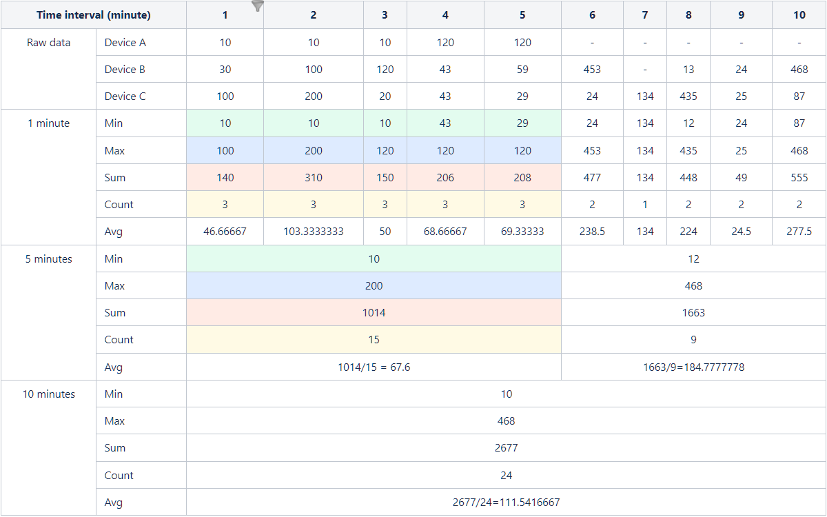
Assuming that the original data is collected every minute for devices A, B, and C and the aggregation operations are performed accordingly, the specific data is shown in the following image:
Grouping and Sorting
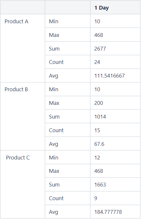
Assuming the data of devices for products A, B, and C is collected for 1 day.
The comparison baseline for grouping and sorting is independent of the time granularity but depends on the time range. If the aggregation type is Sum, the baseline value is the sum of all values within that day. If the aggregation type is Max, the baseline value is the maximum value within that day.
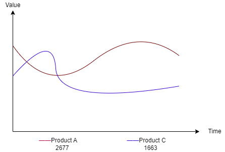
The line chart below shows the data with the largest values for the top 2 products when the aggregation type is Sum. The line chart can represent the data trend over time.
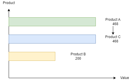
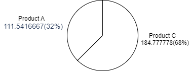
The bar chart and pie chart below show the data with the largest values for the top 3 products when the aggregation type is Max.
- Histogram
- Pie Chart
Best Practice
Scenario Description |
Applicable Configuration |
Note |
|---|---|---|
Trend of the number of points successfully reported through Gateway A in the last three days |
|
None |
Number of online devices for Model A, Model B, and Model C in the last month |
|
Grouping is used to split the data for a more detailed view |
Top 10 provinces with the highest number of offline devices in the last month |
|
Grouping is used for sorting, and the baseline value calculation is based on the sum of values over the past month divided by the number of points (based on device group) |
Top 3 gateways with the least number of messages sent to the platform through the gateway from February 6th to February 12th |
|
Grouping is used for sorting, and the baseline value calculation is based on the sum of values from February 6th to February 12th (based on gateway) |
Current environment status: device online rate, offline rate, and activation rate |
|
The ratio is calculated by dividing the average values of the three metrics between February 6th and February 12th by the sum of their average values during that period |
Maximum size of messages sent from devices to the cloud in the last week |
|
None |