Standard Widgets
Standard widgets contain no data fields by default. application creator need to configure the data ites for the widgets. The page describes the standard widgets provided by Portfolio.
Liquid Fill
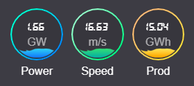
Liquid Fill displays the completing progress of target metrics.
Data Field
You can add up to 3 data fields to a Liquid Fill widget.
Chart Style
You can configure the following style settings of a Liquid Fill widget.
Field |
Description |
|---|---|
Color |
Select the color of the liquid fill. |
Show Divider |
Display a dividing line on the frame of the widget. |
Divider Position |
After enabling Show Divider, select the position of the divider, supporting top, bottom, left, and right. |
Metric
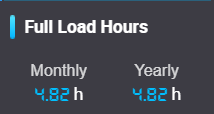
Metric displays the data of the selected data fields.
Data Field
You can add up to 5 data fields to a Metric widget.
Chart Style
You can configure the following style settings of a Metric widget.
Field |
Description |
|---|---|
Display Style |
Select the style to display the names and values of data fields. |
Arrangement |
Select the layout of data fields, supporting Horizontal and Vertical. |
Font Type |
Select the font of data, supporting Normal and LED. |
Flip Card Effect |
Add frames to data values, and flip card animation when data values change. |
Show Divider |
Display a dividing line on the frame of the widget. |
Divider Position |
After enabling Show Divider, select the position of the divider, supporting Top, Bottom, Left, and Right. |
Progress Bar
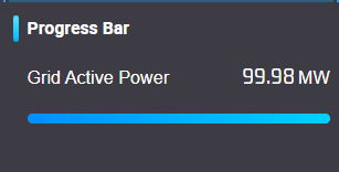
Progress Bar displays the completion progress in bar chart.
Data Field
You can add up to 3 data fields to a Progress Bar widget.
Chart Style
You can configure the following style settings of a Progress Bar widget.
Field |
Description |
|---|---|
Show Data Field Name |
Enable to show the data field names above the progress bars of the dat fields. |
Color |
Select the color of progress bars. |
Show Divider |
Display a dividing line on the frame of the widget. |
Divider Position |
After enabling Show Divider, select the position of the divider, supporting Top, Bottom, Left, and Right. |
Time Series
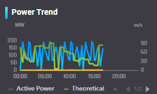
Time Series display the data trend or the comparison of multiple asset data fields throughout a specified time period.
Data Field
You can add up to 4 data fields to a Time Series widget.
Chart Style
You can configure the following style settings of a Time Series widget.
Field |
Description |
|---|---|
Chart Style |
Select the style of the time series chart for a specified data field, supporting Line, Bar, Area, and Bullet. |
Color |
Select the color of the chart for a specified data field. |
Show Future Data |
Display the data on a future time point, for example the estimated or planned data. |
Y Axis Range |
Specify the range of values on Axis Y, supporting Auto to automatically specify the range or Fixed to enter the maximum and minimum value to specify the range. |
Interpolate Values |
Enable to automatically fill in the data according to previous data when the data of specified time points are missed. |
Show Divider |
Display a dividing line on the frame of the widget. |
Divider Position |
After enabling Show Divider, select the position of the divider, supporting Top, Bottom, Left, and Right. |
Time Settings
You can configure the following time settings of a Time Series widget.
Field |
Description |
|---|---|
Overlapped Intervals |
Specify the time interval of adjacent data, supporting the intersection of the time interval for each data field. |
Time Range |
Specify the start time and end time to acquire data. |
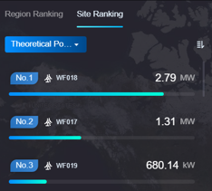
Ranking
Ranking displays a series of data and progress bars in ascending or descending order.
Note
You can only add 1 Ranking widget for a specified asset dimension.
Data Field
You can add up to 30 data fields to a Ranking Widget.
Chart Style
You can configure the following style settings of a Ranking widget.
Field |
Description |
|---|---|
Style |
Select the style of ranking. |
Tab |
Enter the names of the 2 tabs in the Ranking widget. |
Show Divider |
Display a dividing line on the frame of the widget. |
Divider Position |
After enabling Show Divider, select the position of the divider, supporting Top, Bottom, Left, and Right. |
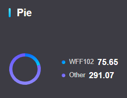
Pie Chart
Pie Chart displays the proportion of values and compares individual data fields in a series of dat fields.
Data Field
You can add 1 data field to a Pie Chart widget.
Chart Style
You can configure the following style settings of a Pie Chart widget.
Field |
Description |
|---|---|
Asset Dimension |
Select the asset dimension of the chart data, supporting region and site. |
Color |
Select the color of data in the pie chart. |
Display Number |
Select the number of data fields displayed individually. Other data fields with fewer proportion are displayed as others on the chart. |
Show Divider |
Display a dividing line on the frame of the widget. |
Divider Position |
After enabling Show Divider, select the position of the divider, supporting Top, Bottom, Left, and Right. |
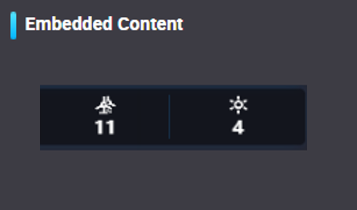
Embedded Content
Embedded Content displays contents such as pictures and websites.
Data Field
You don’t need to add data fields to an Embedded Content widget.
Chart Style
You can configure the following style settings of an Embedded Content widget.
Field |
Description |
|---|---|
Type |
Select the type of the embedded content, supporting Image and Subpage. |
Style |
Select the frame style of the embedded content. |
URL |
Enter the URL Address to open the target address when selecting the widget on canvas. |
Show Divider |
Display a dividing line on the frame of the widget. |
Divider Position |
After enabling Show Divider, select the position of the divider, supporting Top, Bottom, Left, and Right. |
Action
Action displays the button to perform the specified tasks.

Data Field
You don’t need to add data fields to an Action widget.
Chart Style
Select Add Action in the Chart Style section for the following configuration.
Field |
Description |
|---|---|
Action Name |
Enter the displayed name for the widget. |
Link Type |
Choose on a new page or on the current page when opening the link of the widget. |
Link Address |
Enter the URL Address to open the target address when selecting the widget on canvas. |
Button Style |
Select the style of the operation button, supporting Solid Button and Outline Button. |
Show Icon |
Enable to display the |
Show Divider |
Display a dividing line on the frame of the widget. |
Divider Position |
After enabling Show Divider, select the position of the divider, supporting Top, Bottom, Left, and Right. |
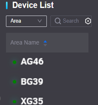
Device List
Device List displays the devices of a specified site.
Note
You can only add a Device List widget on the canvas of a site map.
Data Field
You can add object types to the Device List widget, and add up to 30 data fields to an object type.
Chart Style
You can configure the following style settings for a Device List widget.
Field |
Description |
|---|---|
Link |
Enable to display the link button that can open the URL address specified in Link Address. |
Link Name |
Enter the name of the link button. |
Link Type |
Choose on a new page or on the current page when opening the link of the widget. |
Link Address |
Enter the URL address to open when selecting the link button. |
Status Icon |
Display the connecting status of devices by icons. |
Rows Per Page |
Specify the number of devices displayed on one page of the widget. |
Show Divider |
Display a dividing line on the frame of the widget. |
Divider Position |
After enabling Show Divider, select the position of the divider, supporting Top, Bottom, Left, and Right. |
 icon along side the name tag.