Custom Nodes
Device Integration Service provides a range of standard nodes that can satisfy the construction of most integration flows, as well as provide users the ability to upload customized nodes and design flows according to business needs and usage scenarios.
You can design and create custom nodes according to your needs, upload them in Flow Designer or Integration Agent, and use them in your flows. Once uploaded, the custom nodes can be used in the entire organization (OU).
For how to create custom nodes, see Uploading Customized Nodes.
Form Elements
There are various form elements that are available for your use when customizing nodes. The YAML code samples for each form element are as per the below.
Input
Use the Input form element for text fields.
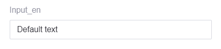
- id: input
    title:
      defaultValue: Input
      i18nValue:
        en_US: Input_en
        zh_CN: 输入框
    type: string
    formElement: Input
    formElementConfigs:
      placeholder: Placeholder text
    defaultValue: Default text
    maxLength: 30
    minLength: 5
Select
Use the Select form element for drop-downs.
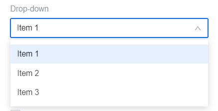
- id: select
    title:
      defaultValue: Drop-down
      i18nValue:
        en_US: Drop-down
        zh_CN: 下拉框
    type: number
    formElement: Select
    formElementConfigs:
      placeholder: Placeholder text
    enumItems:
      - label: Item 1
        value: 0
      - label: Item 2
        value: 1
      - label: Item 3
        value: 2
Switch
Use the Switch form element for toggle switches.

- id: Switch
    title:
      defaultValue: Switch
      i18nValue:
        en_US: Switch EN
        zh_CN: 开关
    type: boolean
    formElement: Switch
Checkbox
Use the Checkbox form element for checkboxes.

- id: checkbox
    title:
      defaultValue: Checkbox
      i18nValue:
        en_US: Checkbox
        zh_CN: 多选框
    type: boolean
    formElement: Checkbox
    formElementConfigs:
      children: Checkbox Item
    defaultValue: false
TextArea
Use the TextArea form element for multi-line text fields.
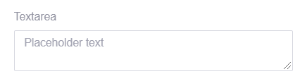
- id: textarea
    title:
      defaultValue: Textarea
      i18nValue:
        en_US: Textarea
        zh_CN: 文本框
    type: string
    formElement: TextArea
    formElementConfigs:
      placeholder: Placeholder text
      rows: 2
InputNumber
Use the InputNumber form element for number fields.
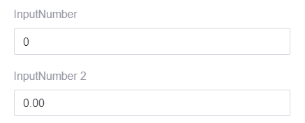
- id: inputNumber
    title:
      defaultValue: InputNumber
      i18nValue:
        en_US: InputNumber
        zh_CN: 输入整数
    type: number
    formElement: InputNumber
    formElementConfigs:
      placeholder: Placeholder text
      precision: 0
      min: -100
      max: 23
      style: {width: '100%'}
    defaultValue: 0

  - id: inputNumber2
    title:
      defaultValue: InputNumber2
      i18nValue:
        en_US: InputNumber 2
        zh_CN: 输入小数
    type: number
    formElement: InputNumber
    formElementConfigs:
      placeholder: Placeholder text
      precision: 2
      min: -123.05
      max: 23.25
      style: {width: '100%'}
    defaultValue: 0
Password
Use the Password form element for password fields.

- id: password
    title:
      defaultValue: Password
      i18nValue:
        en_US: Password
        zh_CN: 密码
    type: string
    formElement: Password
    formElementConfigs:
      placeholder: Placeholder text
      style: {width: '100%'}
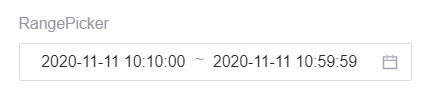
RangePicker
Use the RangePicker form element for selecting a time range.
- id: rangePicker
    title:
      defaultValue: RangePicker
      i18nValue:
        en_US: RangePicker
        zh_CN: RangePicker
    type: array
    formElement: RangePicker
    formElementConfigs:
      placeholder: ['Start Time', 'End Time']
      format: YYYY-MM-DD HH:mm:ss
      showTime: true
      allowClear: false
    defaultValue: ['2020-11-11 10:10:00', '2020-11-11 10:59:59']
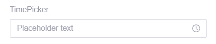
TimePicker
Use the TimePicker form element for selecting a specific time.
- id: timePicker
    title:
      defaultValue: TimePicker
      i18nValue:
        en_US: TimePicker
        zh_CN: TimePicker
    type: string
    formElement: TimePicker
    formElementConfigs:
      placeholder: Placeholder text
      format: HH:mm
      style: {width: '100%'}